
When I was a teen (back around 2005), I really got into video game magazines. EGM, Game...
Month: June 2025
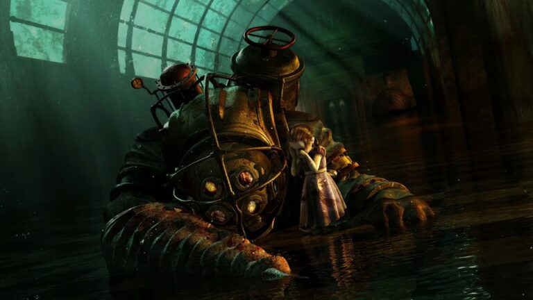
And with that, we have completed another Love/Hate series here on IC2S! As soon as I finished...
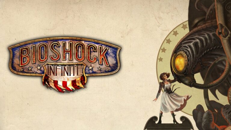
Welcome back to the Bioshock Love/Hate series! In this entry, we’ll be covering the final game in...
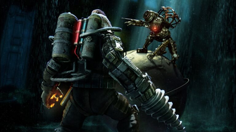
Welcome back to the Bioshock Love/Hate series! In this entry, we’ll be covering Bioshock 2, a sequel...
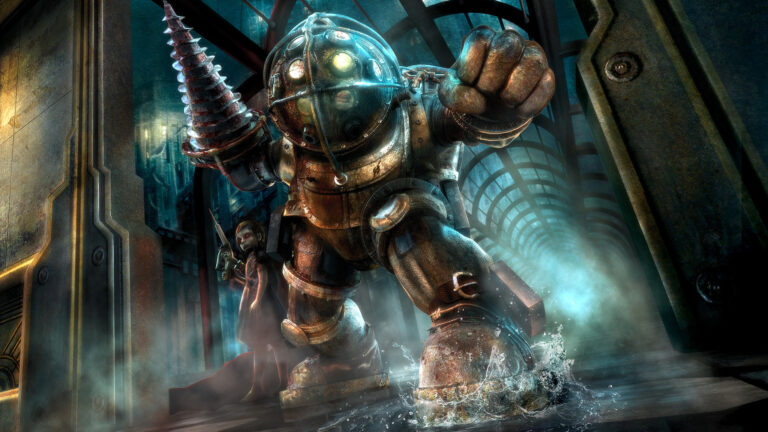
Oh hey, it’s time for another Love/Hate series here on IC2S! After writing the list of my...