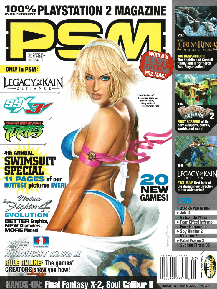
When I was a teen (back around 2005), I really got into video game magazines. EGM, Game Informer, Official PlayStation Magazine, Edge… I would sneak over to the corner store before church and get any issue I could find. In retrospect, I really should have subscribed to all of these, because I would have saved a ton of money in the process, but there was such a magical feeling in checking the magazine rack every week and seeing a new treasure on sale waiting to be poured over. This was before we got high speed internet at home (our dial-up connection was limited to only a couple hours per month), and before I could even buy video games in my home town. Suffice to say that these magazines were my Bible of video game culture.
One of my favourite gaming magazines from this time was PSM, the unofficial PlayStation magazine. As much as I enjoyed Game Informer and the Official PlayStation Magazine, those two publications were borderline advertisements that you paid money for: exaggerated/hyped previews, soft review scoring, every hyped game would get very high scores, and very little critical to say. PSM, on the other hand, was unofficial, so they just said whatever the hell they wanted to. This gave it a much edgier tone and significantly more personality to its reporting and articles, which made it much more appealing to me.
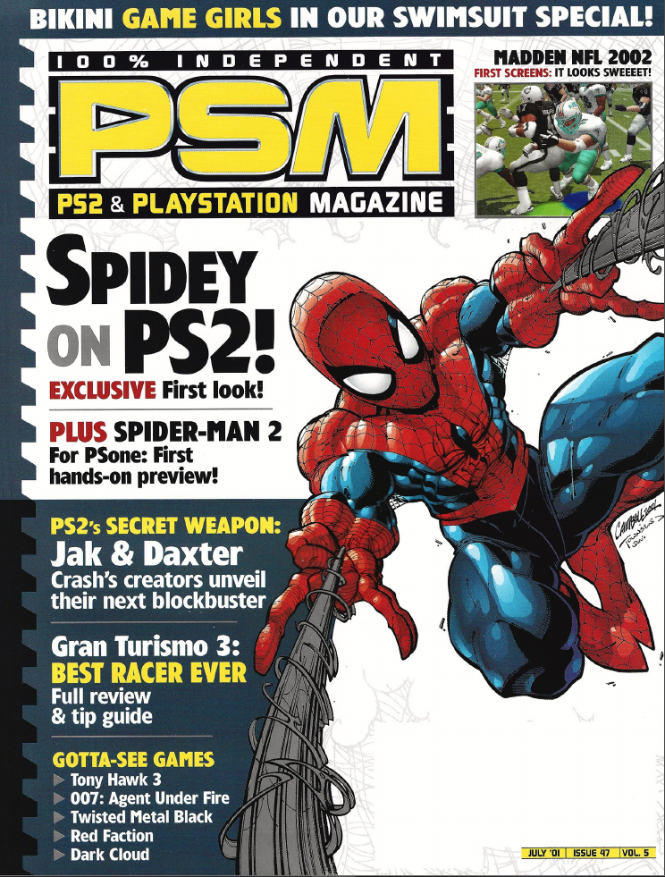
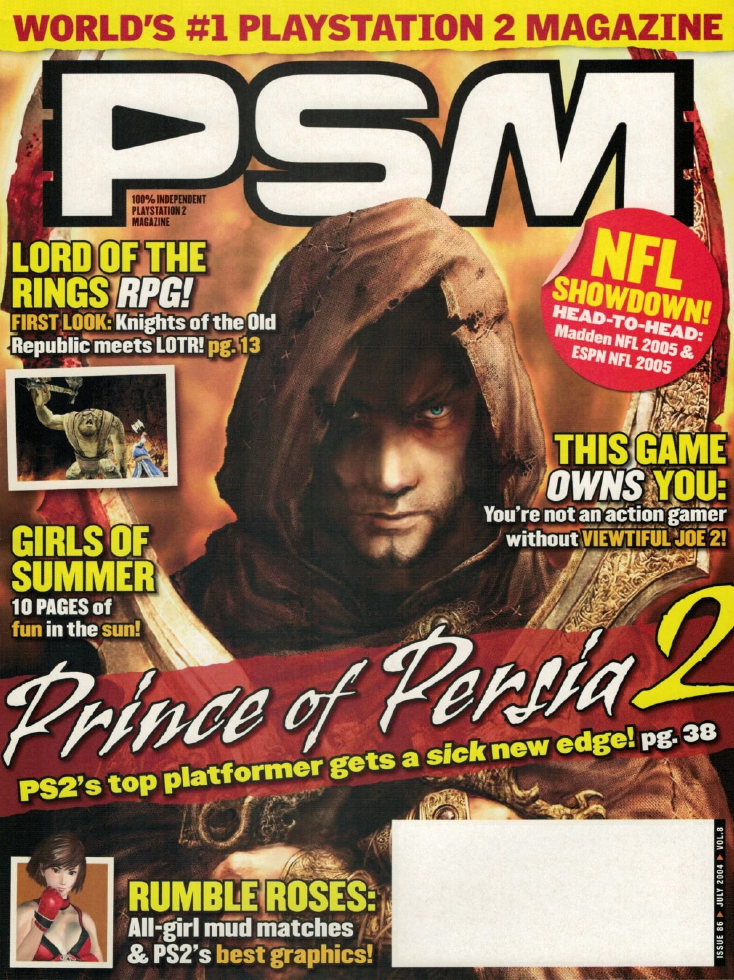
Part of PSM’s charm in the early days was that they would commission comic book artists to do the front cover illustrations for whatever game they were featuring that month. This was opposed to every other gaming magazine at the time, which would just use official advertising art approved by the game’s marketing team. As you can imagine, I find their two Dead or Alive covers to be so fucking cool. This practice would fade out over time, which I get: the comic book covers don’t really communicate that these are gaming magazines unless you recognize the cover character, and it would cost more money than using marketing materials. However, it definitely demonstrates the magazine’s gradual loss of personality as the years went on. By the time of the PS3’s launch, the magazine underwent a big, “serious” rebrand, which heralded their unfortunate shuttering a year and a half later.
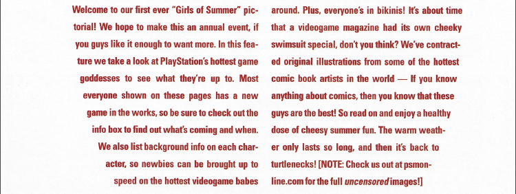
Perhaps the most notorious distillation of PSM’s personality was their annual swimsuit issue. PSM would dedicate nearly a dozen pages showing off their comic book artist pals’ illustrations of various female video game characters in skimpy swimwear… yeah, the early 2000s were a wild time in gaming compared to today. Six swimsuit issues were published between July 2000 to September 2005 (which, I think, was right before I started reading PSM regularly). These sort of low-key offensive ploys to gain market attention are completely lost in today’s sanitized, corporate media landscape… that’s not to say that we should necessarily bring the 90s/2000s era of “edge” back, but there is a certain charm to it in retrospect.
The entire concept of a PSM swimsuit issue was fucking hilarious, so it made me want to track down each issue to see what sort of comedy I could mine out of them. So, here we are: I’m going to go through every swimsuit issue and then ranking each art piece from best to worst. Surprisingly, I seem to be the first person to actually try to do this, because I could not for the life of me find compiled information on which issues had a swimsuit special, what characters appeared in it, and how many years PSM ran it for. I had to find all this info myself while combing through the magazine’s back catalogue.
Speaking of which, credit goes to Retromags for archiving the magazine’s print run. Websites like that are a fucking godsend!
Jump to:
The Scoring System
Each art piece will be scored 0-10 on the following Certified Scientific™ criteria:
- How HOT is the image (aka, the HOTNESS score)? These articles all promise me art of HOT video game girls in BIKINIS, so how well does the image deliver on that central premise?
- Is the art off-putting (aka, the Liefeld score)? Comic book artists are notorious for having a terrible understanding of human anatomy, so I’m expecting to see some abominations as we go through this. To be clear, terrible anatomy will result in a low score, whereas an appealing image without any obvious deformities will earn a high score.
- Does the character selection make sense (aka, the Character selection score)? There weren’t a whole lot of notable female video game characters in the early 2000s, and this will be worse for PSM since they were limited to PlayStation game characters only. Because of this, I’m genuinely curious to see how PSM are going to manage to fill out these issues on an annual basis, and whether they’re going to have to resort to some really weird selections in hindsight. High scores for the no-brainer picks and low scores for the most baffling character selections.
- Does the character’s personality shine through (aka, the Personality score)? It’s easy to draw a sexy woman, but it’s another thing entirely to capture that character’s personality in the image. I really love when fan art is able to communicate who that character is, so I will be giving major bonus points to any images that can pull that off.
- Is their swimwear design interesting (aka, the Swimwear design score)? These are swimsuit issues, after all! How does each piece of swimwear look? Is its design interesting? Does it tell us something about this character, or does it just take their in-game outfit and make it more revealing?
- Intangibles. Any positives or negatives that don’t fall into the previous categories will get mentioned here and potentially provide some bonus points as merited.
PSM Issue 35 (July 2000)
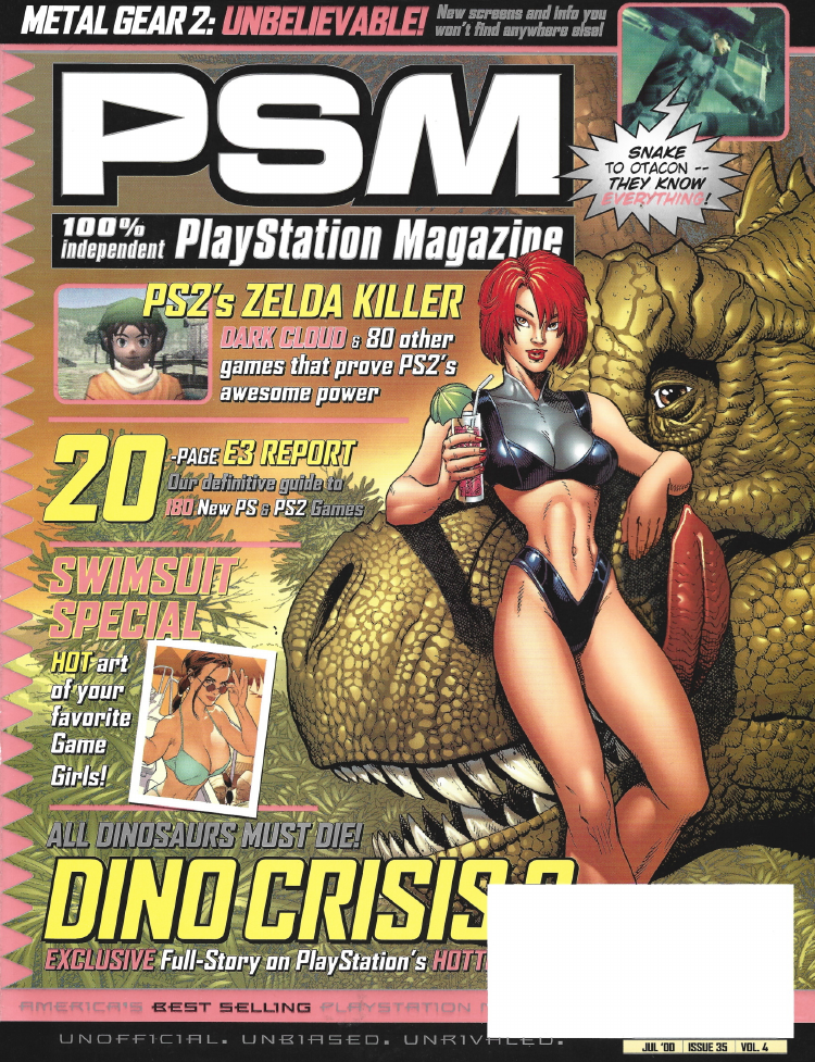
This inaugural issue of the swimsuit special (featuring Regina from Dino Crisis!) promises HOT art of your favourite Game Girls! Can they deliver…?
(Seriously, can they? I’m literally writing this before I’ve even looked at the issue. This is the sort of stream-of-conscious shit I write when I’m high.)
Yeah, this is the over-exaggerated macho writing I was expecting, but at least it acknowledges that this is intended to be tongue-in-cheek… wait a minute, what’s that last part…?

…my God.
Turtlenecks.
Okay, this article is now gonna detour as I try to find some of these uncensored images. I have to know if PSM were just edging their audience, or if they were actually hosting hentai on their website at one point…
Holy shit, guys, so I actually found the page archived on the Wayback Machine! It has all the illustrations there in fairly high quality (for image files from the year 2000 anyway). As expected, they did not post hentai on their website: the “uncensored content” amounts to a bit more sideboob on three of the images. Open them up in another tab here and then check them out after you read this article (no spoilers!).
Anyway, let’s get onto this issue’s images…
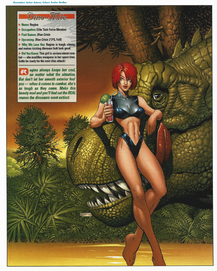
| HOTNESS: 5/10 | PSM sure seemed to like this one, making it their cover image and the first image in the entire article. The style’s a bit too exaggerated for my taste, but there’s one glaring flaw that spoils this for me… |
| Liefeld: 4/10 | My God, look at her left leg. It single-handedly ruins the image for me. On top of that, her legs are twice the length of her entire upper body. Damn, right out of the gate we’re getting the deformed anatomy: not a good look, PSM! |
| Character selection: 7/10 | Regina from Dino Crisis is a really cool pick! While the series didn’t last particularly long, she’s still remembered today and fans have been begging Capcom to resurrect the series for ages. At the time of publication, she still would have been a fairly popular character, so this gets a solid grade from me. |
| Personality: 4/10 | It’s been a long time since I played Dino Crisis, but I recall Regina being a fairly no-nonsense character. This image just looks like “generic hot girl” to me. |
| Swimwear design: 3/10 | This “bikini” is just Regina’s in-game costume, but they snipped away portions of it so they could show more skin. That’s a pretty boring way to design a character’s swimwear in my opinion. It looks more like a superhero costume than it does a swimsuit. |
| Intangibles: 0/10 | I really hate how the T-Rex is licking its lips and giving me the “come hither” look. |
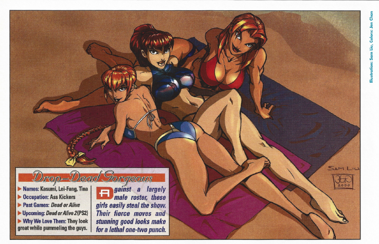
| HOTNESS: 9/10 | HOLD THE FUCKING PHONE, DEAD OR ALIVE GIRLS SPOTTED!!! Yeah, that by itself was enough for me to get excited, but… I mean, just look at it! This is the level of quality that you’d want to get from a PSM swimsuit issue! |
| Liefeld: 7/10 | I really had to look closely to nitpick this one. Kasumi’s shoulders are a bit weird, Leifang’s left leg might be a bit too long, and I have no idea what’s going on under Tina’s boobs, but I really had to pull out the magnifying glass to even notice. I’m fine with some exaggeration and stylization for this category, it’s when it comes at the detriment of the image that I start docking points. |
| Character selection: 10/10 | I see DOA girls, I immediately upvote. Also totally justified selection for the time, as Dead or Alive was fairly popular and known for its sex appeal. Dead or Alive Xtreme Beach Volleyball wasn’t even a thing yet, so this particular image ended up becoming prophetic in retrospect. |
| Personality: 5/10 | Here is by far the biggest issue with the image: the mischievous looks from all three of the girls really don’t convey their personalities at all. That said, this can maybe be chalked up to there only being one Dead or Alive game released at that point, which had pretty limited story and character presentation. |
| Swimwear design: 8/10 | In contrast to Regina’s entry, this is exactly what I’m looking for for this category. They’ve taken the colours associated with each of the girls’ main costumes and then reworked those into a unique swimsuit that feels appropriate for them. |
| Intangibles: 10/10 | I see DOA girls, I immediately upvote. You may feel that this is just my bias showing, but these categories are, as I have established previously, scientific, so therefore reality is biased in my favour. Sorry, I don’t make the rules, take it up with God. |
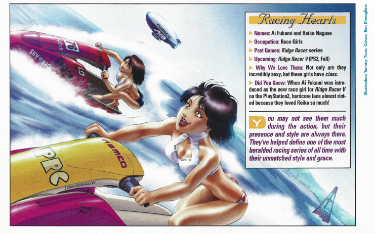
| HOTNESS: 6/10 | While I’m not sure I’d say that this is a particularly “hot” image, it’s certainly appealing to look at. I quite like it overall! |
| Liefeld: 5/10 | This one is not too bad overall, but its score is cratered due to one blatant flaw: the girls’ waists are INSANELY thin, which looks very off-putting attached to their gigantic hips. If not for that, this could have been a perfect score, but it’s so obvious that it really hurts the image. |
| Character selection: 2/10 | Maybe I’m just ignorant, but I had no idea Ridge Racer even had characters, let alone ones who people would want to see in swimwear. Then again, the people who love these characters really love them. Apparently Reiko Nagase is so popular amongst fans that her replacement, Ai Fukami, only appeared in one game before going back to Reiko, because fans threw a complete tantrum over the change. |
| Personality: 5/10 | Granted, I know nothing about these characters, but they look like they’re having fun, so… 5/10? |
| Swimwear design: 7/10 | Again, I know nothing about these characters, but I get the impression they usually just wear plainclothes, so their swimsuits here seem to be original designs. They’re cute outfits, I like them overall. |
| Intangibles: 5/10 | Having the racing girls be riding jet skis is a pretty clever idea and also adds a bit of variety to the images. That’s worth some points as far as I’m concerned. |
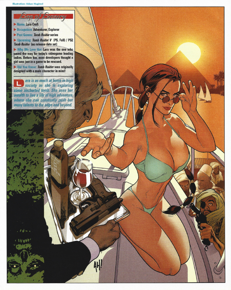
| HOTNESS: 8/10 | Ahh, the video game queen herself, Lara Croft was practically designed for this kind of article and looks as good as you would have hoped. The sun-drenched Egyptian skyline really sells this one. A solid enough contender, befitting The Queen. |
| Liefeld: 5/10 | I’m a bit mixed on this image. Lara’s left boob has an odd shape to it, but my biggest issue is the skewed perspective, which makes Lara look exponentially thinner the further down her body you go. It’s distracting and makes me like this image a lot less than I would like to. |
| Character selection: 10/10 | There was no way that PSM could do a swimsuit issue in the year 2000 without Lara Croft. |
| Personality: 10/10 | They’ve really captured Lara’s personality in this image. The sass, confidence, and classiness are there. Sex appeal was baked into her character from the start, so this is an easy 10/10. |
| Swimwear design: 8/10 | It doesn’t take a whole lot to get a decent score from me in this category. This is a very simple bikini, but it’s in Lara’s colour and feels like something I actually could see her choosing to wear. |
| Intangibles: 5/10 | I don’t know what is up with the guy with the eyepatch and gun (it appears that they’re pirates trying to board Lara’s yacht, but why does he look so weird?), but between him and Winston’s runny nose, there’s lots to look at here when you’ve gotten your eyeful of Lara. |
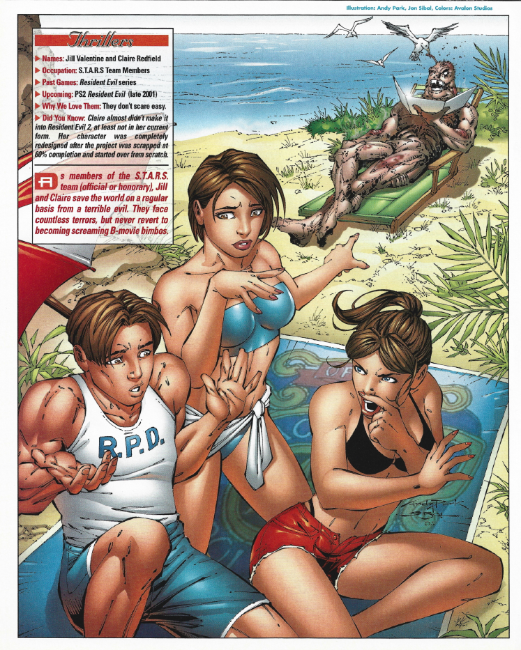
| HOTNESS: 2/10 | There is a lot going on with this image. On the one hand, we’ve got Jill Valentine, Claire Redfield, and Leon Kennedy representing Resident Evil! On the other hand, this image is clearly intended to be more comedic than hot. That’s fine, but it definitely costs this entry in the HOTNESS score. |
| Liefeld: 10/10 | The first entry thus far where I’ve got no nitpicks or glaring flaws to point out – Leon, Claire, and Jill look like human beings, good job. |
| Character selection: 6/10 | While Jill and Claire were pretty much video game royalty by the year 2000, I’m not sure how much sense they make for a swimsuit issue. They’re meant to look like regular people. As a result, if you took out the zombie and the RPD logo, you probably wouldn’t even realize who these characters are supposed to be. I’ll still give a decent score since they kind of had to show up in an article about PlayStation women, but their indistinct designs lose them some points. |
| Personality: 8/10 | Leon being a sad sap, Claire being feisty, Jill being the professional voice of reason… yeah, I’d say they’re tapping into these characters’ personalities here. |
| Swimwear design: 3/10 | The girls are just wearing more revealing versions of their official outfits… boring. It feels kind of necessary though, because without Jill’s tube top and Claire’s red shorts, there would be even less here to identify them. |
| Intangibles: 1/10 | It’s pretty funny that there’s a rotting zombie in the back, but the entire premise of the image is so weird for a swimsuit article: Claire smells the zombie and then assumes that the smell is because Leon farted. That’s… a decision, I’ll give them that. |
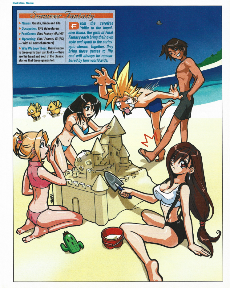
| HOTNESS: 6/10 | This one is like a tale of two images. On the one hand, we’ve got a fairly generic, cutesy anime image of Rinoa, Quistis, Cloud, and Squall having fun at the beach. It’s not particularly “hot”… but then we have Tifa pasted into the foreground and, poor girl, she looks like she’s cold. If this image was just Tifa, this would be up there, but so much of the image is just plain dull and generic. |
| Liefeld: 7/10 | So I’m not really noticing any egregious issues with this one, so that means that it’s time to nitpick. The perspective seems to be off once again, and the shadows make no sense at all, but overall this picture benefits from its simpler art style. |
| Character selection: 6/10 | Tifa and Rinoa are timeless Final Fantasy characters, but Quistis…? I haven’t played Final Fantasy VIII, and don’t think I’ve ever even heard of her, is she that popular a character? I honestly thought that she was Aerith with her hair died blonde at first. |
| Personality: 2/10 | I’m not really seeing anything of these characters’ personalities conveyed here, it’s just generic hot anime girl art. |
| Swimwear design: 4/10 | Rinoa and Quistis’ outfits are kind of cute, but understated. Is Tifa even wearing swimwear? She’s basically in her official, in-game outfit. |
| Intangibles: 3/10 | The Chocobos in the background are cute. |
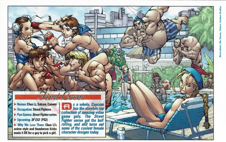
| HOTNESS: 1/10 | This image, featuring the Street Fighter girls, really falls flat when you remember the premise of the PSM swimsuit issue. Street Fighter has a lot of things that you’d expect them to hone in on (particularly Chun Li’s massive thighs and Cammy’s ass). We can’t even see Cammy’s ass at all! And Chun Li’s thighs: they’re pencil thin! On top of that, there are more Street Fighter guys than girls here! Yeah, the more I look at this image, the worse it gets. |
| Liefeld: 8/10 | This one’s a good demonstration of the difference between an exaggerated art style and bad anatomy. There’s a lot of exaggeration here (particularly with Zangief and E. Honda), but I’m not seeing anything that looks like an outright mistake… other than Chun Li’s pencil thighs. Seriously, what the fuck were they thinking with that? |
| Character selection: 10/10 | The girls (and guys!) of Street Fighter are iconic, so it’s a no-brainer that they’d get a spot in this issue. |
| Personality: 2/10 | This image seems to be intended to be a more comedic take on these characters, but as a result it doesn’t really give us much to glean of their actual personalities. |
| Swimwear design: 2/10 | This is a weird one, not because the swimsuits are necessarily bad, but because I can barely even see them. They can’t make much of an impression if you aren’t even going to show them. |
| Intangibles: 3/10 | I’ve got to give some bonus points for including Blanka, Dhalsim, and Zangief in a swimsuit special. |
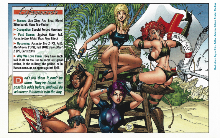
| HOTNESS: 6/10 | This one’s clearly alluding to Baywatch and the fantasy of being rescued by a hot lifeguard. While that’s fairly hot in its own right, Meryl’s ass is doing some heavy lifting. |
| Liefeld: 7/10 | About the only direct criticism I have of the art is that weird fold under Meryl’s boobs… but, honestly, it took me a while for my eyes to get there. Ahem. |
| Character selection: 7/10 | This entry is literally just a grab-bag of PlayStation girls picked seemingly at random. At least we’ve got some pretty big names here: Meryl Silverburgh from Metal Gear Solid (who Snake literally remarked “had a great butt”), Aya Brea from Parasite Eve, Lian Xing from Syphon Filter (which was a huge franchise at the time), and Hana Tsu-Vachel from Fear Effect. I don’t really get why they grouped these particular girls together, but I ain’t going to complain. |
| Personality: 3/10 | Once again, this is just generic “hot girl strikes sexy pose” art that says nothing about these characters or their personalities. Aya Brea as a hot lifeguard seems particularly weird. However… I have to give points for Meryl’s ass, not just because it’s distractingly rendered, but because it’s a pretty big plot point in Metal Gear Solid that Meryl has a great ass. That’s dedication to character right there! |
| Swimwear design: 5/10 | I’m not really sure what they were going for with these swimsuits. On the one hand, they aren’t just “in-game costume, but more skin”. On the other hand, they don’t really seem to be particularly interesting or true to the character. I dunno, they’re fine, but I’m lukewarm on this swimwear. |
| Intangibles: 0/10 | The big selling points of this one are the interesting character selection and Meryl’s ass… other than that, there’s not a whole lot I can say about this image. |
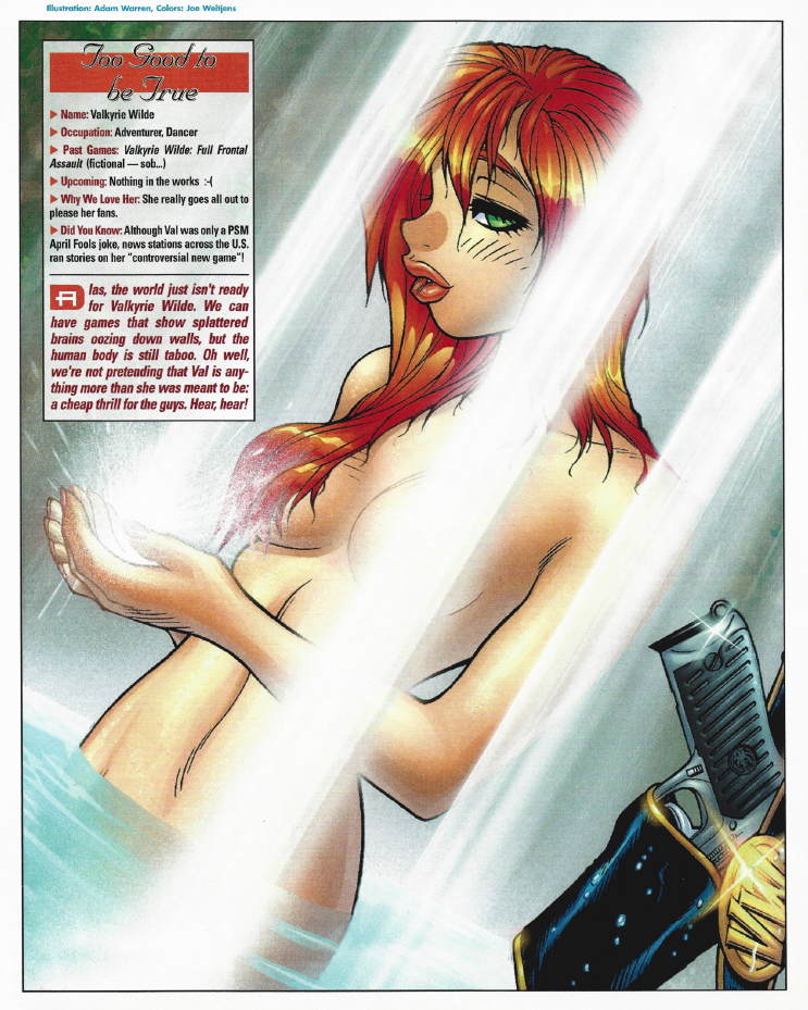
| HOTNESS: 8/10 | This is about as risqué as a magazine for teen boys could get in the year 2000. The entire image is meant to be an over the top juvenile fantasy… which actually kind of hurts it for me somewhat. It’s trying too hard to turn you on with the excessively-cutesy art style. |
| Liefeld: 10/10 | I can’t really complain about this illustration being “off”. There’s no navel, which makes it a bit less hot, but this is clearly a stylistic choice rather than a mistake. Valkyrie’s face and particularly her doe-eyes feel make it feel like they’re trying a bit too hard to arouse you… but that’s not really an issue with anatomy, so top scores it is. |
| Character selection: 3/10 | Okay, so this is where we pull back the curtain on what makes this particular entry special: Valkyrie Wilde was the subject of an April Fools joke PSM had done that same year. What was that joke, you may ask? It was a fake preview for a video game where the entire premise is that you play as… a naked woman with guns. Yeah, so this is basically just PSM’s editorial team making up their super hot fantasy OC and plastering her wherever they could. I’ll give them some credit for keeping the bit going, but man, that’s just a masturbatory uroboros. |
| Personality: 10/10 | Valkyrie Wilde is a hot naked girl with guns. This image is of a hot naked girl with guns. They encapsulated her entire personality here flawlessly. |
| Swimwear design: 0/10 | She’s not even wearing swimwear! I was promised HOT video game girls in BIKINIS! |
| Intangibles: 0/10 | I already gave her bonus points for being a callback to an April Fools joke, so I don’t think she deserves even more points for the exact same thing. |
All-in-all, that was a fairly interesting first issue! Quite the grab-bag of styles, characters, and quality, covering most of the major game series known for their sex appeal at the time. I’m very curious to see if PSM would push the envelope even harder next time around.
PSM Issue 47 (July 2001)
No spoilers on the cover this time, just Spider-man slinging webs and a promise of BIKINI GAME GIRLS inside. No more “uncensored” versions of the images that I can find from this point onwards. Alright, let’s see what they have in store for us…
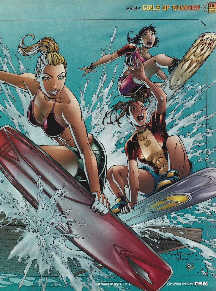
| HOTNESS: 6/10 | There’s a really understated hotness to this image that I really enjoy! The girls here aren’t posing suggestively, and their swimwear is downright modest, but their enthusiasm, general attractiveness, and appealing art style make this an image I do like to look at! |
| Liefeld: 10/10 | I don’t really have any complaints about this one. If I really want to nitpick, Elise (the blonde)’s feet don’t even look like they would be on her surfboard, but it doesn’t really hurt the image’s quality overall. |
| Character selection: 2/10 | While SSX was a pretty big extreme sports franchise at the time, were its characters particularly notable? If the article didn’t specify that these characters were named Elise, Zoe, and Kaori, it would have been a nightmare for me to try to figure that out for myself. |
| Personality: 6/10 | I’m running into the same problem I did with Ridge Racer where I have no idea if this is captures the characters’ personalities or not. I guess SSX is a snowboarding game, so that would naturally provide some overlap with surfing…? |
| Swimwear design: 6/10 | Elise’s black and pink bikini top is cute, but otherwise these outfits aren’t particularly notable… that said, they do look like practical swimwear for extreme sports enthusiasts and they are also wholly original outfits. Even thought they aren’t particularly “hot” swimsuits, I’ve really got to reward that dedication to character… and all that to represent some random characters from SSX! |
| Intangibles: 5/10 | Again, like Ridge Racer, bonus points for finding a way to incorporate SSX‘s gameplay into the image. |
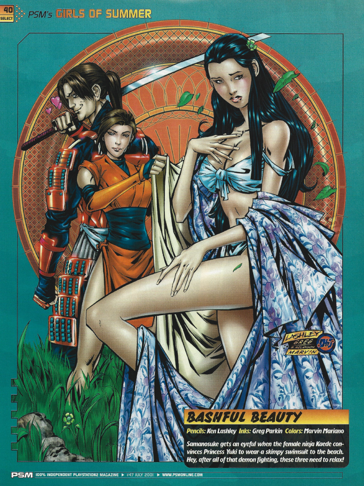
| HOTNESS: 6/10 | I think somebody at PSM has a fetish for Asian women… Even if that is the case, the large robes concealing some skin and the self-conscious expression do make this kind of hot. |
| Liefeld: 5/10 | I didn’t really see any major issues with the anatomy here… until I noticed Samanosuke’s head. Either he has a massive head, or Kaede’s head is tiny… neither option is particularly good and kind of ruins the image for me. On further inspection, Yuki’s eyeline is also kind of weird, but that’s definitely more of a nitpick than the giant fucking head in the background. |
| Character selection: 3/10 | A couple minor characters from Onimusha get a whole page in this year’s swimsuit special? Really? While Onimusha has never been a juggernaut franchise, this would have been around its peak in popularity, so I can kind of see why they would consider it. Still, what a weird selection in retrospect. |
| Personality: 3/10 | Once again, I do not know these characters very well, but based on a couple long-form analyses of Onimusha I’ve watched over the years, I don’t think that this really captures the characterization of Yuki, Kaede, or Samanosuke. Someone correct me if I’m wrong. |
| Swimwear design: 3/10 | While I do rather like the design of Yuki’s swimsuit, Kaede is literally just wearing her in-game costume. For a “sexy” swimsuit article, that’s pretty egregious, especially considering that Kaede is the more important character of the two to the narrative. |
| Intangibles: 0/10 | The image would honestly be better if it was just Yuki, the inconsistent head sizes are an own-goal that could have easily been avoided. |
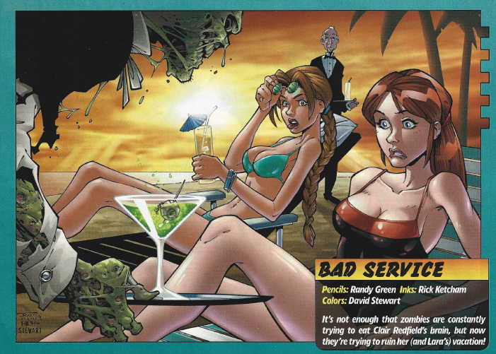
| HOTNESS: 6/10 | Oh hey, it’s a mash-up between two of the images from last year: Lara Croft and the comedic Resident Evil illustration. Once again, this one is leaning heavy on the comedy, so while Lara and Claire’s outfits are certainly nice, sexiness isn’t really the intent here. |
| Liefeld: 6/10 | Lara’s right hand is weirdly undefined, and her right leg looks REALLY long, but otherwise this isn’t too bad on the Liefield scale. |
| Character selection: 10/10 | I’ve already covered these two characters, so I’ll keep this brief: yeah, they’re both PlayStation royalty. They’ve made Claire look a bit more distinctly “Claire Redfield”, so that’s also a positive. |
| Personality: 5/10 | I had to think about this one a little bit, but does reacting with disgust at the sight of a zombie really fit Lara Croft or Claire Redfield? They’d both whip out a gun and deal with the problem I think. |
| Swimwear design: 8/10 | Lara’s in her near-perfect bikini from last year, so she gets a passing grade for just doing what already worked. Claire’s a bit more interesting, since they actually went to some effort to give her a unique design. It uses her red and black colour motif, and I like how this one-piece suit turned out on her. |
| Intangibles: 0/10 | As a call-back to last year’s images, I feel like this one’s a bit of a disappointment. Better than the previous Resident Evil one, but clearly inferior to the Tomb Raider image. |
| HOTNESS: 0/10 | Man, this picture sucks, and that’s largely down to the terrible colours that make everything look like brown shit. I don’t think that the image is unsalvageable, but it needs to be completely re-coloured. Even then… it’s not a very “hot” image, now is it? |
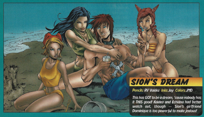
| Liefeld: 8/10 | As far as the Liefeld scale goes, this doesn’t look terrible… but there is some weird composition stuff here where Kaldea (the raven-haired one) has her knee poking out past Dominique (the blonde one)’s boob, which makes it look like she’s got a deformed elbow or a boob poking out. They should have differentiated the characters better or just cut that small detail out entirely. |
| Character selection: 0/10 | So this issue, unhelpfully, does not tell you what games the characters are from, which really presents problems when PSM are commissioning drawings of characters from games like The fucking Bouncer. This was a Squaresoft JRP-beat-’em-up that released in the early PS2 lifestyle. The game had some hype behind it, but sold extremely poorly and was not received well. Sure, I’ve got the benefit of a quarter century of hindsight, but this is a baffling selection for the annual swimsuit issue. |
| Personality: 5/10 | I haven’t played this game. Barely anybody has played this game, and many who did don’t even remember it. I had to look up some information to try to figure out if this in any way accurate. In every picture I saw of her, Echidna (the redhead) looked pissed-off, so… accurate, I guess? That said, Dominique was usually pretty happy, so… a middling score is probably right? I dunno, you’ve never played this game, so you will not be able to contradict my score. |
| Swimwear design: 3/10 | Bleh, the swimwear here is dull. Again, the colours do not help matters at all. |
| Intangibles: 0/10 | I’m kind of glad that this image is of The Bouncer, because if I got art like this for a series I actually cared about, I’d probably start awarding negative points. |
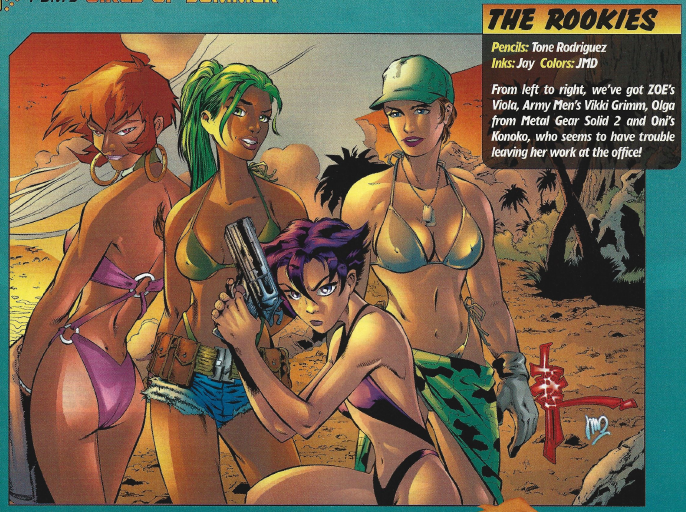
| HOTNESS: 3/10 | Good God, they really fucked up Viola’s face. She’s supposed to have a pretty standard 80s anime-style adult woman look to her, but instead they’ve given her the face of a dude. Olga also does not look a thing like her Metal Gear Solid 2 counterpart and I would never guess that was supposed to be her. This image is kind of mediocre overall, but these issues really sour the image for me. |
| Liefeld: 5/10 | Again… it’s Viola fucking this one up. Her shoulders to her neck are like a fucking stretched triangle, it just makes my issues with her face even more pronounced. If you can ignore her though, the rest of the image is pretty good. |
| Character selection: 5/10 | Some interesting selections here for the random character grab-bag. Zone of the Enders‘ Viola makes sense: the series had a lot of hype, because it was produced by Hideo Kojima at the height of Metal Gear fever. That’s also why it makes sense that Metal Gear Solid 2‘s Olga Gurlukovich is here as well. Vikki Grimm from Army Men is a bit more of an odd pick, but when you think about it more it totally makes sense for her to show up in a swimsuit issue. She only exists in the Army Men games to add a bit of sex appeal! Konoko from Oni is the most interesting selection, not least of which being that Oni was a game developed by Bungie and published by Rockstar! A pretty obscure title here, but a really interesting inclusion! |
| Personality: 4/10 | Where the fuck is Olga’s armpit hair, you cowards??? That’s legitimately a personality complaint, by the way, because… fuck me, I can’t believe I’m about to explain why Olga’s armpit hair tells us about her as a character… Anyway, it’s a weird, unexpected character detail that communicates that immediately communicates to the audience that she’s not just a sex doll like so many other female video game characters of the time. She’s a professional soldier who isn’t concerned with conventional beauty standards. Here, they’ve not-so-subtly danced around that and just made her “generic hot girl”. As for the other girls, I’m not really familiar with them, but that said: Konoko’s serious expression appears to be accurate to her character, and Vikki Grimm has always been the Army Men eye candy so I guess that one works. But yeah, again, they completely fucked up Viola. |
| Swimwear design: 4/10 | Vikki and Konoko’s swimsuits are pretty interesting, but Viola and Olga’s are much more dull… on a whole, I’d say this is a wash. |
| Intangibles: 0/10 | I cannot really convey how badly Viola and Olga fucked over this otherwise-mediocre image’s score for me. |
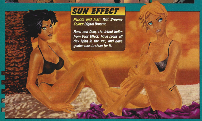
| HOTNESS: 1/10 | Oh great, the terrible colouring is back and… I mean, just look at it, this picture looks awful. Again, I’m sure this looks better as a sketch, because the piss they painted this with completely ruins the image. |
| Liefeld: 5/10 | Hana’s proportions look like they might be off, but my main complaint is that the hands just look weird… Oh God, and Hana’s bikini disappearing behind her neck just reveals that she was born on Kamino, because that neck is LONG and SKINNY. |
| Character selection: 8/10 | Fear Effect is one of those series that wasn’t super popular, but was still known for its sexiness, so Hana and Rain are actually pretty cool selections. |
| Personality: 1/10 | The characters’ expressions here tell us nothing of their personalities. They look downright bored. |
| Swimwear design: 1/10 | God, this whole image sucks. |
| Intangibles: 0/10 | All I can think while looking at this image is that it looks like a B-grade high school art submission. |
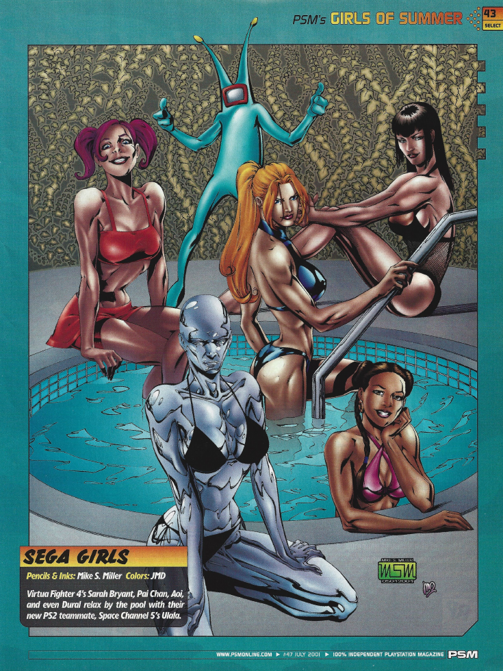
| HOTNESS: 4/10 | Once again, I’m not a fan of the colouring, but for once this is for stylistic reasons rather than looking like utter ass. I’m just not a fan of the harsh shadows and highlights, it makes the image look unpleasant (which isn’t what you want from an image aiming to look hot). |
| Liefeld: 5/10 | Man, this particular image feels like something Rob Liefeld would draw. That said, this doesn’t look too bad, except that Sarah Bryant’s spine is broken and so is… whoever the purple-haired lady is. I legitimately do not know who that’s supposed to be. I checked the Virtua Fighter character roster and couldn’t find her, so I think that it’s just the artist’s OC. |
| Character selection: 5/10 | Virtua Fighter has never really been the most popular fighter on consoles, but I think that its characters would have been just relevant enough to earn its place in this issue. |
| Personality: 6/10 | So I don’t know a whole lot about Virtua Fighter, but the differing expressions and poses do give you some insight into the girls’ different personalities, so I think that deserves some points. |
| Swimwear design: 4/10 | Pai’s pink bikini is very cute, but there’s not a whole lot we can glean from the others’. Dural’s black bikini is a tad uninteresting, and Sarah and Aoi’s are hidden enough that they don’t leave an impression on me. |
| Intangibles: 0/10 | I legitimately don’t understand why the illustrator threw in a dancing alien and what I can only assume is somebody’s OC making a cameo. |
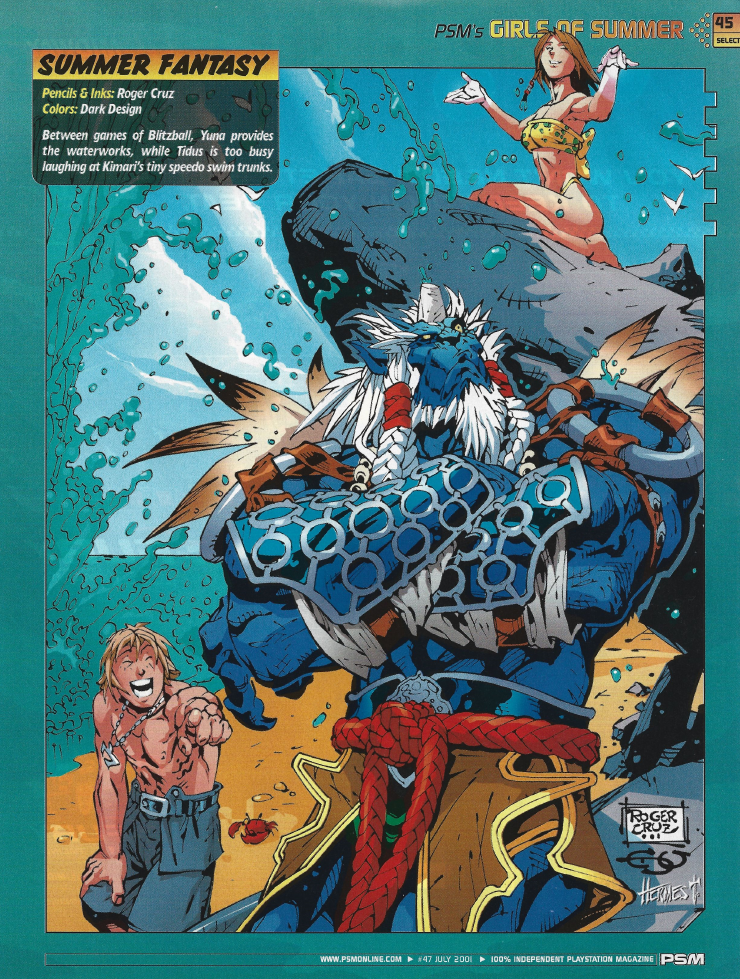
| HOTNESS: 1/10 | I’m not even sure if this is meant to be a part of the swimsuit collection or not (there’s a full-page ad for a goddamn Gundam game separating it from everything else). Suffice to say, this is a comedy image, so unless you’re into blue beast men, there’s nothing arousing about it. |
| Liefeld: 9/10 | Tidus’ arm musculature is a bit weird looking, but otherwise this is very solid artwork. |
| Character selection: 0/10 | So this one actually gets a 0/10 from me for two reasons: 1) Yuna’s 17 years old… She’s not being sexualized in this image, but it sure is sus… 2) They got a Final Fantasy X swimsuit issue commission and didn’t even include Lulu in it! Travesty! |
| Personality: 7/10 | Tidus is laughing. |
| Swimwear design: 3/10 | Oh, is there swimwear in this picture? It’s so far away that I couldn’t see it. |
| Intangibles: 7/10 | While this picture is just terrible for a series about HOT girls in BIKINIS, it is a pretty solid piece in its own right that’s full of personality, so I’ll throw it some bonus points. |
Man… this was a really underwhelming issue. Were PSM intentionally trying to tone things down after going about as hard as they could get away with in the inaugural swimsuit issue? I’m not sure, but here’s hoping that the next year’s images improve matters…
PSM Issue 61 (August 2002)
Oof, it’s always interesting when you see a gaming magazine hyping up a game that’s going to go on to be a notorious disaster (in this case, Tomb Raider: The Angel of Darkness, generally considered the nadir of the franchise). Oh and what’s this?
You’re promising A LOT here, PSM, and I doubt you can follow-through on that…
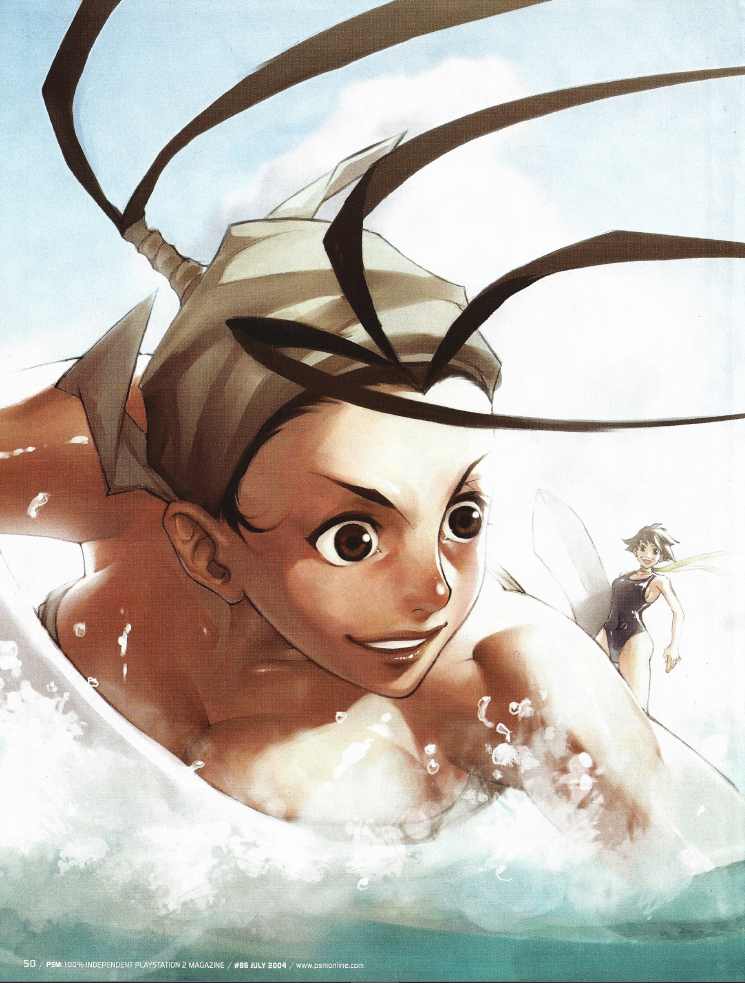
| HOTNESS: 10/10 | PSM are actually bringing their A-game out of the gate this time. I think that most of us can agree that this is pretty damn hot. |
| Liefeld: 9/10 | Lara’s head and body seem to have a slightly different skin tone, but that’s me nitpicking so much that it’s not even an anatomy issue, it’s a colouration one. |
| Character selection: 10/10 | I’ve said it before and I’ll say it again: it’s Lara Croft. You’d be asking where she was if she wasn’t in the annual swimsuit issue. |
| Personality: 7/10 | While Lara’s personality doesn’t shine through quite as much as it did in her first iteration, the location and props really go a long way to selling the idea of Lara as an adventuresome noblewoman. |
| Swimwear design: 10/10 | As much as I liked Lara’s bikini in the first swimsuit issue, I’m glad they tried something new this time around, and they absolutely knocked it out of the park. This gem-studded number just radiates the classy opulence of Lara Croft. |
| Intangibles: 10/10 | I don’t really have much else to say about this one. If you are committed to making a video game girls swimsuit issue, then this is the level of quality that you are wanting all your commissions to meet (and probably costs a lot to commission, which would be why we don’t have many of this quality). |
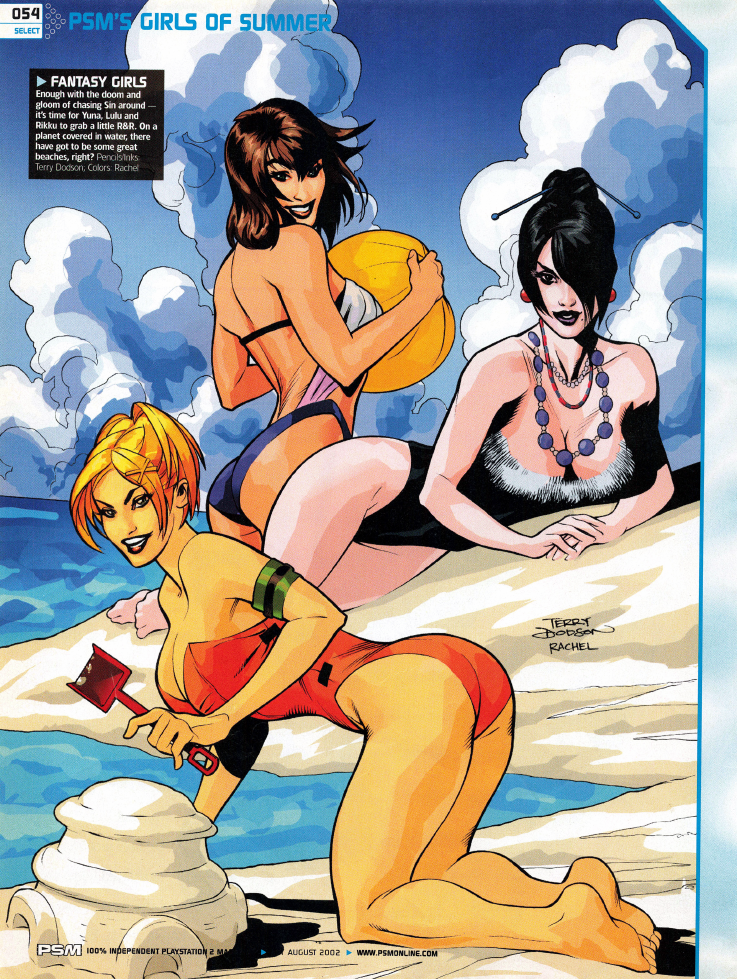
| HOTNESS: 0/10 | OH FOR FUCK SAKES! Not only is 17-year-old Yuna in this pic, but so is 15-year-old Rikku. I ain’t risking a visit from the Feds, so 0/10 HOTNESS, officer. |
| Liefeld: 5/10 | I ain’t studying these minors’ anatomy enough to identify whether there’s an issue with them so… middling score? |
| Character selection: 1/10 | Look, I’ll give one point here entirely down to them including Lulu this time, but… for fuck sakes, I can see them not realizing that Yuna is 17, but Rikku looks underage. What the fuck were they thinking? |
| Personality: 1/10 | Based on my brief glance of the image, this just looks like generic hot girl pose stuff. |
| Swimwear design: 1/10 | They’re all just wearing a more revealing version of their in-game costumes… |
| Intangibles: 10/10 | Look, I’ve got to give this image some credit because, again, they actually included Lulu this time. Crop the rest of the image out and she could carry this entry on her own – she looks that good! |
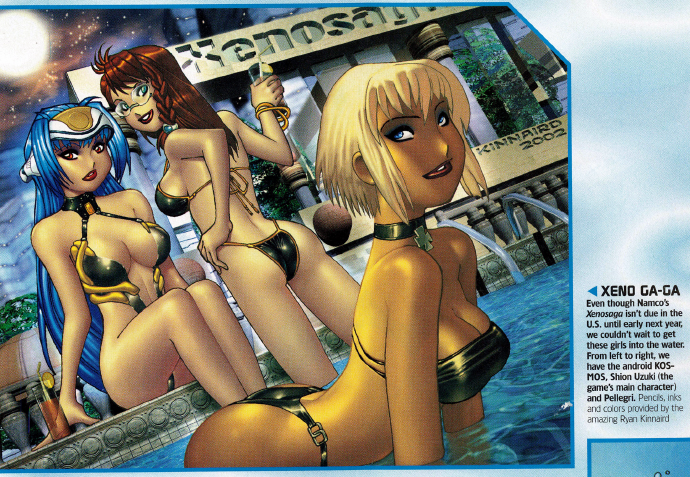
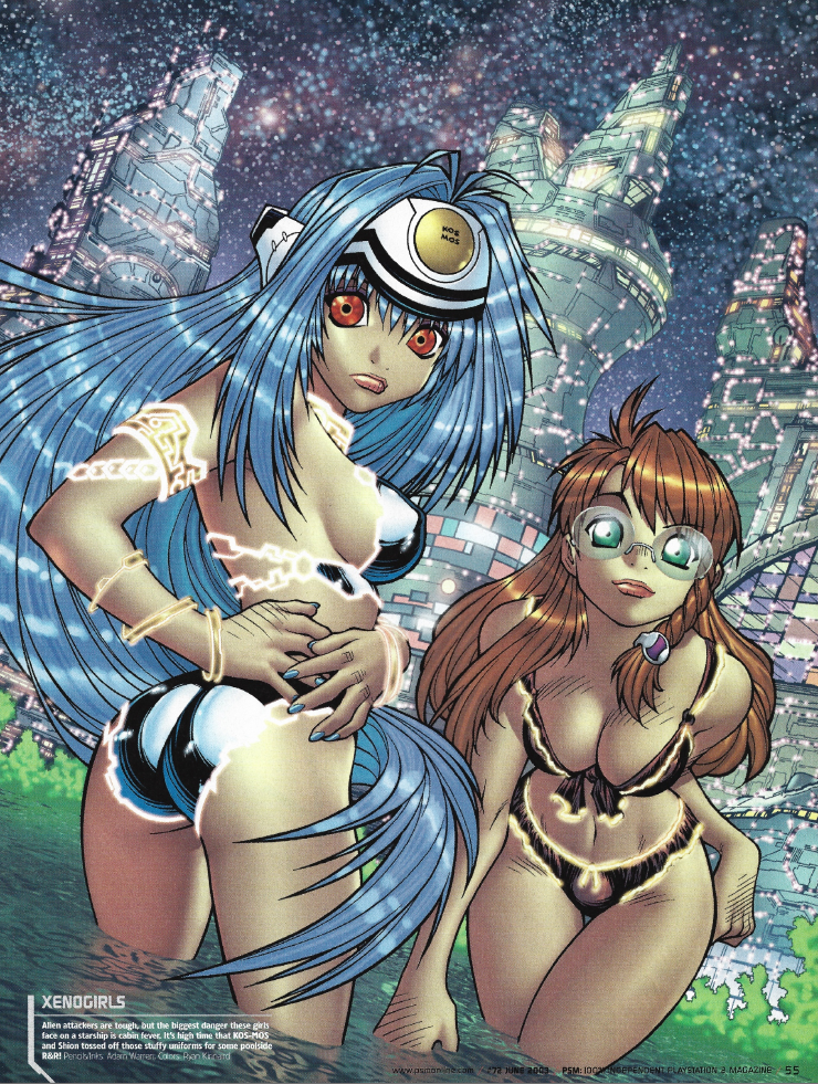
| HOTNESS: 3/10 | So the bodies and poses in this image are actually pretty hot, but fucking hell the faces are derpy, which ruins the entire image. It’s clearly a conscious, stylistic choice by illustrator Ryan Kinnaird, but I can’t stand how it looks. |
| Liefeld: 6/10 | Ignoring the faces (since they’re not a mistake), Pellegri (the blonde)’s shoulders are hunched forward in a way that looks really awkward to maintain. |
| Character selection: 2/10 | KOS-MOS, Shion, and Pellegri from Xenosaga are such a weird selection – it was a brand IP whose first game hadn’t even been localized yet, so most PSM readers would have no idea who these characters were. Between this, The Bouncer, Zone of the Enders, and Onimusha, I really get the sense that there was someone high-up at PSM obsessed with relatively obscure Japanese franchises and forcing them to appear in each year’s swimsuit commissions. |
| Personality: 4/10 | I know nothing about Xenosaga, but as far as I can tell, this just looks like generic hot girl poses. |
| Swimwear design: 6/10 | While I don’t know much about these characters, their swimwear at least lives up to the goal of looking alluring. Maybe not the smallest bikinis, but they’re a bit more revealing than what we’ve seen in the past from PSM. |
| Intangibles: 0/10 | I can’t get over those faces. |
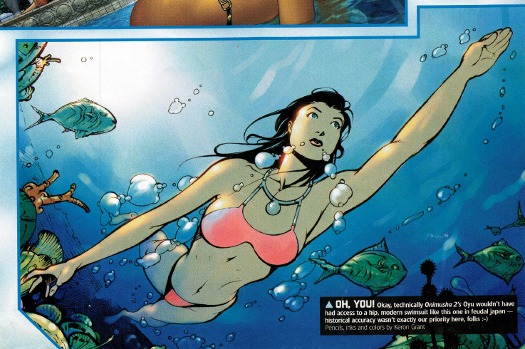
| HOTNESS: 4/10 | While this image suffers from a lack of detail, I do really like how it captures the look of an underwater photograph. That at least makes this image really enjoyable to pour over. |
| Liefeld: 10/10 | Any potential issues can be chalked up to the intentionally-skewed perspective of the “camera”. As a result, I have zero complaints to level. |
| Character selection: 3/10 | Like the previous Onimusha swimsuit commission, it seems really weird to me that they would choose a character like Oyu for an entire entry in this year’s issue. |
| Personality: 0/10 | Look… you can’t even tell this is supposed to be Oyu from Onimusha 2. She could be literally any dark-haired woman in fiction. |
| Swimwear design: 3/10 | This outfit is… fine, I guess? Not particularly interesting or something that feels fitting on this character. |
| Intangibles: 5/10 | I do think that this image deserves some extra points for the unique perspective it brings. This is a pretty mediocre image overall, but the pose and lighting really bring it to life. |
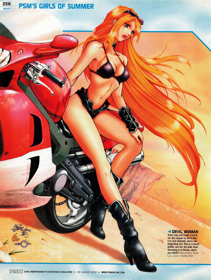
| HOTNESS: 10/10 | So many of these swimsuit commissions have been safe, conventional, submissive, hot girl fantasies. Trish doesn’t deviate too hard from that, but there are hints of a “bad girl” here: the motorcycle, the black leather, the way she looks down on you… Yeah, this one is legitimately enticing. |
| Liefeld: 10/10 | I’ve got no complaints. If anything, her anatomy is more realistic here than it is in some of her official arts. |
| Character selection: 10/10 | Trish showing up in the 2002 swimsuit issue is a no-brainer: the game was massive, and she was such an iconic sex symbol that she appears in silhouette in the game’s logo. |
| Personality: 5/10 | I actually do think that the outfit, motorcycle, pose, etc in this image do capture some of Trish’s personality. It’s too bad that they drew her in a generic anime art style though, it makes it nearly impossible to tell that it’s supposed to be her. You could tell me that this image could be literally any blonde, buxom video game girl and I’d probably believe you. |
| Swimwear design: 5/10 | I’m mixed on this one. Black is obviously Trish’s colour, but the actual swimwear doesn’t work for me. However, the accessories she’s decked out in make her outfit so much more interesting than the actual bikini. |
| Intangibles: 3/10 | I don’t really have a whole lot more to say about this particular picture: it’s really good, and I like that it’s hitting some different notes than most of the other illustrations in these articles. Most of that’s covered in the other categories though, so I can’t really justify many bonus points. |
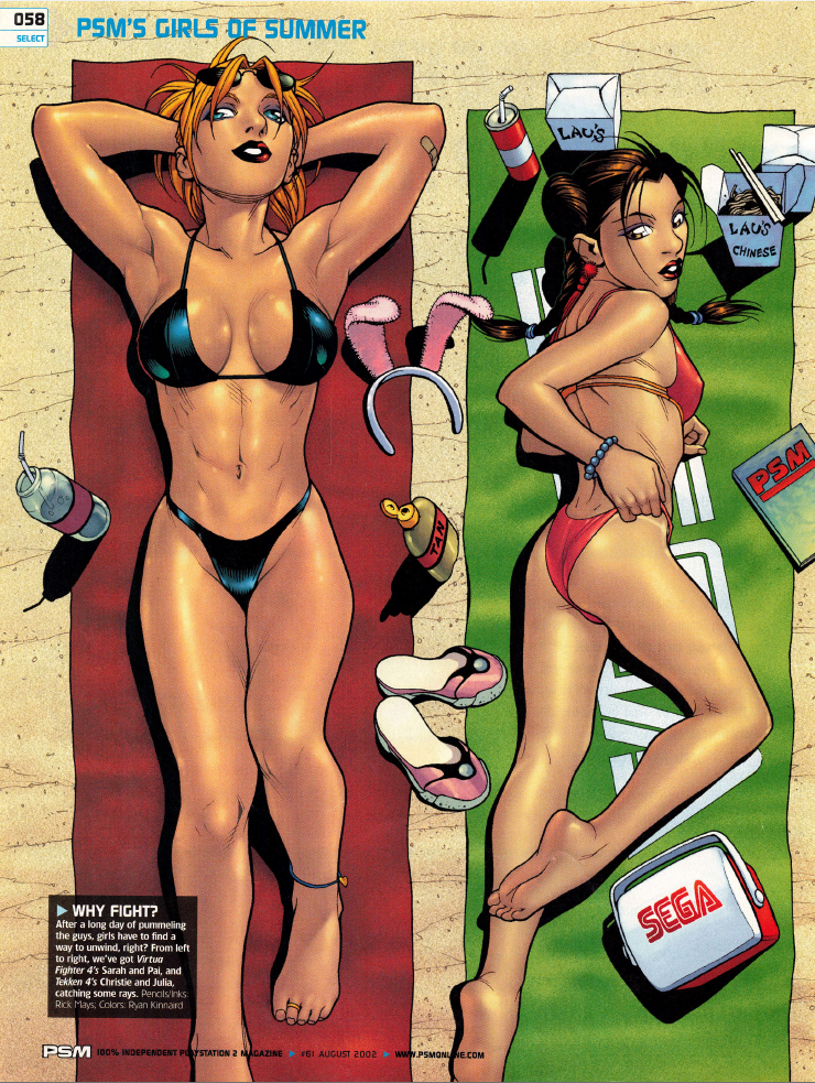
| HOTNESS: 6/10 | Oh hey, the main girls of Virtua Fighter are back, and this time they’ve brought some friends from Tekken. Sure, this is mostly just “generic hot girl” art, but having them posed on beach towels does give the image some interesting novelty. |
| Liefeld: 5/10 | Most of my complaints here relate to Pai Chan. Her pose causes her torso to look compressed, her head is twisted in a way that makes her look like she has no neck, and she has no butt whatsoever. The others are mostly fine, although their lower-halves seem to be a bit too small compared to their upper halves. |
| Character selection: 4/10 | Were the girls of Virtua Fighter ever popular enough to warrant back-to-back appearances in the PSM swimsuit issue? It’s nice to see them give some Tekken representation at least. |
| Personality: 0/10 | This is just generic hot girl art. Making matters worse, Sarah looks absolutely nothing like she’s supposed to. |
| Swimwear design: 5/10 | I quite like Christie and Julia’s unique and personalized outfits, but Sarah and Pai’s are just generic bikinis. This one’s a wash for me. |
| Intangibles: 4/10 | I’ll give some bonus points for this image being the first two-page spread, so we get more room to pour over the finer details. |
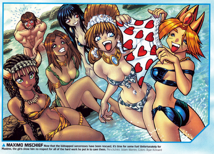
| HOTNESS: 4/10 | I know I keep saying this, but this image is just generic anime hot girl stuff, with a bit of comedy thrown in. It’s not terrible, not not particularly arousing. Apparently I’m just a snobby wanker. |
| Liefeld: 10/10 | No real concerns, my only complaints are all stylistic rather than mistakes. |
| Character selection: 0/10 | Fucking Maximo??? The game was fairly well received at the time and sold well enough to be a Greatest Hits title… but still, fucking Maximo??? I had no idea that there even were women in the damn game. |
| Personality: 0/10 | This image is so generic that it legitimately looks like they pasted the girls’ heads onto stock “sexy” bodies. |
| Swimwear design: 2/10 | I was going to give some points for Mamba Marie’s costume at least getting across that she’s a Conan-style fighter… but then I found out that she’s literally just wearing her in-game outfit (so is Sephonie, the generic brunette on the right side of the image). Sophia and Aurora Lee are both wearing more revealing versions of their in-game costumes, and I can’t even see Lenore’s outfit. All-in-all, very uninspired stuff. |
| Intangibles: 5/10 | I’ll give some bonus points for the comedy of Maximo getting his armour knocked off and his underwear stolen. |
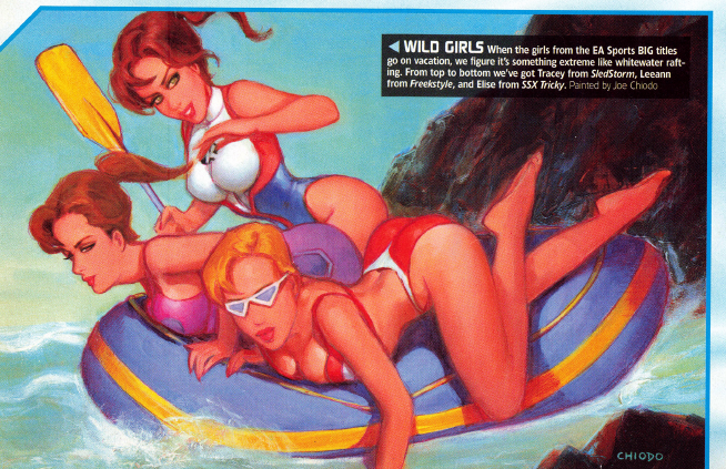
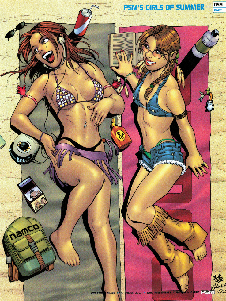
| HOTNESS: 3/10 | This is another one of those cases where the original sketch was probably pretty good, but the end result is absolutely botched by the colouring. While there are parts that I like (Tracey, the brunette at the top, looks pretty cute), everything just feels a bit too indistinct. |
| Liefeld: 2/10 | Oh my God, look at Leeann (the middle one)’s head: it’s so lopsided. Elise (the blonde) also has a couple issues. Her sexy pose makes it look like she’s gonna fall into the water at any moment, her bikini top strap goes over her left shoulder really awkwardly, and she has literally no neck. |
| Character selection: 0/10 | Man, PSM were really scraping the bottom of the barrel for this issue. I’ve at least heard of every game thus far and could understand why someone would include them in this list, but Tracey from SledStorm? Leeann from Freestyle? I’ve literally never heard of these games. Elise from SSX Tricky makes a bit more sense, but she was also in last year’s issue! Are SSX‘s characters so good as to warrant back-to-back swimsuit special appearances??? |
| Personality: 5/10 | Sports girls like doing sports, I guess? |
| Swimwear design: 6/10 | For what it’s worth, at least all the swimwear in this image are really cute! |
| Intangibles: 0/10 | Everything about this commission feels kind of half-assed. I think even PSM were just trying to fill some page space with this one. |
This issue came out swinging with Lara Croft, but every subsequent art piece (aside from Trish) was quite disappointing. I was promised the SMALLEST bikinis, but they failed to deliver! I don’t think I can ever trust again! I’m starting to think that the whole “HOT video game girls in BIKINIS” promise is just a joke to sell magazines to 13-year-old nerds…
PSM Issue 72 (June 2003)
…mother of God. I’ve been burned before, but it looks like PSM might be swinging for the fences with this swimsuit issue. I’m promised 11 pages of “our HOTTEST pictures EVER”, and if this cover is any indication, they might be able to pull that off (ahem).
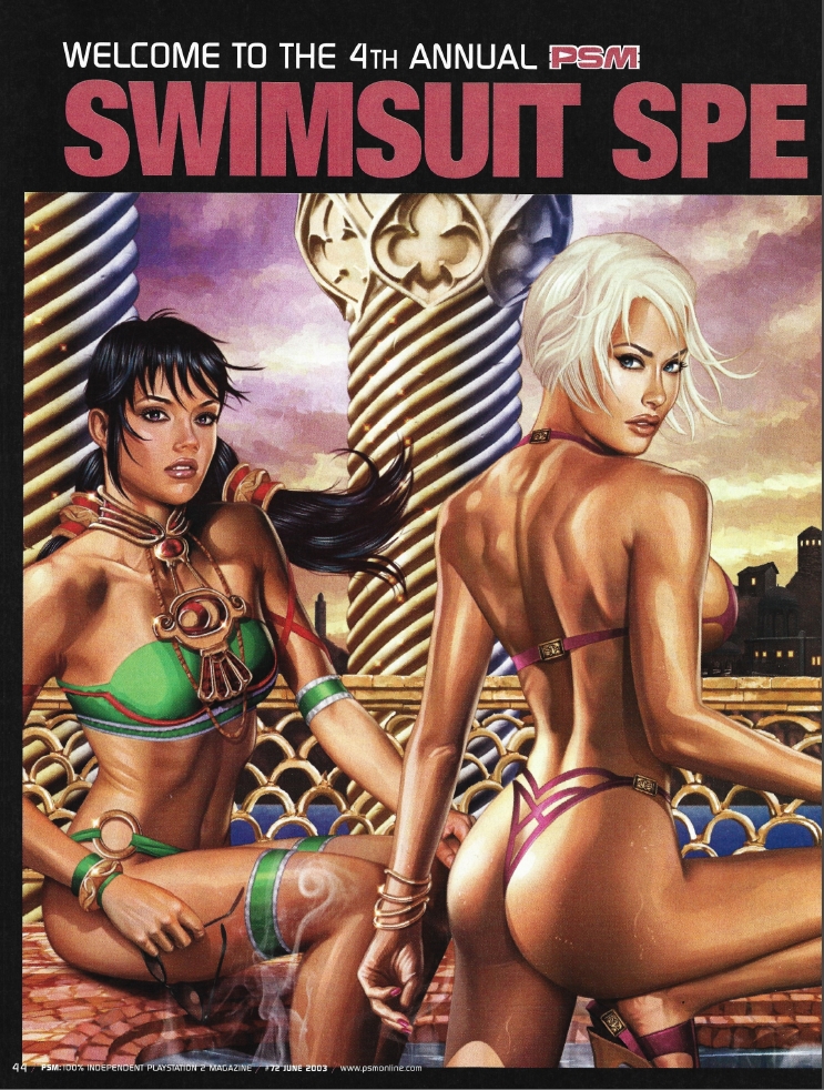
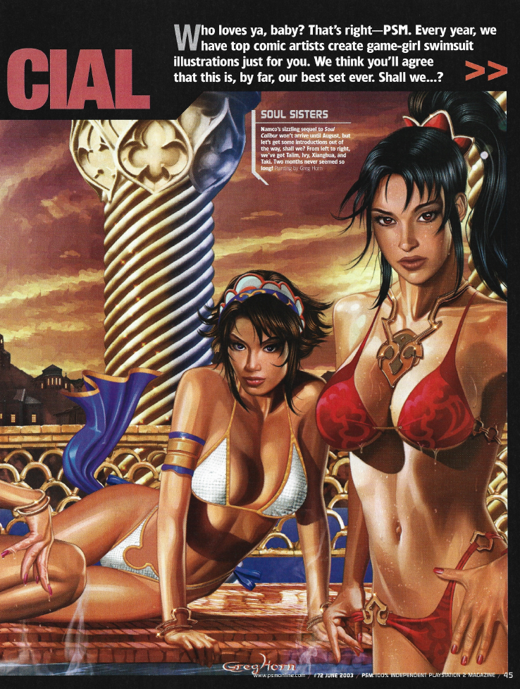
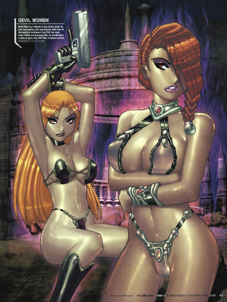
| HOTNESS: 4/10 | Holy shit. Look, Dead or Alive has the reputation for being the titty fighter, but I’ve always considered Soulcalibur to be low-key the fighting game with the most egregious fan service (at least amongst the mainstream publishers). That’s right on display here (just like Ivy’s ass). Yeah, this is exactly the sort of piece that you’d want to see out of a video game girls swimsuit issue. That said, Talim (the girl on the left) is also in this image and she’s only 15… Her inclusion here is very questionable… but she’s also presented the most tastefully? I dunno, you can draw a picture of a 15 year old in a swimsuit as long as you’re not fucking them with the camera, but this is so sus that I’m halving the points that I would have given otherwise. |
| Liefeld: 8/10 | About my only complaint here is that the faces look like they were done separately from the bodies, and Ivy’s left shoulder looks a little off. Let’s be honest though, you’re staring at Ivy and Taki’s assets, there’s no way you’re even noticing that. Oh and Ivy’s bikini appears to be lopsided too for no discernable reason. |
| Character selection: 7/10 | See my previous comment about Soulcalibur‘s fan service. Soulcalibur II was a 100% guaranteed inclusion in this year’s swimsuit special (and, for what it’s worth, Ivy and Taki’s outfits are actually less egregious than the stuff they wear in official art). Again though… gotta shave some points off for including Talim at all, because seriously: what the fuck, PSM? Seong Mi-na and Sophitia were right fucking there waiting to be used! |
| Personality: 2/10 | Soulcalibur goes a long way to fleshing out its story and characters, to the point where they all have fairly distinctive personalities and goals… none of that comes across here, this is just a boyhood sexy harem fantasy. I guess I’ll give a couple points for Ivy being mostly-naked like she is in-game? |
| Swimwear design: 6/10 | They’ve got each girls’ signature colours down pat, so that’s a plus. Talim’s swimwear is basically just a more revealing version of her in-game outfit, but the other three are more distinctive. Ivy’s in particular takes inspiration from her Soulcalibur II outfit without outright repeating it, so that earns some points for sure. There’s a spread on these ones, but I think that they’re pretty good overall. |
| Intangibles: 6/10 | Crop out Talim and this is easily one of the best entries in the history of PSM’s swimsuit specials. A great crossroads of iconic characters and appropriately alluring, high-quality art, all set to a unique and exotic backdrop! |
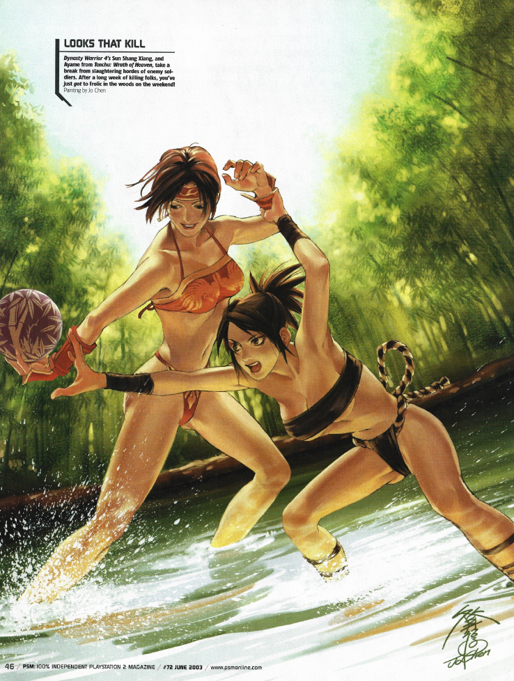
| HOTNESS: 5/10 | While this isn’t the most exciting image in the world, it sure is HOT video game girls in BIKINIS… so I guess that’s the bare minimum we can expect? |
| Liefeld: 5/10 | Sun Shang Xiang (the one in orange) has a humpback it seems. Ayame, on the other hand, has something weird going on where her leg connects to her ass cheek… did they think that a realistic thigh would make her look too fat or some bullshit? |
| Character selection: 4/10 | If you had to pick a Dynasty Warriors girl for a video game swimsuit issue in 2003, then Sun Shang Xiang is the obvious choice… but the fact that she’s here at all is still an odd choice. This would have been the height of Dynasty Warriors‘ popularity, but even then the series wasn’t really known for its sexy ladies. Ditto with Ayame, Tenchu: Wrath of Heaven had a mixed reception and was a pretty niche title. |
| Personality: 10/10 | I haven’t played Tenchu, so I don’t know exactly what Ayame’s personality is like, but this image really gets across a fearsome and competitive personality, which the Tenchu Wiki describes for her. Sun Shang Xiang, on the other side, has always been more of a playful and cheerful character, so I’d say that the image captures their contrasting personalities well! |
| Swimwear design: 5/10 | While these two swimsuits do match the characters’ signature colours, their designs are just not that interesting to me. Definitely a your-mileage-may-vary situation though. |
| Intangibles: 1/10 | This might just be the most “average” image in the entire series. |
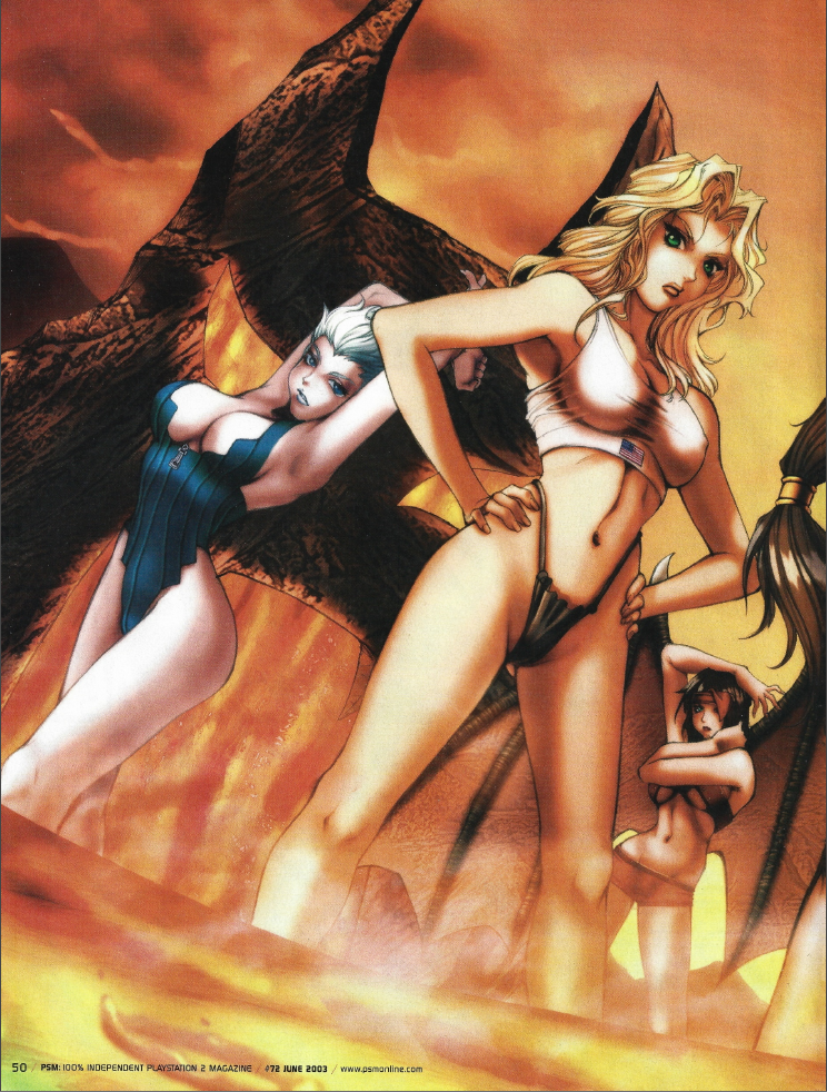
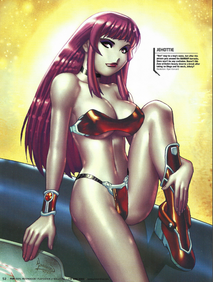
| HOTNESS: 4/10 | Oh for fuck sakes, more art by Ryan Kinnaird… I’m sorry, I just do not find this art style appealing, especially with the way that he does their faces. In spite of that, Trish is still kind of hot through sheer force of sex appeal. |
| Liefeld: 10/10 | I don’t notice any egregious anatomy issues, but I also don’t want to look at this goddamn picture any more than I have to. |
| Character selection: 6/10 | So Trish was a no-brainer for the 2002 issue, but I’m kind of surprised to see her return in 2003 as well. I guess there was just a lot of lingering hype for Devil May Cry 2 at the time? If that’s the case, then Lucia also makes sense here. |
| Personality: 4/10 | I… guess…? It resembles their personalities, but I can barely even tell that these characters are supposed to be Trish and Lucia at all. |
| Swimwear design: 4/10 | Kinky, b-movie alien bikinis wasn’t something I was expecting to see in this article, but here we are. Two of the more overtly revealing bikinis in this entire series, but wasted on an image I don’t even want to look at. |
| Intangibles: 0/10 | I’m sorry Ryan, you’re probably a chill dude, but I just do not like your art. |
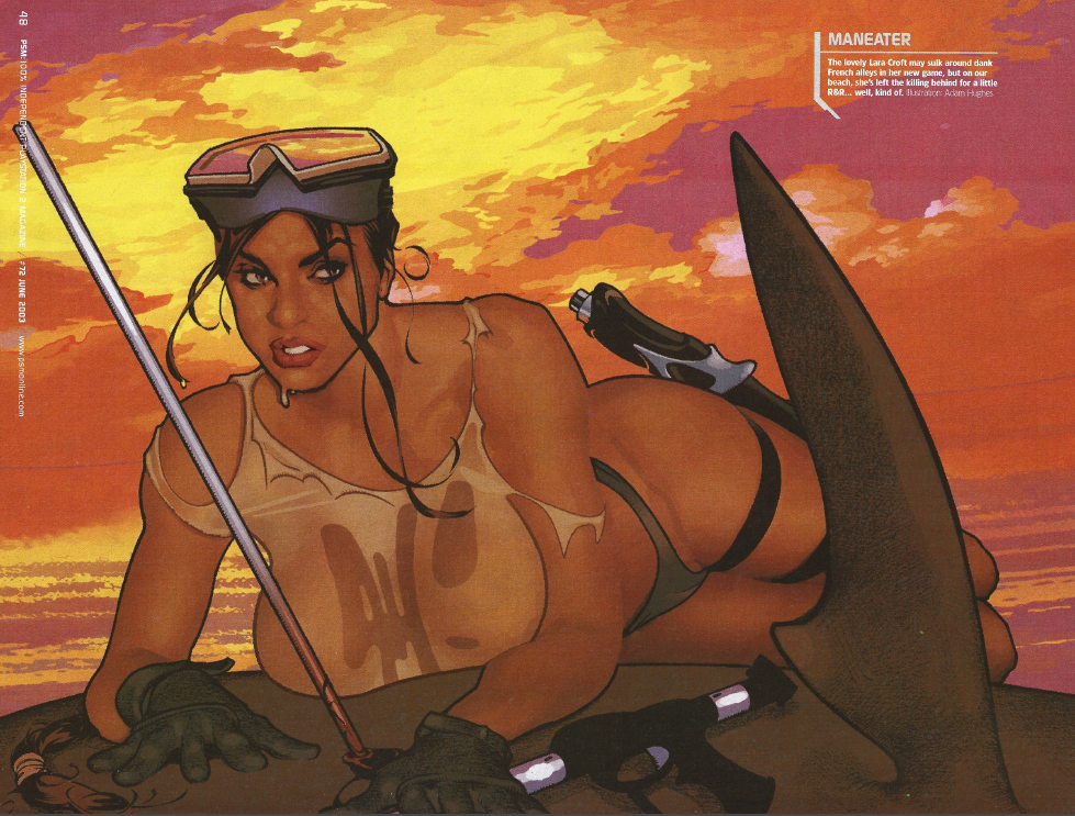
| HOTNESS: 5/10 | Lara’s back once again and, despite appearing here in a wet t-shirt, this image feels underwhelming. This time, it’s because they made the stylistic choice to not outline her arms, so they seem to disappear into her body. It makes her look like a fleshy blob abomination until you take a closer look. A few more black lines, and this would be significantly better. |
| Liefeld: 6/10 | …wait a minute, is that supposed to be fucking camel toe!??!!!? |
| Character selection: 10/10 | Lara Croft was still a video game goddess in 2003, it would be weird if she didn’t appear for the third consecutive year. |
| Personality: 10/10 | Yeah, that sure looks like Lara Croft. Even having her slaughtering wildlife is totally in-character, even if it’s a baffling thing to include in a swimsuit issue. |
| Swimwear design: 7/10 | This looks like an outfit you might expect to see Lara Croft wear in-game during the Core Design era. The wet t-shirt is a nice touch too. |
| Intangibles: 0/10 | This is a weird one, but definitely feels worse due to being a poor showing from the Queen. |
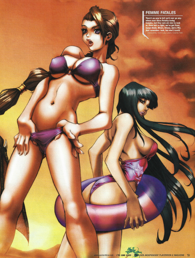
| HOTNESS: 4/10 | This image is trying so fucking hard to be sexy and provocative. Unfortunately, reeking of desperation makes this image so much less appealing. |
| Liefeld: 3/10 | Zoom in on Kitana (the brunette on the right)’s right boob. What the actual fuck is going on with it!? Her face appears to be lop-sided as well. Also, take a look at Frost (the blue-haired on the left)’s left leg: it’s fucking gigantic. |
| Character selection: 2/10 | Look, let’s be honest with ourselves here: for all its popularity, Mortal Kombat isn’t really known for its sexy girls (and this is in spite of them having some ridiculously revealing outfits. Sonya Blade and Kitana would have been the franchise’s most notable sex symbols in 2003, but they are well below other female fighters in terms of popularity and attractiveness. Add on top of that that Mortal Kombat was at its nadier after Mythologies: Sub Zero, MK4, Special Forces, and Advance and it seems really weird that they’d get a two-page spread after all that. Granted, Mortal Kombat has enough general popularity that it makes sense that they’d get some representation, but still, there are far more deserving games in 2003 that could have gotten a look in. |
| Personality: 0/10 | This is generic sexy girl poses and nothing else. If you made me guess which franchise these characters were from, I would not in a million years have guessed Mortal Kombat. This looks like a magical girl manga, not Mortal Kombat. |
| Swimwear design: 5/10 | While I appreciate that there was clearly thought put into each of these outfits, none of them are particularly interesting at the end of the day. |
| Intangibles: 0/10 | For a two-page spread, this one’s pretty underwhelming. |
| HOTNESS: 2/10 | Oh my fucking God, AGAIN Ryan!?! Let me re-iterate: I am looking at these images one at a time. I didn’t know that I was going to be seeing so much Ryan Kinnaird art when I started writing this. Was the guy just cheaper to commission? Was he easy for PSM to work with? Why does he show up this often? |
| Liefeld: 10/10 | I hate the faces, obviously, but at least I don’t see any notable issues with her anatomy. |
| Character selection: 5/10 | After the first game bombed, Zone of the Enders was already a damn-near forgotten franchise at this point. Still, there was some lingering cult popularity back in 2003, so it’s not a terrible choice. Maybe PSM were trying to drum up some interest in the franchise? |
| Personality: 5/10 | I know nothing about Ken so… a 5/10? |
| Swimwear design: 7/10 | While the other two schlock sci-fi bikinis Ryan did this same issue were a bit too silly for my tastes, I actually like how he’s gone about designing Ken’s bikini. The red chrome evokes imagery of expensive sports cars, which actually makes the image more alluring. Too bad it’s wasted on a Ryan Kinnaird art, but it certainly bumps the score up at least. |
| Intangibles: 0/10 | This image is improved ten-fold if you just crop it off at Ken’s chin. |
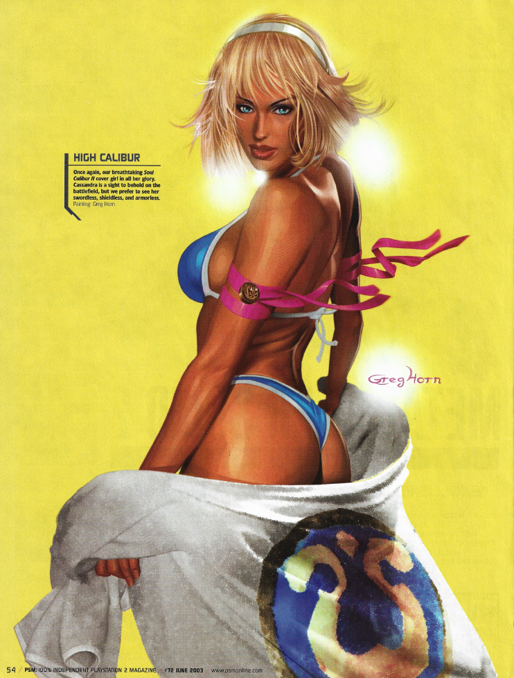
| HOTNESS: 10/10 | I don’t know if I’ve mentioned this before, but my fighting game of choice before Dead or Alive was Soulcalibur. While Sophitia has always been my favourite, her sister, Cassandra, is exceptionally attractive too. For an art piece of HOT video game girls in BIKINIS, this is a fucking masterpiece. |
| Liefeld: 7/10 | My only complaint is that Cassandra’s spine looks like it’s detached from her neck, but you have to be actively looking at something other than her ass to notice that. |
| Character selection: 10/10 | While not the most obvious choice in the world, Cassandra is one of those characters where you see them in a swimsuit issue and go “man, what a great inclusion!” Giving her an entire page to herself is also fantastic, too many of these commissions end up feeling crowded. |
| Personality: 7/10 | Cassandra is a committed, fierce, courageous, and confident character, which I feel is communicated here with this pose and expression. Then again, this could also be seen as “generic sexy pose” and it’s a happy accident that they’ve executed that in a way that seems like something you could see Cassandra doing. I think it’s worth points regardless. |
| Swimwear design: 10/10 | It’s perfect, I don’t know what else to say. |
| Intangibles: 10/10 | This is a great piece, full-stop, and deserves every point I throw at it. |
| HOTNESS: 5/10 | Okay, is PSM just trolling me at this point? Not only is this another piece featuring Ryan Kinnaird, but it’s of the exact same Xenosaga girls we got last year? |
| Liefeld: 9/10 | There’s a little weirdness going on here, but nothing particularly noteworthy. |
| Character selection: 0/10 | No. Having Xenosaga in 2002 was already a questionable selection, but having them be in back-to-back swimsuit issues when Dead or Alive was one-and-done despite being at the height of its popularity is just fucking bullshit. Another Ridge Racer image would have made more sense than this. |
| Personality: 5/10 | I have no idea, so 5/10. |
| Swimwear design: 4/10 | More sci-fi bikinis… ehh, having them be held together with arcing energy just seems silly. |
| Intangibles: 0/10 | Credit where it’s due, at least I can stand looking at this Xenosaga image. And Shion’s pose is pretty cute. |
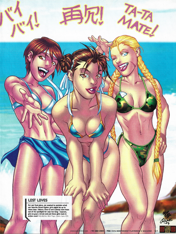
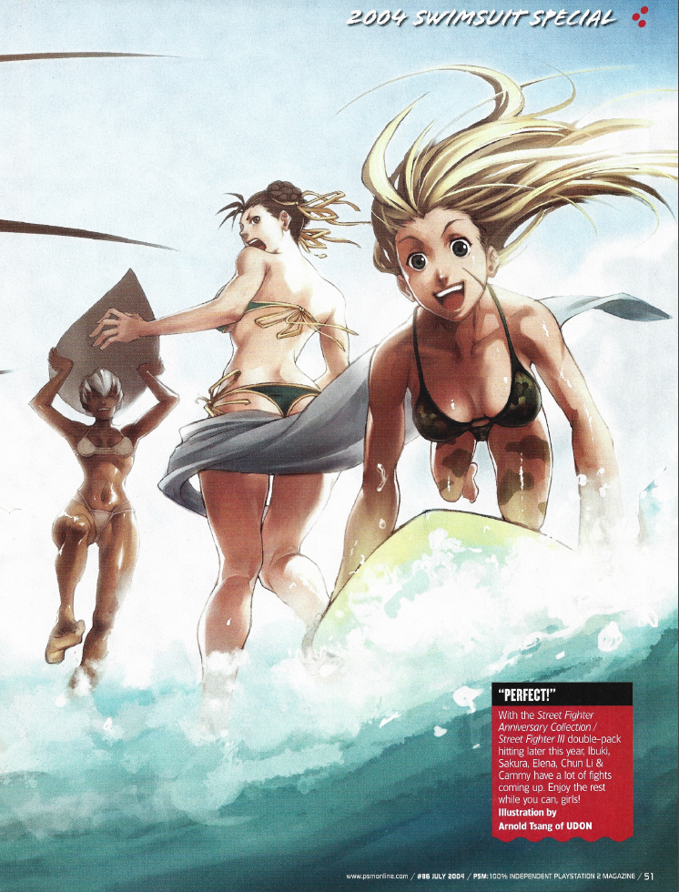
| HOTNESS: 5/10 | Oh hey, at least we can see the Street Fighter girls this time… too bad it’s on a pretty mediocre image. |
| Liefeld: 10/10 | I’m not noticing any obvious anatomical issues. |
| Character selection: 9/10 | I’ll be honest, I have never even heard of Sakura. However, that’s kind of irrelevant, because Street Fighter‘s Chun Li and Cammy are video game goddesses who could show up in every PSM swimsuit issue like Lara Croft and no one would question it. |
| Personality: 0/10 | This is just generic sexy girl poses. |
| Swimwear design: 4/10 | While the swimsuits do seem like something each character would wear, they’re not particularly interesting. |
| Intangibles: 0/10 | The fact that I barely prefer this to the previous Street Fighter image (where you couldn’t even see the girls) is a damning praise. |
Okay, yeah, that issue was definitely a big step up from the last couple years, even with the Ryan Kinnaird overload. Let’s see if PSM can keep the quality up in the final two swimsuit specials…
PSM Issue 86 (July 2004)
Oh… PSM were really playing down this year’s swimsuit special, eh? A small, undescriptive headline, and muted promises of “fun in the sun” rather than “HOT video game women in BIKINIS!” Were PSM’s editors starting to grow embarrassed with the tradition, or are they just trying to set expectations to a more reasonable level? Let’s find out…
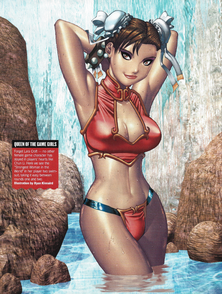
| HOTNESS: 7/10 | Honestly, after all the trolling Ryan Kinnaird has done to me thus far, I was not expecting to see him put out a piece that’s actually pretty good. Amazing what you can do when you actually put some effort into the face! |
| Liefeld: 7/10 | Chun Li’s left eyebrow is very skewed and lop-sided. She’s also got no belly-button, but that’s clearly a stylistic choice. Nothing too severe I’d say. |
| Character selection: 10/10 | It’s Chun Li, we’ve gone over this: girl’s up there with Lara Croft amongst video game girl royalty. |
| Personality: 0/10 | This is just generic sexy girl posing. |
| Swimwear design: 7/10 | This is actually a pretty interesting one for me. I love the design of the swimsuit: it really fits the visual language you’d expect from Chun Li. However, she usually is associated with blue, not red, but I like how this has turned out regardless. Pretty damn solid, I’d say. (Note: there actually is a blue version of this image that I’ve seen floating around, but I like that they chose to go with red; it’s definitely the bolder choice!) |
| Intangibles: 6/10 | I think Ryan deserves some “BRAVO!” bonus points after all the shit I’ve given him up to this point. |
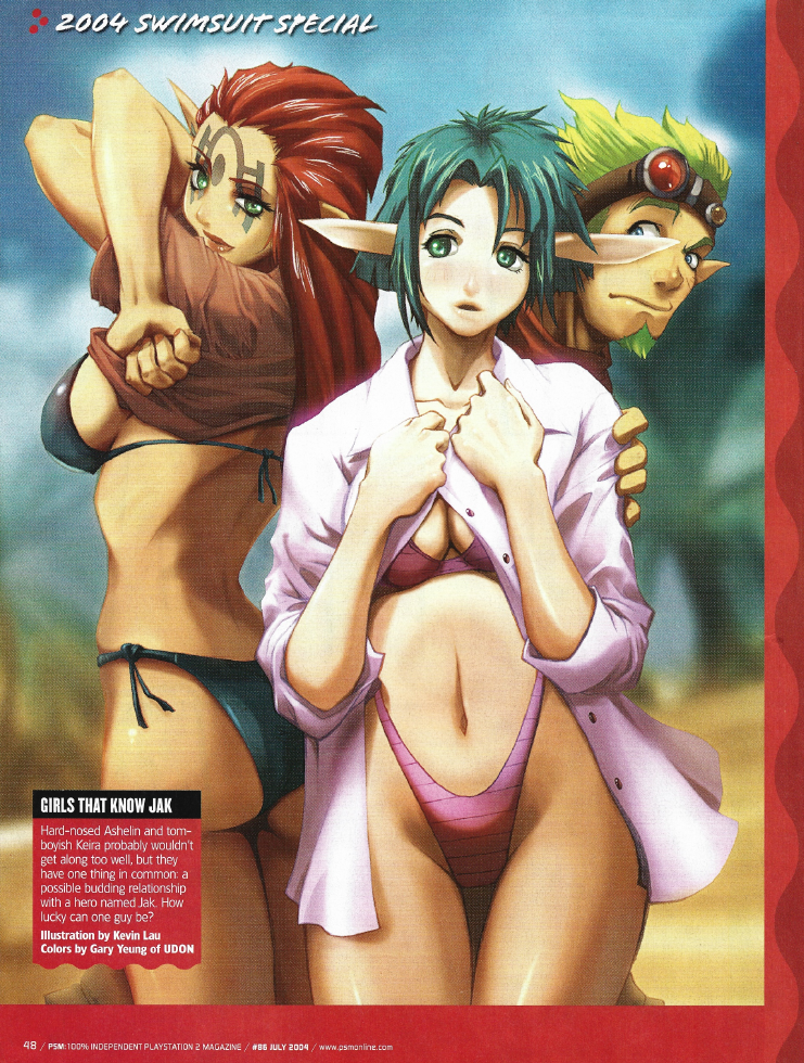
| HOTNESS: 6/10 | I’ve never played a Jak & Daxter game, so I’m not really familiar with these characters. That said, this is image is suggestive in all the right ways, which makes it hotter than the images that are trying way too hard to be appealing. |
| Liefeld: 5/10 | Ashelin’s face is shaped like a goddamn comma. Keira’s better, but good God that thigh gap. Her hips are wider than her shoulders too! |
| Character selection: 6/10 | I mean… sure, I guess? Jak & Daxter was one of the biggest PS2-exclusive franchises in 2004, so I guess it makes sense that some characters from it would show up here? That said, it also was never really known for sex appeal, so still kind of weird at the end of the day. |
| Personality: 5/10 | I know nothing about these characters… so 5/10. |
| Swimwear design: 6/10 | Keira’s swimsuit is pretty cute, and the button-up shirt she’s wearing makes it even cuter. |
| Intangibles: 0/10 | I famously hate elves (don’t tell me they’re humans, Jak Wiki, they’re fucking elves). |
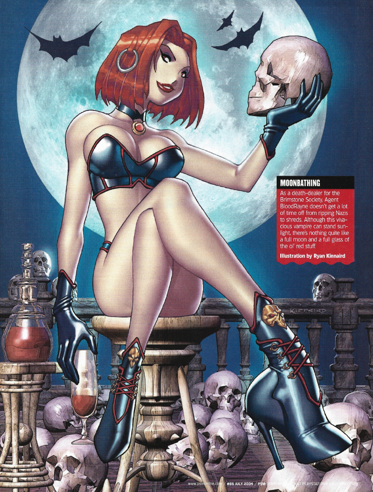
| HOTNESS: 4/10 | Oh Ryan, just when I was starting to warm up to you, you reminded me why I disliked your art style in the first place. This is actually extra insulting to me, because Bloodrayne is a franchise all about sex appeal, so it feels like it’s getting squandered with this image. |
| Liefeld: 5/10 | Oh my fucking God, what is wrong with her right foot??? I’m trying to imagine the contortion she would have to subject herself to to wear that boot. |
| Character selection: 9/10 | Majesco were on a hard marketing push in 2004 to make Bloodrayne 2 a success. The first game was a disaster, but Rayne’s eye-catching design had won her some fans, so having her appear here in the 2004 swimsuit issue is a very obvious decision. |
| Personality: 8/10 | Rayne is not a very complicated character: she’s an sexy vampire killer for edgy boys, and I’d say that this image gets that across quite well. |
| Swimwear design: 5/10 | This is just Rayne’s in-game outfit, but more revealing. That said… still a pretty hot outfit, not gonna lie. |
| Intangibles: 0/10 | Fun fact, only three months later, Rayne would bare her boobs in the pages of Playboy, rendering this mediocre art of a HOT video game girl in a BIKINI completely redundant for titillation. |
| HOTNESS: 5/10 | This sure is an image of HOT video game girls in BIKINIS frolicking at the beach. |
| Liefeld: 10/10 | I’m not seeing any obvious issues with the anatomy this time. |
| Character selection: 5/10 | Okay, so Chun Li and Cammy are video game royalty, but are the girls of Street Fighter so iconic that they deserved four whole pages to themselves in the 2004 PSM swimsuit issue…? Sure, Soulcalibur had three pages last year, but those were all of different girls, and the release of Soulcalibur II was arguably the peak of the franchise’s popularity. Meanwhile, this image has Chun Li again… I think even Lara Croft would be pushing it to appear twice in one swimsuit issue. |
| Personality: 3/10 | I actually thought that this was a Final Fantasy image at first glance… I guess Chun Li and Ibuki are identifiable, but Cammy is unrecognizable for such an iconic character. |
| Swimwear design: 3/10 | Ehh, that is some pretty generic swimwear. |
| Intangibles: 0/10 | Another one of those “perfectly acceptable” swimsuit issue commissions, but nothing more than that. |
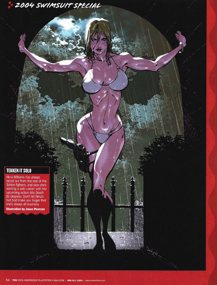
| HOTNESS: 1/10 | Holy fucking shit, do I really need to explain why I hate this one? This Slenderman-esque take on Nina Williams is exaggerated to the point of looking idiotic. |
| Liefeld: 0/10 | This legitimately looks like what you’d expect to see from a 13 year old boy’s create-a-character wank-material: maxed out the boob and hip sliders and as little clothing as possible. |
| Character selection: 8/10 | If you are going to put a Tekken girl in your swimsuit special, then Nina is the obvious choice. It especially makes sense here since her solo spin-off game, the notorious Death By Degrees, was due out the next year. As a result, there would have actually been some hype around her in particular in 2004. |
| Personality: 8/10 | While there’s basically nothing to identify that this is THE Nina Williams, the image at least gets across her cold and ruthless personality. |
| Swimwear design: 2/10 | That’s about the most generic bikini I’ve ever seen. |
| Intangibles: 0/10 | This is easily one of my least favourite commissions in this entire series. |
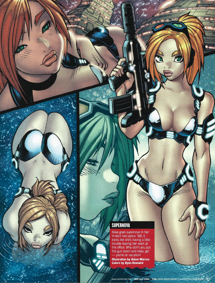
| HOTNESS: 3/10 | Oh hey, it’s another Adam Warren/Ryan Kinnaird collaboration (we’ve even got another sci-fi bikini!). GOD they are trying so hard to make Nova look sexy, to the image’s detriment. |
| Liefeld: 7/10 | My main complaint here is Nova’s arm placement in the top-left picture. Try posing the way that Nova is posed there. Her left arm must be scrunched really awkwardly (maybe even painfully) behind her to make that kind of pose. |
| Character selection: 6/10 | There’s an interesting story behind this one. The magazine does not tell you who the hell Nova is or what game she comes from, so I was wracking my brain trying to figure it out. After doing some digging, I eventually realized that this is the main character from StarCraft: Ghost, the notorious StarCraft console shooter spin-off that went into prolonged development hell before finally being cancelled. So, on the one hand, I can see why she’d be included here, since hype would have been through the roof for this game. On the other hand, it’s a pretty poor choice in retrospect. |
| Personality: 0/10 | Something tells me that Nova was not going to spend StarCraft: Ghost making “fuck me now” faces. |
| Swimwear design: 2/10 | I don’t get this obsession with sci-fi bikinis, much less one that’s “tacti-cool”. |
| Intangibles: 1/10 | They were trying so hard to make Nova look attractive, so the fact that she ghosted us all makes this funny in retrospect. |
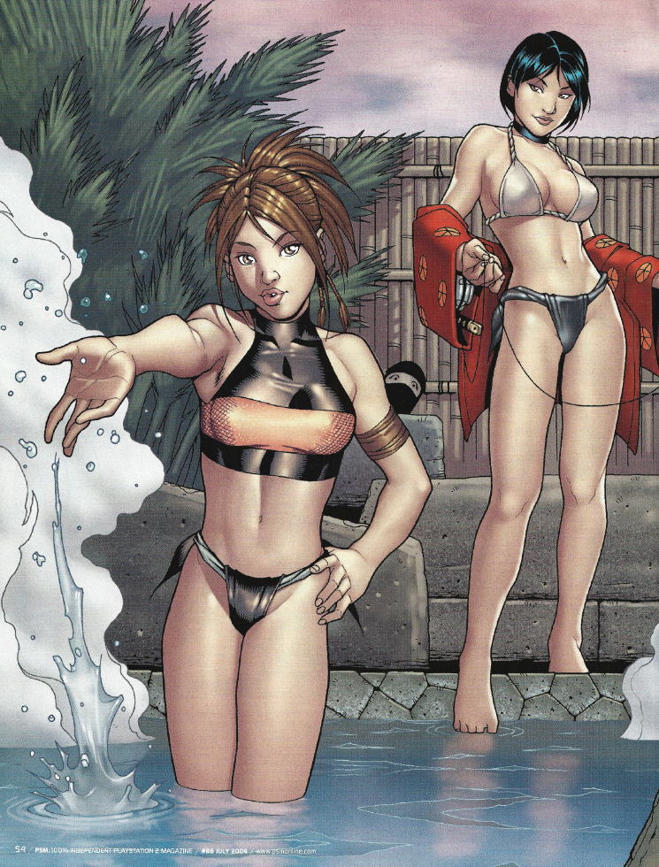
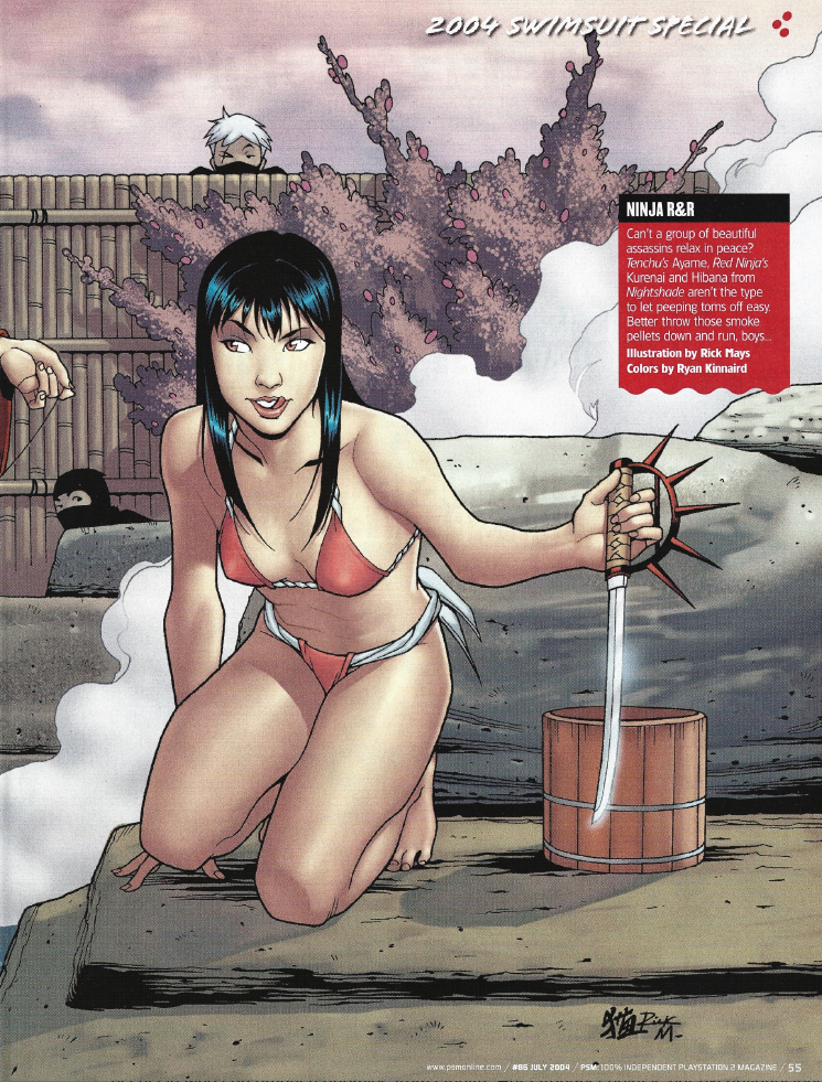
| HOTNESS: 5/10 | I said it before and I’ll say it again: someone at PSM clearly had a thing for Asian women. As far as these HOT images of video game girls in BIKINIS go, this is fairly middle of the road. |
| Liefeld: 6/10 | What the hell is going on with Ayame’s left arm and shoulder!? |
| Character selection: 3/10 | Ayame from Tenchu was in last year’s special, and the series was already on its decline in popularity by 2004, so this is a very questionable choice (that I can only quantify with my previous thoughts about an editor forcing their favourites into every issue). As for Kurenai from Red Ninja and Hibana from Nightshade, I’ve never even heard of these games. A Red Ninja selection actually makes some sense to appear here though: the entire gimmick of that game was that you played a kunoichi who could get a “seduction kill” on enemies. This was done by flirting with them suggestively to lure them in for an instant execution. That’s fucking bonkers; too bad the game was a janky mess by most accounts. |
| Personality: 3/10 | I’m not gleaning much personality from this picture, it just looks like generic sexy poses. |
| Swimwear design: 3/10 | So the swimwear here is pretty uninteresting to me, with one exception: why the hell does every girl have a rope-tied bikini bottom…? Is that just a stereotypical kunoichi thing? Is it some typical Asian-women fetish thing? They had the exact same type of bikini bottom of Ayame last year, so it clearly means something. Seriously, someone explain this to me, because it’s starting to concern me! |
| Intangibles: 5/10 | I’ll give some bonus points for having this be set in a sauna, it gives the image some thematic flair. The peeking ninjas are also kind of funny. |
Wait… that’s it? Yeah, there are only seven images in this year’s swimsuit issue (the previous three issues had nine, eight, eight, and nine, respectively). Granted, this is because there are more two-page spreads and all the others are full-page images, but still… this was a really underwhelming issue. When a Ryan Kinnaird commission is your highlight for the year, you know that the bar for quality got lowered. The character choices were pretty poor (Lara didn’t even show up this year!), there were no show-stopper images… was PSM’s heart not in it anymore? Or was their budget getting stretched thin…?
I’ve got a bad feeling about the final issue of the swimsuit special…
PSM Issue 101 (September 2005)
How the times change in only a few years. This was by far the hardest swimsuit issue to find, because not only was it released after the summer was over, but they don’t even advertise it on the cover. It seems pretty clear by this point that somebody in charge was either ashamed of the whole affair, or they were doing it entirely out of obligation by 2005. They claim in the editor’s blurb that “this is our best ever” swimsuit issue. I’m sitting here writing this having not seen any of these images yet: I don’t believe them. I’m fully expecting to end this series on a dull note. Let’s see if my instincts are on-point…
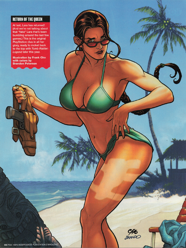
| HOTNESS: 8/10 | As we have come to expect, the near-anual Lara Croft image is pretty damn hot (the gun holster tan-line is pretty damn funny too)! |
| Liefeld: 7/10 | Lara’s body is borderline contorted and her right boob is notably larger than her left one, but those are pretty nit-picky complaints. |
| Character selection: 10/10 | It’s Lara Croft: if anything it’s weird that she didn’t appear in the 2004 swimsuit special. It seems that year off was due to Angel of Darkness bombing, but that hasn’t stopped PSM from including much more questionable characters in these pages… |
| Personality: 6/10 | While this is a pretty funny image, it doesn’t really capture Lara Croft’s confident and sassy personality, does it? |
| Swimwear design: 8/10 | The simple but perfect Lara bikini is back. Complaining that they aren’t even trying to top perfection seems petty. |
| Intangibles: 8/10 | Man, people were really sour on Lara Croft after Angel of Darkness, eh? Glad to see her back again for the finale. |
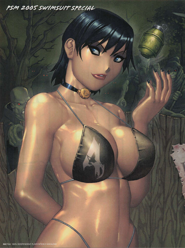
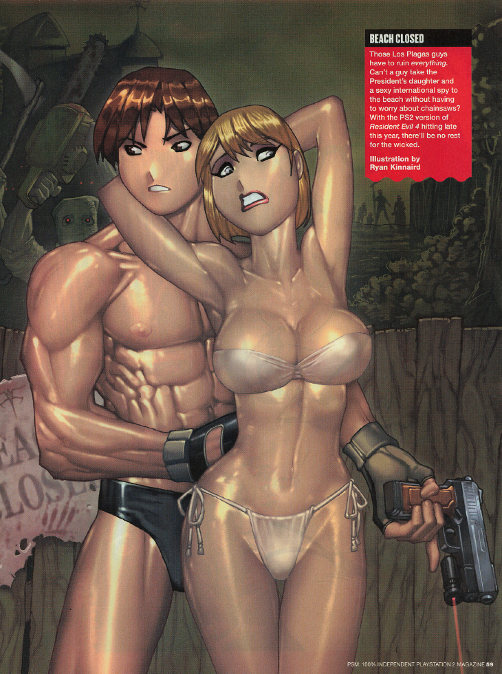
| HOTNESS: 3/10 | Oh look… it’s our old friend… I actually don’t mind the Ada half of this image: his art has improved and it’s the most outright, over-the-top sexualized any Ryan Kinnaird image has gotten to this point. However, the Leon/Ashley half just kills it, because… I mean, just look at them. Leon looks like a fucking human-coloured crocodile and Ashley looks like she stepped out of a pulp serial novel. |
| Liefeld: 0/10 | This is textbook Rob Liefeld stuff. |
| Character selection: 6/10 | Resident Evil 4 would have already been a year old when this came out, but I guess that the release of the PS2 port would be reason enough to earn it a spot (especially considering how massive this game was on release). |
| Personality: 3/10 | Ashley is scared throughout Resident Evil 4, has to rely on Leon to protect her, AND tries to fuck Leon… in spite of that, I think this image is terrible at communicating what Ashley is like. Here she looks like his vapid, seductive sex doll, but that’s not the case at all. Ada, as a femme fatale, should be pretty easy to do right, but even she comes across as generic. Really poor showing here. |
| Swimwear design: 4/10 | Okay, I’ll admit that the “4” on Ada’s bikini is kind of a cool touch… that’s about the only thing I find notable here though. |
| Intangibles: 0/10 | Leon’s abs have more layers than an ogre. |
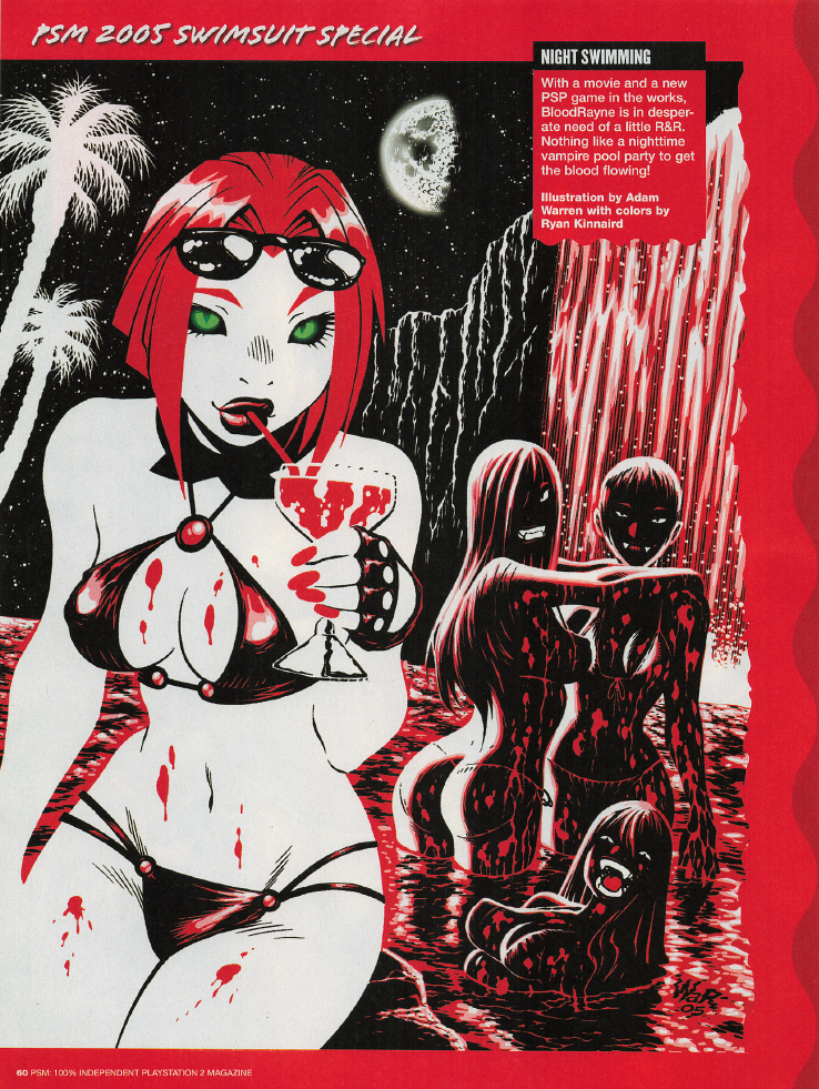
| HOTNESS: 8/10 | While I usually do not find Adam Warren’s cutesy art style to be particularly alluring, he’s giving 110% here to accomplish it anyway. This is definitely one of the most suggestive swimsuit images in the entire run of PSM, but the cutesy art style keeps it from feeling tacky or excessive. |
| Liefeld: 10/10 | The art style is so minimalist that I don’t think Adam could screw up Rayne’s anatomy if he tried. |
| Character selection: 5/10 | Rayne was fresh off of two poorly received video games, that embarrassing Playboy article, and the upcoming film was coming out when Uwe Boll was already known for making terrible movies, so it was clearly going to bomb as well. By this point it was obviously Rayne was never going to be the next big female video game star, so it does feel a little odd that they’d commission art of her two years in a row. |
| Personality: 7/10 | While this does look like something that Majesco themselves would release to advertise Bloodrayne, I do feel like it’s notably missing her sarcastic and aggressive attitude. Still, it captures enough of Rayne’s characterization that I can’t be that harsh on it. |
| Swimwear design: 6/10 | This swimwear looks very fitting for a character like Rayne. |
| Intangibles: 10/10 | Major bonus points for making this work with the limited colour palette! |
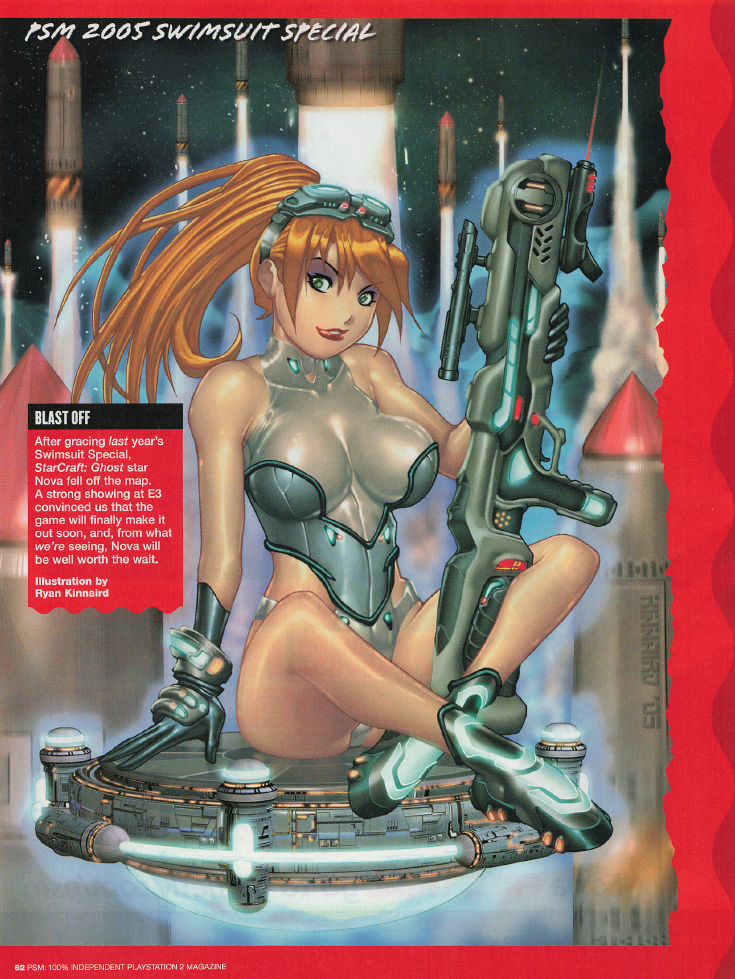
| HOTNESS: 7/10 | Oh hey Ryan. You did a pretty good job this time, this is almost on-par with your Chun Li piece! |
| Liefeld: 7/10 | Her upper-right thigh looks a bit strange… |
| Character selection: 5/10 | Oh my God they did it again! Apparently they were already concerned that StarCraft: Ghost might get canceled, but they were putting this commission out there to will it into existence. |
| Personality: 5/10 | The game never came out, how am I supposed to know Nova’s personality in StarCraft: Ghost? |
| Swimwear design: 7/10 | Congrats Ryan, you got to make a sci-fi bikini that looks interesting. |
| Intangibles: 5/10 | The dramatic irony of PSM stating that “we were worried for a bit, but it looks like StarCraft: Ghost is guaranteed to come out now!” |
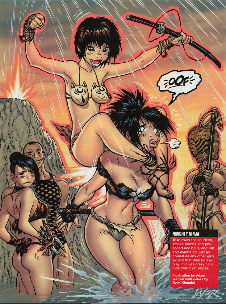
| HOTNESS: 0/10 | From what I can find, Rin from Tenchu is 14 years old (and looks it). What the actual fuck PSM? This opens up a whole can of worms for how you assess this image: is Rin being sexualized here? Maybe, but I don’t think it matters anyway: this image is part of a sexy swimsuit collection, there’s a baseline assumption that you’re supposed to oogle every character in a swimsuit. Like, if they just put a random photo of a little girl in the middle of a Sports Illustrated swimsuit issue, that would be really fucking weird. |
| Liefeld: 10/10 | I do not notice any anatomical issues (other than one of the characters’ bodies being four-plus years undeveloped). |
| Character selection: 0/10 | No. Just fucking no. Two years of Tenchu was insane enough. How they hell do we have Ayame three consecutive years!? She was clearly one of the bosses’ favourite characters (definitely the guy who has the Asian fetish), because it’s absolutely insane to imagine this being a popularity selection. Plus… y’know, including a minor, but I would have given this a 0/10 for Ayame alone at this point. |
| Personality: 5/10 | I don’t know these characters… you know the drill. |
| Swimwear design: 2/10 | THE FUCKING ROPE BIKINI-BOTTOMS ARE BACK, WHAT IS THIS GODDAMN OBSESSION!??!! |
| Intangibles: 5/10 | Everything else aside, the Kitsune-head bikini top is legitimately funny. |
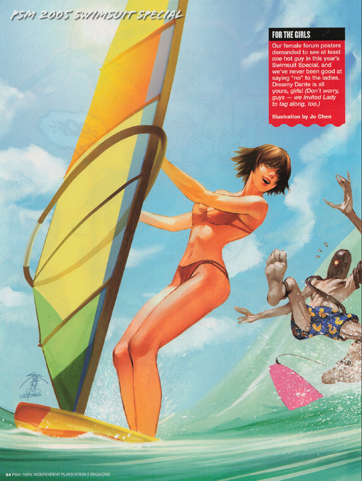
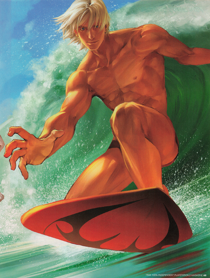
| HOTNESS: 10/10 | So this particular image is interesting, because it’s meant to be appealing primarily to the women readers of PSM… and I think they succeeded! Making this even more impressive is that this image is still appealing for the men, because we have Lady looking smoking hot! |
| Liefeld: 10/10 | I’m not noticing any glaring issues, which is extremely impressive for an image like this with a big muscly man front and center. Bravo, Jo Chen! |
| Character selection: 10/10 | If you have to pick a male video game character that the women readers of PSM would find attractive, you couldn’t do much better than Dante. The fact that the extremely appealing Lady is here too is just an incredible bonus. |
| Personality: 10/10 | You know you could see Dante doing this exact scene in-game and it would be perfectly natural. |
| Swimwear design: 6/10 | This is the one area where this image falters, and that’s because I can barely see what anyone is wearing! Nothing looks bad… but I’d like to have a better look at both to give their swimwear full points. |
| Intangibles: 10/10 | No notes, this is easily one of the best images in the entire series and I’m glad to see the swimsuit special going down swinging for the fences. |
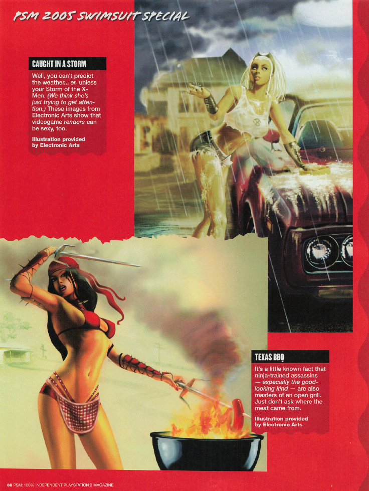
| HOTNESS: 3/10 | Oh my God: these are official images created by EA. They used their Marvel license for Marvel Nemesis: Rise of the Imperfects to commission sexy swimsuit images of Storm and Elektra. That means one of two things: 1) They had multiple back-and-forths with Marvel to get these images approved by them, or 2) They just went ahead and did it and could have gotten into hot water with Marvel if they found out. The funniest part about all this though? The images kind of suck. |
| Liefeld: 3/10 | It should come as no surprise that the actual comic book superheroes end up having some of the worst anatomy in the entire series. From the waist-up, Elektra is just a contortionist’s nightmare. At least Storm looks good though. |
| Character selection: 2/10 | I do not understand the decision-making that went into selecting Storm and Elektra for this swimsuit issue. Elektra was really unpopular due to the fresh memories of the Daredevil and Elektra movies bombing. Storm was reasonably popular I guess, but I can’t help but feel that Marvel wasn’t willing to let EA use their more popular characters for this swimsuit ad. Post-script: turns out that the reason they picked Elektra and Storm is because they were the only established female characters in Marvel Nemesis. There were multiple original characters in that game which were designed for sex appeal, which makes me wonder why they didn’t include one or more of their original characters here to specifically advertise the game? |
| Personality: 4/10 | Storm looks like a valley girl, which couldn’t be further from her character. As for Elektra… I guess that looks like a pose she’d do? |
| Swimwear design: 0/10 | Storm isn’t even wearing a swimsuit! And I think that Elektra is literally just wearing one of her costumes from the comics. |
| Intangibles: 5/10 | The fact that these are official images of licensed characters provided by EA is just so goddamn funny. |
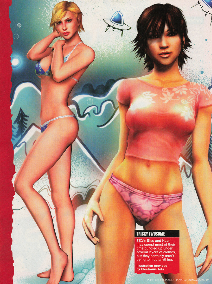
| HOTNESS: 4/10 | Oh my God they did it again. EA wants you to think that the girls of SSX are hot, but these in-engine PS2 renders aren’t particularly impressive. |
| Liefeld: 10/10 | I guess the benefit of using renders is that you avoid most of the anatomy pitfalls that drawing everything from scratch brings with it. |
| Character selection: 1/10 | It’s so funny that these are officially-created renders provided by EA themselves. It just reeks of desperation to drum up interest for SSX on Tour, which was launching the month after this issue released. After three games, it was clear that nobody cared about the characters in SSX, especially after a two year gap between releases. On top of that, this is the third time SSX characters were appearing in the swimsuit special. Might I remind you that Dead or Alive and Soulcalibur both only appeared once (and this is despite Soulcalibur III‘s hyped release later in 2005). |
| Personality: 5/10 | Something, something, don’t know this character… |
| Swimwear design: 3/10 | Kaori’s outfit looks more like sleepwear than swimwear… Elise’s outfit is just mediocre. |
| Intangibles: 4/10 | Again, it’s so funny and reeking of desperation that EA would provide these images themselves to PSM for their swimsuit special. What a wild marketing move. This is something that legitimately would not be done today by a major publisher. |
Credit where it’s due, this was a great final issue for the PSM swimsuit special. You had some of the best art in the entire series, some weird swings, and hilarious editorial choices. Certainly better than what I was expecting!
Final Rankings
What a wild journey that was. It was legitimately interesting to see how the PSM swimsuit special evolved from issue-to-issue: starting out as a legitimate attempt to get attention through sex appeal, and then slowly feeling more and more like an obligation. That said, I imagine that the budget for the special was higher in the first issue, and then got tighter and tighter with each subsequent one. I also think this is probably why Ryan Kinnaird was all over these issues: he was probably able to do commissions fast and inexpensively, hence why he was soon doing two or three images per year. That said, when PSM wanted a particular image to make a splash, you can tell that they put the money into it, hence how we got the stunning images of Cassandra, Dante & Lady, and Lara Croft sharing space with art of notably worse quality.
Then there’s the next thing I want to address: I expect that a common response to these swimsuit articles would be “boy, they couldn’t do this today!” I honestly think that that is patently false. Could, say, IGN or Eurogamer suddenly decide to release an annual swimsuit special? Yeah, I think that they could do so with little controversy surrounding the decision. As long as they treated it with a bit more tact than PSM did, and had a bit more balance between the girls and guys, I think that there would be minimal criticism. That said, would they do this? No, probably not, but that’s not so much due to “wokeness”. Unlike the 90s and early 2000s, game’s journalism is now directed at a general audience rather than teenage boys (a shift in audience that we can track through PSM’s own gradual loss of personality over the years).
Wanna know how I know that you could make a video game swimsuit issue today without it being a problem? Well, I was looking into Ryan Kinnaird’s career after I finished the last issue and it turns out that the guy has been contributing to UDON magazine, which releases its own video game girl swimsuit specials to this day. They’re actually pretty damn good! All that said, as much as I’ve complained about Ryan Kinnaird through this article, the guy’s art style has improved significantly since these articles were published, so I want to give him some kudos: nothing against you, I just did not like most of your swimsuit illustrations in PSM! Congrats on finding a way to make a career for the last quarter century drawing HOT video game girls in BIKINIS!
With all that said, lets get to the final rankings based on the sum total of their scores. In the case of a tie, I’ve ranked images based on personal preference:
| Rank | Character(s) | Series | Issue | Artist | Total Score |
|---|---|---|---|---|---|
| 1 | Lady, Dante | Devil May Cry | Sept 2005 | Jo Chen | 56 |
| 2 | Lara Croft | Tomb Raider | Aug 2002 | Greg Horn | 56 |
| 3 | Cassandra Alexandra | Soulcalibur | June 2003 | Greg Horn | 54 |
| 4 | Kasumi, Leifang, Tina Armstrong | Dead or Alive | July 2000 | Sam Liu | 49 |
| 5 | Lara Croft | Tomb Raider | Sept 2005 | Frank Cho | 47 |
| 6 | Rayne | Bloodrayne | Sept 2005 | Adam Warren | 46 |
| 7 | Lara Croft | Tomb Raider | July 2000 | Adam Hughes | 46 |
| 8 | Trish | Devil May Cry | Aug 2002 | Kevin Lau | 43 |
| 9 | Lara Croft | Tomb Raider | June 2003 | Adam Hughes | 38 |
| 10 | Chun Li | Street Fighter | July 2004 | Ryan Kinnaird | 37 |
| 11 | Nova | StarCraft | Sept 2005 | Ryan Kinnaird | 36 |
| 12 | Elisa, Zoe, Kaori | SSX | July 2001 | Andy Park | 35 |
| 13 | Talim, Ivy Valentine, Xianghua, Taki | Soulcalibur | June 2003 | Greg Horn | 34 |
| 14 | Lara Croft, Claire Redfield | Tomb Raider & Resident Evil | June 2003 | Randy Green | 32 |
| 15 | Valkyrie Wilde | PSM April Fools | July 2000 | Adam Warren | 31 |
| 16 | Rayne | Bloodrayne | July 2004 | Ryan Kinnaird | 31 |
| 17 | Ai Fukami, Reiko Nagase | Ridge Racer | July 2000 | Tommy Yune | 30 |
| 18 | Jill Valentine, Claire Redfield, Leon Kennedy | Resident Evil | July 2000 | Andy Park, Jon Sibal | 30 |
| 19 | Sun Shang Xiang, Ayame | Dynasty Warriors & Tenchu | June 2003 | Jo Chen | 30 |
| 20 | Ken | Zone of the Enders | June 2003 | Ryan Kinnaird | 29 |
| 21 | Lian Xing, Aya Brea, Meryl Silverburgh, Hana Tsu-Vachel | Various | July 2000 | Joyce Chin, Arthur Adams | 28 |
| 22 | Tifa, Quistis, Rinoa, Cloud, Squall | Final Fantasy | July 2000 | Naska | 28 |
| 23 | Sakura, Chun Li, Cammy | Street Fighter | June 2003 | Rick Mays | 28 |
| 24 | Ashelin, Keira | Jak & Daxter | July 2004 | Kevin Lau | 28 |
| 25 | Trish, Lucia | Devil May Cry | June 2003 | Ryan Kinnaird | 28 |
| 26 | Yuna, Tidus, Kimari | Final Fantasy | July 2001 | Roger Cruz | 27 |
| 27 | Elise, Kaori | SSX | Sept 2005 | EA Studios | 27 |
| 28 | Yuki, Kaede, Samanosuke | Onimusha | July 2001 | Ken Lashley | 26 |
| 29 | Chun Li, Sakura, Cammy | Street Fighter | July 2000 | Ale Garza | 26 |
| 30 | Ibuki, Sakura, Elena, Chun Li, Cammy | Street Fighter | July 2004 | Arnold Tsang | 26 |
| 31 | Ayame, Kurenai, Hibana | Various | July 2004 | Rick Mays | 25 |
| 32 | Oyu | Onimusha | Aug 2002 | Keron Grant | 25 |
| 33 | Sarah Bryant, Pai Chan, Christie, Julia | Virtua Fighter & Tekken | Aug 2002 | Rick Mays | 24 |
| 34 | Sarah Bryant, Pai Chan, Aoi, Dural | Virtua Fighter | July 2001 | Mike S. Miller | 24 |
| 35 | KOS-MOS, Shion | Xenosaga | June 2003 | Adam Warren | 23 |
| 36 | Regina | Dino Crisis | July 2000 | Arthur Adams | 23 |
| 37 | Rin, Ayame | Tenchu | Sept 2005 | Adam Warren | 22 |
| 38 | Viola, Vikki Grimm, Olga Gurlukovich, Konoko | Various | July 2001 | Tone Rodriguez | 21 |
| 39 | Mamba Marie, Sephonie, Lenore, Aurora Lee, Sophia | Maximo | Aug 2002 | Adam Warren | 21 |
| 40 | KOS-MOS, Shion, Pellegri | Xenosaga | Aug 2002 | Ryan Kinnaird | 21 |
| 41 | Nova | StarCraft | July 2004 | Adam Warren | 19 |
| 42 | Nina Williams | Tekken | July 2004 | Jason Pearson | 19 |
| 43 | Rikku, Yuna, Lulu | Final Fantasy | Aug 2002 | Terry Dodson | 18 |
| 44 | Storm, Elektra | Marvel comics | Sept 2005 | EA Studios | 17 |
| 45 | Tracey, Leeann, Elise | EA Sports BIG franchises | Aug 2002 | Joe Chiodo | 16 |
| 46 | Dominique, Kaldea, Echidna, Sion | The Bouncer | July 2001 | RV Valdez | 16 |
| 47 | Ada Wong, Leon Kennedy, Ashley Graham | Resident Evil | Sept 2005 | Ryan Kinnaird | 16 |
| 48 | Hana Tsu-Vachel, Rain | Fear Effect | July 2001 | Matt Broome | 16 |
| 49 | Frost, Sonya Blade, Nitara, Kitana, Lei Mei | Mortal Kombat | June 2003 | Kevin Lau | 14 |
And here’s how I would rank the images based entirely on personal, subjective appeal:
If you liked this article…
I hate ads. You hate ads. In order to stop polluting my site with obtrusive and annoying ads, I’ve elected to turn them off on IC2S. That said, writing still takes time and effort. If you enjoyed what you read here today and want to give a token of appreciation, I’ve set up a tip jar. Feel free to donate if you feel compelled to and I hope you enjoyed the article! 🙂
Oh my God dude you are such a faggot! I busted hundreds of nuts to these back in the day. Every time an image came up and I thought to myself “oh yeah that one was fuckin hot” you would give it like a 3. You need to come out of the closet already because you are 100% gay fag. And you even gave the one with the surfer guy a 10! You are so fucking gay!
So… what, I should give *every* image a 10/10 for hotness to prove I’m not gay…? It’s a jokey ranking list, I’ve gotta have some granularity/standards.
Anyway, this comment stays because it’s fucking funny.