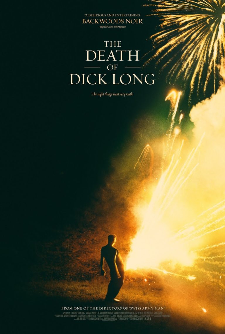
15 Best Movie Posters of 2021

Welcome back to the mostly-annual year-end countdown of the best movie posters of the year! Obviously since we basically got no movies in 2020 I had to take the last year off, but we’re back for 2021 with a very solid selection of eye-catching posters that I had a seriously difficult time narrowing down into just a top 15. As before, I’m using impawards as the source for 2021 posters. Any poster released during the year is eligible, but special consideration is given to posters which are intended for mass distribution rather than posters which are intended to be limited-release, alternative, “artistic” posters. As usual, you can see the full-sized poster in all its glory if you click on the images. Anyway, with those considerations out of the way, let’s get onto the list!

Dishonourable Mention: Cosmic Sin

Okay, the idea of Bruce Willis and Frank Grillo as a couple of space marines sounds fucking awesome, but the cheap, obvious, awful headswap Photoshop job on this poster makes this whole movie seem cheap and laughable. Not that Cosmic Sin needs much help, this movie is apparently so bad and forgettable that no one has even fixed the numerous grammatical errors in its Wikipedia page as of October 21, 2021. Ouch.

15) The French Dispatch

This one mostly makes the list because you take one look at it and go “Oh hey, it’s a Wes Anderson movie in poster form”. It’s quirky, detailed and has tons of stuff to look at, each cell is practically a miniature character poster of its own and the Fibonacci sequence-like layout directs your eyes in an unusual and interesting way. The pulpy, 30s/40s serial art style also helps this standout amongst the other posters of 2021 and no-doubt reflects Anderson’s distinct visual style and aesthetics. All-in-all, a unique and fun poster which undoubtedly reflects the film’s aesthetic as well.

14) Spencer

This poster is very striking. Between the massive, elaborate outfit, the contrast between the dark and the light of the dress and Kristen Stewart’s flawless transformation into Princess Diana, there’s plenty to draw you in. What helps make this more than just a visually-appealing piece is that the design also belies the story’s darker elements, with Diana seemingly stifled, like she’s trapped in the opulence. It’s a true art piece in its own right and I’m curious if Spencer can live up to it.

13) Billie Eilish: The World’s a Little Blurry

I’m not really a fan of pop music (shocker), so unsurprisingly I don’t give a shit about Billie Eilish and could care even less for an Apple TV exclusive documentary about her. However, it’s hard to deny that she doesn’t have her own distinct style, best highlighted in these posters for The World’s a Little Blurry. I like the first one mostly, it has a moody tone to it, Eilish’s signature green hair gives it a strong hue and it (obviously) lives up to the “blurry” part of the title. It reminds me of the Joker poster from 2019 that I liked so much. Like most good posters, the use of colour is very intentional, bringing its own tone, mood, style and even symbology to these posters which I can’t help but appreciate.

12) Prisoners of the Ghostland

While I find this poster very visually-arresting, promising me the trippiest samurai movie you’ve ever seen, there’s one small element that really makes me love this poster. I love how this poster draws your eyeline downward – first you see a samurai badass with his back to you, then the spooky mask, then the title and then “This wildest movie I’ve ever made”. Wow, who’s saying that? Nicholas goddamn Cage and for him that is a freaking declaration. The poster itself is cool but that strategically-placed quote gets my imagination racing, just going to show that every aspect of poster design can be crucial to its success. For that, Prisoners of the Ghostland deserves special commendation!

11) A Classic Horror Story

This one succeeds for a couple reasons. First of all, it’s called A Classic Horror Story and the poster design makes this look like… a classic 70s horror story. Secondly, if I saw that horned devil lady in my doorway, I’d be legitimately unsettled. The fact that it seems to be happening in full daylight just makes the whole thing even more unsettling to me, while the red and black colours give the whole thing a sinister vibe. Like I said, colour is very important in good poster design (a trend which you will likely notice going forward) and the use of it here helps contribute to the horrifying atmosphere that A Classic Horror Story is giving off.

10) Honeydew

There are several horror posters this year that get by with their disturbing and unnerving imagery, including choices that just missed the list such as Malignant and We Need to Do Something. However, this poster for Honeydew is the most unsettling for me. I’m not entirely sure what is happening here, but it sure looks uncomfortable and you can see the fear in this guy’s eyes at whatever’s going on. It conjures images in my mind of some Saw-like trap and all the nastiness associated with that. The sickly, yellow hue over the entire poster just makes it feel even more disconcerting.

9) Old

This one is pretty simple but effective. While other posters for Old get across the idea that it takes place on a beach more, this one is far more interesting. In my opinion, it captures the concept of the inevitable, uncontrollable and even frightening passage of time and death very well, all wrapped up in a minimalist, black and white style that makes it striking to view.

8) The Sleeping Negro

Oh and speaking of minimalist styles, while the poster for Old mostly just looks cool, this poster for The Sleeping Negro uses it to get across some pretty clever racial imagery. This poster deftly gets across the theme of alienation and isolation in this film in a very simple manner that makes it even more effective than if they had gone for something more complicated or less stylized. Hell, they could honestly go even more minimalist if they wanted to, cutting out the title completely, and the message would still be conveyed just as strongly, as even the black character’s afro highlights that he’s singled out because of his race. When you can afford to strip down your poster even more then you know the designers hit on something right.

7) Bulletproof

This is another one of those posters where the imagery captures the ideas of the film in a really striking manner. Bulletproof is about the American response to school shootings and seeing children pointing finger guns at each other here is an eerie encapsulation of the topics this film will be exploring. Once again, the eyeline works perfectly – you see the finger guns, then you’re drawn down to the title and know what this movie is saying in chilling fashion.

6) The Suicide Squad

The Suicide Squad has a huge cast of extremely colourful and varied characters and this first poster captures that aspect of the film and its off-kilter tone in glorious fashion. It also doesn’t give any of the characters more prominence than the others, which makes the characters’ fates in the film even more ambiguous (which is pretty important for a movie where, like, 80% of these characters get annihilated in gory fashion). The second poster captures the feel of a pulpy, 60s-era action movie, which isn’t nearly as interesting but it it’s worth highlighting and contrasting it to the first poster. These are very different styles but they both work to capture the fun of this very enjoyable romp of a film.

5) The Green Knight

I love the use of bright red and gold and the subjects facing away from the camera across The Green Knight‘s posters, it gives them all a unifying, sombre tone. While the main theatrical poster would have made this list regardless due to its strong aesthetic, what really pushed this into the top five for me was the presence of that brilliantly huggable foxy boi. When I first saw that poster I squealed with glee. For the record, graphic designers, throw a fox on your poster and you’re pretty much guaranteed to make my top 15 if your poster is any good.

4) Godzilla vs. Kong

I’ve said it before and I’ll say it again, the Monsterverse consistently have some of the best posters of all Hollywood blockbusters. We get posters like Spiral which are pretty and posters like Bring Your Own Brigade and The River Runner which give you massive scale, but Godzilla vs. Kong gives you pretty colours and massive scale! The fact that they have so many cool posters and so many of these were actually used in the general marketing of the film make this even more impressive to me. Even if Godzilla vs. Kong was kinda disappointing, there’s no denying that the marketing was, once again, on point.

3) Army of the Dead

I didn’t really care for Army of the Dead – I thought it was bloated, poorly written and squandered what should have been an over-the-top action romp. While the film itself fell short, the marketing department for Army of the Dead clearly understood what this movie should have been. We get gorgeous poster after gorgeous poster of colourful, macabre excess, all of which make the film look way cooler than it actually is. This is just a handful of the great posters Army of the Dead got this year, so even if the quality wasn’t there (which it is) then due to pure variety this would have ranked highly. For my own part, I especially like the neon-hued skull in a river of paint and the pile of corpses in the shape of a skull. Man, seeing these posters is making me think about how I wish the movie lived up to them all over again…

2) The Night House

We’ve had a slew of spooky and disturbing horror movie posters in 2021, but for my money The Night House has the best of them. What makes it more impressive is that there isn’t much horror imagery to speak of – there’s a blood-red moon, a scared expression from Rebecca Hall and, in one poster, a ghostly hand cutout, representing a spectral figure or perhaps someone who’s been lost? Then there’s the strong use of red and black to give everything an eerie atmosphere. In any case, it works, I really want to see this movie and figure out what sort of thrills The Night House has in store for me, which makes it more than worthy of this spot. However, there can only be one #1 pick…

1) Jackass Forever

There’s something about this poster where I looked at it and said “this is perfect” and instantly put it as a frontrunner for the year’s posters. Like, just look at it, it’s the perfect encapsulation of what Jackass is. You’ve got the rainbow hang glider and obese man to draw your attention and then the eyeline goes down to the cactus plants and then down to the film’s title. Just by looking at it, it creates a story in your head that is equal parts funny, painful and so incredibly stupid that I can’t help but applaud it. It’s so simple, but so striking that I still can’t quite believe that it’s this good, especially because the other Jackass Forever posters don’t hit me the same way at all. Don’t let anyone tell you otherwise though, this right here: this is art.

POST-SCRIPT: Well, shit. I usually have a rule here – only posters for movies released in the year in question are considered and here I have completely flubbed as Jackass Forever is going to be released in 2022 instead. To be fair, when I started this list it actually would have been a 2021 film, but it was delayed and I missed that in the time it took to make selections, write and release the list. This isn’t the first time I’ve had this issue due to unexpected delays, but it should probably go without saying that I’ll not take Jackass Forever into account for 2022’s list (because it would probably win again).

Let Them Fight – The Human Characters in the Monsterverse

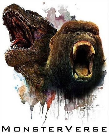
Godzilla vs. Kong was easily the most excited I have been for a movie since… well, since right before Covid-19 hit and delayed A Quiet Place: Part II indefinitely. Most of the Monsterverse films are little more than disposable fun (except for the 2014 Godzilla, which is a straight-up great blockbuster as far as I’m concerned), but I got hyped regardless and found myself entertained as I watched the big gorilla and the big lizard punch each other on-screen. To the surprise of no one, Godzilla vs. Kong‘s human characters feel superfluous, which led to the common refrain of “well it’s a kaiju movie, of course the human characters suck!” This feels like a total cop-out though, because not only are there several good human characters in the long history of the Godzilla and Kong franchises, but we had a solid human cast in Godzilla 2014. Think about it – we don’t get any giant monsters until about forty minutes in and Godzilla himself doesn’t show up until nearly an hour has passed. The humans have to hold up the entirety of that first hour and the film doesn’t suffer because of it – can you imagine that with one of the more recent Monsterverse movies? So what happened? How did we get from the grounded human drama of Godzilla 2014 to the melodrama and camp of the latter-Monsterverse? Let’s examine each of these movies in turn and see how the human characters were handled there.

Oh, and in case it wasn’t obvious?

Alright, with that said, let’s get into this…

Godzilla (2014)

At the time of its release, one of the big controversies with Godzilla 2014 (which I’m just going to refer to as “Godzilla” from here on for simplicity’s sake) was that Bryan Cranston’s Joe Brody shouldn’t have been killed off and that they should have killed the film’s actual main character, Aaron Taylor-Johnson’s Ford Brody, instead. The reasoning for this is because Joe was a far more compelling character than Ford, which is hard to deny – he’s a broken man driven to self-destructive obsession to try to understand the unexplained nuclear reactor meltdown which killed his wife a decade and a half ago. There’s some good family drama early on where he and Ford reluctantly reconnect and try to uncover what caused the reactor disaster. Cranston puts his everything into this role, and the writing is interesting enough to carry the film on its own long before any kaiju appears on-screen. However, as soon as the first MUTO emerges and Joe dies, Ford takes over and is characterized as a dull, lawful good soldier. I can see how this would be a big come-down from Joe’s more compelling characterization, but I feel like this was an underrated narrative decision which ultimately made Godzilla a stronger film overall.

The best and most distinctive part of Godzilla is that it frames the kaiju action at a human level. The monsters are enormous, rarely able to fit into the frame and they are so gargantuan and unstoppable that the lives and cares of humans are unworthy of their attention. Some of the most memorable scenes in this film are just random humans trying to survive the destruction going on around them, with the audience’s full understanding that it is all unintentional collateral damage. For example, the tsunami in Hawaii or Godzilla going through the Golden Gate Bridge aren’t particularly crucial moments in the plot, but they get so much focus because they show the scale of the devastation that these monsters can unintentionally cause from a human perspective. In this kind of narrative, you need someone on the ground level who would have to be in the vicinity of the monsters in order to progress the story and Ford works perfectly in this regard. Think about it – what would Joe have done to improve the plot if he didn’t die? He’s not a soldier; at most he would be working with Monarch to try to stop the MUTOs. In order to keep Joe in this film, we would either require more dull expository scenes with Monarch (which would hurt this film’s pacing), or he’d have to be awkwardly shunted to the background of the film in order to preserve the narrative direction. Ultimately, killing him off was the most efficient solution – unfortunate, but necessary to preserve the pacing of the narrative.

On the other side of the narrative, we have Ken Watanabe as Dr. Serizawa. He isn’t really a main character per se, instead acting as more of a mouthpiece to deliver exposition and, perhaps unintentionally, deliver memes straight to the audience. He’s in the movie just enough to let us know what’s going on and who we should be rooting for, but he doesn’t make a huge impression. He’s functional and unobtrusive.

That said, Godzilla‘s biggest sin would be how badly it wastes Elizabeth Olsen’s Elle Brody. Like… seriously? You got Elizabeth Olsen (who had just received critical acclaim for Martha Marcy May Marlene and was poised for superstardom in the MCU) and then trapped her in a forgettable role as Ford’s wife. She barely even appears in the movie, but there’s no good reason for this to be the case. She’s a freaking nurse caught in the big showdown in San Francisco, you’re telling me you can’t find something for her to do? Especially in the early hours of the attack in San Francisco, before Ford is even on-site, she should be treating victims, avoiding falling buildings, etc.

Godzilla‘s human characters aren’t the most compelling out there, but you can see that they’re interesting enough to carry a good chunk of the film by themselves and provide a strong narrative grounding which only serves to make the overall film stronger. The monsters are still the main draw, but the humans don’t feel like they’re actively robbing us of anything interesting. It strikes by far the best balance in the entire Monsterverse and looking back it really is shocking how bad the human characters have become in comparison.

Kong: Skull Island

Kong: Skull Island starts out promisingly enough, introducing us to a large and colourful cast of human characters. They’re all clear archetypes (Tom Hiddleston’s your action hero, Brie Larson’s your tough leading lady, Samuel L. Jackson’s your Vietnam squad leader, John Goodman’s your shady, desperate scientist), but they’re interesting enough to give us people to care about and get the plot moving forward. The problem with Skull Island is that these characters don’t really go anywhere beyond these basic archetypes. Once the characters end up on Skull Island, they have little to no development to speak of, with the only real exception being that Samuel L. Jackson’s Preston Packard goes kill-crazy (which is particularly notable because it is implied to be due to PTSD from the Vietnam War which leads to this breakdown, providing some well-trodden political commentary on the film’s 70s backdrop). The lack of development is particularly disappointing with Tom Hiddleston’s Conrad and Brie Larson’s Weaver – you’d think they’d at least give their leading duo something to do other than just look cool, but nope.

Luckily, Kong manages to get away with having such a disposable human cast by treating them as, well, disposable. The cast gets quickly whittled down one-by-one in fun ways at a quick pace. Like Godzilla, Kong: Skull Island wastes several of its talented actors, but I’m less annoyed about it here because Kong seems to understand the how high-profile its cast is and revels in killing them off unexpectedly. If anyone feels truly wasted it would be John Goodman, but he gets a funny and memorable death which helps make up for it. That’s not even mentioning Shea Whigham who, as a recent viral tweet stated, has one of the funniest death scenes ever. It almost feels like a disrespectful way to off one of the most colourful characters in the film, but it’s so funny that it is hard to hold it against the movie.

Kong also has one ace up its sleeve in the human character department and that’s John C. Reilly’s Hank Marlowe. He gets by far the most interesting characterization as a World War II fighter pilot who gets stranded on the island with a Japanese soldier and is instantly endearing to us with his fun personality, capability and desperation to get home to his wife and son who has hasn’t seen in almost thirty years. Seeing him reuniting with his family at the end is surprisingly poignant for a film that is almost entirely breakneck-paced action up to that point.

Kong: Skull Island represents the best and worst of human characters in a kaiju film. On the one hand, the cast is undeveloped and exist mainly to be killed off in fun ways, but on the other hand they’re just interesting enough to carry the plot forward, shuffle us along to a lot of entertaining action sequences and don’t feel like they’re detracting us from the good stuff (Kong kicking ass). While developing a couple more cast members would make the narrative resonate more, this is around the baseline of what you could consider “acceptable” for a broad-appeal adventure movie.

Godzilla: King of the Monsters

The number one complaint about Godzilla was that the title monster didn’t show up nearly enough. King of the Monsters came along to try to right that, but the end result leaves me so mixed. On the one hand, this is a fundamentally flawed film, but it might be my favourite entry in the Monsterverse and is the best 5/10 movie I’ve ever seen by far. At the very center of King of the Monsters‘ flaws are those human characters, which are probably the worst in the franchise in some ways.

King of the Monsters has more of an epic, globe-trotting scale compared to Godzilla‘s grounded and human-level scope. This necessitates a larger cast of soldiers and scientists who are constantly giving exposition dumps to explain what big disaster is going on at any one time, which they make sure to constantly update us on. As if this wasn’t enough by itself, we also have family melodrama between Kyle Chandler, Vera Farmiga and Millie Bobbie Brown (I could not tell you their actual characters’ names for the life of me), who are caught up in a bio-terrorist plot to unleash monsters across the world. This family drama has the potential to be compelling – their son was killed in the attack on San Francisco and it has caused them to grow estranged from each other. Kyle Chandler blames Godzilla for his son’s death and wants to destroy all the monsters, whereas Vera Farmiga uses their loss as motivation to try to save the world. Unfortunately, the film doesn’t explore their relationship any further than that. There’s just no time for human drama with all the action going on and it ends up serving as a way to have a fractured family caught on opposite sides of the conflict.

Serizawa also returns to lead the scientists and he’s about as functional here as he was there. His heroic sacrifice resonates because we’re familiar with the character and he seems like a good person who wants to do the right thing, although he still isn’t very well-developed. As for the rest of the characters, they are a bunch of nobodies. Like, don’t get me wrong, there’s a bunch of people we see a whole lot on the Argo: the lady commander/pilot, the smart alec, O’Shea Jackson Jr.’s soldier character, and probably a couple other nobodies that I’m forgetting because they were all so pointless. Oh and Sally Hawkins reprises her role from the first movie as well, but she was so forgettable there that I didn’t even realize she wasn’t in this as a stunt-casting due to her role in The Shape of Water. Oh, and she gets unceremoniously stepped on early in the film, making her character’s entire existence feel even more hollow.

Unlike Kong: Skull Island, King of the Monsters sticks to Godzilla‘s more serious tone, making these characters all just so dull to watch and entirely forgettable. For example, there’s the scene where Rodan flies over a Mexican town, destroying it from the hurricane-force winds created by his passing. Conceptually, it’s similar to the scene in Godzilla where Godzilla comes ashore in Hawaii and unintentionally creates a tidal wave which wipes out the entire downtown sector, but far less exciting because the film doesn’t bother to make us care about anyone on the ground. Like, they throw O’Shea Jackson and a kid into the scene, but at this point I don’t even know a thing about this soldier and this kid literally just showed up out of nowhere. Not only that, but we don’t even get a proper resolution. One second we see O’Shea Jackson desperately holding onto this kid and then like five minutes later we find out that they’re all fine, not that any of us were wondering anyway. To make matters worse, King of the Monsters does a fantastic job of giving all the monsters distinct personalities. Hell, King Ghidorah’s individual heads have more interesting characterization than anyone in this movie! Worst of all? The human characters actively take up time which should be dedicated to the monsters fighting, especially in the second half of the film. The two most egregious examples are when Rodan and King Ghidorah are fighting and suddenly the film cuts away to dumb drama aboard the Argo and when we get just one shot of Ghidorah wrecking downtown Washington D.C. That’s the kind of moment where some ground-level scenes of destruction could go a long way, but King of the Monsters‘ scope is planted so firmly on its epic, globe-spanning scale that it can’t even take the time to linger on this before zipping the plot ahead to the next big event. Again, I like King of the Monsters and in some ways I think it’s the ideal Hollywood blockbuster interpretation of a kaiju movie, but the human characters are by far its greatest weakness, to the point of being actively detrimental to the whole experience.

Godzilla vs. Kong

I was nervous going into Godzilla vs. Kong, but after seeing the first trailer I was reassured that they had learned one lesson – even if the human characters inevitably sucked, they had pulled off a masterstroke by making Kong the film’s true leading character and emotional core. That said, some studio head out there decided that there still have to be human characters in this movie, and these are a tale of two halves…

For the Kong half of the film, we get Alexander Skarsgård as Nathan Lind, Rebecca Hall as Ilene Andrews and Kaylee Hottle as Jia. They’re all functional at best and serve little more purpose than to drive the plot forward (Lind has researched the hollow earth, and they need Kong to guide them there) or provide a connection to Kong (Andrews is the top researcher on Kong and Jia has bonded with Kong to the point of being able to communicate with him). This half of the film also features Eiza González in an obviously-villainous corporate underling role as she funds their expedition to the hollow earth, but she similarly has little in the way of development or interesting motivation, you just sit there waiting for her sudden but inevitable betrayal. Like most people in the Monsterverse, the humans in this half of the film are purely functional – not actively detrimental or disruptive, but about as uninteresting as you’d expect from a film like this… so better than King of the Monsters, at least.

Speaking of which, that brings us to the Godzilla half of the film, which is centered around Millie Bobby Brown’s returning character, Madison, along with her friend and a bumbling conspiracy theorist who unearth a sinister conspiracy afoot at Apex Cybernetics… and good God, this is by far the worst set of characters we’ve gotten in the entire Monsterverse. Godzilla vs. Kong makes the interesting decision of dialing back on the po-faced seriousness of Godzilla and King of the Monsters and instead goes for a campier tone. This is an sensible idea for a monster movie, since they are intended to be a breezy fun time, but the camp is cranked to the max whenever this trio is on-screen to the point of being grating. It’s to the point of being cartoonish, as these three clowns bumble their way into Apex Cybernetics, somehow avoiding detection the entire way, until they come face-to-face with the moustache-twirling corporate villain. This half of the film also suffers from two egregious sins (actually let’s make that three – Jessica Henwick was cast but cut from the final film, what the fuck movie!?). The first is that poor Kyle Chandler is completely wasted, relegated to little more than a cameo role. A familiar face would have done wonders and I struggle to see how you couldn’t have worked him into the plot in a more substantial manner. The second sin is that the bad guy’s main henchman is freaking Ren Serizawa, the son of Ken Watanabe’s Dr. Serizawa, and the film doesn’t play this fact up at all. Hell, he even dies unceremoniously, making the entire existence of this character pointless. Like, at that point why not just make him a nameless goon? Or just fold his role into that of the main bad guy? I don’t understand this decision and all I can think is that there was significant chunks of story cut out in the final film which may have expanded on his role.

So Godzilla vs. Kong has one set of characters who are functional at best and another set that I actively wish would die. This might have been a crippling flaw for the film but, like I said at the outset, Godzilla vs. Kong downplays this issue by making Kong the true main character. This provides what should be a blueprint for future Monsterverse films where they won’t feel like they have to saddle us with boring or annoying humans and instead focus on the monsters directly. That said, I would like to see a return to what made the first Godzilla film so successful, where the action is shown from ground level with humans scrambling just to survive. King of the Monsters already put the stakes about as high as they can realistically get, so I feel like trying to maintain that kind of scope just isn’t sustainable and instead the right course of action is to lean into the human stakes instead. I really enjoy the Monsterverse and it would be great to see this franchise continue and improve as time goes on

15 Best Movie Posters of 2019

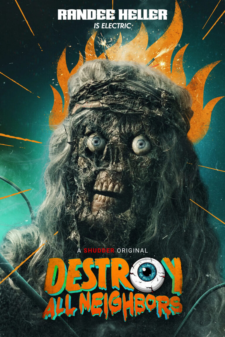
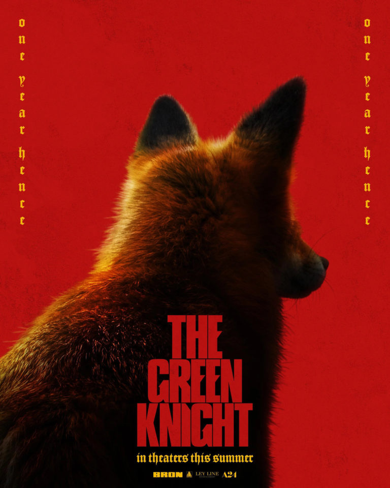
Welcome back to the annual, year-end countdown of the best movie posters of the year! And just like that, this is now officially an annual thing! I’ve been browsing impawards throughout the year, keeping an eye out for eye-catching, interesting posters and saving them for later. Suffice to say, I had a bunch of posters to sift through and narrowing this down to a top 15 was difficult (not least of all because new posters are released all the time so I couldn’t even begin to narrow the list down until the start of September). Also, starting this year I’m going to be giving extra consideration towards posters which are actually intended for mass distribution rather than posters which are intended to be artistic but very limited in their reach. I mean, this Dark Phoenix poster is really cool, but it’s also clearly a poster you’re never going to see if you go to a theatre. I’m still going to consider these kinds of posters if they’re really good, but I find it more impressive when a poster which is meant to sell general audiences on the film does something particularly artistic or interesting.

Anyway, with those considerations out of the way, let’s get onto the list! As usual, you can see the full-sized poster in all its glory if you click on the images.

Honourable Mentions

While Disney absolutely destroyed the competition at the box office this year, their posters were, by and large, very mediocre and lifeless. This poster for Frozen II was one of the few exceptions, with its interesting use of colour and reflections hinting at the plot and feel of the film. It ultimately just missed the list, but it was definitely worth mentioning.

This is another entry which could have easily made the list if the competition wasn’t quite so fierce. It’s got such a creepy design already and then as your eye gets drawn upwards you realize that the trees have been arranged in such a way that they spell “FEED”. I like this poster a lot, it looks way better than a gritty, Grimms fairy tale adaptation should.

Having seen Us, I like this poster quite a bit with its minimalist design resembling a Rorschach blot, but with the right side missing bits which hint at the film’s psycho doppelganger premise. It gets across the idea of the film very well, but I feel like it’s just a bit too subtle to really be appreciated unless you’ve actually seen the film first.

15) The Death of Dick Long

This is one of those posters where I have no idea what the film is actually supposed to be about, but it kind of makes me want to see the movie regardless. As I’ve said in previous best posters of the year countdowns, that’s ultimately the goal of a movie poster, so it’s worth some points in my book. On top of that, this poster is just eye-catching with its use of harsh, contrasting lighting and muted colours… and then you notice that the fireworks are coming from the guy’s freaking crotch. And then you notice the title is called The Death of Dick Long, and that it’s from one of the directors of Swiss Army Man. Yeah, it’s going to be weird as all hell, but intriguingly so. That said, I could have very easily skipped over this one if the poster wasn’t so eye-catching so I’d say that this is well-deserving of a spot in the Top 15.

14) Low Tide

Every best movie posters countdown needs a poster which is just a beautiful, “artistic” shot and Low Tide takes that spot for me this year. It really isn’t much more than an extremely well-composed photo and a cleverly integrated title using a reversed gradient, but that’s all it really needs to be. Low Tide‘s poster is so beautiful it makes your eyes water, suggesting that you’re in for a gorgeous treat if you watch it. In addition, its use of colour and gradients also implies a dangerous tone for the movie without really having to overtly spell it out. A great poster all-round, and that fact that it is only in at #14 just shows how impressive posters have been in 2019.

13) Hail Satan?

This poster is just so clever. It’s appropriately interesting, informative and inflammatory in equal measure. Most Americans (especially evangelicals) are uninformed about the Satanic temple and have a knee-jerk opposition to them, but that is exactly how they get awareness to their admittedly worthy causes. Usually, if you hear about Satanists in the news, it’s because they’re fighting for religious equality – after all, if an evangelical is okay to do something, a Satanist should be able to do an equivalent action, right? That idea gets across perfectly in this poster, with the image of the Statue of Liberty as Baphomet as a striking visual that is guaranteed to trigger evangelicals. Oh and it also has one of the best taglines of the year, which just manages to put this over Low Tide as far as I’m concerned. I love it.

12) Bliss

This is definitely the poster I’ve mulled over the most on this list. At first glance, the colour choices make it very ugly to look at and unappealing. However, the longer you look at it, the more intriguing it is. For one thing, the ugliness is clearly intentional and is meant to be at odds with the title, Bliss, which is usually associated with bright, cheerful colours. If you look closer you can pick out all sorts of unsettling details – screaming, disembodied mouths, blood dripping off the woman’s face, and piles of reaching, naked bodies scrambling over each other. The longer you look at it, the more unsettling things you begin to notice and the more intriguing Bliss becomes to me. Also, it’s worth mentioning that the hand-painted art help make this stand out a bit more compared to all the photoshopped posters of its contemporaries. All-in-all, when I was narrowing down this list to just a top 15, I had considered dropping Bliss on a number of occasions because of its surface-level ugliness, but I’m now confident that it really deserves a spot here due to its bold and evocative design.

11) The Ghost Who Walks

Again we have another poster which is, by itself, super intriguing. We’ve got what appears to be a very zoomed out, birds-eye shot of Santa Claus in an alleyway being escorted or robbed by a pair of men – whatever the scenario is, they don’t seem to be doing him a favour anyway. The story the poster tells is enough to make you go “WTF?”, but what really puts it over the top is the very clever composition and framing of the image and the way that the title has been integrated into the shot. It doesn’t really give you any information about the film’s story beyond a tone, but it’s fascinating enough that I can see it selling someone on the film by itself.

10) Pet Sematary

There’s no movie in 2019 that I wanted to love more than Pet Samatary, but good God the film was so mediocre that I can’t even be charitable to it. Oh well, at least we have this awesome poster that’s forever going to get my imagination going for a movie better than what we got. I love the way colour has been mostly drained from the poster. The use of black and white tones makes for great contrast and allow the bits of gold in Church’s eyes and the red in the title to stand out all the more. It’s all put together in such a creepy manner, from the great, shadowy shots of the main cast (especially the look of dread on Amy Seimetz’s face and the nearly skeletal-looking Jason Clarke), to the scary, masked children, to Church’s glower hanging over everyone. It uses the Drew Struzan style in an interesting way, is just striking and original in its own right, and ultimately does a better job of selling the film’s premise than the actual movie did. Sigh, sometimes print is better.

9) Once Upon a Time… In Hollywood

Tarantino’s latest kind of had to make this list. Sure, it’s not exactly the flashiest poster of the year, but it captures the aesthetic of 1960s film posters perfectly. The hand-drawn style, the vignettes of moments from the film, the way that the cast is shown off, even down to the way that the credits are listed – it’s perfect. Considering that that’s clearly the intent here, it would feel wrong for me not to recognize it on this list.

8) Child’s Play

Speaking of posters that, on their own, aren’t all that flashy… holy crap, Childs Play just goes bonkers. If you’re not aware, the Child’s Play remake/reboot went head-to-head with freaking Toy Story 4, and the marketing department were eager to make the most of this with this bonkers poster that takes the aesthetic from Toy Story 4‘s own marketing and uses it to make a freaking statement. There were a few posters in this Chucky murders Toy Story series, but the one with Woody’s arm and hat was the most striking, in my opinion. It reminds me of those posters for You’re Next a few years ago which had a killer hiding in the “reflection”. I just love how cheeky, bold and clever this poster design is and can only imagine how hard Bob Iger must have shit himself when he saw it for the first time.

7) Joker

Hoo boy, if there’s one movie we didn’t need in 2019, it’s probably a sympathetic, mass killer origin story for Joker for all the incels to admire… That said, this poster does a great job of conveying the idea without making him into someone we’re meant to feel sorry for. There’s such a creepy vibe here with the idea of a psychotic person who can’t smile without physically forcing himself. The awfulness of this is further reinforced by the paint-drop tear, the sickly colour palette and the disturbing extreme close-up which shows off all the strained emotion on Joker’s face. It’s a very well-composed image that gets across the idea of the film perfectly… arguably better than the actual film does, in some ways.

6) The Unborn

What. The. FUCK. IS THAT!?!?!! Okay, I’m sold on this movie already – I don’t know what the hell it’s about, but this poster is straight-up disturbing shit. It has such a disgustingly creepy vibe to it with little more than a shadowy mutant baby in a jar backlit by what looks like a hundred year old light bulb. It’s horrifying and, while I’m certain the movie can’t hope to live up to the sick shit running through my head when I look at this poster, it makes me want to find out what the hell this movie is all about. Sign me the hell up.

5) Detective Pikachu

Okay, obviously I’m a Pokemaniac, so I’m kind of biased on this one. That said, this is a dense poster packed with all sorts of subtle Easter eggs and plot hints that are enough to make a Pokemaniac like me jizz their pants. Seriously, whoever designed this poster clearly loves Pokemon and packed nearly every inch of it with obscure references to the games’ universe. Even if you don’t get the nerdy references, the Easter eggs still do the job of making the world of Ryme City appear lived-in and bustling, inviting you to pour over all the details that have been hidden in it. As a result, I’ve probably sunk more time into this one poster than I have on all the other posters on this list, combined. That by itself is an accomplishment worthy of some appreciation, which is why Detective Pikachu ranks so high on this list.

4) Aladdin

Perhaps mirroring their creative bankruptcy for most of the year, Disney’s poster output in 2019 has been unfortunately mediocre. Even Endgame didn’t have any particularly interesting posters, so imagine my surprise when I finally found a visually arresting poster for a Disney movie: the live-action AladdinAladdin was a mostly-mediocre and over-stuffed film, but it did have its charms thanks largely to the performances from the three main leads, especially Will Smith. Thankfully, they’re all on display in this gorgeous poster which uses the white background and expert use of a red and blue to draw your eye and tell a particular story. Your eye is naturally going to be drawn to Will Smith’s genie first, then down to Jafar and Jasmine, then down to Aladdin, then down to Abu jumping into the lamp before you reach the title. It’s such a cool and clearly-intentional trick, using the space of the poster itself to great effect to direct the viewer in an unnatural upper-right to lower-left line. That’s impressive on its own, but the fact that the poster itself is just gorgeous-looking easily cemented this as one of my absolute favourite posters of 2019.

3) Glass

Glass was, in a lot of ways, a colossal disappointment which threw the nascent Shyamalan resurgence back into disarray. There are a number of reasons for this, but probably the most pertinent is that Glass represents so much wasted potential. We can see some of that potential here in this poster, which captures the essence of a climactic superhero story in such a beautiful way. Each broken piece of glass shows off characters painted in a comic-book art style, interspersed with actual comic art created for the films itself. It’s enthralling to look at, packed with strong emotions for each of the characters and can’t help but feel evocative to for anyone who appreciates comic book storytelling.

Also worth mentioning is this other poster which creates a portrait of Mr. Glass out of literal shards of broken glass. It’s not nearly as striking as the above poster of course, but it is quite interesting in its own right, especially for a “character poster”, which usually just comes across as a boring, requisite marketing piece.

2) John Wick: Chapter 3 – Parabellum

There were ultimately only two films on this list which were duking it out for the top spot, and I have to say that John Wick: Chapter 3 only just barely lost out on it. I mean, just look at this poster, it is exquisite! I would hang this on my wall in a heartbeat. The neon-soaked colour palette is simultaneously arresting to look at and a perfect representation of the aesthetic of John Wick, while the harsh metals and skull imagery convey the feel of the series. There really isn’t much more to it than that – it’s just a poster so cool that it just plows its way to the runner-up position of this year’s posters.

Oh, also worth mentioning is the poster on the right, featuring John Wick versus hundreds of assassins. This gets across the tone and sort of odds that ol’ John is in for in the film in such a striking and frankly funny fashion. It isn’t quite as visually-arresting as the above poster, but it is definitely worth mentioning in its own right.

Which brings us to our #1 spot for 2019…

1) Godzilla: King of the Monsters

 If there’s one film whose marketing department absolutely killed it this year, it’s definitely Godzilla: King of the Monsters‘. To put it simply, every single poster for this film is simultaneously visually beautiful and totally kick-ass (as if this were an action movie starring Emily Blunt and Charlize Theron). Unlike a lot of blockbusters, even the regular theatrical posters have a level of creative artistic merit to them which is usually reserved for more specialized posters (presumably for fear of alienating the mass audience with a poster that’s not aimed at the lowest common demoninator). When you consider that the beautiful shots in these posters are also just being indicative of the cinematography of the film itself, it just makes the marketing for this film even more impressive. Godzilla: King of the Monsters may have been a bit bloated and underwhelming on its own merits, but holy crap if the film’s marketing department didn’t go all-out this year. Here’s hoping that next year’s Godzilla vs. Kong continues this trend, because if it does then we are in for an absolute treat.

The “Other” Cinematic Universes

When it comes to cinematic universes, we all know the story: Marvel’s only getting better as they go, DC has struggled to get any sort of consistent quality going, etc. However, with as much attention as these franchises get, it’s easy to forget that they’re not the only ones making their mark on the cinematic universe trend. There are actually quite a few current cinematic universes out there now, some several films deep, that have continued to grow without the attention and scrutiny that Marvel and DC seem to inspire. There are also many more on the way (keep an eye out for Hasbro, they seem to be pushing the hardest), but even after 10 years of Marvel dominance, most have failed to actually get underway. With that in mind, let’s look at the less-appreciated landscape of cinematic universes.

Note: I’m only going to be looking at franchises which are still ongoing. To determine if it constitutes a cinematic universe, I’m only looking at major releases (for all I know, The Asylum has a Mega Shark cinematic universe, but I’m sure as hell not going to go digging for turds like that). I’m also looking for franchises which aren’t just following a normal, linear progression from film to film. Spin-offs don’t necessarily constitute a cinematic universe either, although if there are multiple spin-off films in a franchise then it could apply. Oh, and goofy cameos and tongue-in-cheek jokes don’t count either (so no, Transformers and Friday the 13th aren’t in the same universe). Ultimately, it’s all down to my discretion. Got it? Great, let’s buckle in.

Honourable Mentions:

Star Wars (image source): Again, this is down to my discretion, but I don’t feel like Star Wars is quite at “cinematic universe” level yet, at least in the way that that label gets applied anyway. For the most part, Star Wars in the cinematic landscape consists of films which follow on from one another (whether as prequels or sequels). Even the spin-offs we’ve had in Rogue One and Solo were just prequels to the events of the main stories and given less prominence, so I’m struggling to really count these on the same level as, say, your average Marvel or DC solo film in their respective universes. Now, with the groundwork laid by The Last Jedi and Disney’s desire to milk this franchise forever (…those are mutually exclusive ideas, I swear), we might actually be getting to a point in the next couple of years when Star Wars is an interconnected universe of various divergent characters and storylines, but until then I have a hard time viewing it as more than a very epic saga.

Alien vs Predator (…vs Blade Runner???) – I’m only not counting this one because there has been basically no official word on whether these franchises still are, or ever were, truly linked in the first place. Basically every Alien and Predator film since has ignored the continuity established by the AVP movies, although they have never completely separated. To make matters even more confusing, the Alien prequels went and made it official that Blade Runner takes place in this universe as well. Considering that all of these separate franchises take place nearly 100 years apart from one another, it makes the continuity pliable, but it would be awesome if we could give AVP another shot at greatness.

The Tarantinoverse(s) – Yes, these films all technically take place in the same universe (click the image on the side to see the entire, complicated breakdown as to how), whether as actual events (Inglourious Basterds, Pulp Fiction, Django Unchained, etc) or as films within that universe (Kill Bill, From Dusk Till Dawn, Death Proof, etc). There are also a number of characters who are related (most notably, Vic Vega aka Mr. Blonde in Reservoir Dogs and Vincent Vega in Pulp Fiction). Here’s the thing though: none of these connections really matter. I mean, is Vincent affected in Pulp Fiction by Vic’s death? No, it’s just an easter egg for fans, and that’s what everything in the Tarantinoverse is – there’s no actual crossover or overarching plot (especially when you can just say “eh, it’s a movie in that universe!”), so I’m not counting it. Like I said, my discretion.

And so, let’s move onto the actual cinematic universes, shall we?

5) The Dark Universe – Is there any surprise that this is the worst of the current crop of cinematic universes? I mean, let’s look at the situation: Universal had the first successful cinematic universe back when they were releasing their classic monster films. For almost 20 years now they have been trying to recapture that success with failure after failure. The Mummy laid a decent groundwork for this, but then Van Helsing failed and scuppered that idea. Then they tried once again to set up this universe with The Wolfman, but it was a commercial and critical failure (although I love it personally and feel like its reception will improve over time).

After so many false starts, suddenly Marvel’s cinematic universe model began getting successful and Universal decided that they wanted a piece of that pie. As a result, Dracula: Untold was produced with the explicit intention of aping Marvel’s formula to finally get the Universal monsters on screen again. The resulting film was just plain dull – the source material didn’t fit a PG-13 summer action tentpole treatment and the resulting universe it was selling (PG-13 grimdark anti-heroes facing some nebulous ancient evil) was unappealing, so once again Universal was left in a lurch with a stillborn franchise.

With yet another failure under their belts, Universal almost immediately jettisoned Dracula: Untold from memory and then got to work on what was arguably the most seriously committed effort to reboot their monsters properties: The Dark Universe. Universal clearly went all-in this time, snatching up some major star power with Russell Crowe as Dr. Jeckell and Mr. Hyde, Javier Bardem as Frankenstien’s Monster, Johnny Depp as The Invisible Man and Tom Cruise as (ultimately) this universe’s version of The Mummy. Since The Mummy was the only reboot Universal had any success with, perhaps it is natural that they’d try to launch their universe with it, along with the consistent quality that comes along with Tom Cruise. Unfortunately, despite the huge marketing push and the big talk about how this was going to be Universal’s big shared universe, The Mummy proved to be a rare Tom Cruise misfire which single-handedly put the future of the entire franchise into question. Things have been quiet on The Dark Universe front, with many assuming it is dead since its two main producers have departed the project, but there have been some occasional rumblings to suggest we haven’t seen the last of it.

I feel like the issues with The Dark Universe were twofold. First of all, I don’t think that aping Marvel’s formula and attempting to reboot the Universal monsters as quasi-superheroes is ever going to work, nor is attempting to shoehorn all of these movies into the PG-13 summer action blockbuster template a good idea. I understand that a smaller, more traditional horror series would not make as much money if The Dark Universe had met its ambitions, but at least it would not be competing with the juggernauts, would be carving its own niche in the cinematic landscape and would be a considerably safer investment. Dracula: Untold had already failed in part because of this. It doesn’t matter how much money and star-power you throw at a project, if the concept is rotten at its core, then it is going to have a very hard time gaining traction.

Secondly, I feel like The Dark Universe was hamstrung from the start by its two main producers, Alex Kurtzman (also director of The Mummy) and Chris Morgan. Both are blockbuster scriptwriters and producers, with Kurtzman being known for the modern Star Trek films, the first two Transformers, Cowboys & Aliens and the Now You See Me franchise, and Chris Morgan being known for the Fast & Furious franchise, Wanted and 47 Ronin. They’re both involved in big, successful action franchises, but none of those franchises are really known for their great scripts. To make matters even worse, Guillermo del Toro was originally asked to helm The Dark Universe, which could have been incredible if Universal would allow him to lean into these characters’ horror origins. There is some hope for The Dark Universe still: it’s being rumoured that renowned horror-producer Jason Blum is being given the reins of the franchise. However, as it stands currently, The Dark Universe is little more than a cautionary tale in franchise building.

4) The Monsterverse – This is the universe that inspired this list, because while Legendary hasn’t been subtle about the fact that they want to bring Godzilla and King Kong together once again, they haven’t been hammering audiences with their world-building (unlike, say, The Mummy or Batman vs Superman). In fact, you could easily be forgiven for not realizing that Kong: Skull Island was a part of the same universe as Godzilla, outside of the subtle references to Monarch and the post-credits scene. I feel like this will probably be emphasized more by the end of the upcoming Godzilla: King of the Monsters, but at least it’s refreshing that Legendary isn’t counting their chickens before they’ve hatched.

Perhaps the most interesting thing about the Monsterverse is that, like the Universal monsters, it’s building on a foundation that originated the shared universe concept in film in the first place. The Toho Godzilla films had their own colourful cast of monsters that would feature in each others’ films and the original Godzilla vs King Kong was one of the earliest and most notable major franchise crossover films (also, while I may not prefer the direction of this incarnation of Kong, I can’t deny that it’s a part of the character’s roots). Unlike the Universal Monsters, Legendary is succeeding by keeping the Monsterverse true to the roots which made them successful in the first place. Also, Legendary has been killing it in terms of direction and cinematography thus far – Kong: Skull Island is downright beautiful at times and Godzilla has some of my favourite direction of all time (seriously).

The Monsterverse has also had some pretty decent quality thus far, with both entries being quite fun, if disposable, entertainment. Granted, giant monsters are much easier to fit into a dumb action blockbuster mould, and neither Godzilla or Kong: Skull Island had much ambition to be anything other than that. Considering that they’re giant monster movies, they don’t really need to do much more, but some more interesting human characters would go a long way. Godzilla: King of the Monsters could theoretically improve this one aspect, but we’ll see. If Legendary can keep the quality up, the Monsterverse could easily move up a slot in this list.

3) Cloverfield Universe – This universe could have easily topped the list if not for the release of the absolutely putrid The Coverfield Paradox, which has soured the franchise’s name overnight and turned it into a punchline. That said, the quality of Cloverfield and 10 Cloverfield Lane can’t be denied, and the chance for more cool genre films with genuine surprise to them is too much of an allure to pass up after one misfire (even one as disastrous as Paradox).

Cloverfield was a very intriguing Hollywood experiment, forgoing a huge budget and star power in favour of an ingenious and mysterious alternate reality game (ARG) marketing campaign. I got caught up in the Cloverfield hype leading up to its release and had a lot of fun with the ARG, looking for clues and speculating on what the monster was going to be. Cloverfield was also one of the earliest modern found footage films and, I would argue, one of the best utilizations of the concept. Oh, and lest we forget, Cloverfield was also the film which brought us Matt Reeves (far and away one of the most ambitious and consistently good blockbuster directors in Hollywood). The film left plenty of unanswered questions and for years there were rumblings of a sequel, but nothing materialized (even though it looked like Super 8 was going to fulfil that promise).

Then, suddenly, franchise producer J.J. Abrams had an idea to use the Cloverfield name to promote smaller, quality genre films and loosely tie them together. The first film they tried this on was 10 Cloverfield Lane, which was originally a stand-alone film that underwent reshoots to make it fit into the concept of a “Cloverfield movie”. The film was announced quietly and with minimal marketing, relying on word of mouth, a couple teasers and a release date 3 months away to build hype. There was some talk about whether this strategy would work, but work it did – 10 Cloverfield Lane was another success for the franchise, in part because the film was so damn good that the cynical nature of its creation didn’t really matter. It didn’t really connect to the previous film in the franchise, but it didn’t need to: if Cloverfield was a signifier for a type of quality genre film that you could expect, then bring on more Cloverfield we all said.

Of course, it’s important to understand that this is the sort of goodwill which was paramount to the firestorm of hype that exploded upon announcement that the third Cloverfield film had secretly dropped on Netflix during the Super Bowl… and the resulting disappointment when it turned out that that film was utter shit. Like I said, when your shared universe is only loosely connected between films, Cloverfield becomes a mark of quality. Releasing a bad film taints that reputation. Worse, releasing an awful film throws all confidence in that franchise into the wind. Who knows, another Cloverfield film could be good, but it might take years of good films to get the bad taste of Paradox out of our mouths.

2) The Conjuring – The Conjuring universe is remarkable for a few reasons. One, it’s based primarily on the stories of one real-life family (although the veracity of those stories is suspect, naturally). Two, these are all full-on R-rated horror films, whose considerable success should put Universal’s attempts to reboot their monsters to shame. Three, this franchise’s shared universe it at a point where it’s becoming comparable to the MCU. Seriously, The Conjuring is the beating heart of this franchise, but Annabelle is almost on par in terms of box office success, and The Nun has just released with the franchise’s biggest opening yet, purely off the success of the character in The Conjuring 2.

In terms of quality, the films are generally solid. The Conjuring and The Conjuring 2 are both classic horror films in the vein of The Exorcist (I personally preferred The Conjuring 2), which do a good job of making the supernatural seem plausible and which are buoyed tremendously by solid direction from James Wan and the performances of Patrick Wilson and Vera Farmiga. The spin-offs have been more of a mixed bag, with Annabelle: Creation being generally considered quite good, while Annabelle and The Nun have been met with a negative reception. That said, as spin-offs in an explicitly niche shared universe, they seem to still have an audience who are interested in them. With smaller budgets and this built-in audience, The Conjuring universe manages to find success by marketing to its own niche, rather than going for the mass audience and viewing $800 million as a failure, such as Justice League. If more studios would realize this and try to find other genre niches, we might have more successful shared universes out there.

1) X-Men – And finally we have the other, other superhero shared universe, the long-running X-Men universe. In fact, thanks to the Disney-20th Century Fox acquisition, this universe is almost certainly reaching its death-knell with upcoming release of X-Men: Dark Phoenix, after 19 years of ups and downs.

Back before the MCU took the world by storm, X-Men was the superhero franchise of most consistent quality (next to Spider-man, anyway), and for a long time it was just that – a franchise, not a shared universe. But then the Wolverine spin-offs happened, which turned into a trilogy of its own with Origins, The Wolverine and Logan. And then Deadpool and Deadpool 2 were released, and suddenly X-Men had become the full-on cinematic universe it was so well-suited to become. Hell, you could even argue that the franchise’s main timeline fits in the shared universe idea, with two different eras of X-Men interacting in Days of Future Past (the best X-Men movie, in my opinion).

X-Men has had some major lows (The Last Stand and Origins), but it has also had considerable heights (X2DoFP, Logan, Deadpool) which have allowed it to succeed for so long, and it was always good to have a serious competitor to the MCU. Lest we forget that this shared universe has also gifted us with one of the best superhero castings of all time in Hugh Jackman’s Wolverine, not to mention the Ryan Renold’s Deadpool or Michael Fassbender’s Magneto. I don’t have high hopes for Dark Phoenix, but I can only hope that it does this franchise justice and allows it to go out on a high note.