Welcome back to the mostly-annual year-end countdown of the best movie posters of the year! Obviously since we basically got no movies in 2020 I had to take the last year off, but we’re back for 2021 with a very solid selection of eye-catching posters that I had a seriously difficult time narrowing down into just a top 15. As before, I’m using impawards as the source for 2021 posters. Any poster released during the year is eligible, but special consideration is given to posters which are intended for mass distribution rather than posters which are intended to be limited-release, alternative, “artistic” posters. As usual, you can see the full-sized poster in all its glory if you click on the images. Anyway, with those considerations out of the way, let’s get onto the list!
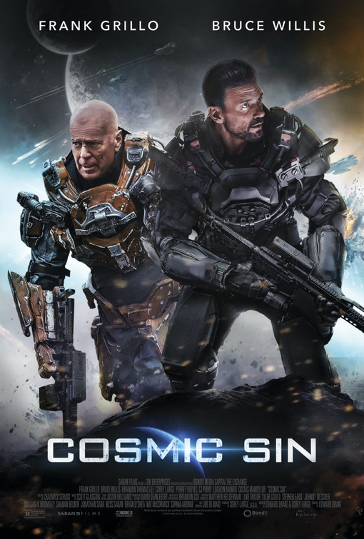
Dishonourable Mention: Cosmic Sin
Okay, the idea of Bruce Willis and Frank Grillo as a couple of space marines sounds fucking awesome, but the cheap, obvious, awful headswap Photoshop job on this poster makes this whole movie seem cheap and laughable. Not that Cosmic Sin needs much help, this movie is apparently so bad and forgettable that no one has even fixed the numerous grammatical errors in its Wikipedia page as of October 21, 2021. Ouch.
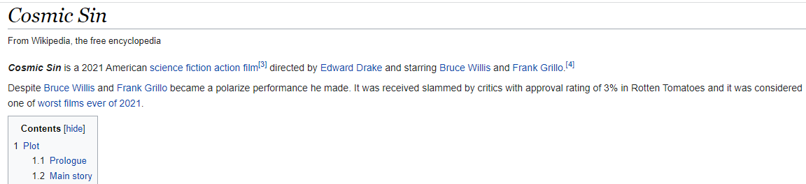
15) The French Dispatch
This one mostly makes the list because you take one look at it and go “Oh hey, it’s a Wes Anderson movie in poster form”. It’s quirky, detailed and has tons of stuff to look at, each cell is practically a miniature character poster of its own and the Fibonacci sequence-like layout directs your eyes in an unusual and interesting way. The pulpy, 30s/40s serial art style also helps this standout amongst the other posters of 2021 and no-doubt reflects Anderson’s distinct visual style and aesthetics. All-in-all, a unique and fun poster which undoubtedly reflects the film’s aesthetic as well.
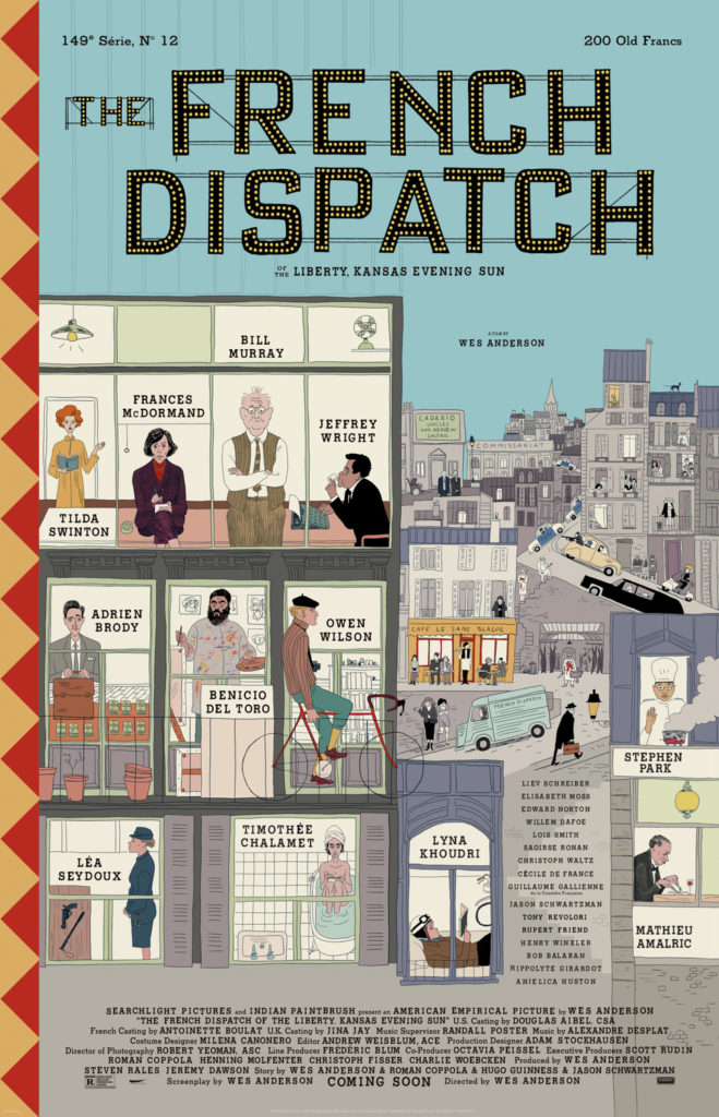
14) Spencer
This poster is very striking. Between the massive, elaborate outfit, the contrast between the dark and the light of the dress and Kristen Stewart’s flawless transformation into Princess Diana, there’s plenty to draw you in. What helps make this more than just a visually-appealing piece is that the design also belies the story’s darker elements, with Diana seemingly stifled, like she’s trapped in the opulence. It’s a true art piece in its own right and I’m curious if Spencer can live up to it.
http://www.impawards.com/2021/billie_eilish_the_worlds_a_little_blurry_xxlg.html 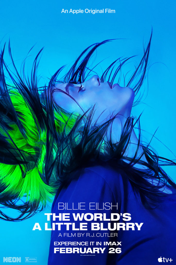
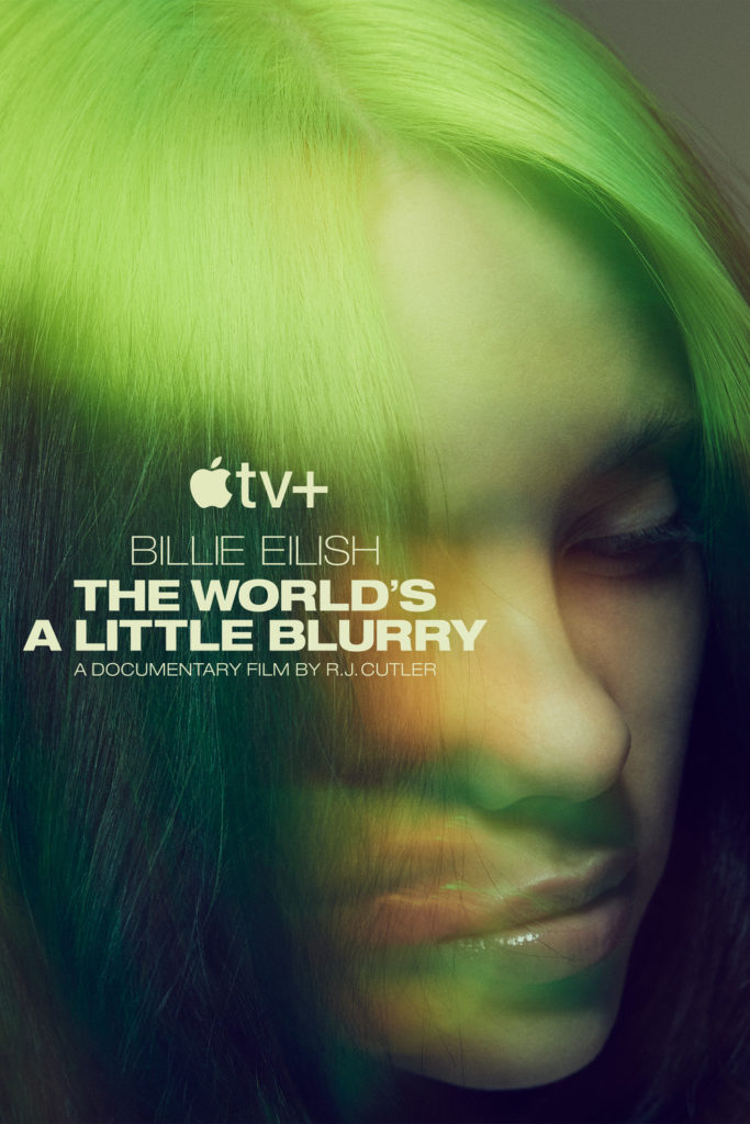
13) Billie Eilish: The World’s a Little Blurry
I’m not really a fan of pop music (shocker), so unsurprisingly I don’t give a shit about Billie Eilish and could care even less for an Apple TV exclusive documentary about her. However, it’s hard to deny that she doesn’t have her own distinct style, best highlighted in these posters for The World’s a Little Blurry. I like the first one mostly, it has a moody tone to it, Eilish’s signature green hair gives it a strong hue and it (obviously) lives up to the “blurry” part of the title. It reminds me of the Joker poster from 2019 that I liked so much. Like most good posters, the use of colour is very intentional, bringing its own tone, mood, style and even symbology to these posters which I can’t help but appreciate.
12) Prisoners of the Ghostland
While I find this poster very visually-arresting, promising me the trippiest samurai movie you’ve ever seen, there’s one small element that really makes me love this poster. I love how this poster draws your eyeline downward – first you see a samurai badass with his back to you, then the spooky mask, then the title and then “This wildest movie I’ve ever made”. Wow, who’s saying that? Nicholas goddamn Cage and for him that is a freaking declaration. The poster itself is cool but that strategically-placed quote gets my imagination racing, just going to show that every aspect of poster design can be crucial to its success. For that, Prisoners of the Ghostland deserves special commendation!
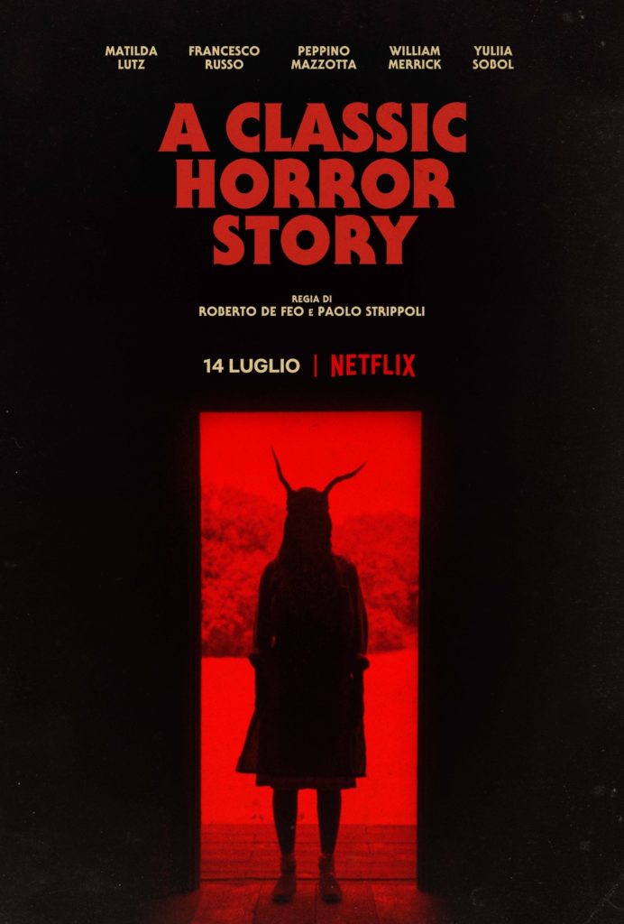
11) A Classic Horror Story
This one succeeds for a couple reasons. First of all, it’s called A Classic Horror Story and the poster design makes this look like… a classic 70s horror story. Secondly, if I saw that horned devil lady in my doorway, I’d be legitimately unsettled. The fact that it seems to be happening in full daylight just makes the whole thing even more unsettling to me, while the red and black colours give the whole thing a sinister vibe. Like I said, colour is very important in good poster design (a trend which you will likely notice going forward) and the use of it here helps contribute to the horrifying atmosphere that A Classic Horror Story is giving off.
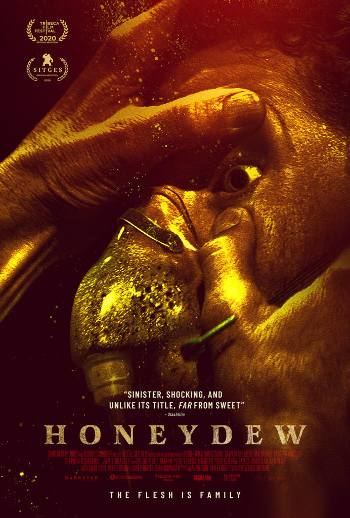
10) Honeydew
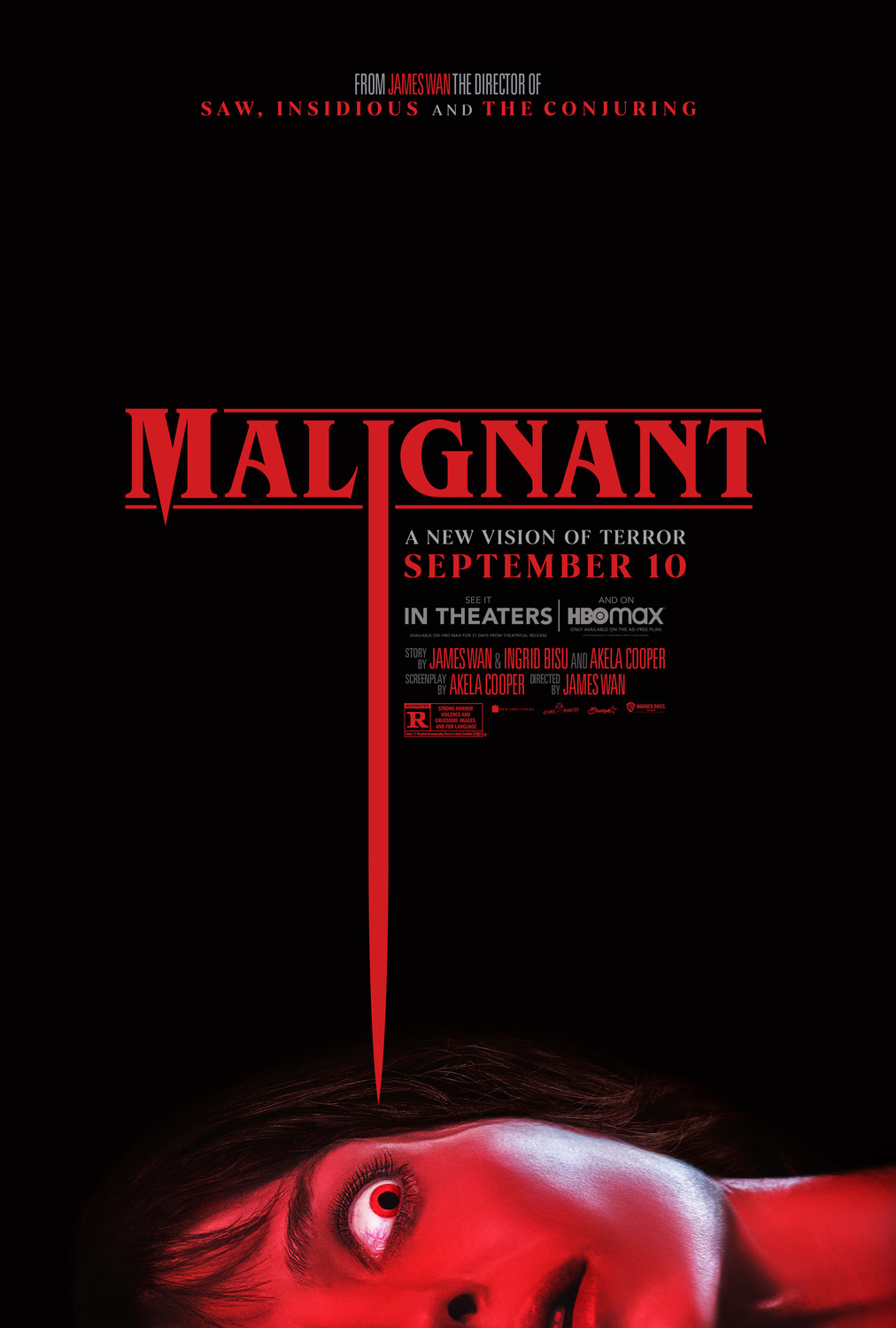
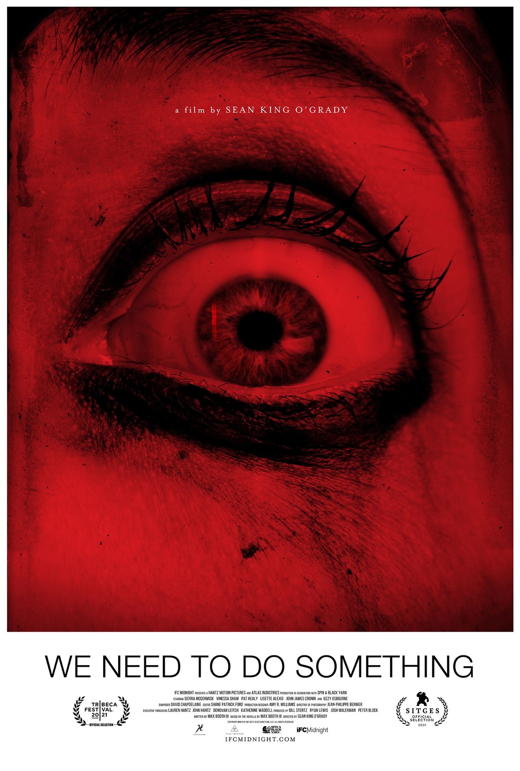
There are several horror posters this year that get by with their disturbing and unnerving imagery, including choices that just missed the list such as Malignant and We Need to Do Something. However, this poster for Honeydew is the most unsettling for me. I’m not entirely sure what is happening here, but it sure looks uncomfortable and you can see the fear in this guy’s eyes at whatever’s going on. It conjures images in my mind of some Saw-like trap and all the nastiness associated with that. The sickly, yellow hue over the entire poster just makes it feel even more disconcerting.
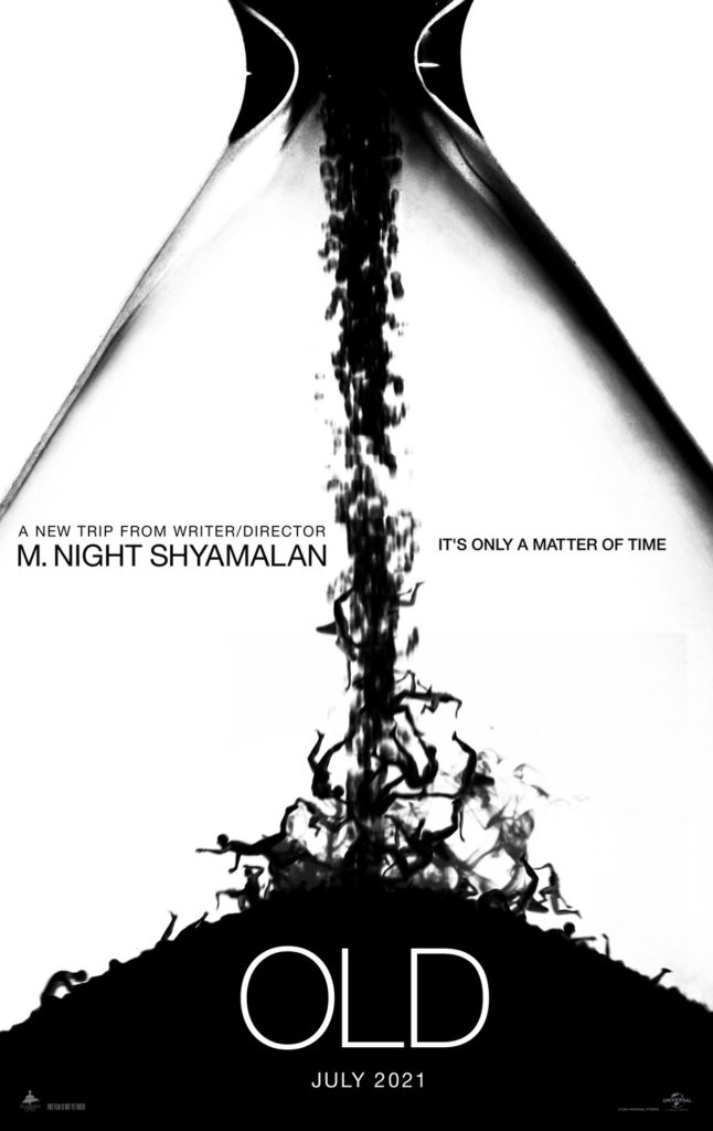
9) Old
This one is pretty simple but effective. While other posters for Old get across the idea that it takes place on a beach more, this one is far more interesting. In my opinion, it captures the concept of the inevitable, uncontrollable and even frightening passage of time and death very well, all wrapped up in a minimalist, black and white style that makes it striking to view.
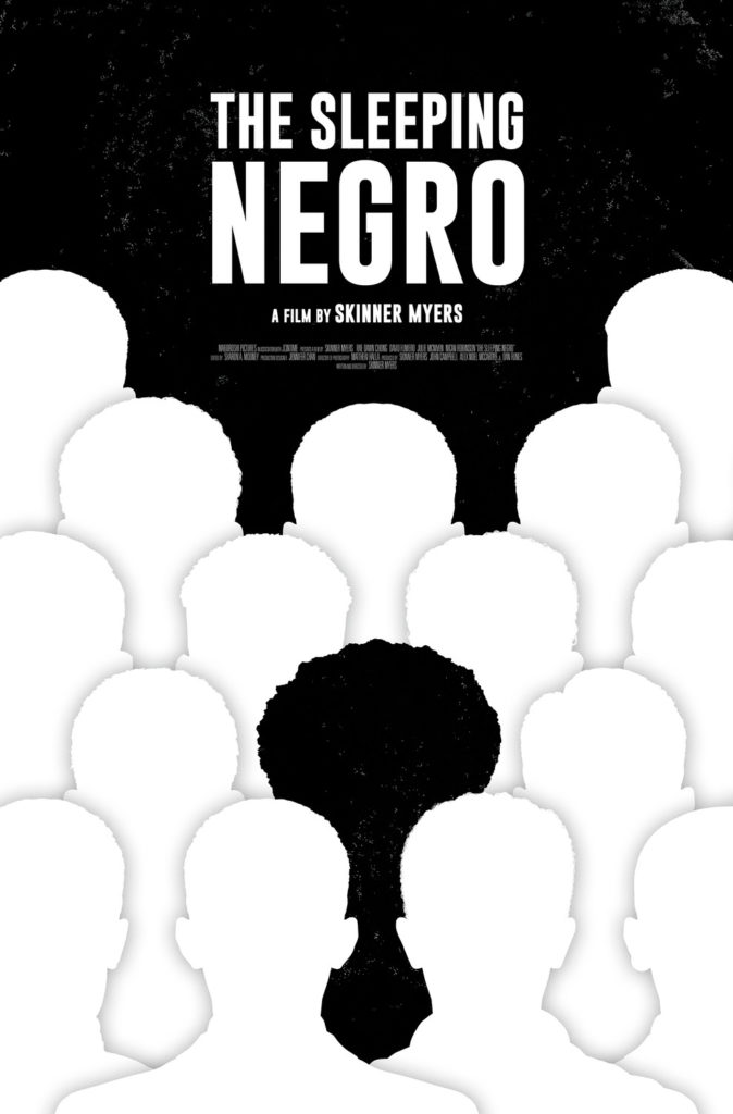
8) The Sleeping Negro
Oh and speaking of minimalist styles, while the poster for Old mostly just looks cool, this poster for The Sleeping Negro uses it to get across some pretty clever racial imagery. This poster deftly gets across the theme of alienation and isolation in this film in a very simple manner that makes it even more effective than if they had gone for something more complicated or less stylized. Hell, they could honestly go even more minimalist if they wanted to, cutting out the title completely, and the message would still be conveyed just as strongly, as even the black character’s afro highlights that he’s singled out because of his race. When you can afford to strip down your poster even more then you know the designers hit on something right.
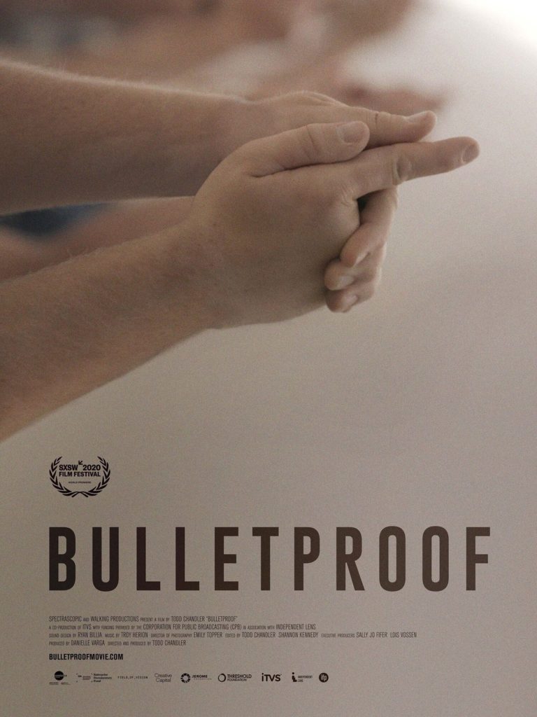
7) Bulletproof
This is another one of those posters where the imagery captures the ideas of the film in a really striking manner. Bulletproof is about the American response to school shootings and seeing children pointing finger guns at each other here is an eerie encapsulation of the topics this film will be exploring. Once again, the eyeline works perfectly – you see the finger guns, then you’re drawn down to the title and know what this movie is saying in chilling fashion.
http://www.impawards.com/2021/suicide_squad_ver2_xxlg.html 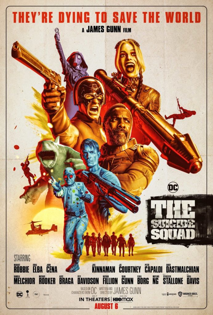
http://www.impawards.com/2021/suicide_squad_ver22_xlg.html
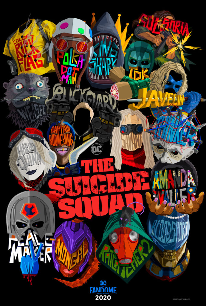
6) The Suicide Squad
The Suicide Squad has a huge cast of extremely colourful and varied characters and this first poster captures that aspect of the film and its off-kilter tone in glorious fashion. It also doesn’t give any of the characters more prominence than the others, which makes the characters’ fates in the film even more ambiguous (which is pretty important for a movie where, like, 80% of these characters get annihilated in gory fashion). The second poster captures the feel of a pulpy, 60s-era action movie, which isn’t nearly as interesting but it it’s worth highlighting and contrasting it to the first poster. These are very different styles but they both work to capture the fun of this very enjoyable romp of a film.
http://www.impawards.com/2021/green_knight_ver6_xxlg.html 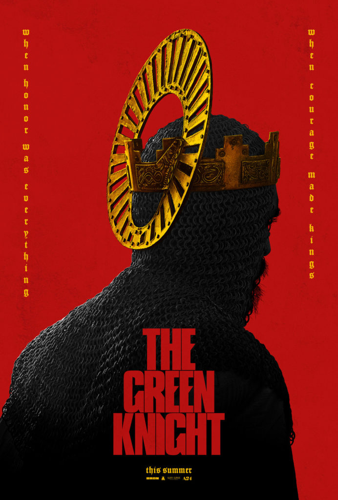
http://www.impawards.com/2021/green_knight_xxlg.html
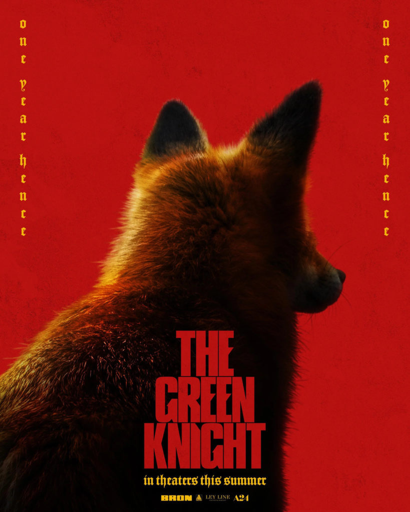
5) The Green Knight
I love the use of bright red and gold and the subjects facing away from the camera across The Green Knight‘s posters, it gives them all a unifying, sombre tone. While the main theatrical poster would have made this list regardless due to its strong aesthetic, what really pushed this into the top five for me was the presence of that brilliantly huggable foxy boi. When I first saw that poster I squealed with glee. For the record, graphic designers, throw a fox on your poster and you’re pretty much guaranteed to make my top 15 if your poster is any good.
http://www.impawards.com/2021/godzilla_vs_kong.html 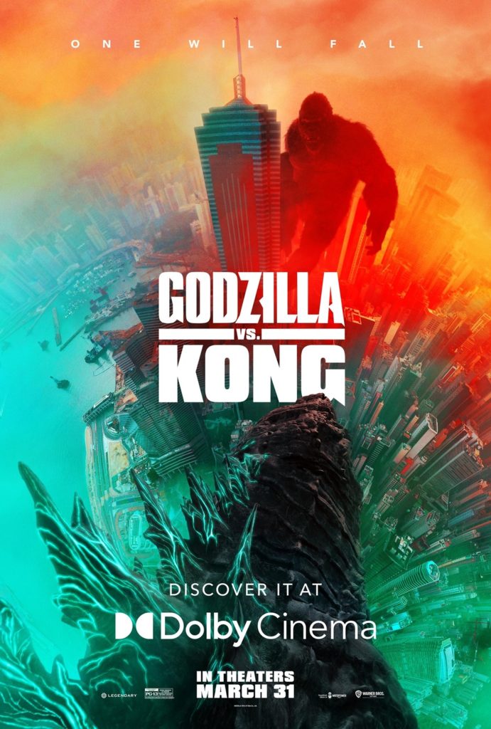
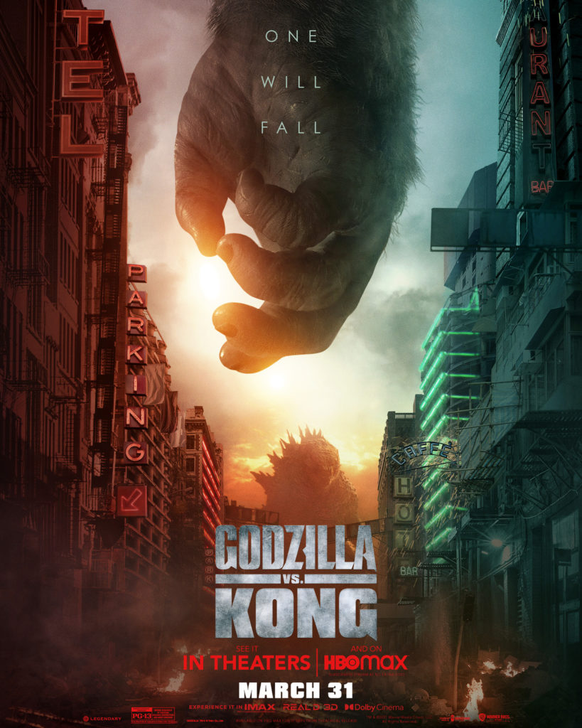
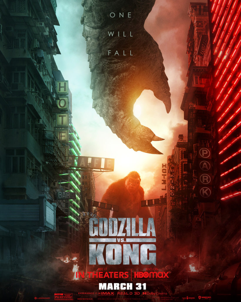
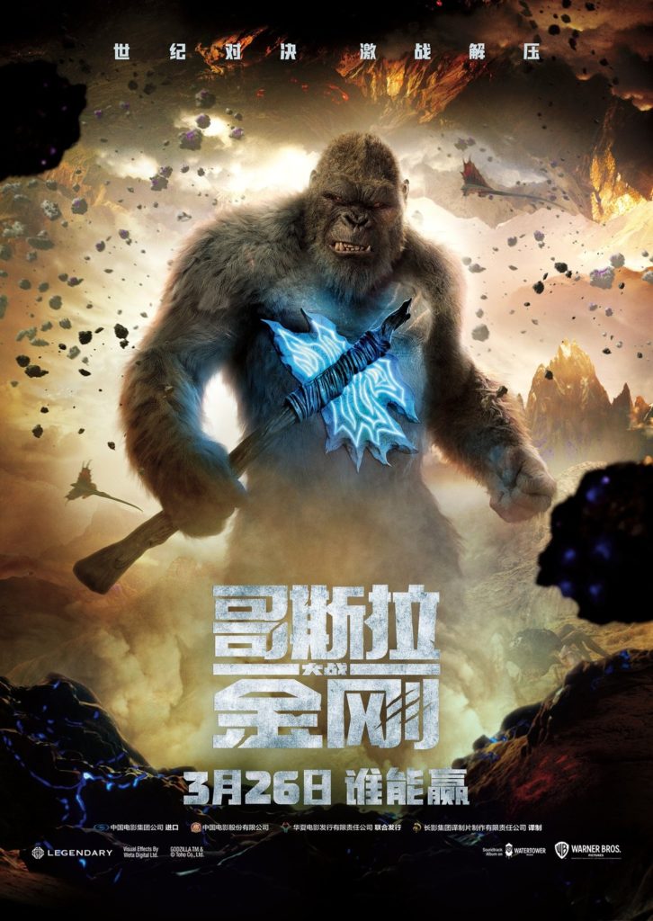
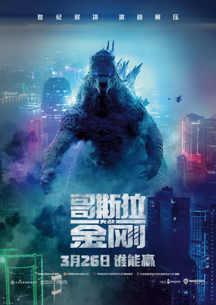
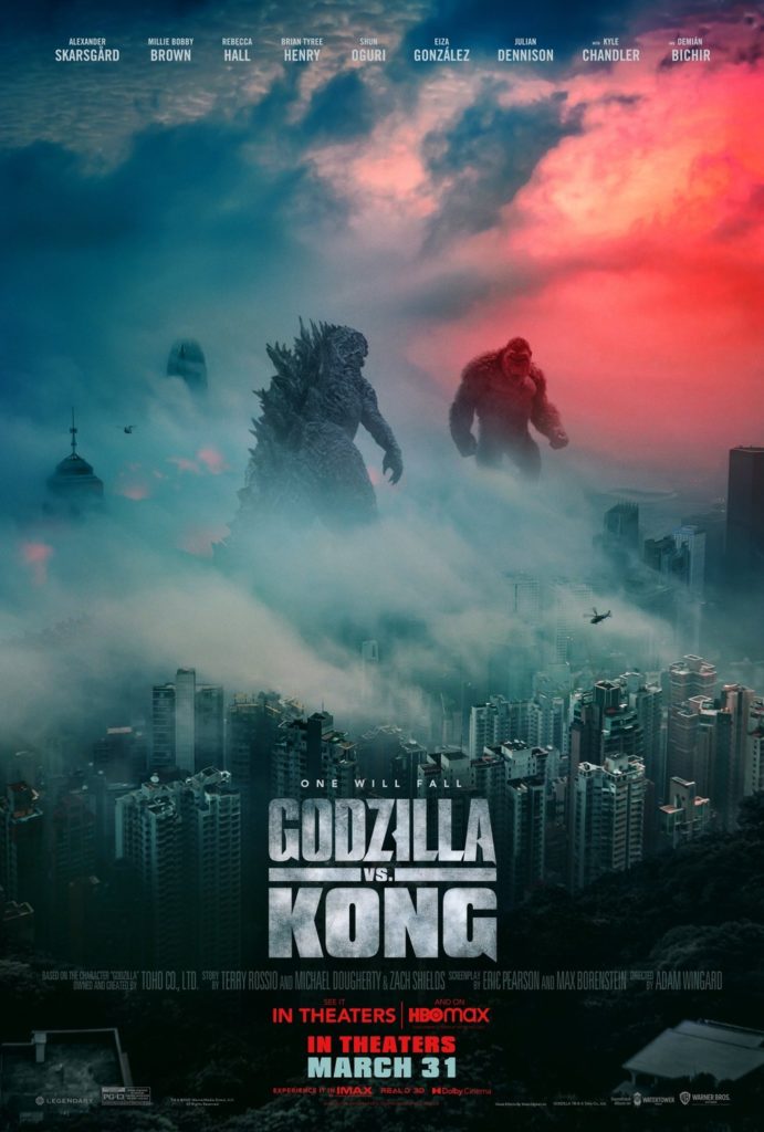
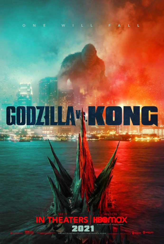
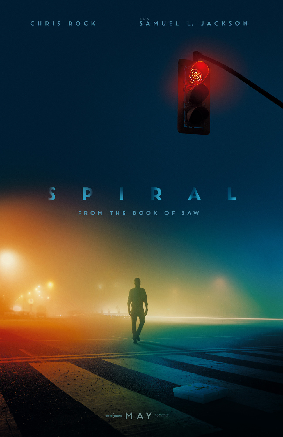
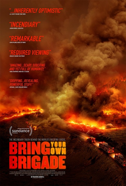
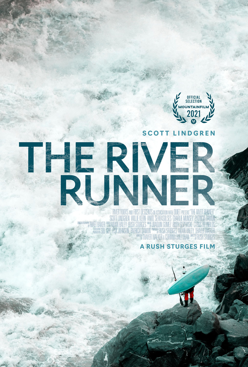
4) Godzilla vs. Kong
I’ve said it before and I’ll say it again, the Monsterverse consistently have some of the best posters of all Hollywood blockbusters. We get posters like Spiral which are pretty and posters like Bring Your Own Brigade and The River Runner which give you massive scale, but Godzilla vs. Kong gives you pretty colours and massive scale! The fact that they have so many cool posters and so many of these were actually used in the general marketing of the film make this even more impressive to me. Even if Godzilla vs. Kong was kinda disappointing, there’s no denying that the marketing was, once again, on point.
http://www.impawards.com/2021/army_of_the_dead.html 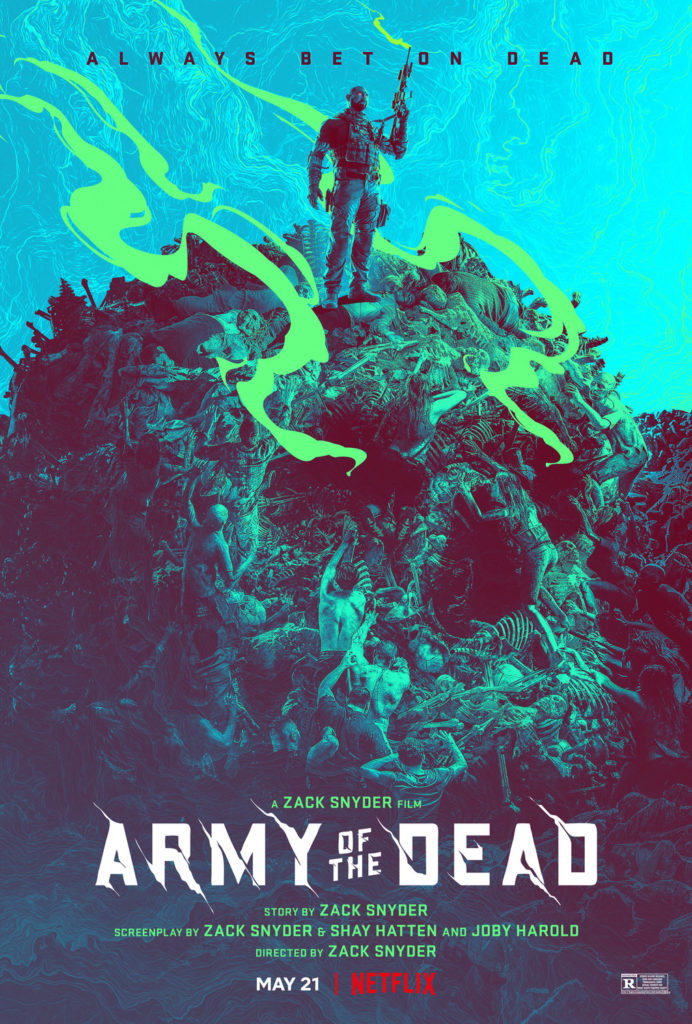
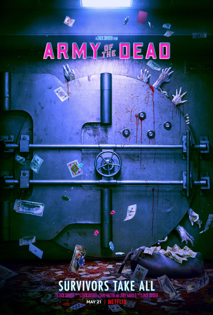
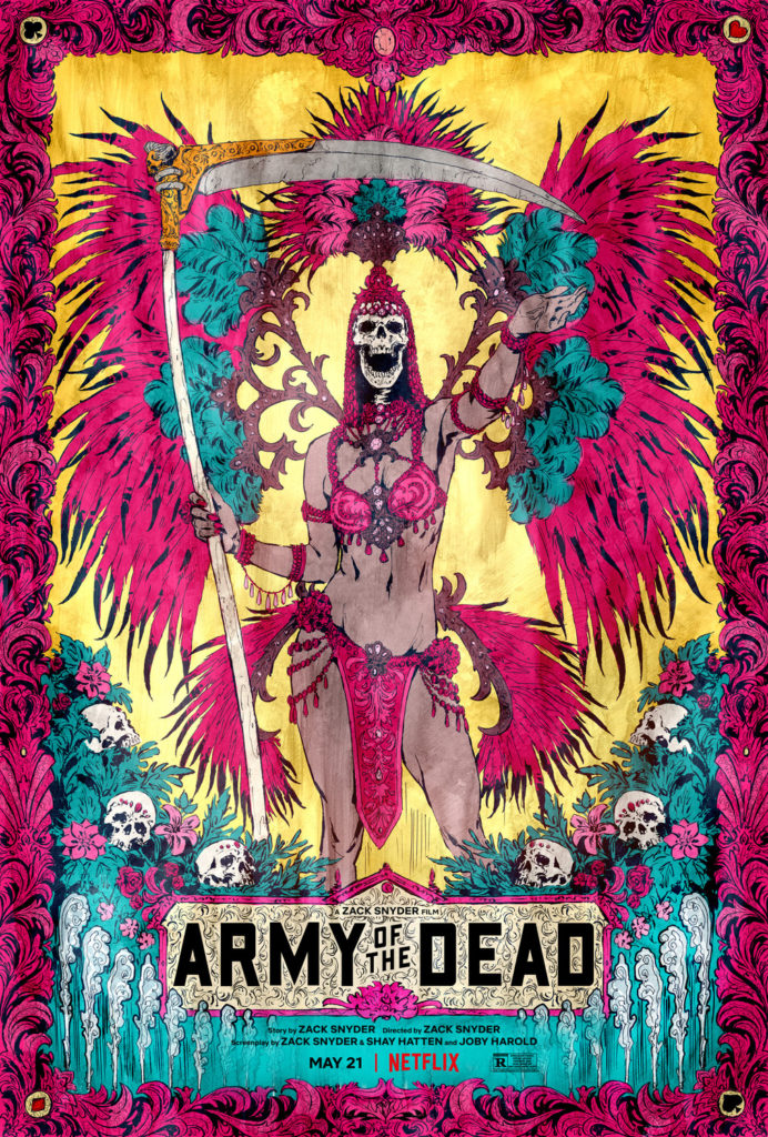
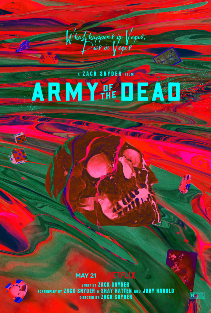
3) Army of the Dead
I didn’t really care for Army of the Dead – I thought it was bloated, poorly written and squandered what should have been an over-the-top action romp. While the film itself fell short, the marketing department for Army of the Dead clearly understood what this movie should have been. We get gorgeous poster after gorgeous poster of colourful, macabre excess, all of which make the film look way cooler than it actually is. This is just a handful of the great posters Army of the Dead got this year, so even if the quality wasn’t there (which it is) then due to pure variety this would have ranked highly. For my own part, I especially like the neon-hued skull in a river of paint and the pile of corpses in the shape of a skull. Man, seeing these posters is making me think about how I wish the movie lived up to them all over again…
http://www.impawards.com/2021/night_house_xxlg.html 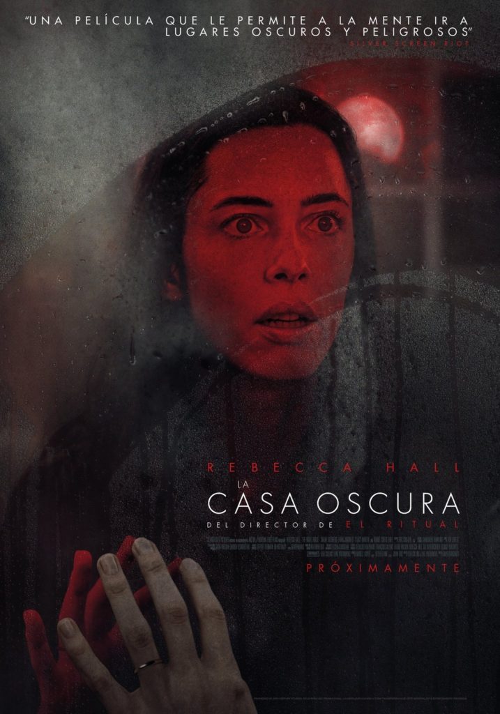
http://www.impawards.com/2021/night_house_ver3_xxlg.html
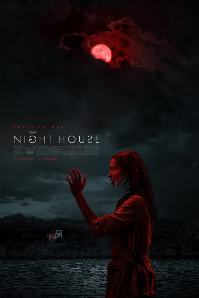
2) The Night House
We’ve had a slew of spooky and disturbing horror movie posters in 2021, but for my money The Night House has the best of them. What makes it more impressive is that there isn’t much horror imagery to speak of – there’s a blood-red moon, a scared expression from Rebecca Hall and, in one poster, a ghostly hand cutout, representing a spectral figure or perhaps someone who’s been lost? Then there’s the strong use of red and black to give everything an eerie atmosphere. In any case, it works, I really want to see this movie and figure out what sort of thrills The Night House has in store for me, which makes it more than worthy of this spot. However, there can only be one #1 pick…
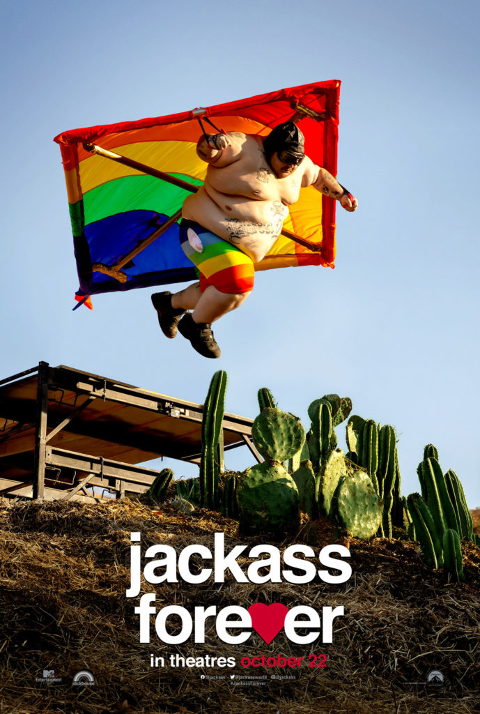
1) Jackass Forever
There’s something about this poster where I looked at it and said “this is perfect” and instantly put it as a frontrunner for the year’s posters. Like, just look at it, it’s the perfect encapsulation of what Jackass is. You’ve got the rainbow hang glider and obese man to draw your attention and then the eyeline goes down to the cactus plants and then down to the film’s title. Just by looking at it, it creates a story in your head that is equal parts funny, painful and so incredibly stupid that I can’t help but applaud it. It’s so simple, but so striking that I still can’t quite believe that it’s this good, especially because the other Jackass Forever posters don’t hit me the same way at all. Don’t let anyone tell you otherwise though, this right here: this is art.
POST-SCRIPT: Well, shit. I usually have a rule here – only posters for movies released in the year in question are considered and here I have completely flubbed as Jackass Forever is going to be released in 2022 instead. To be fair, when I started this list it actually would have been a 2021 film, but it was delayed and I missed that in the time it took to make selections, write and release the list. This isn’t the first time I’ve had this issue due to unexpected delays, but it should probably go without saying that I’ll not take Jackass Forever into account for 2022’s list (because it would probably win again).