15 Best Movie Posters of 2019

Welcome back to the annual, year-end countdown of the best movie posters of the year! And just like that, this is now officially an annual thing! I’ve been browsing impawards throughout the year, keeping an eye out for eye-catching, interesting posters and saving them for later. Suffice to say, I had a bunch of posters to sift through and narrowing this down to a top 15 was difficult (not least of all because new posters are released all the time so I couldn’t even begin to narrow the list down until the start of September). Also, starting this year I’m going to be giving extra consideration towards posters which are actually intended for mass distribution rather than posters which are intended to be artistic but very limited in their reach. I mean, this Dark Phoenix poster is really cool, but it’s also clearly a poster you’re never going to see if you go to a theatre. I’m still going to consider these kinds of posters if they’re really good, but I find it more impressive when a poster which is meant to sell general audiences on the film does something particularly artistic or interesting.

Anyway, with those considerations out of the way, let’s get onto the list! As usual, you can see the full-sized poster in all its glory if you click on the images.

Honourable Mentions

While Disney absolutely destroyed the competition at the box office this year, their posters were, by and large, very mediocre and lifeless. This poster for Frozen II was one of the few exceptions, with its interesting use of colour and reflections hinting at the plot and feel of the film. It ultimately just missed the list, but it was definitely worth mentioning.

This is another entry which could have easily made the list if the competition wasn’t quite so fierce. It’s got such a creepy design already and then as your eye gets drawn upwards you realize that the trees have been arranged in such a way that they spell “FEED”. I like this poster a lot, it looks way better than a gritty, Grimms fairy tale adaptation should.

Having seen Us, I like this poster quite a bit with its minimalist design resembling a Rorschach blot, but with the right side missing bits which hint at the film’s psycho doppelganger premise. It gets across the idea of the film very well, but I feel like it’s just a bit too subtle to really be appreciated unless you’ve actually seen the film first.

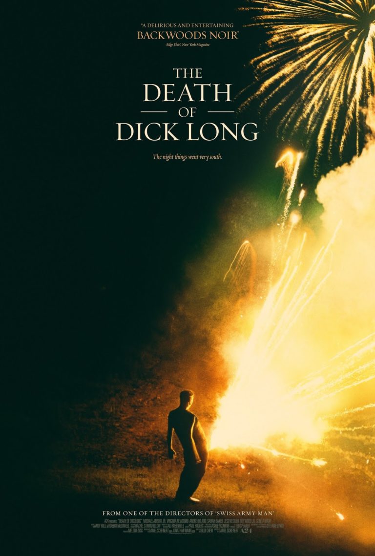
15) The Death of Dick Long

This is one of those posters where I have no idea what the film is actually supposed to be about, but it kind of makes me want to see the movie regardless. As I’ve said in previous best posters of the year countdowns, that’s ultimately the goal of a movie poster, so it’s worth some points in my book. On top of that, this poster is just eye-catching with its use of harsh, contrasting lighting and muted colours… and then you notice that the fireworks are coming from the guy’s freaking crotch. And then you notice the title is called The Death of Dick Long, and that it’s from one of the directors of Swiss Army Man. Yeah, it’s going to be weird as all hell, but intriguingly so. That said, I could have very easily skipped over this one if the poster wasn’t so eye-catching so I’d say that this is well-deserving of a spot in the Top 15.

14) Low Tide

Every best movie posters countdown needs a poster which is just a beautiful, “artistic” shot and Low Tide takes that spot for me this year. It really isn’t much more than an extremely well-composed photo and a cleverly integrated title using a reversed gradient, but that’s all it really needs to be. Low Tide‘s poster is so beautiful it makes your eyes water, suggesting that you’re in for a gorgeous treat if you watch it. In addition, its use of colour and gradients also implies a dangerous tone for the movie without really having to overtly spell it out. A great poster all-round, and that fact that it is only in at #14 just shows how impressive posters have been in 2019.

13) Hail Satan?

This poster is just so clever. It’s appropriately interesting, informative and inflammatory in equal measure. Most Americans (especially evangelicals) are uninformed about the Satanic temple and have a knee-jerk opposition to them, but that is exactly how they get awareness to their admittedly worthy causes. Usually, if you hear about Satanists in the news, it’s because they’re fighting for religious equality – after all, if an evangelical is okay to do something, a Satanist should be able to do an equivalent action, right? That idea gets across perfectly in this poster, with the image of the Statue of Liberty as Baphomet as a striking visual that is guaranteed to trigger evangelicals. Oh and it also has one of the best taglines of the year, which just manages to put this over Low Tide as far as I’m concerned. I love it.

12) Bliss

This is definitely the poster I’ve mulled over the most on this list. At first glance, the colour choices make it very ugly to look at and unappealing. However, the longer you look at it, the more intriguing it is. For one thing, the ugliness is clearly intentional and is meant to be at odds with the title, Bliss, which is usually associated with bright, cheerful colours. If you look closer you can pick out all sorts of unsettling details – screaming, disembodied mouths, blood dripping off the woman’s face, and piles of reaching, naked bodies scrambling over each other. The longer you look at it, the more unsettling things you begin to notice and the more intriguing Bliss becomes to me. Also, it’s worth mentioning that the hand-painted art help make this stand out a bit more compared to all the photoshopped posters of its contemporaries. All-in-all, when I was narrowing down this list to just a top 15, I had considered dropping Bliss on a number of occasions because of its surface-level ugliness, but I’m now confident that it really deserves a spot here due to its bold and evocative design.

11) The Ghost Who Walks

Again we have another poster which is, by itself, super intriguing. We’ve got what appears to be a very zoomed out, birds-eye shot of Santa Claus in an alleyway being escorted or robbed by a pair of men – whatever the scenario is, they don’t seem to be doing him a favour anyway. The story the poster tells is enough to make you go “WTF?”, but what really puts it over the top is the very clever composition and framing of the image and the way that the title has been integrated into the shot. It doesn’t really give you any information about the film’s story beyond a tone, but it’s fascinating enough that I can see it selling someone on the film by itself.

10) Pet Sematary

There’s no movie in 2019 that I wanted to love more than Pet Samatary, but good God the film was so mediocre that I can’t even be charitable to it. Oh well, at least we have this awesome poster that’s forever going to get my imagination going for a movie better than what we got. I love the way colour has been mostly drained from the poster. The use of black and white tones makes for great contrast and allow the bits of gold in Church’s eyes and the red in the title to stand out all the more. It’s all put together in such a creepy manner, from the great, shadowy shots of the main cast (especially the look of dread on Amy Seimetz’s face and the nearly skeletal-looking Jason Clarke), to the scary, masked children, to Church’s glower hanging over everyone. It uses the Drew Struzan style in an interesting way, is just striking and original in its own right, and ultimately does a better job of selling the film’s premise than the actual movie did. Sigh, sometimes print is better.

9) Once Upon a Time… In Hollywood

Tarantino’s latest kind of had to make this list. Sure, it’s not exactly the flashiest poster of the year, but it captures the aesthetic of 1960s film posters perfectly. The hand-drawn style, the vignettes of moments from the film, the way that the cast is shown off, even down to the way that the credits are listed – it’s perfect. Considering that that’s clearly the intent here, it would feel wrong for me not to recognize it on this list.

8) Child’s Play

Speaking of posters that, on their own, aren’t all that flashy… holy crap, Childs Play just goes bonkers. If you’re not aware, the Child’s Play remake/reboot went head-to-head with freaking Toy Story 4, and the marketing department were eager to make the most of this with this bonkers poster that takes the aesthetic from Toy Story 4‘s own marketing and uses it to make a freaking statement. There were a few posters in this Chucky murders Toy Story series, but the one with Woody’s arm and hat was the most striking, in my opinion. It reminds me of those posters for You’re Next a few years ago which had a killer hiding in the “reflection”. I just love how cheeky, bold and clever this poster design is and can only imagine how hard Bob Iger must have shit himself when he saw it for the first time.

7) Joker

Hoo boy, if there’s one movie we didn’t need in 2019, it’s probably a sympathetic, mass killer origin story for Joker for all the incels to admire… That said, this poster does a great job of conveying the idea without making him into someone we’re meant to feel sorry for. There’s such a creepy vibe here with the idea of a psychotic person who can’t smile without physically forcing himself. The awfulness of this is further reinforced by the paint-drop tear, the sickly colour palette and the disturbing extreme close-up which shows off all the strained emotion on Joker’s face. It’s a very well-composed image that gets across the idea of the film perfectly… arguably better than the actual film does, in some ways.

6) The Unborn

What. The. FUCK. IS THAT!?!?!! Okay, I’m sold on this movie already – I don’t know what the hell it’s about, but this poster is straight-up disturbing shit. It has such a disgustingly creepy vibe to it with little more than a shadowy mutant baby in a jar backlit by what looks like a hundred year old light bulb. It’s horrifying and, while I’m certain the movie can’t hope to live up to the sick shit running through my head when I look at this poster, it makes me want to find out what the hell this movie is all about. Sign me the hell up.

5) Detective Pikachu

Okay, obviously I’m a Pokemaniac, so I’m kind of biased on this one. That said, this is a dense poster packed with all sorts of subtle Easter eggs and plot hints that are enough to make a Pokemaniac like me jizz their pants. Seriously, whoever designed this poster clearly loves Pokemon and packed nearly every inch of it with obscure references to the games’ universe. Even if you don’t get the nerdy references, the Easter eggs still do the job of making the world of Ryme City appear lived-in and bustling, inviting you to pour over all the details that have been hidden in it. As a result, I’ve probably sunk more time into this one poster than I have on all the other posters on this list, combined. That by itself is an accomplishment worthy of some appreciation, which is why Detective Pikachu ranks so high on this list.

4) Aladdin

Perhaps mirroring their creative bankruptcy for most of the year, Disney’s poster output in 2019 has been unfortunately mediocre. Even Endgame didn’t have any particularly interesting posters, so imagine my surprise when I finally found a visually arresting poster for a Disney movie: the live-action AladdinAladdin was a mostly-mediocre and over-stuffed film, but it did have its charms thanks largely to the performances from the three main leads, especially Will Smith. Thankfully, they’re all on display in this gorgeous poster which uses the white background and expert use of a red and blue to draw your eye and tell a particular story. Your eye is naturally going to be drawn to Will Smith’s genie first, then down to Jafar and Jasmine, then down to Aladdin, then down to Abu jumping into the lamp before you reach the title. It’s such a cool and clearly-intentional trick, using the space of the poster itself to great effect to direct the viewer in an unnatural upper-right to lower-left line. That’s impressive on its own, but the fact that the poster itself is just gorgeous-looking easily cemented this as one of my absolute favourite posters of 2019.

3) Glass

Glass was, in a lot of ways, a colossal disappointment which threw the nascent Shyamalan resurgence back into disarray. There are a number of reasons for this, but probably the most pertinent is that Glass represents so much wasted potential. We can see some of that potential here in this poster, which captures the essence of a climactic superhero story in such a beautiful way. Each broken piece of glass shows off characters painted in a comic-book art style, interspersed with actual comic art created for the films itself. It’s enthralling to look at, packed with strong emotions for each of the characters and can’t help but feel evocative to for anyone who appreciates comic book storytelling.

Also worth mentioning is this other poster which creates a portrait of Mr. Glass out of literal shards of broken glass. It’s not nearly as striking as the above poster of course, but it is quite interesting in its own right, especially for a “character poster”, which usually just comes across as a boring, requisite marketing piece.

2) John Wick: Chapter 3 – Parabellum

There were ultimately only two films on this list which were duking it out for the top spot, and I have to say that John Wick: Chapter 3 only just barely lost out on it. I mean, just look at this poster, it is exquisite! I would hang this on my wall in a heartbeat. The neon-soaked colour palette is simultaneously arresting to look at and a perfect representation of the aesthetic of John Wick, while the harsh metals and skull imagery convey the feel of the series. There really isn’t much more to it than that – it’s just a poster so cool that it just plows its way to the runner-up position of this year’s posters.

Oh, also worth mentioning is the poster on the right, featuring John Wick versus hundreds of assassins. This gets across the tone and sort of odds that ol’ John is in for in the film in such a striking and frankly funny fashion. It isn’t quite as visually-arresting as the above poster, but it is definitely worth mentioning in its own right.

Which brings us to our #1 spot for 2019…

1) Godzilla: King of the Monsters

 If there’s one film whose marketing department absolutely killed it this year, it’s definitely Godzilla: King of the Monsters‘. To put it simply, every single poster for this film is simultaneously visually beautiful and totally kick-ass (as if this were an action movie starring Emily Blunt and Charlize Theron). Unlike a lot of blockbusters, even the regular theatrical posters have a level of creative artistic merit to them which is usually reserved for more specialized posters (presumably for fear of alienating the mass audience with a poster that’s not aimed at the lowest common demoninator). When you consider that the beautiful shots in these posters are also just being indicative of the cinematography of the film itself, it just makes the marketing for this film even more impressive. Godzilla: King of the Monsters may have been a bit bloated and underwhelming on its own merits, but holy crap if the film’s marketing department didn’t go all-out this year. Here’s hoping that next year’s Godzilla vs. Kong continues this trend, because if it does then we are in for an absolute treat.