It’s mid-December, so that means another count-down of my favourite movie posters of the past year! In case you’re unfamiliar with how this works, I spend the year trolling through impawards and collecting all the really cool, interesting and striking poster designs for movies that were released in 2025* and then narrow them down into a shortlist.
Some quick rules for how these rankings work:
- Posters are judged based on artistic merit, composition, and subjective preference. Do not take this to be an objective ranking of the year’s posters, if you disagree with my picks then feel free to leave a comment and/or make your own list.
- Any of the year’s film posters are eligible to make the list, but special consideration is given to posters which are intended for mass marketing, rather than alternate, limited-run posters. These kinds of posters are often more “artistic” and creative than standard marketing materials, but they’re not really meant to mass-market the movie, so I find them significantly less-impressive than a good set of posters that you could realistically encounter in public.
- In order to be eligible for this year’s list, the film in question had to actually get released this year. That can be a limited release, wide release, straight to streaming, etc.
- If a film had a limited release in a prior year and is now getting a wide release this year, or it ends up getting delayed, I will count it towards this year’s list if it did not make it onto a prior year’s list (I call this the Jackass rule).
Anyway, with those considerations out of the way, let’s get onto the list, starting with some honourable and dishonourable mentions:
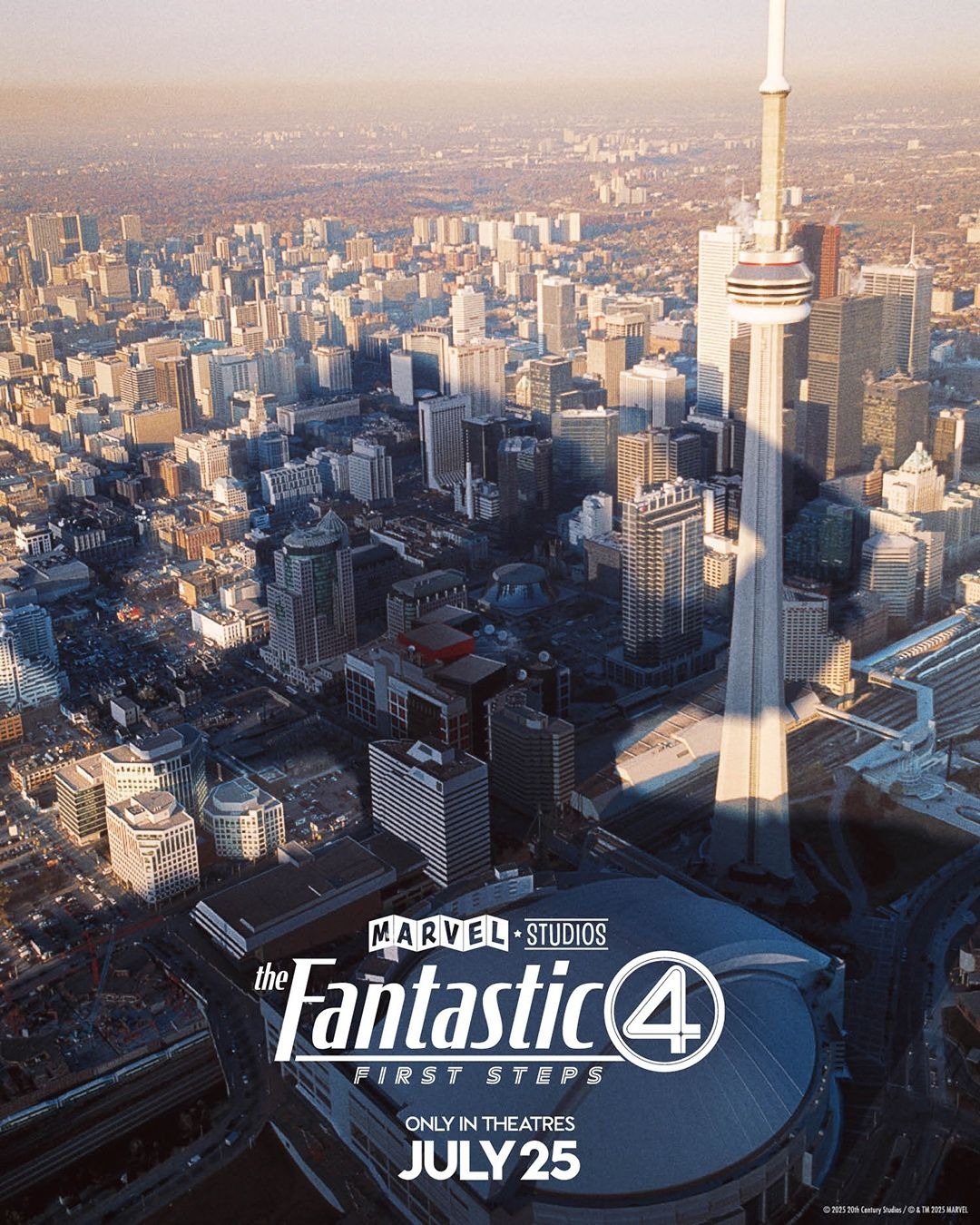
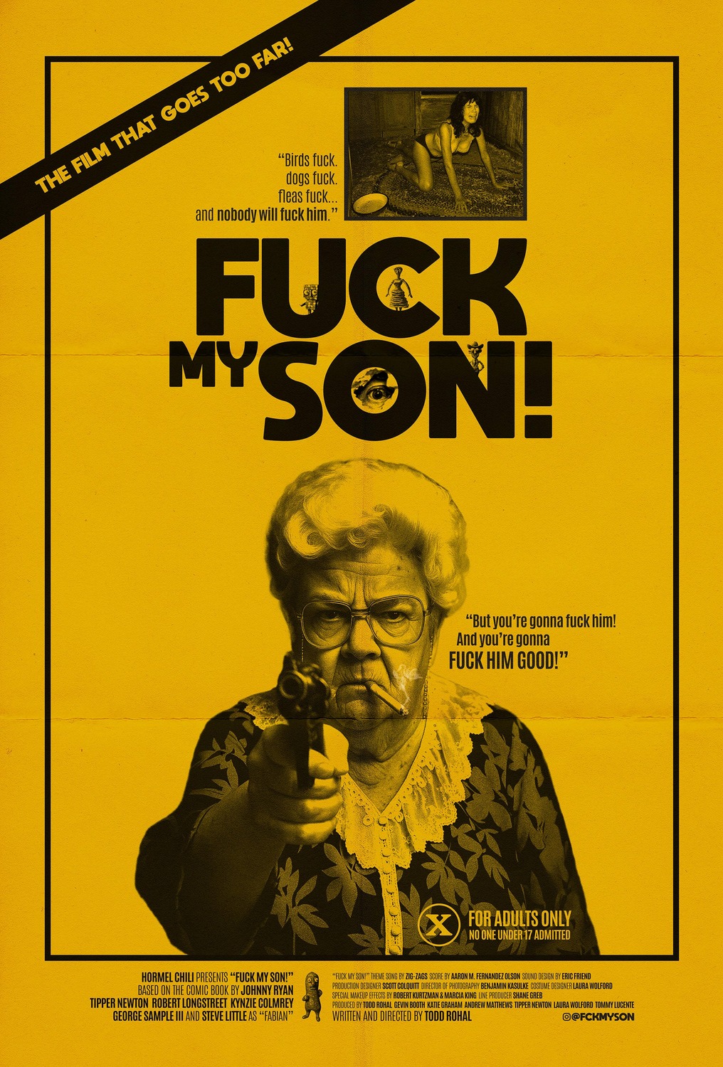
For our honourable mentions, we’ve got The Fantastic Four: First Steps and Fuck my Son! with some pretty interesting designs which weren’t quite good enough to make the list proper. For Fantastic Four, I really appreciated their series of alternate poster designs which were tailored to several major cities around the world and showed Galactus’ shadow looming over them. This is such a clever way to show the scale and threat present in the film and add a bit of personality, I love it. As for Fuck My Son!, I struggle to say that this is a good poster, but it gets across the grimy, tasteless, grindhouse tone perfectly and the taglines are fucking hilarious. It may not be good enough for the list proper, but I couldn’t let it go without a mention.
Oh, speaking of mentions, here are our dishonourable mentions of the year…
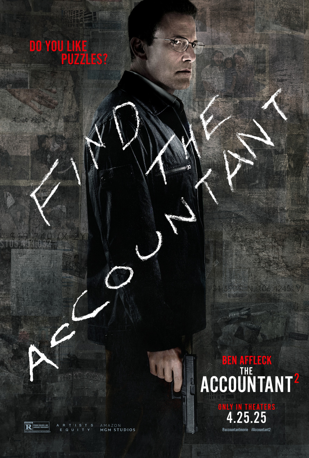
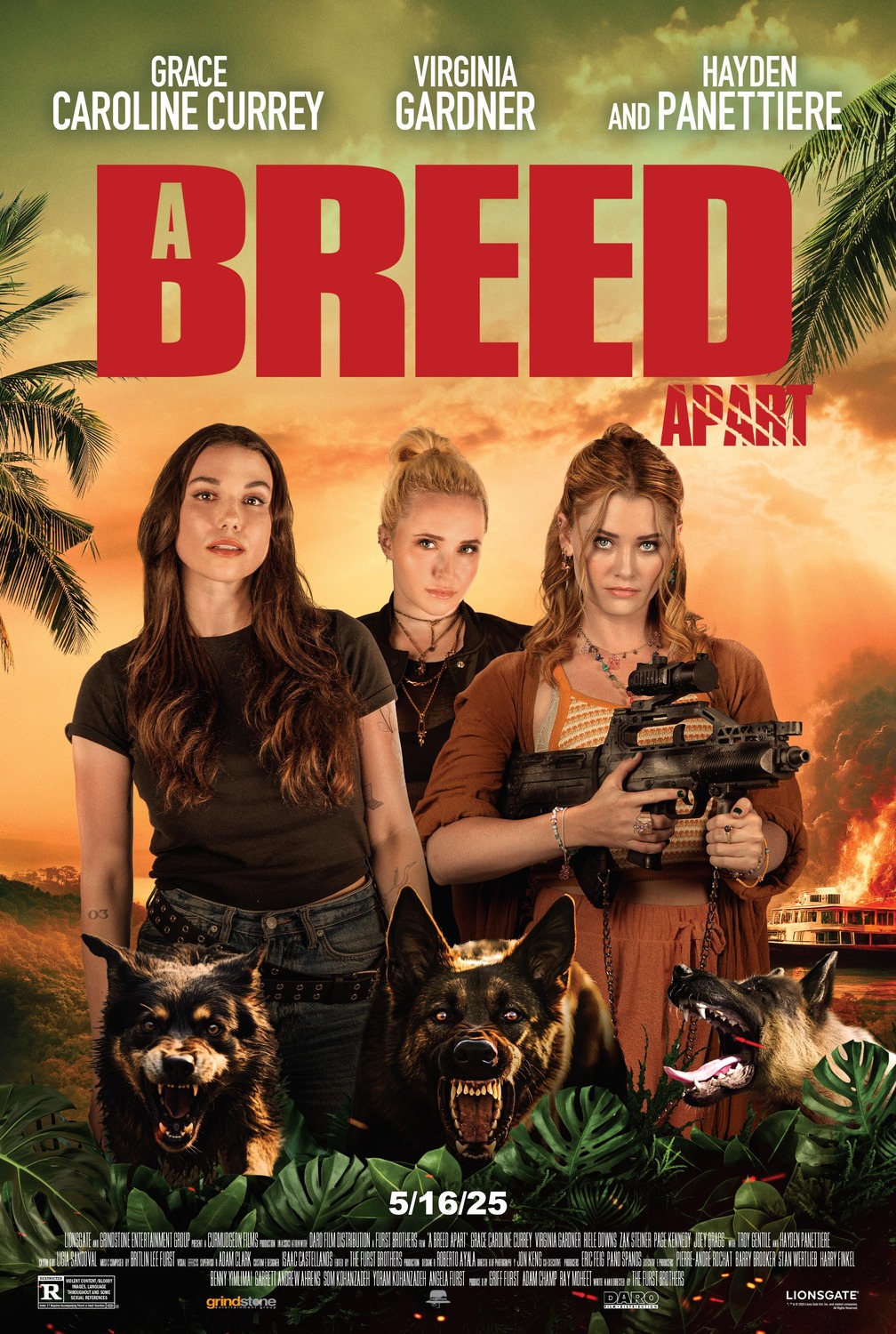
OOF. The poster for The Accountant 2 has to be one of the worst big-budget film posters I’ve ever seen. Poor Ben Affleck looks like he’s had the life drained right out of him, and I legitimately cannot tell if they badly photoshopped his face onto someone else’s body, or if the colour saturation has just been drained out of the image that badly. As for A Breed Apart… I mean, just look at it. It looks like a C+-grade high school media arts project, not a movie starring Hollywood actress Hayden Panettiere.
And with that said, let’s get into our top 15 proper:
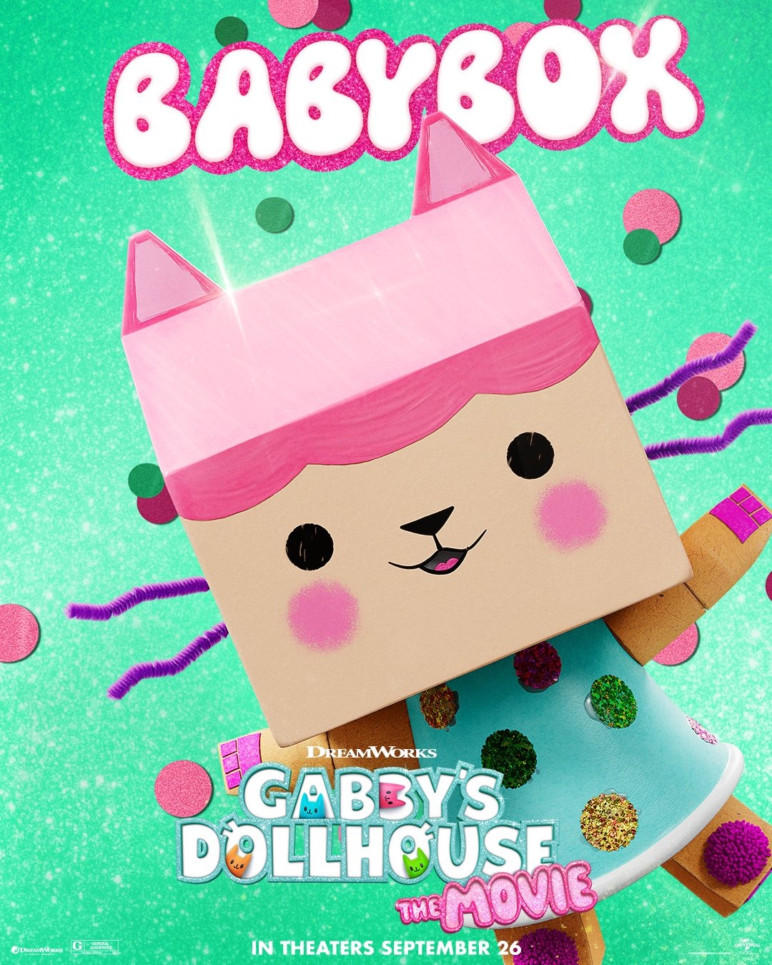
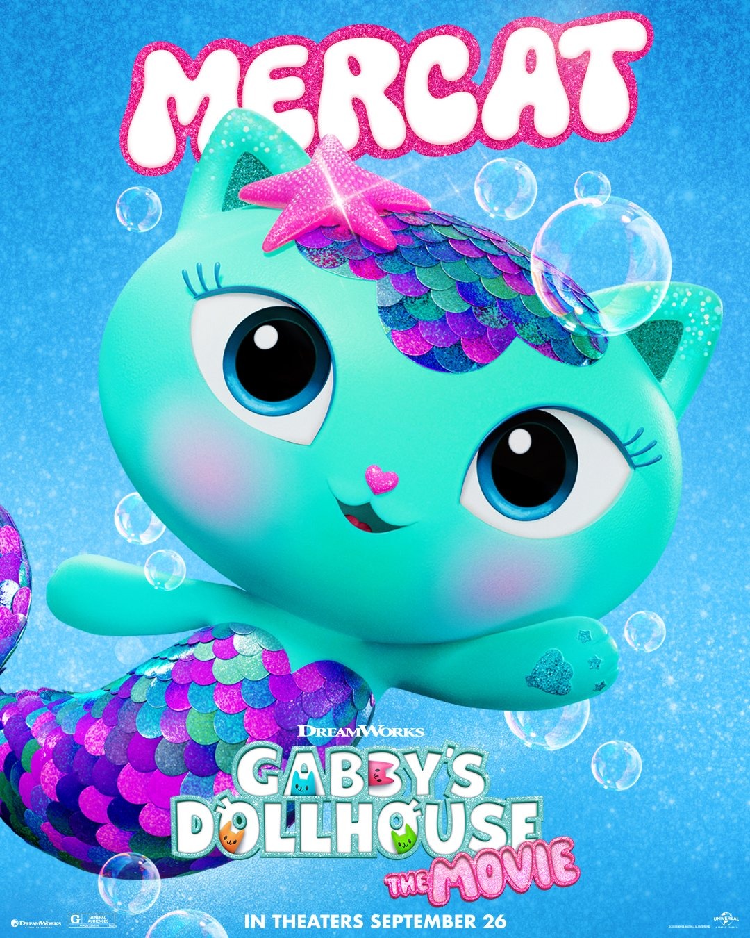
15) Gabby’s Dollhouse: The Movie
My daughter is really into Gabby’s Dollhouse, so of course we went and saw the movie (her first full cinema experience after an aborted attempt to watch Superman with her a couple months earlier!). As a result, there’s probably some bias here on my part… but, damn, DreamWorks have really nailed the character designs, eh? Every year I do these rankings, I see these tentpole releases putting out “character posters”: basically just a series of posters which are meant to introduce the audience to individual characters from the films. Usually these really suck, hence why they never make the list: like, cool, why should I care who Bob the Fisherman is, I know nothing about the movie he’s in or why he’s important. However, even if you know nothing about Gabby’s Dollhouse, just look at these posters: the characters in the show have very distinctive and differing art styles which makes them all really appealing. Honestly, for a movie like Gabby’s Dollhouse, these character posters are the main marketing, as they show off how well-designed and fun all of the characters are. Again, I’m sure there’s some bias talking here, but I’ve seen so many character posters over the years for properties I actually cared about, and I never even considered putting them onto the list, so I think that Gabby’s Dollhouse really deserves some special credit here.
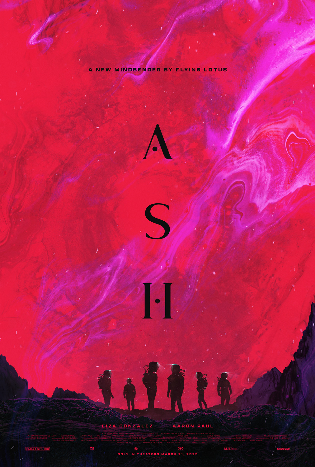
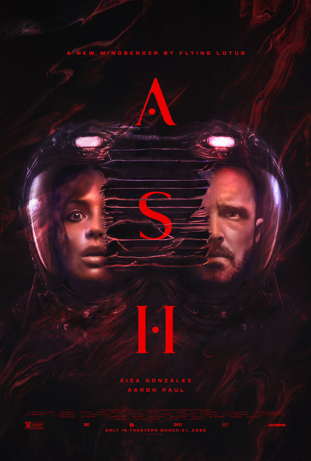
14) Ash
These posters for Ash don’t tell us a whole lot: it looks like this is a sci-fi film with cosmic horror, perhaps some body horror as well? Whatever the case, their use of abstract, garish, blended colours makes them extremely eye-pleasing and does get me intrigued about the film. Sometimes a bit of ambiguity and very pretty colours are all you need.
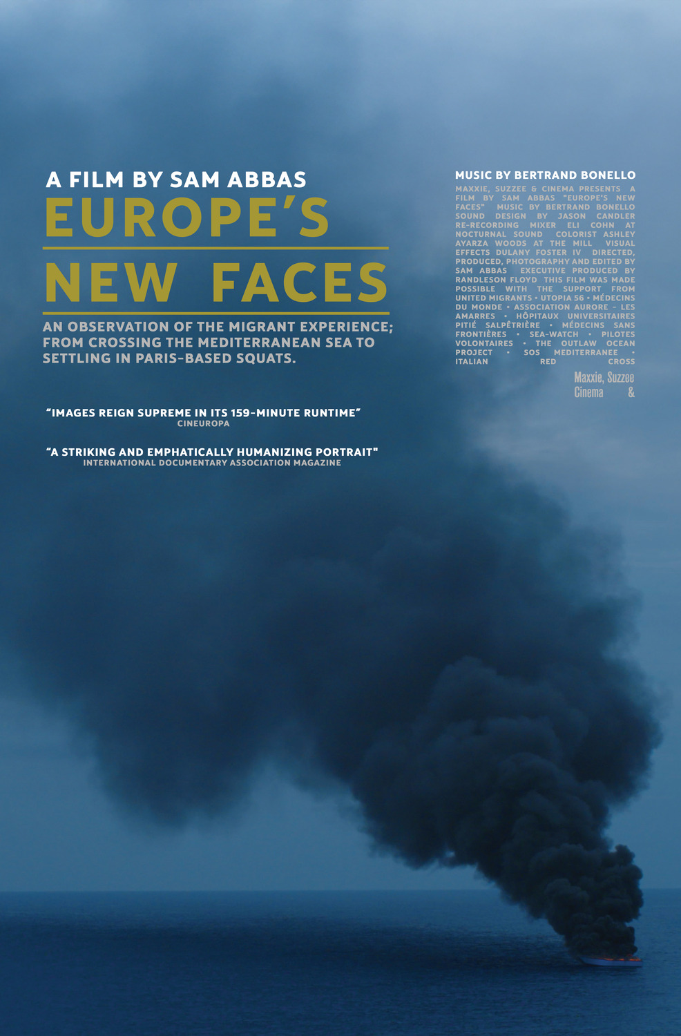
13) Europe’s New Faces
I think that the most impressive aspect of this poster for Europe’s New Faces is the scale of the image. The overwhelming plume of smoke, the scale of the sea, the tiny little boat so small that you can barely even see the flames consuming it… right away, this communicates just a fraction of the life-threatening dangers facing anyone seeking asylum in a first-world country, and makes you wonder what other dangers lurk along the journey.
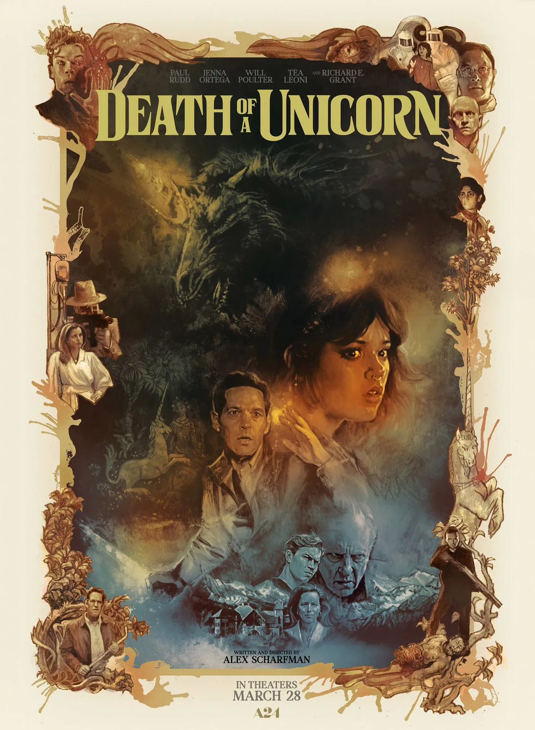
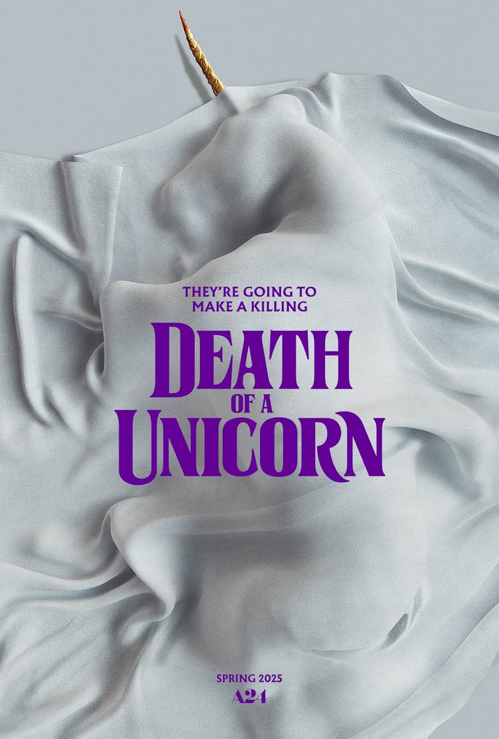
12) Death of a Unicorn
Drew Struzan (and Struzan-inspired) posters have been a fixture of my yearly rankings since I started doing them annually, so you can imagine my sadness when the legend passed away this past October from Alzheimer’s. This poster on the left has to be one of the most gorgeous Struzan-inspired posters I’ve ever seen, to the point where I thought that it may have been one of his final works. However, this one was actually hand-painted by Tony Stella and really gets across the dark, dreamy fantasy tone of the film. The poster on the right was also pretty eye-catching, with the sheet draped loosely over the unicorn’s corpse, creating some very unique and evocative imagery.
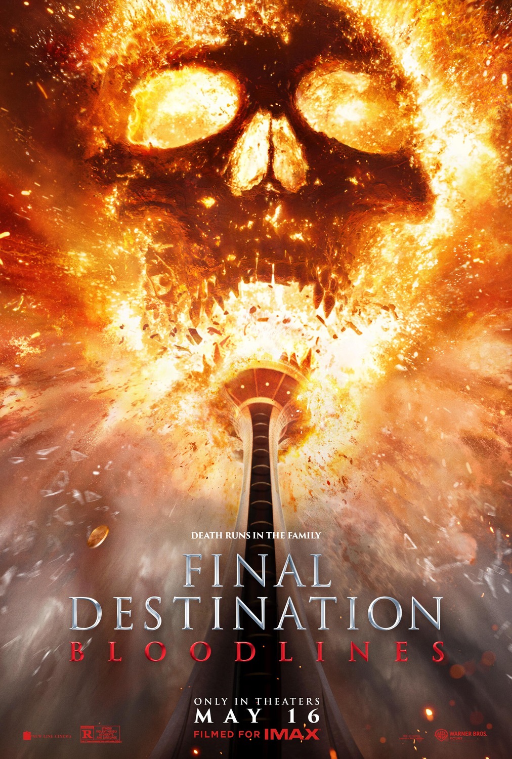
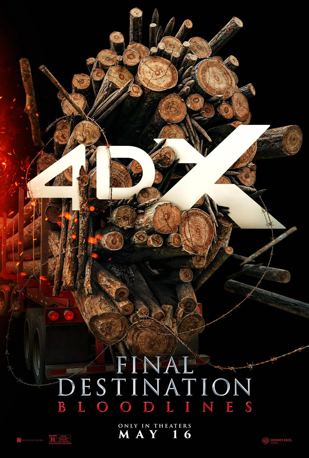
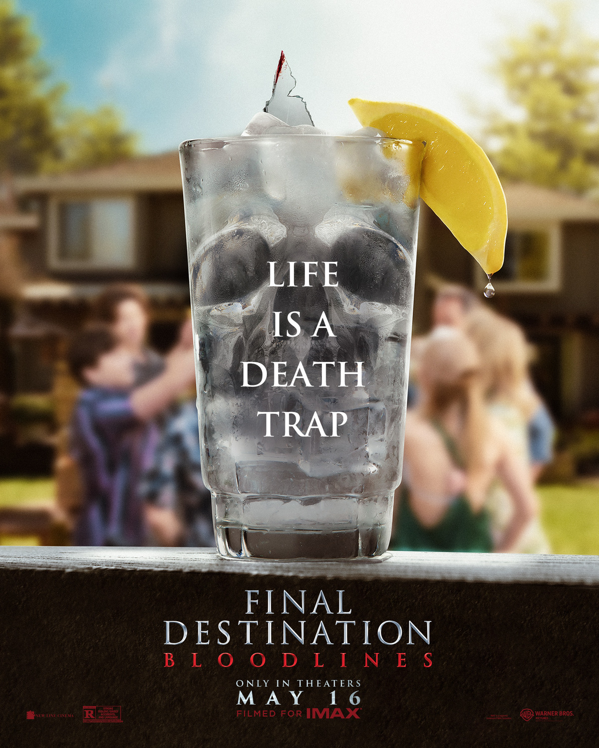
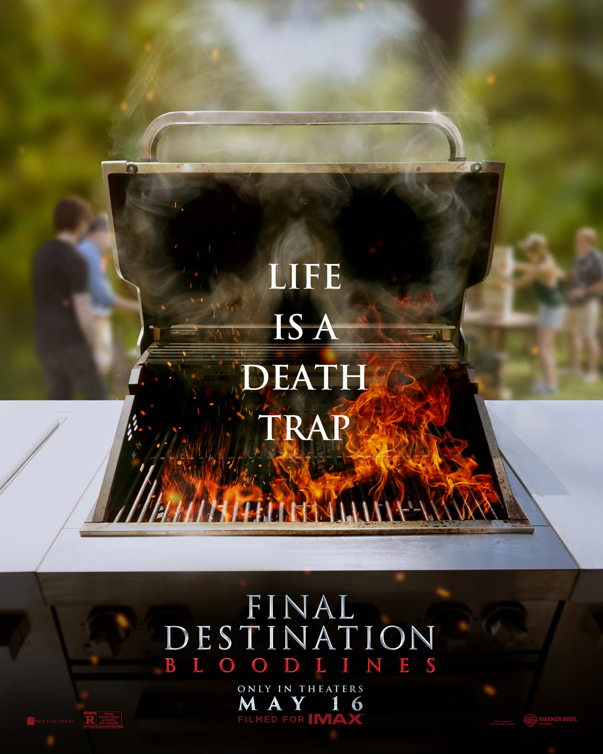
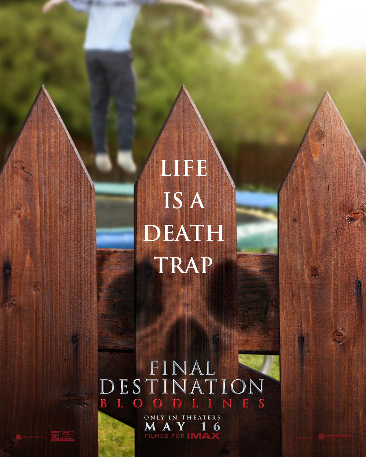
11) Final Destination Bloodlines
I really like these posters – they communicate the Final Destination premise of danger and “accidental” death through unexpected, everyday circumstances very well. I’d like to have put these a lot higher on the list, as they’re reminiscent of some of the best posters of years past, but I couldn’t justify a higher ranking because of is the actual composition of the posters. The skull motif is really poorly blended into some of these images, and the BBQ and water glass are clearly photoshopped over a blurred-out background image that isn’t even on the same angle as the foreground. Still, these are good enough in concept and execution that I have to give some recognition regardless without being too nitpicky.
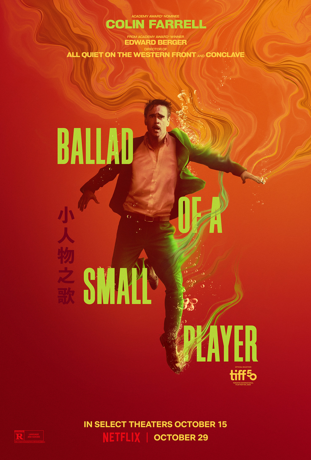
10) Ballad of a Small Player
Goddamn is this a gorgeous-looking poster! It’s not purely aesthetic appeal – the title, image, and composition do provide some hints about the plot of a gambler getting himself into some deep shit in a very artful manner. Most importantly though: pretty colours!
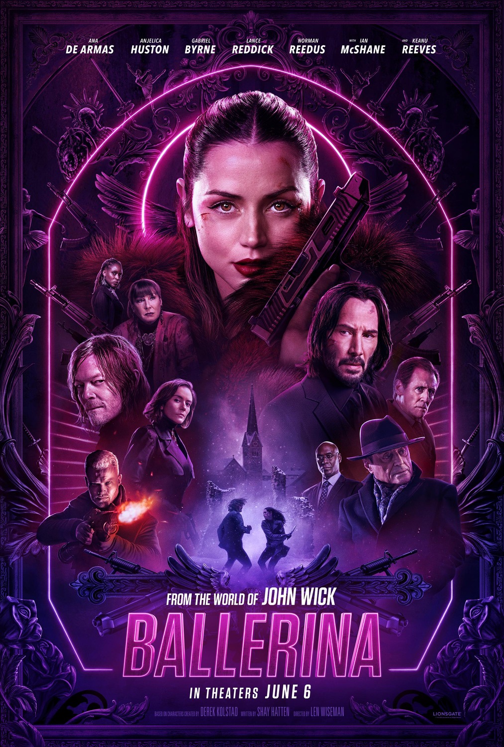
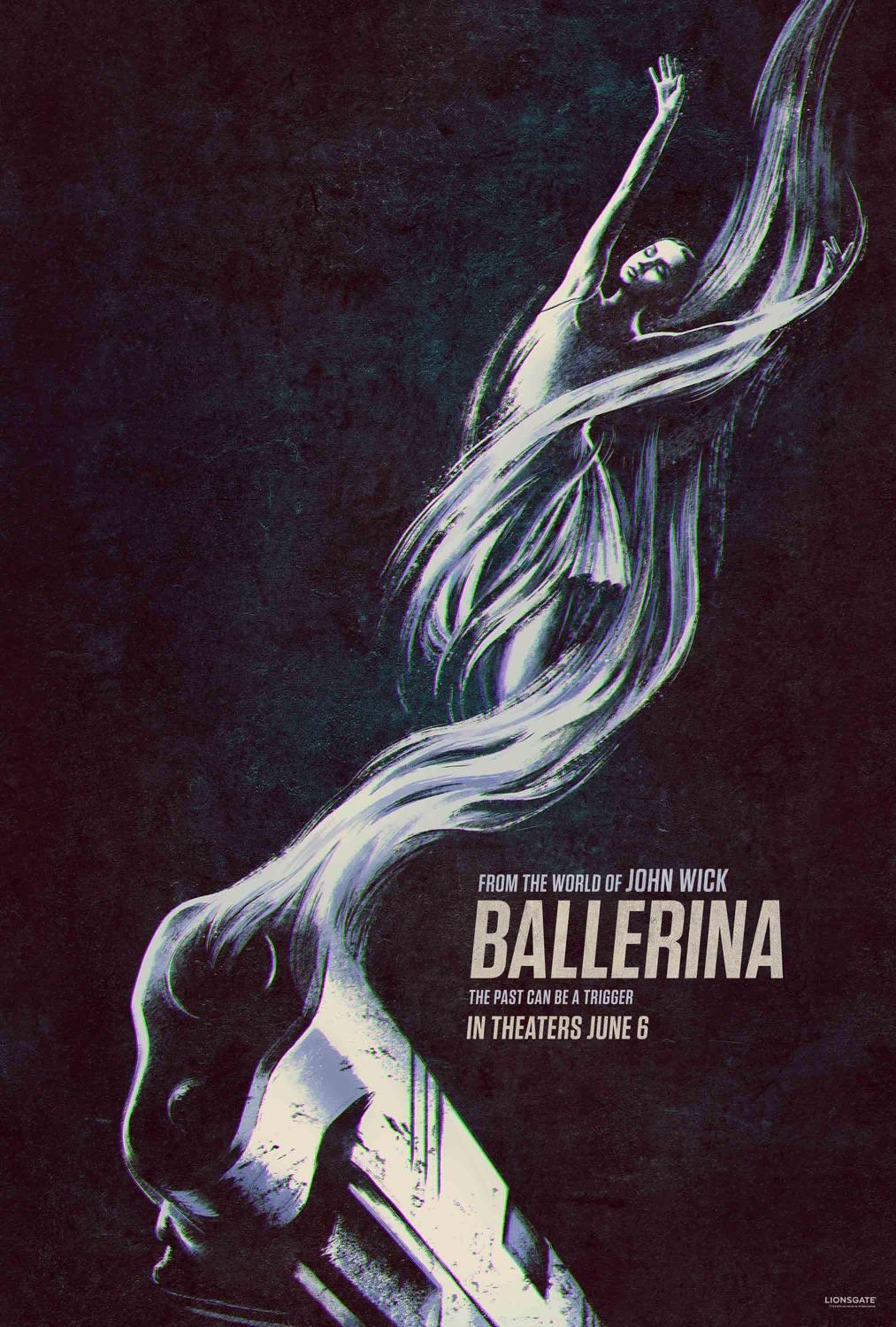
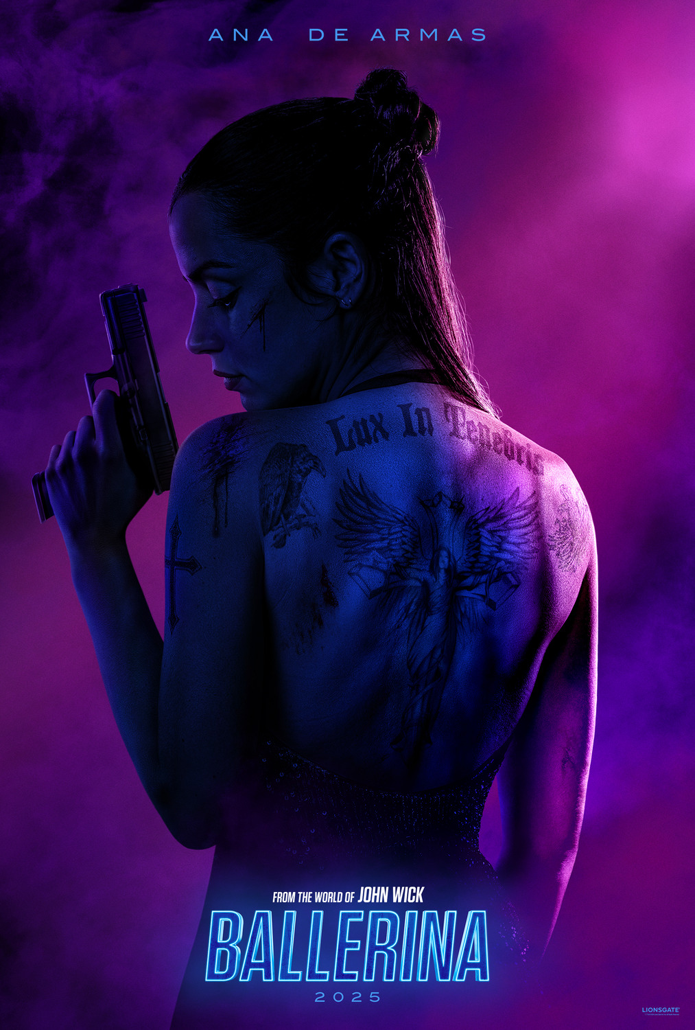
9) Ballerina
Another year, another swathe of badass John Wick posters. However, I can’t justify ranking this film’s marketing quite as highly as I did the mainline John Wick films for a couple reasons. For one thing, there’s far less visual variety in the images (they’re basically all communicating “sexy ballerina assassin with guns”, whereas John Wick‘s posters could communicate overwhelming odds, action, exotic locations, not to mention that they had a lot more colour diversity). For another thing, these posters are just aping the existing John Wick visual identity, so they’re not really all that “unique” or “distinct” either. That said, even when they’re being second-rate, John Wick‘s marketing team are still absolute pros, hence why Ballerina still cracks the top ten.
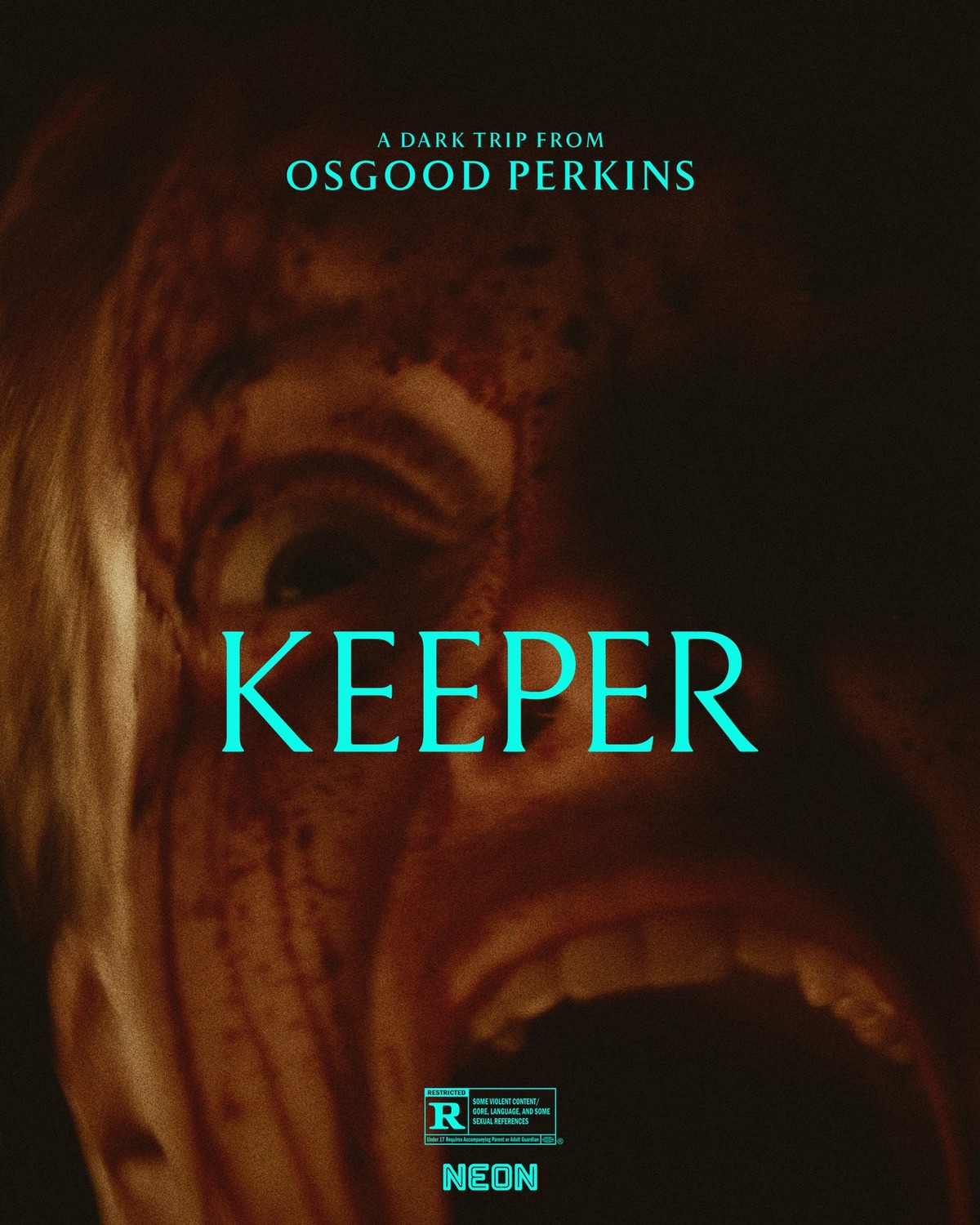
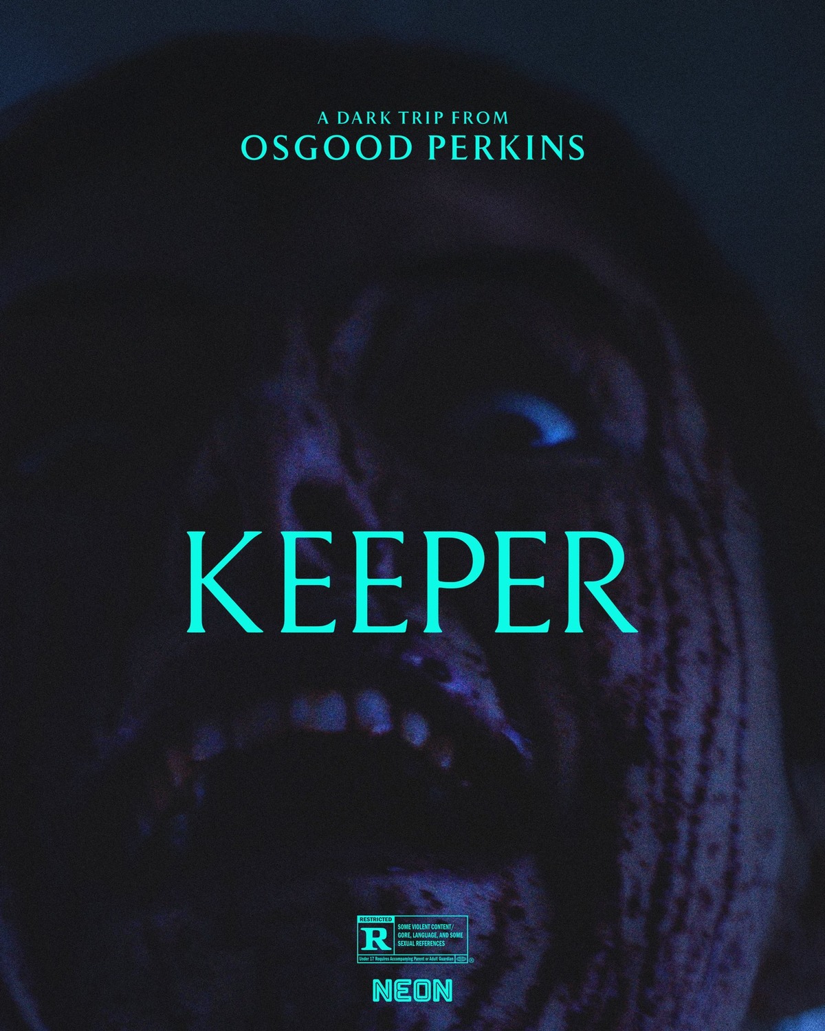
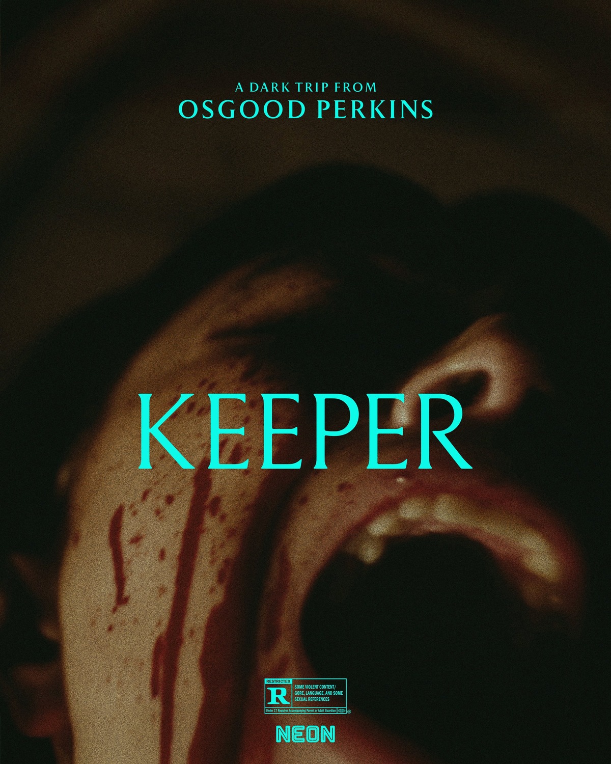
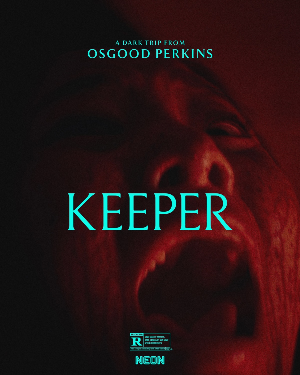
8) Keeper
A lot of horror movie posters tend to make these year-end poster lists. I love horror and dark imagery, so there’s obviously some bias in that regard. I think the main reason for this though is that horror films really need to use creative marketing to get across their tone and feel, make them stand out, and actively try to scare you. As a result, horror movie posters try to make you feel something by looking at them. Compare that to a romance film, where you just need to put your two leads on the poster and make them look good to draw in an audience – these don’t tend to stand out all that much compared to the rest of the year’s movies, hence why they don’t tend to show up here (unless they go to some real effort to make the audience feel that romance).
Anyway, with that said, 2024 champ Osgood Perkins and NEON are back with an extremely solid contender in Keeper, a series of posters which convey nothing more than tone… and that tone is one of utter terror, madness, and violence. I love me a good ambiguous poster, but these ones may be a bit too ambiguous to get much higher on the list… still though, these are very effective and unsettling, so I can’t really complain too much.
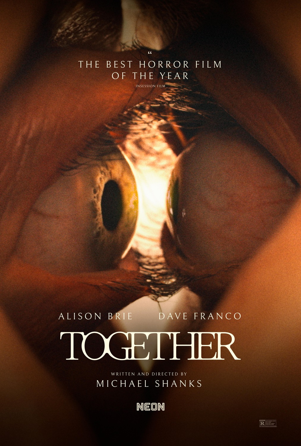
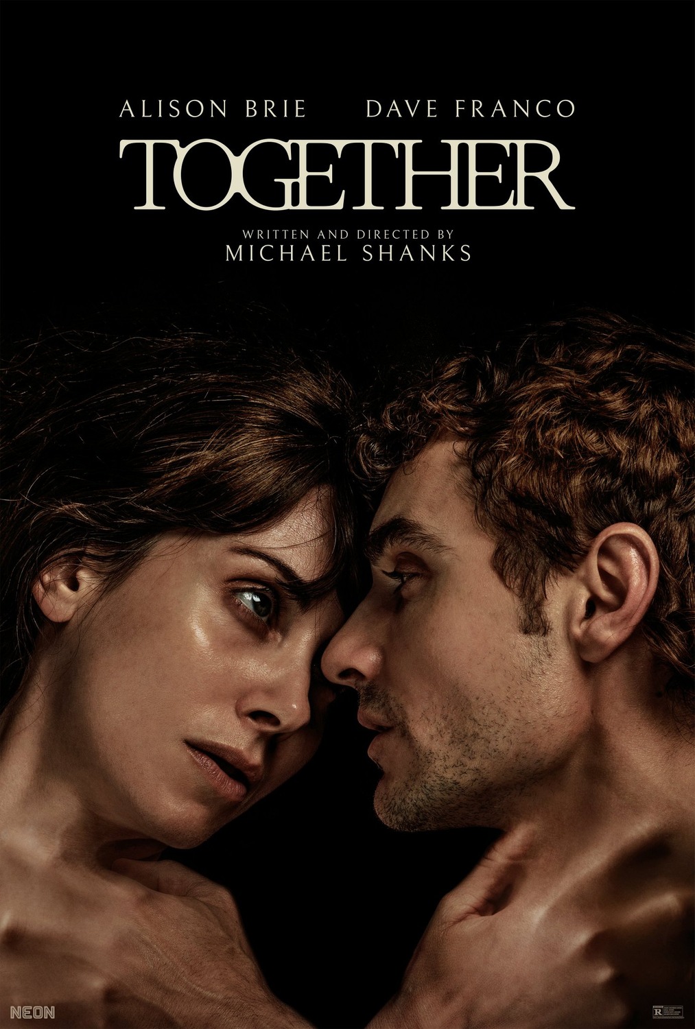
7) Together
Keeper and Together being back-to-back on this list wasn’t entirely intentional, but they provide an interesting comparison in my opinion. Whereas Keeper‘s posters convey nothing more than tone to try to sell you on the film, Together shows you what the film is about, without going too far in the process. There’s still a lot of ambiguity here, so you don’t really know what exactly is going to go down, but the hints of body horror imagery are disturbing and effective. This is an illustration that just enough context is important to make a poster have the strongest impact.
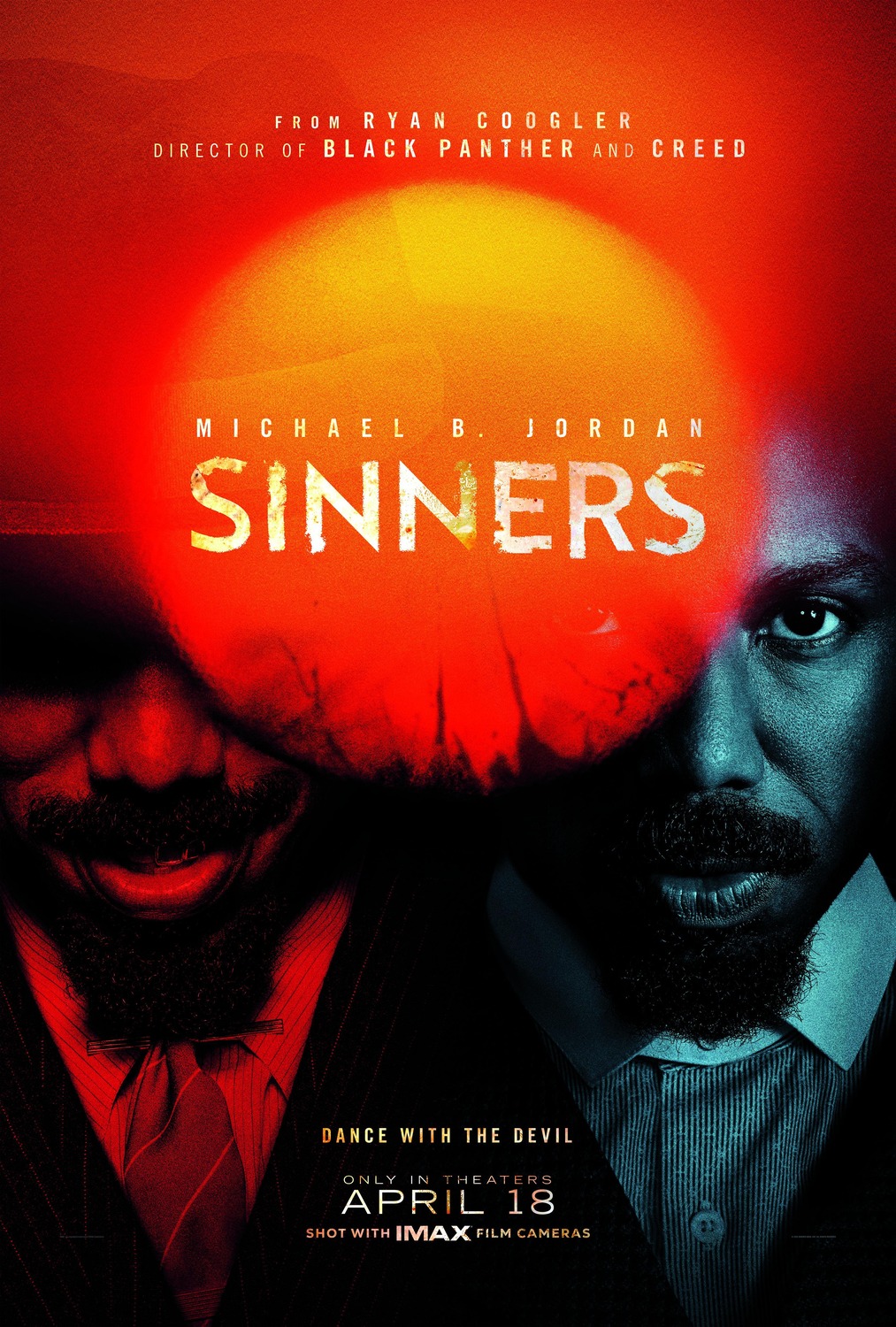
6) Sinners
Yet another very gorgeous poster design here for Sinners. It doesn’t really tell you a whole lot about the film itself, but (having seen the film) I really appreciate the stuff it hints at: the twins, their personalities, their associated colours, their journeys over the course of the film, plus the sun that almost looks like it’s bleeding into the image. It’s very abstract, but if once you’ve seen the film, you can definitely see the very intentional design behind this poster… plus it just looks really cool, I’d happily hang this on my wall.
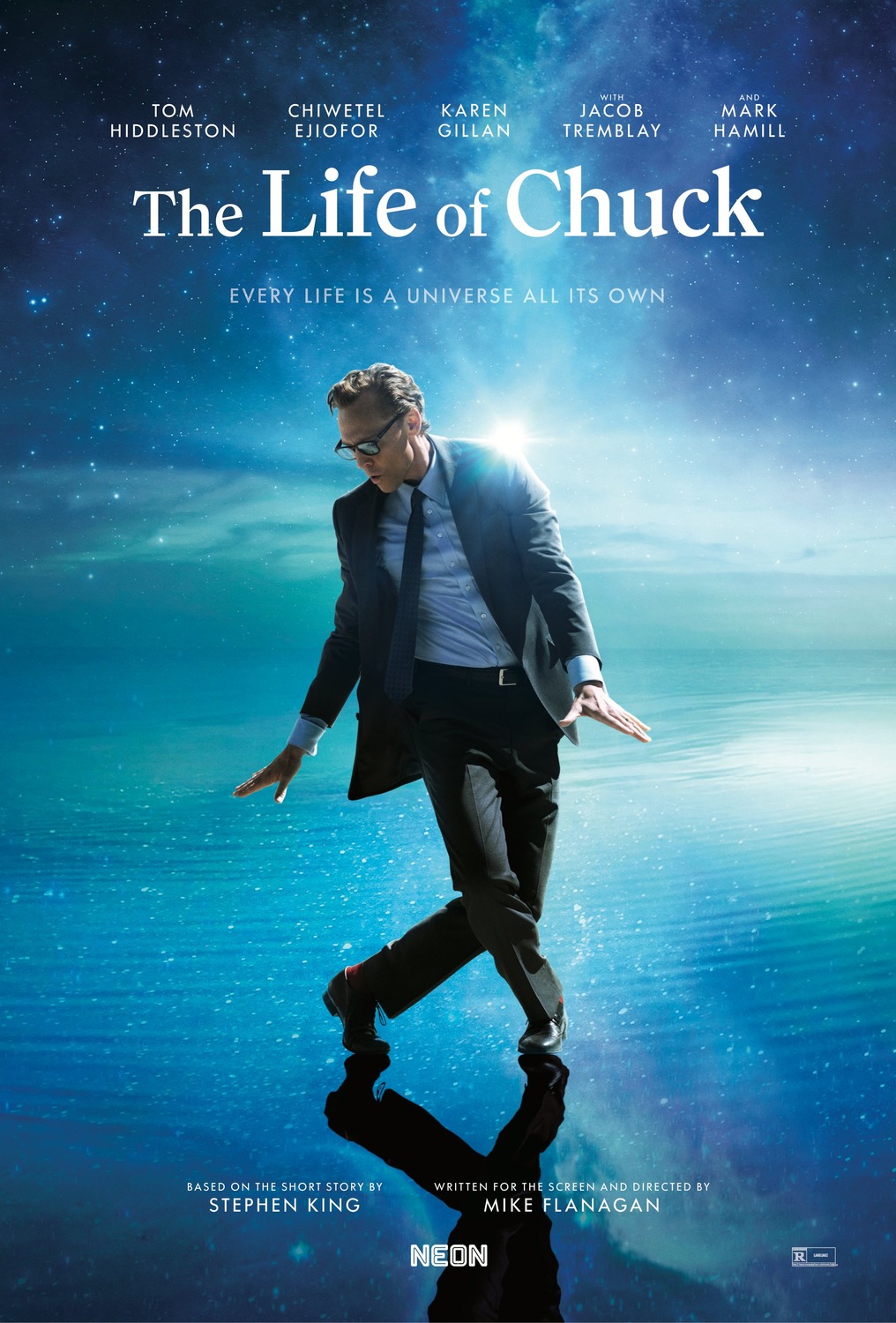
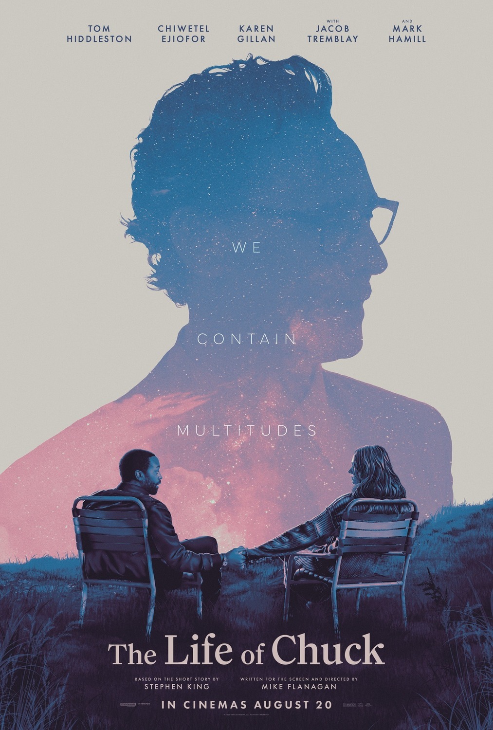
5) The Life of Chuck
I’m probably heavily biased by this selection because I love Mike Flanagan and Tom Hiddleston… but, man, these posters are great. Tom Hiddleston’s goofy “cool guy” strut within his own little universe makes what should be a pretty bog-standard standard poster so much more memorable and personable. The poster on the right also just looks really cool with its mixture of blue, white, pink, and purple hues, but the more you look at it, the more you realize it hints at themes of life, death, memory, and the inner universe we all hold inside of us.
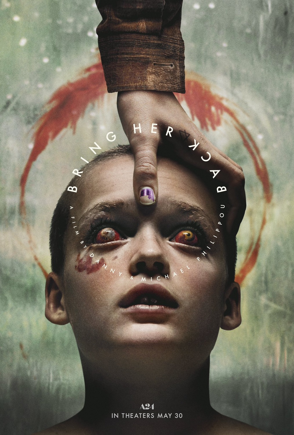
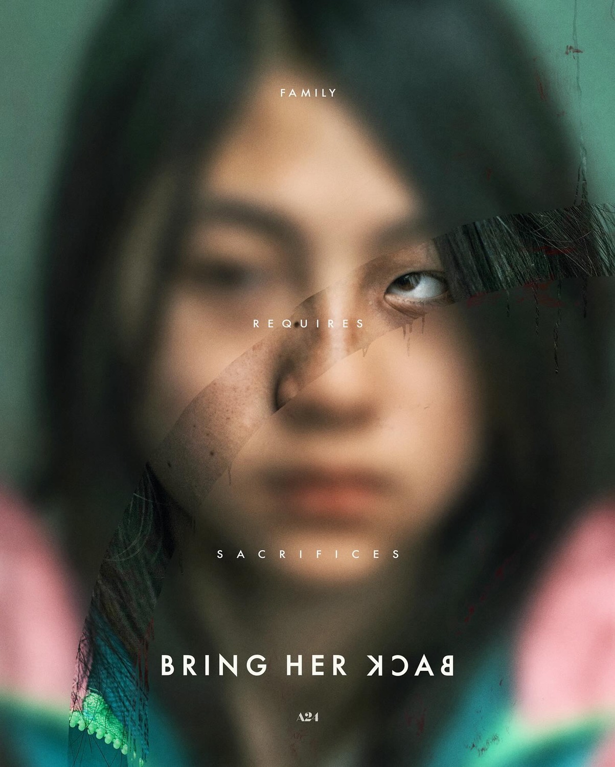
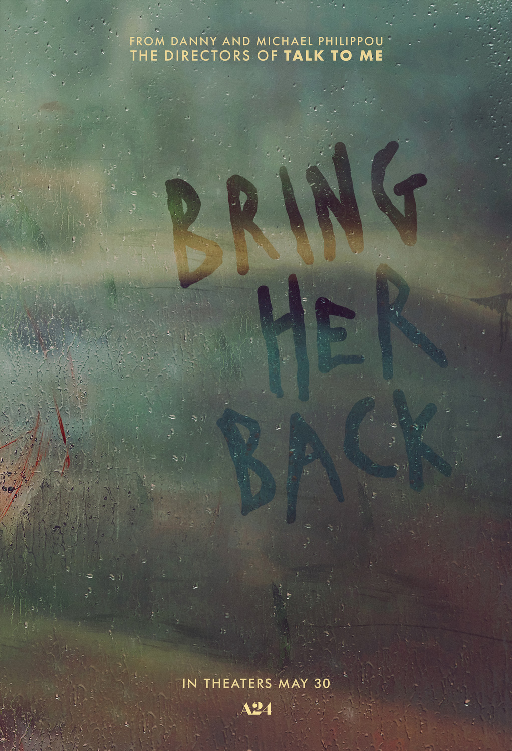
4) Bring Her Back
It takes a lot for a horror movie to get a visceral reaction out of me, but good fucking God did Bring Her Back manage it. The possessed child poster is pretty disturbing on its own and probably the most iconic poster for the film, but it’s one of those cases where I think it might be giving the game away a bit too much. My favourite of the bunch is the one in the middle, with the daughter’s face mostly blurred out, but with a circle wiped over the image to make it clearer. There’s lots to love here: the seemingly-incongruent eye positions, the ominous and staggered tagline, the hints of blood smeared subtly around the image, the sickly colour palette, and the fact that it leaves nearly everything to your imagination. These posters are all suitably unsettling, and befitting of one of the creepiest horror films of the year.
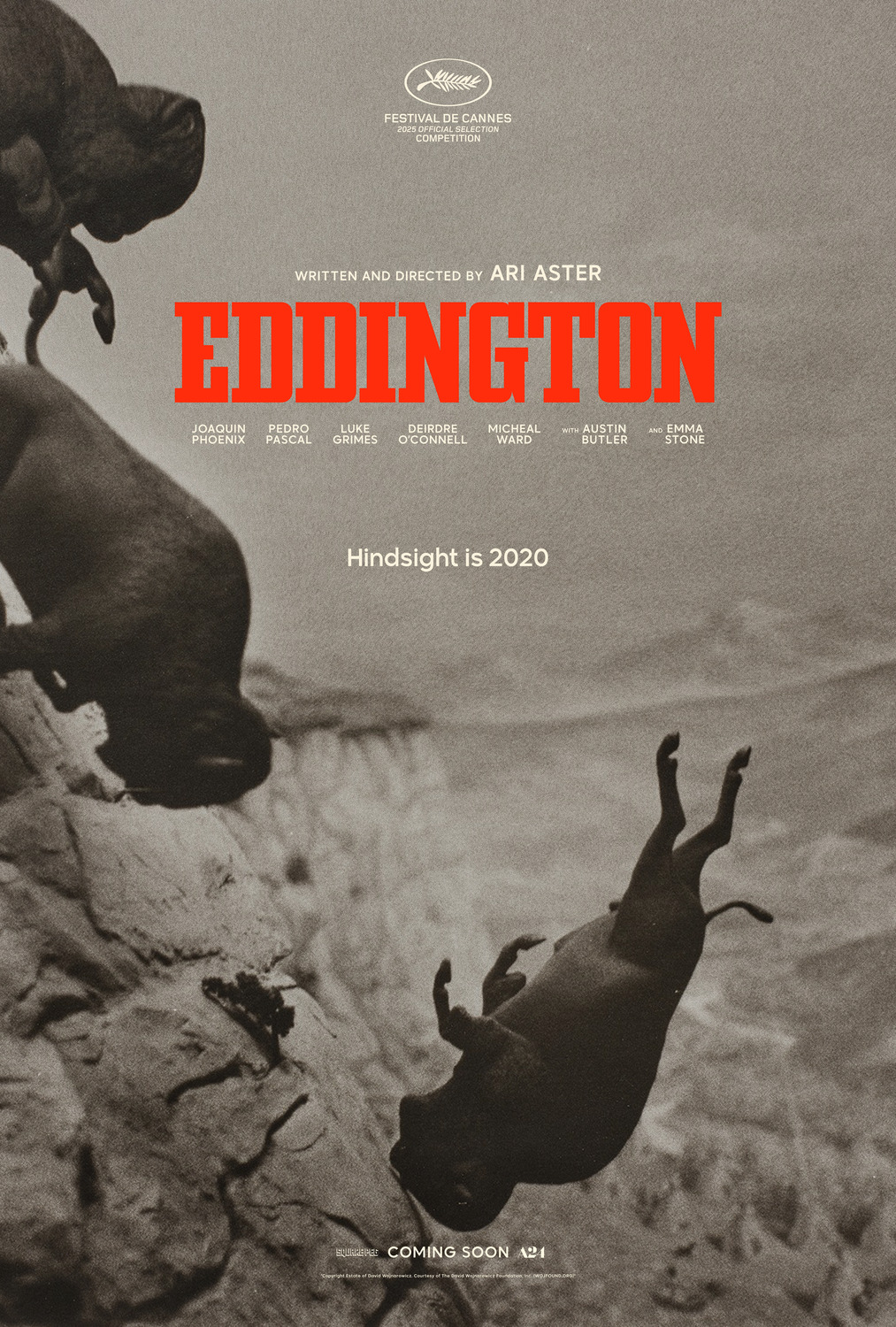
3) Eddington
I know next to nothing about Eddington, aside from it being a modern western and that it’s apparently set during COVID. My analysis here is entirely aesthetic, and in that regard this poster is so striking. The buffalo jump imagery here is so evocative and well-composed, hinting at all sorts of thematic riches (especially when combined with its tagline). What really pushes this into this high spot on the ranking though is the fact that the whole image has been done via miniatures! As something of a miniature enthusiast myself, this is just delightful, especially since it takes a bit of closer inspection to really notice it (especially that very fine contact point on the lower-most buffalo’s head).
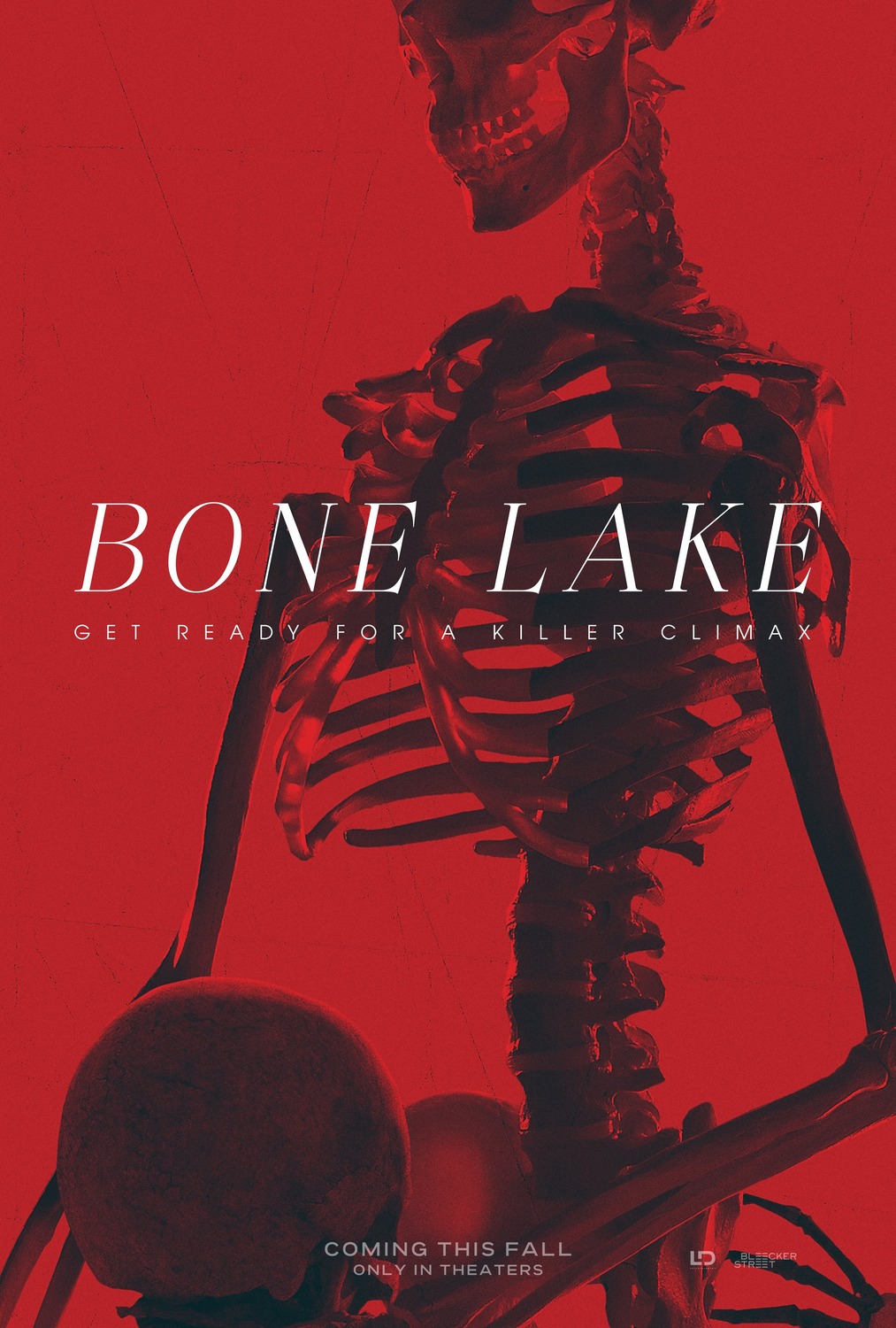
2) Bone Lake
Man, this poster is so good that it single-handedly sold me on this movie. It manages to be lurid and erotic, while staying on the right side of tasteful implication, while simultaneously also communicating the idea that this is going to be a horror movie. Hell, it would have managed this even without the goofy tagline. This communicates erotic horror so well that I instantly knew that this was a top-tier contender for the year’s best poster. However, there’s one that stuck with me just a little bit more…
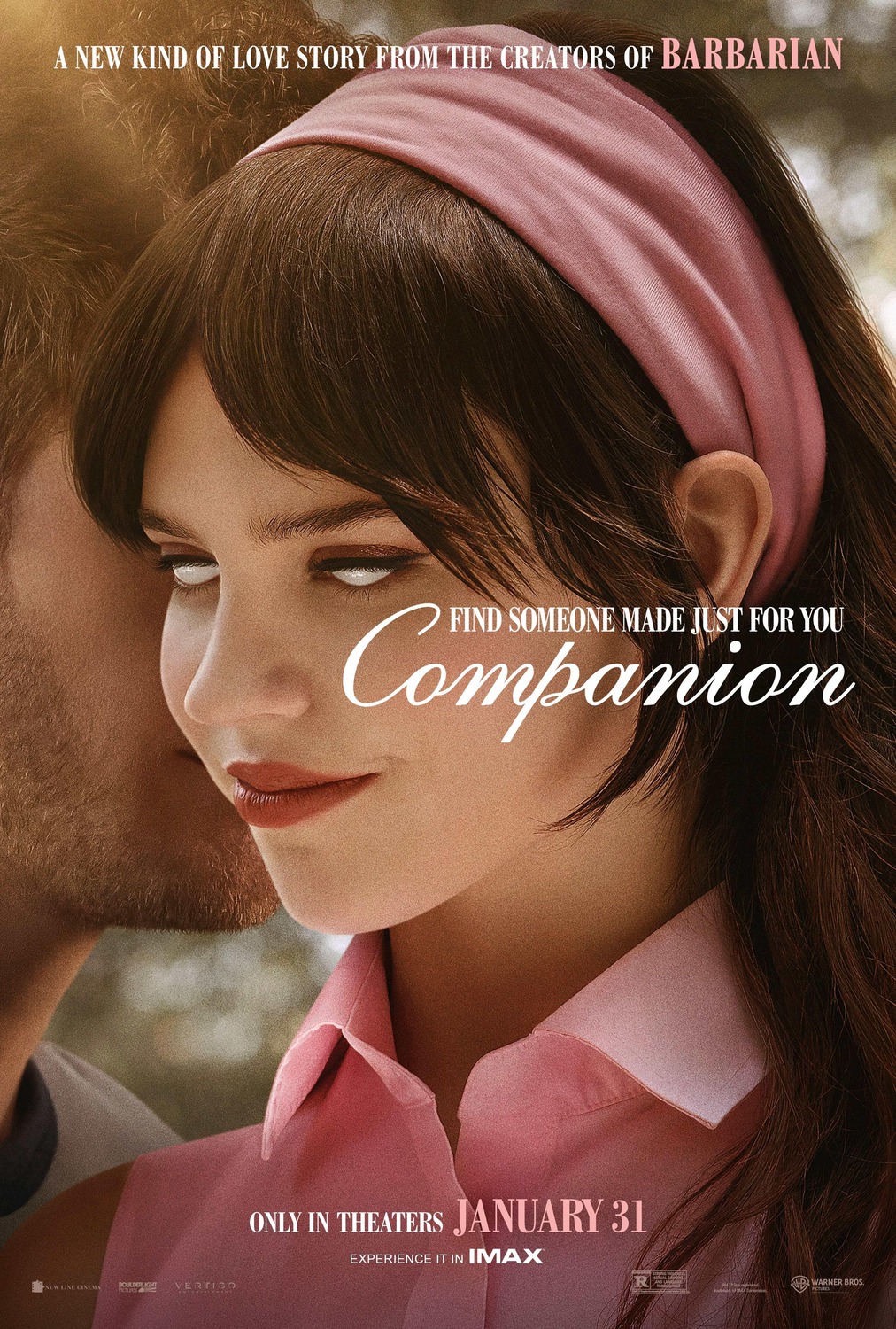
1) Companion
This is such a simple poster, but that’s where the brilliance lies. This is exactly what I was saying earlier about romantic posters capturing the feeling of romance instead of just showing us the two leads and making us think “boy, I wonder what would happen if they got feelings for each other, had some sort of silly misunderstanding that breaks them up, and then reconcile in the third act”. It’s soft, elegant, romantic… and unsettling as hell, all because of one tiny change to the image which flips the entire thing on its head. Like, seriously, removing her irises from the image must account for a low, single-digit percentage change to the overall image, but man, what a massive change that is. In one swoop, the entire thing goes from romantic to creepy, unsettling, and unforgettable. Honestly… bravo. There’s no way that I could justify not giving this poster the #1 spot this year, it earned it.
If you liked this article…
I hate ads. You hate ads. In order to stop polluting my site with obtrusive and annoying ads, I’ve elected to turn them off on IC2S. That said, writing still takes time and effort. If you enjoyed what you read here today and want to give a token of appreciation, I’ve set up a tip jar. Feel free to donate if you feel compelled to and I hope you enjoyed the article! 🙂