I may not be writing as much as I used to, but it’ll be a cold day in hell before I miss my mostly-annual year-end countdowns! In case you’re unfamiliar with how this works, I spend the year trolling through impawards and collecting all the really cool, interesting and striking poster designs for 2023 movies and then narrow them down into a shortlist. As always, any poster released during the year is eligible to make the list, but special consideration is given to posters which are intended for mass distribution rather than posters which are intended to be limited-release, alternative, “artistic” posters. As usual, you can see the full-sized poster in all its glory if you click on the images.
Anyway, with those considerations out of the way, let’s get onto the list, starting with some honourable and dishonourable mentions:
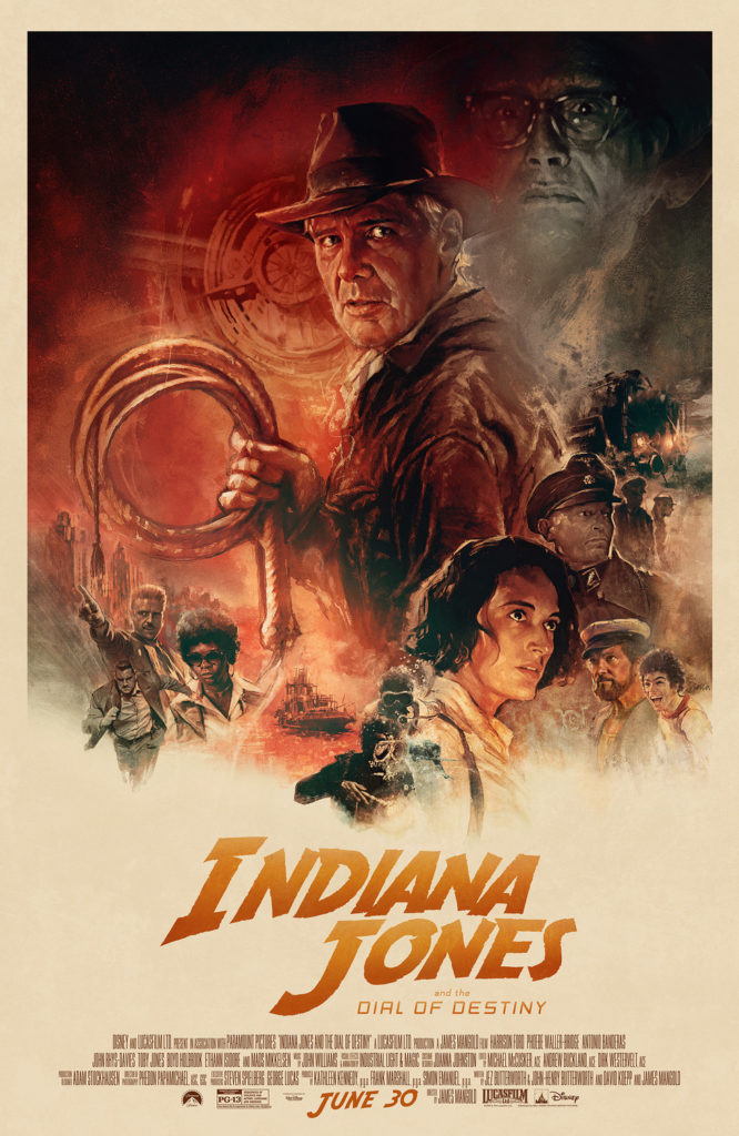
The Drew Struzan style is over-done and tired at this point, a lazy trope to make a poster look nostalgic and exciting without having to put in any actual effort to design something original. On top of that, I couldn’t care less about a new Indiana Jones movie in 2023. However… I’d be lying if it wasn’t nice to see the iconic Struzan style brought back for one last hurrah where it absolutely is warranted, for the franchise which is perhaps most intrinsically tied to this style. It wasn’t enough to make the list proper, but I felt it worth highlighting.
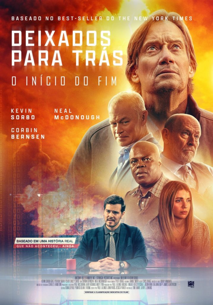
Oh, and speaking of the Struzan style, here we have the poster for a new Left Behind movie. I’ll be honest, the poster itself is incredibly dull, but I mainly put it here to shit on this series and Kevin Sorbo. Also, Neal McDonough, you poor man, what the hell happened to you to make you have to slum this hard? I haven’t had the spark to do a new Retrospective series, considering all the time and effort that has to go into writing them, but dammit the idea of looking at all the Left Behind movies fills me with a sinister excitement… Maybe stay tuned in 2024 if I can muster the motivation.
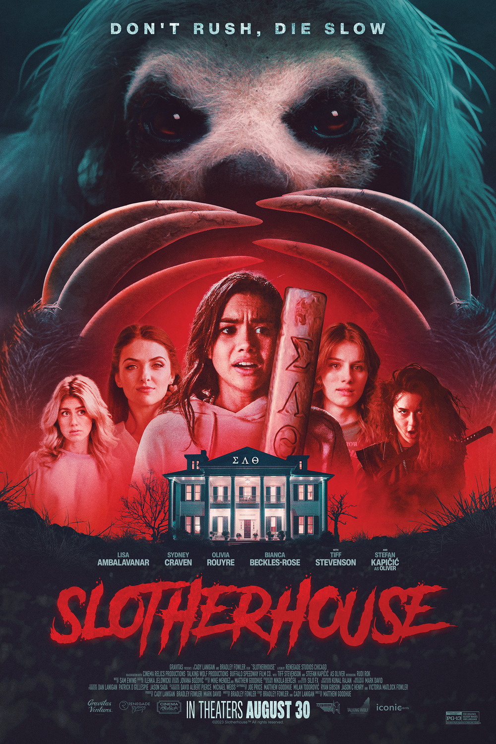
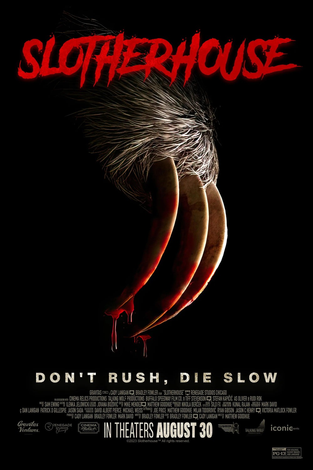
Okay, this one deserves some mention for how effective these posters are for a “ridiculous slasher villain” movie. These would all be slightly-above-average posters for a regular slasher film, but add in the decent tagline and how seriously they’re taking the ridiculous premise, I can’t help but chuckle.
And with that said, let’s get into our top 15 proper:
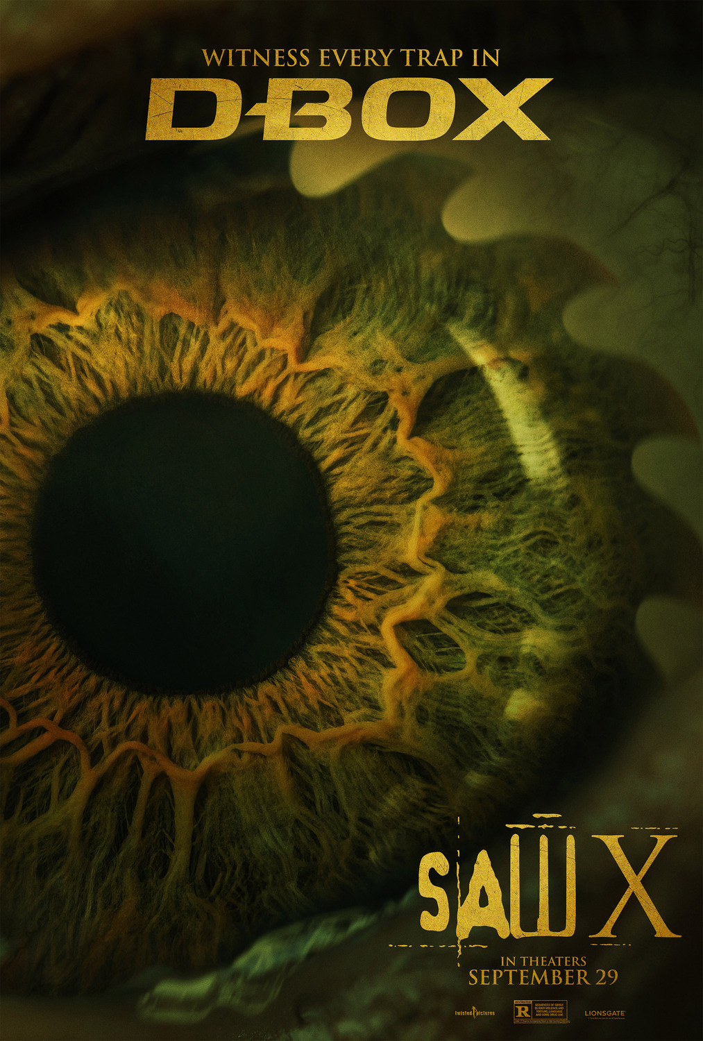
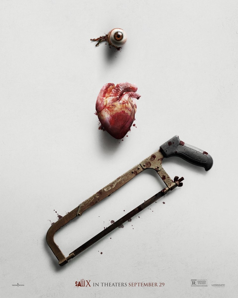
15) Saw X
Saw X starts the list with a couple posters that I found fairly clever in their simplicity. First off is the “eye poster”, which instantly evokes a sense of primal terror before you even notice the saw shape at the edge of the iris, revealing what the victim is so scared of. The “I Heart Saw” isn’t quite as striking, but I do appreciate how it cheekily calls back to the series’ legacy of posters featuring severed body parts, hinting that this is a sequel aiming to go back to the franchise’s roots.
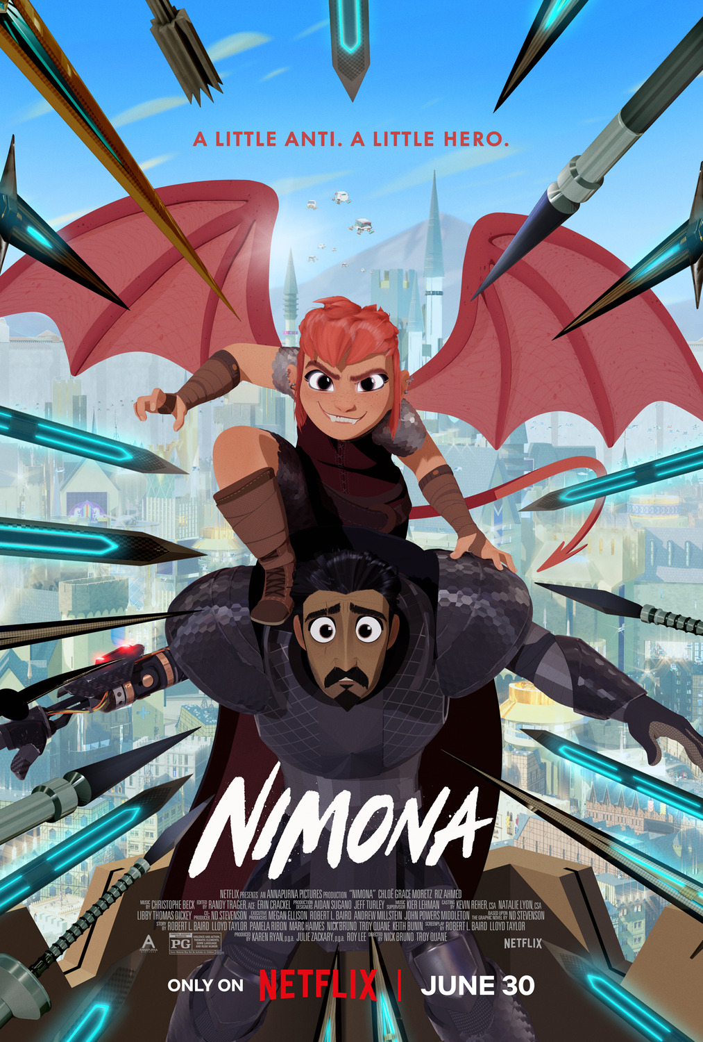
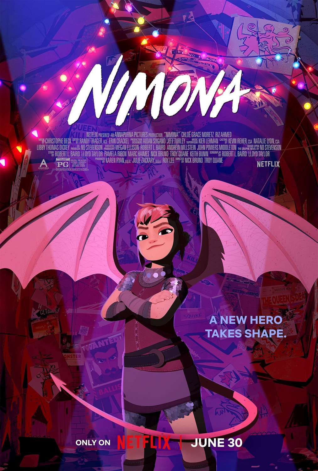
14) Nimona
Back when I was in university, one of the most important lessons I learned came from an American literature prof who had a blunt, but effective motto when we were writing essays: “Why should I care?” I think about that whenever I’m writing, and it’s a lesson that can be applied in most walks in life. For a poster designer, the job is (usually) to sell a movie, so “Why should I care?” presents a challenge with results that can be intriguing, if you check out this countdown annually.
I mention this because these posters for Nimona represent a twist on the usual approaches to “Why should I care” from graphic designers. Honestly, these posters have sold me on Nimona, and they aren’t doing anything particularly special in their own right. They just demonstrate that if you are working with a strong, charming art style, then that can be enough to sell a movie on its own, without any special flair being required on top of that. The designers of these posters are clearly putting in some work in order to be able to highlight the art so stylishly, so credit where it’s due, but this is one of those cases where character and tone are expressed so strongly in the character designs that you don’t really need anything else. These lists aren’t just about elaborate artistry or unique twists, sometimes it’s just working with the pieces you have and realizing that they can speak for themselves. I just thought that that was neat.
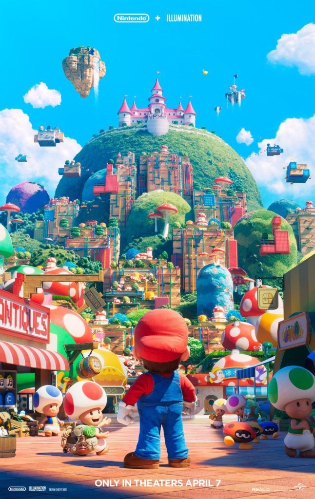
13) Super Mario Bros.: The Movie
I’m not a massive Mario fan – I enjoy the 8- and 16-bit classics, but never have played much of the games beyond that point. However, looking at this poster, I can’t help but get hyped. This is a perfect distillation of what a Mario fan would want to see in a movie, full of colourful, iconic imagery and easter eggs, similar to the Detective Pikachu poster a few years ago. It’s also worth noting that this establishes that the art style will be familiar to fans, which you wouldn’t think would be that notable, but considering that the last attempt at a Mario movie ended up being a surreal, dystopian, live-action fever dream, it’s warranted.
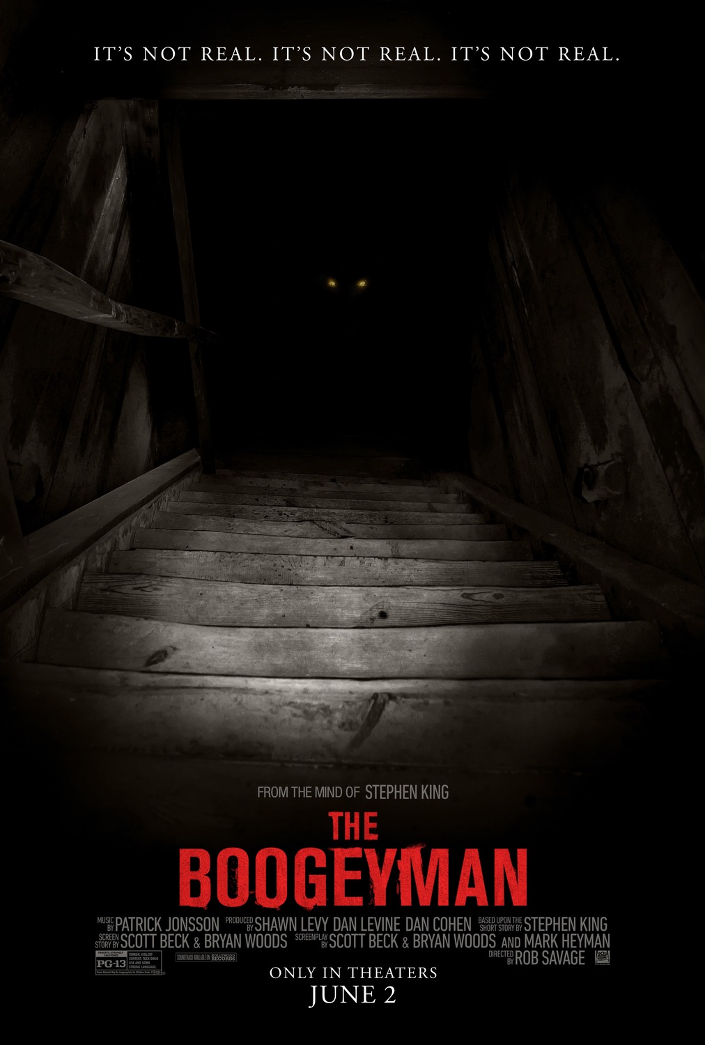
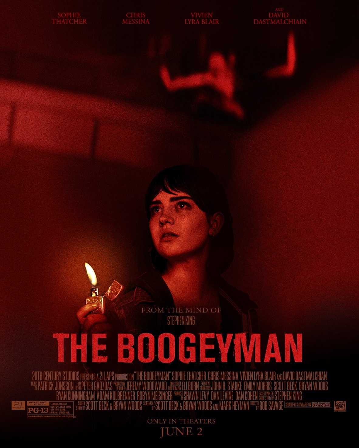
12) The Boogeyman
Look, if a movie’s posters are pulling off imagery which would be The Moneyshot in your average horror film, you know someone’s doing something right. The fact that these posters are actually rather scary in their own right, while still keeping its titular villain shrouded in mystery, is a bonus as well. I have no idea if this movie is any good, but if the marketing is this strong, it certainly suggests that you’d be in for a good time.
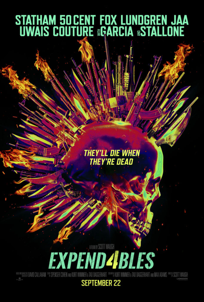
11) Expend4bles
Full disclosure: I’ve always loved this poster design which has been used across the entire Expendables franchise, to the point that it was the basis for my custom logo back when I spend hundreds of hours playing Battlefield 4. The skull + wings (or, in this case, hair) made of various weapons is a flawless bit of symbology for a deeply flawed franchise, promising all the action you could ever want from its star-studded cast. It still works here for me, and it’s good enough that I’ll even forgive that idiotic tagline.
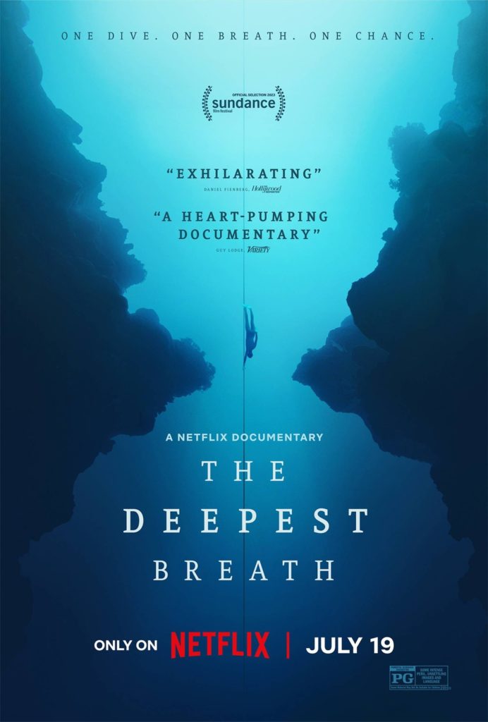
10) The Deepest Breath
I call this the “Free Solo poster design philosophy” – a poster for a documentary which is just a simple picture of someone doing something batshit insane. While The Deepest Breath can’t quite match the same level of sheer intensity as Free Solo (to be fair, few could), it still promises an ass-clenching thriller of a documentary that will thriller your thalassophobia to record levels.
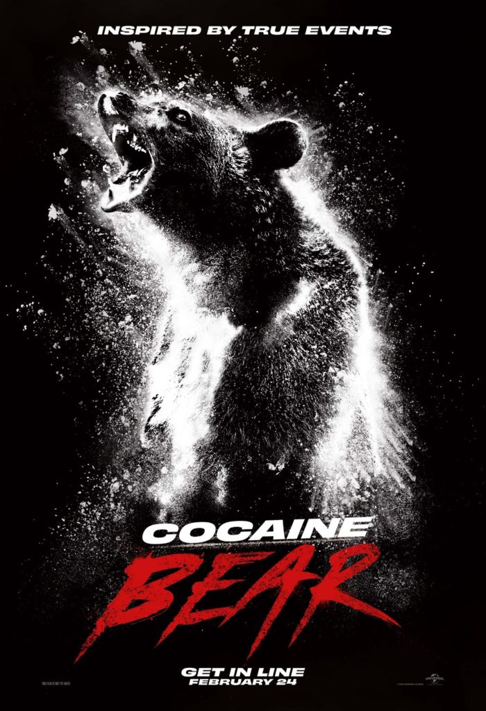
9) Cocaine Bear
THE BEAR. IS MADE. OF COCAINE.
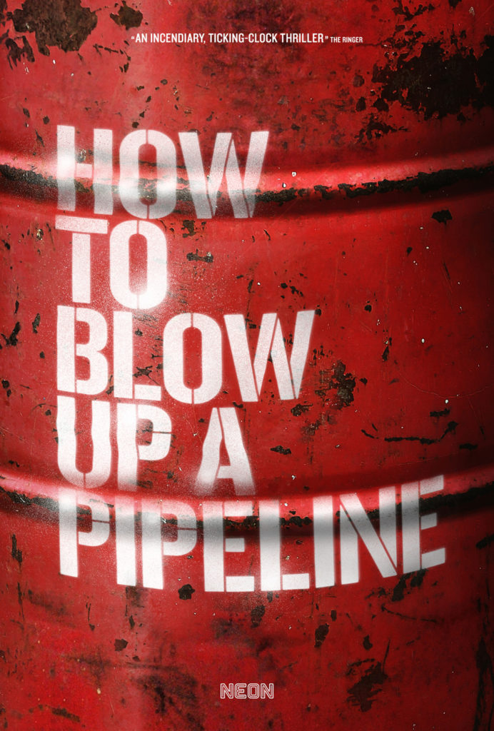
8) How to Blow Up a Pipeline
This one gets a spot for how its title is worked into the image. It’s simple on its face, but very stark, evocative, even transgressive. I can’t help but be impressed by how the title makes it work – on many posters, the title is just there to let you know what the movie’s called. Some posters use a tagline to try to tell you what it’s about, and use characters and imagery to try to sell it. This just has a simple barrel and some inflammatory language, and it instantly gives you an idea of the sort of journey you’re in for with this movie. Kind of like Nimona, this is a lesson in using what you have, to an even more extreme degree, since they’re almost exclusively using the title to sell the film. While maybe this makes for a poster that’s less striking than some of the others on first glance, it’s a fascinating case when you think about the decisions put into it.
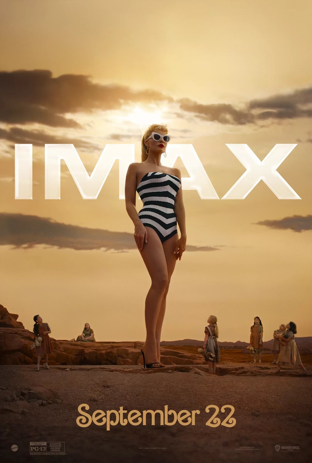
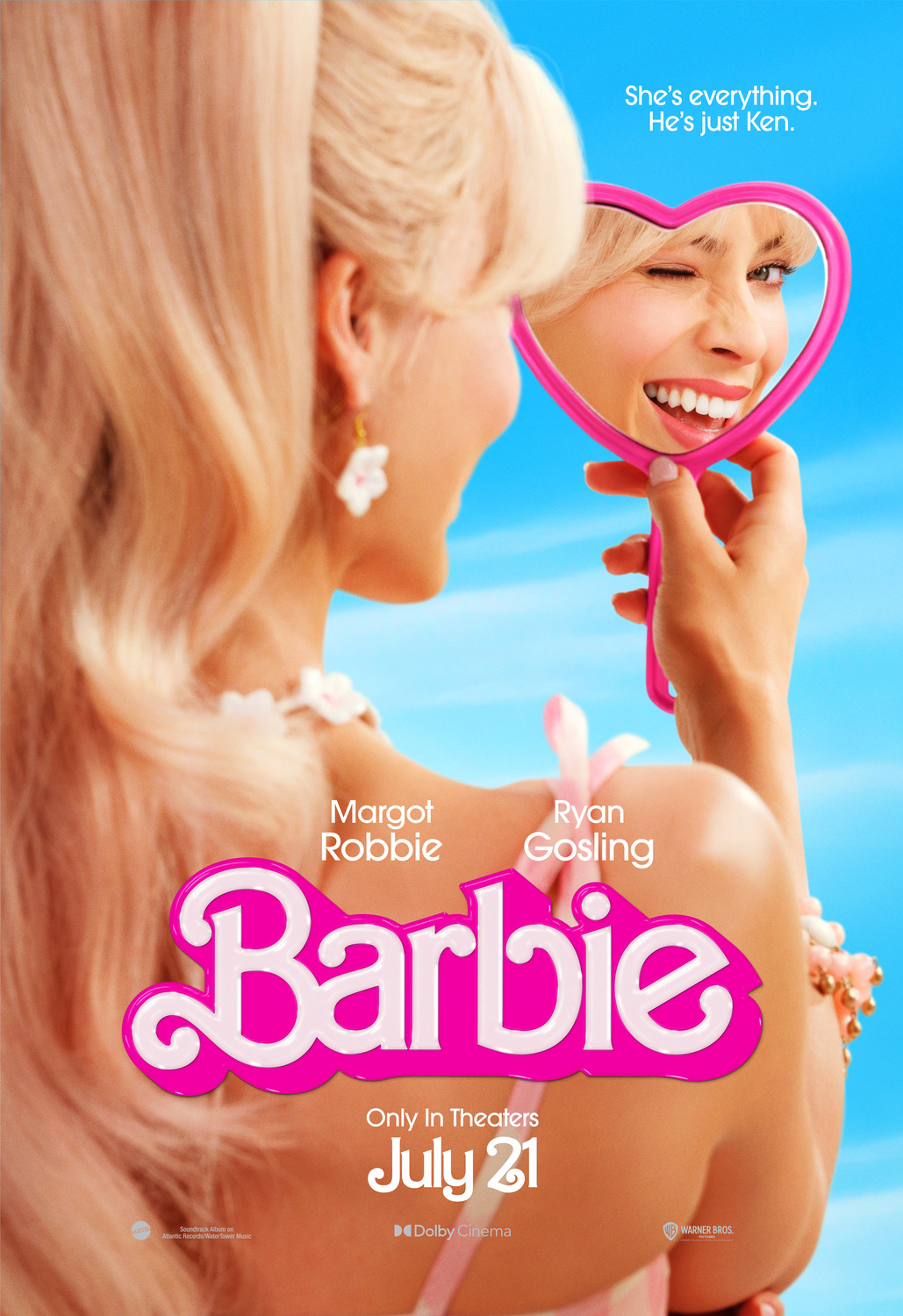
7) Barbie
I could not be further from the target audience for a Barbie movie, but goddamn do these posters nail the titular character’s pop cultural footprint. First of all, the “larger than life” poster is what made this rank so highly – it succinctly and artfully evokes how Barbie is an icon, a monolith which girls have looked up to for decades (literally, in this case). Meanwhile, the second poster deserves some mention because it shows that not only is Margot Robbie the perfect casting for Barbie, but assures the audience that the film understands Barbie as a character and is going to deliver on those expectations.
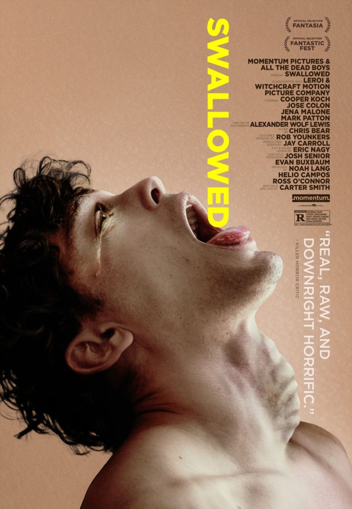
6) Swallowed
Do I really need to explain this one? This one just looks BLOODY PAINFUL, and assures you that you are in for an extremely uncomfortable time if you watch this movie. For a certain class of horror fan, what more could you ask for?
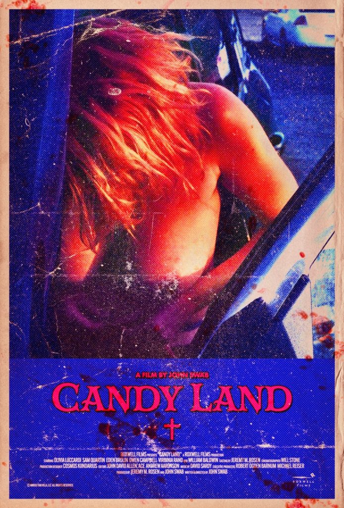
5) Candy Land
I really love this poster. It’s so evocative – it’s appropriately sleazy and erotic, hinting at nudity while barely obscuring it, and the faux-vintage design and blood splatters only serve to heighten all of that. Obscuring the subject’s face also serves to depersonalize her, lending the whole design a forbidden, voyeuristic quality which is nearly as uncomfortable as the more overt imagery Swallowed uses.
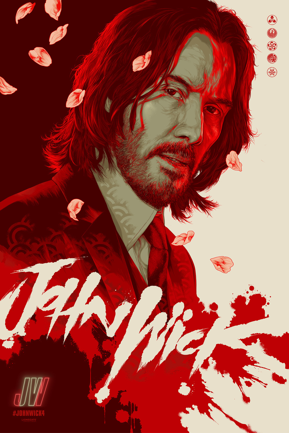
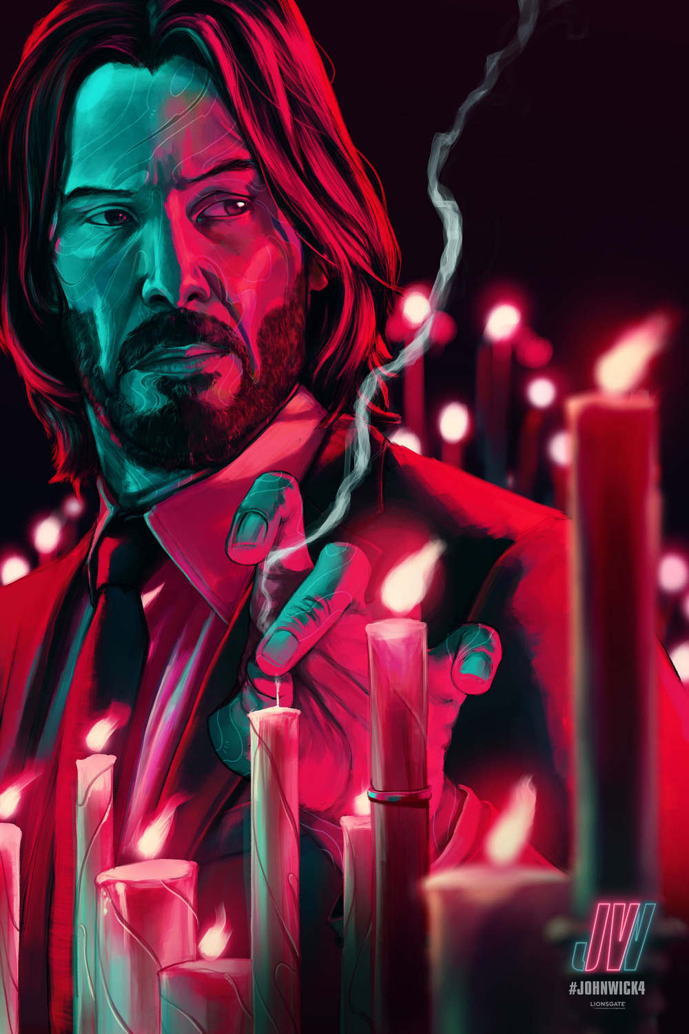
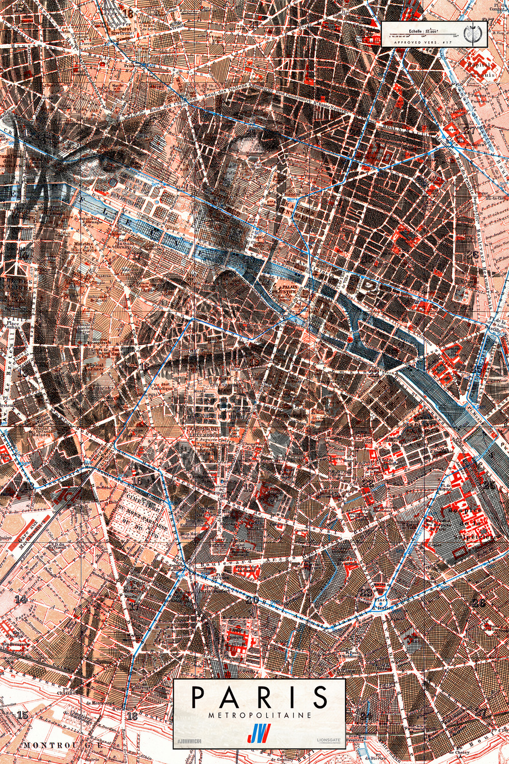
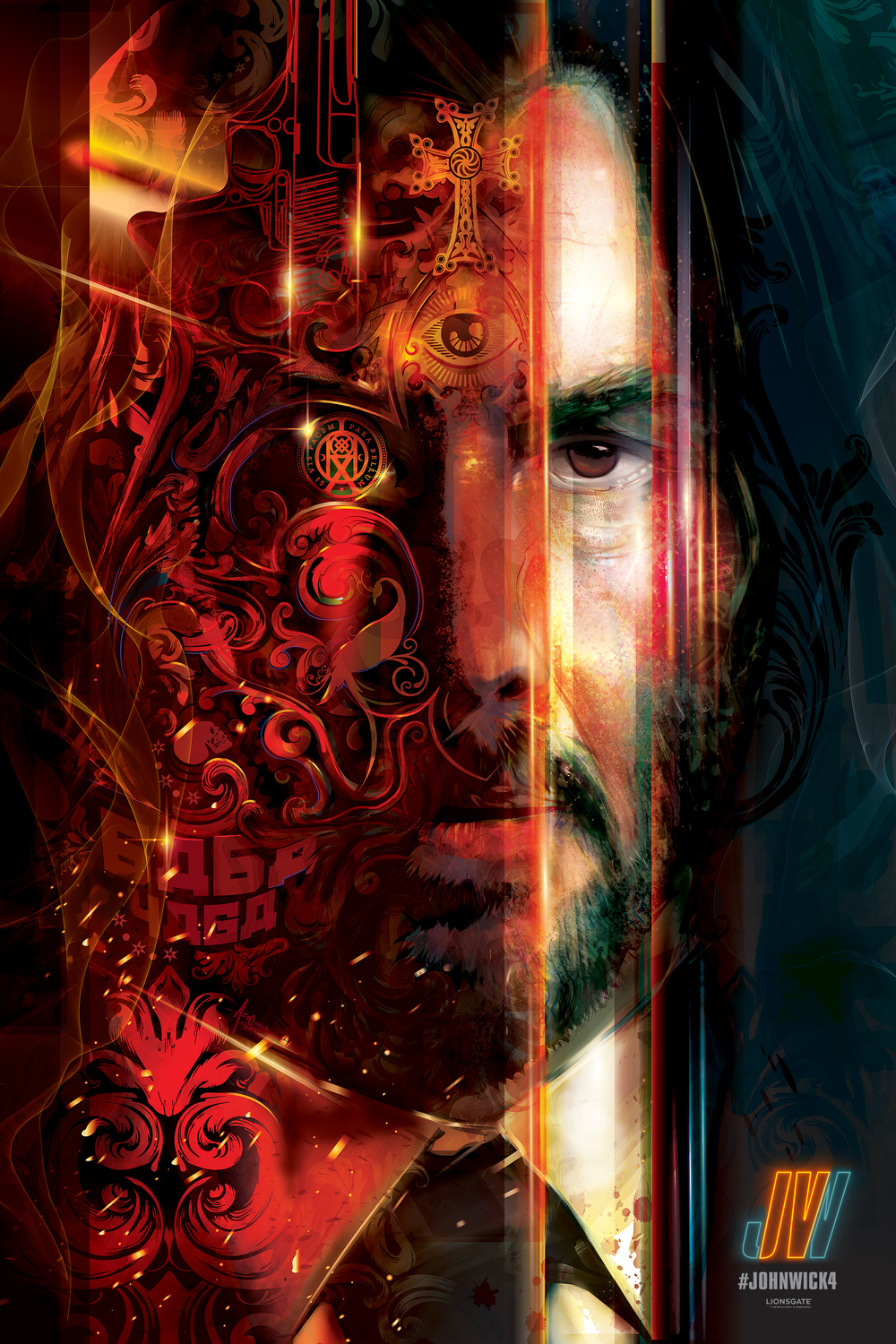
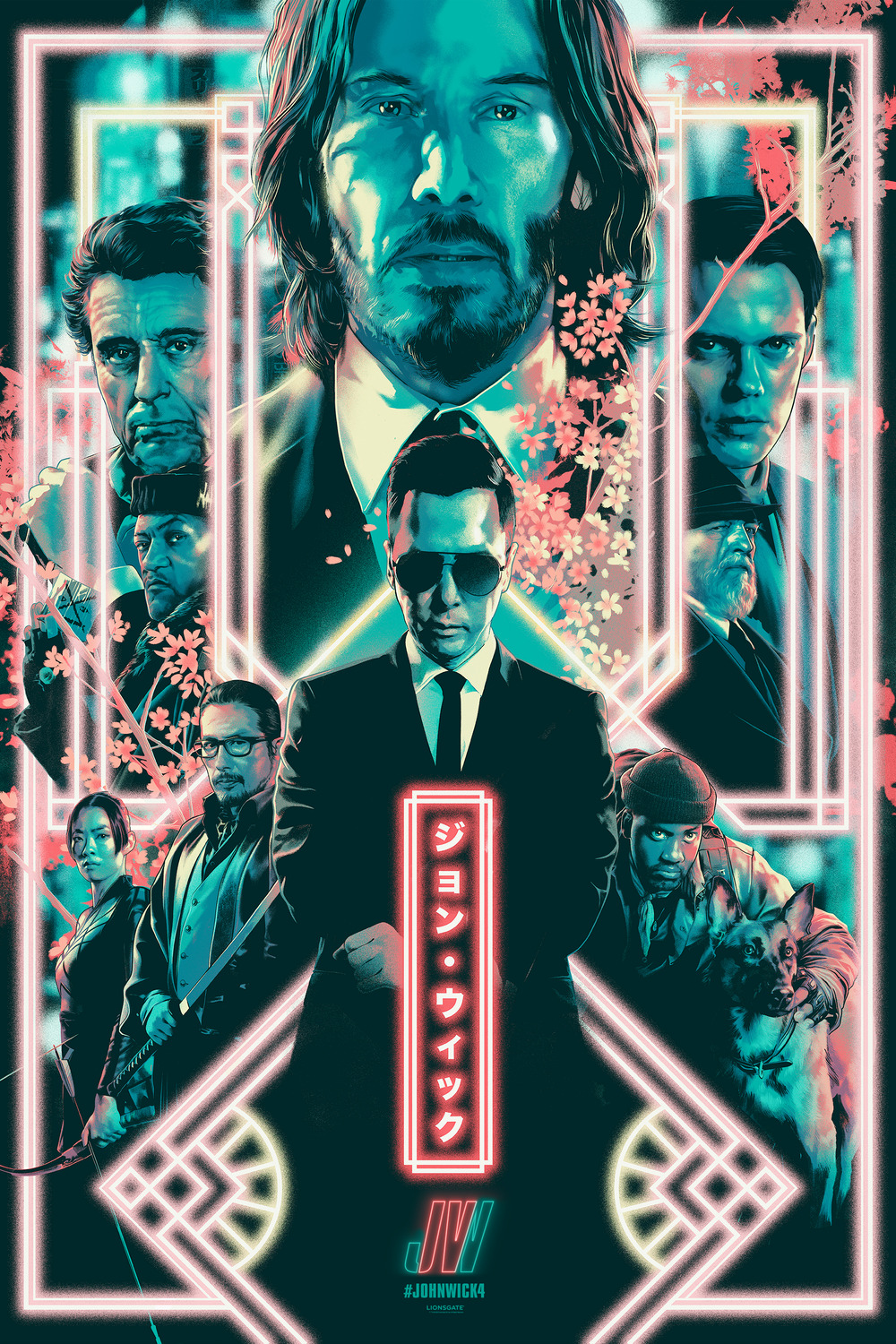
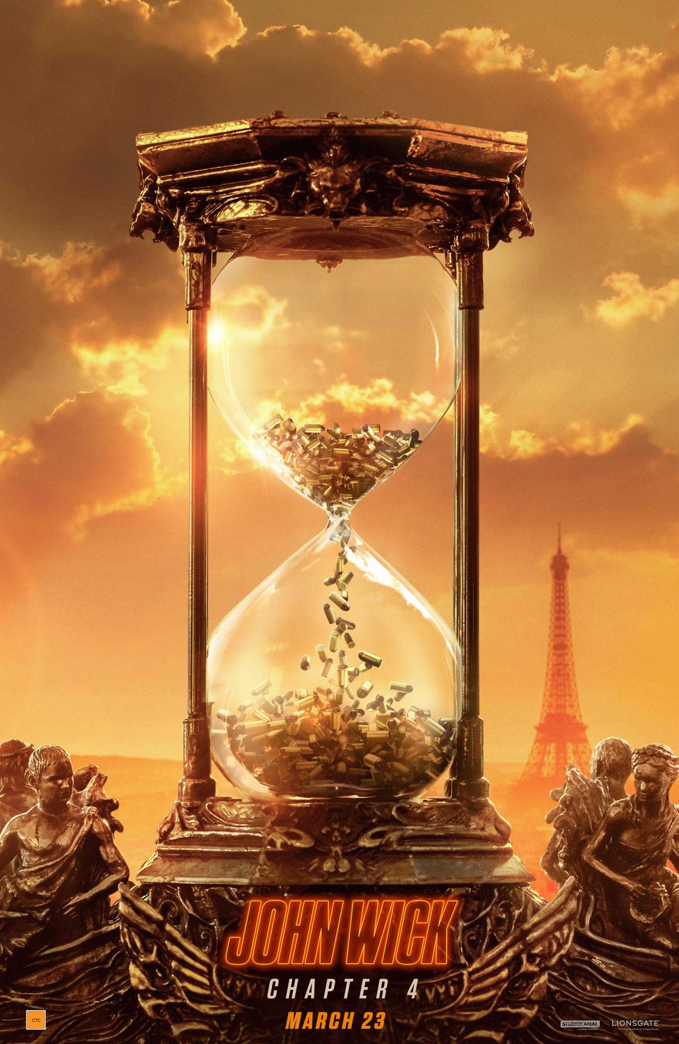
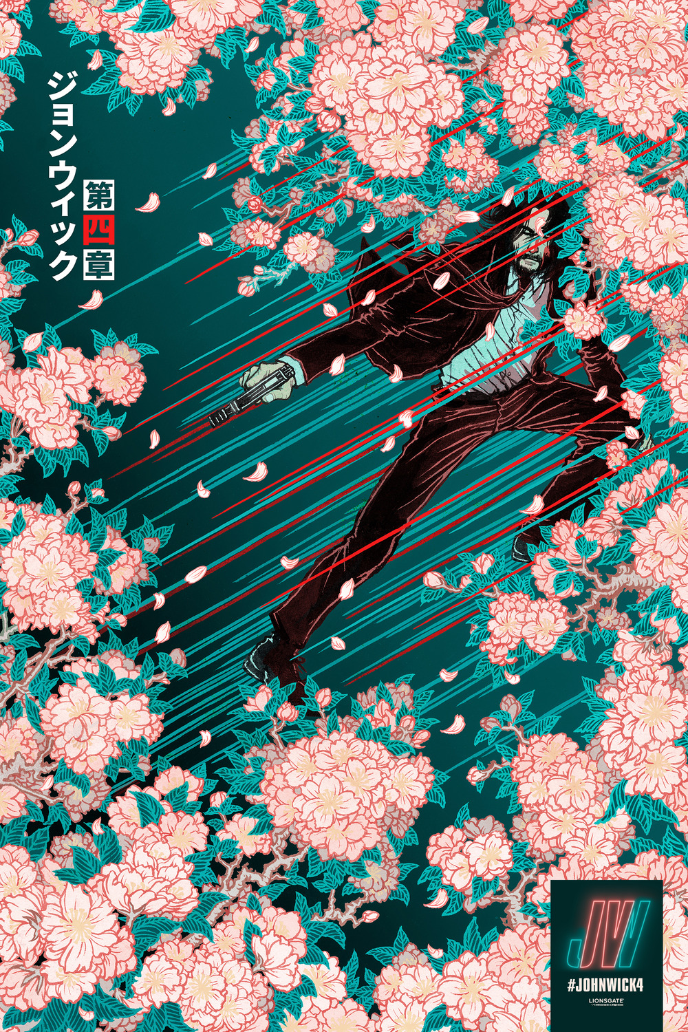
4) John Wick: Chapter 4
A John Wick movie came out this year, so you know they went hog wild on amazing posters. As usual, the artists really need to be commended here, because they’ve put together enough stylish designs that I could have made an entire list just of the best John Wick posters. They’re all just goddamn cool, but not quite enough to put them at the top of the list this year.
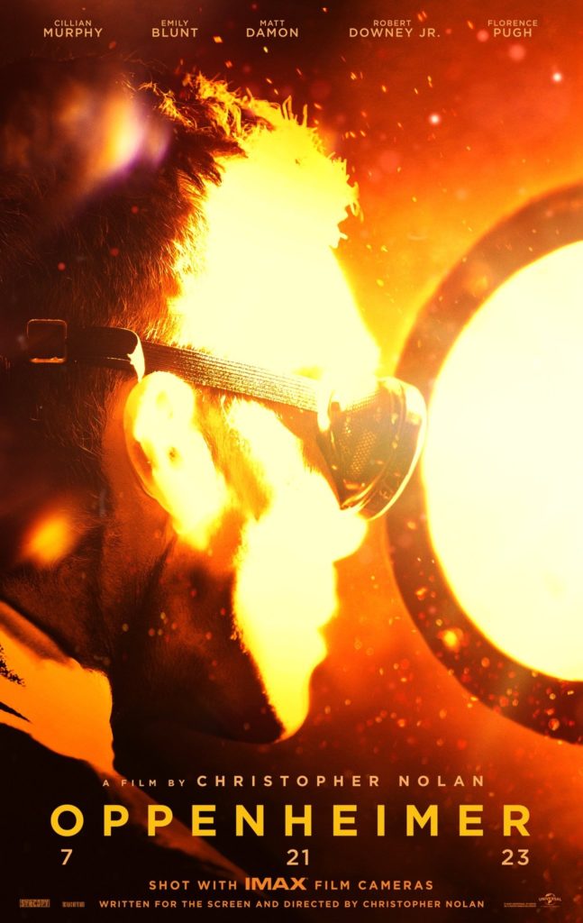
3) Oppenheimer
This is one of those posters where the title kind of brings it all together. First you see the extremely harshly-lit picture and wonder what the hell is happening. Then your eye is drawn to the title and it becomes chilling as you realize the apocalyptic awe of what is unfolding. It’s a poster that basically tells the story of Oppenheimer in one image and makes you want to see that unprecedented power unleashed for yourself. Pretty impressive I’d say for a poster which is so harshly lit that it obscures most of what you can actually see in it.
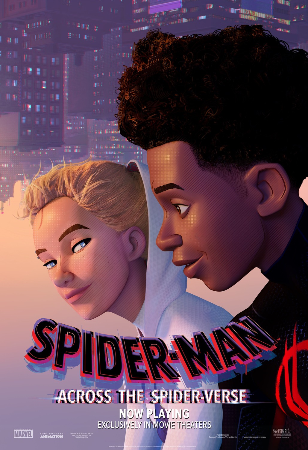
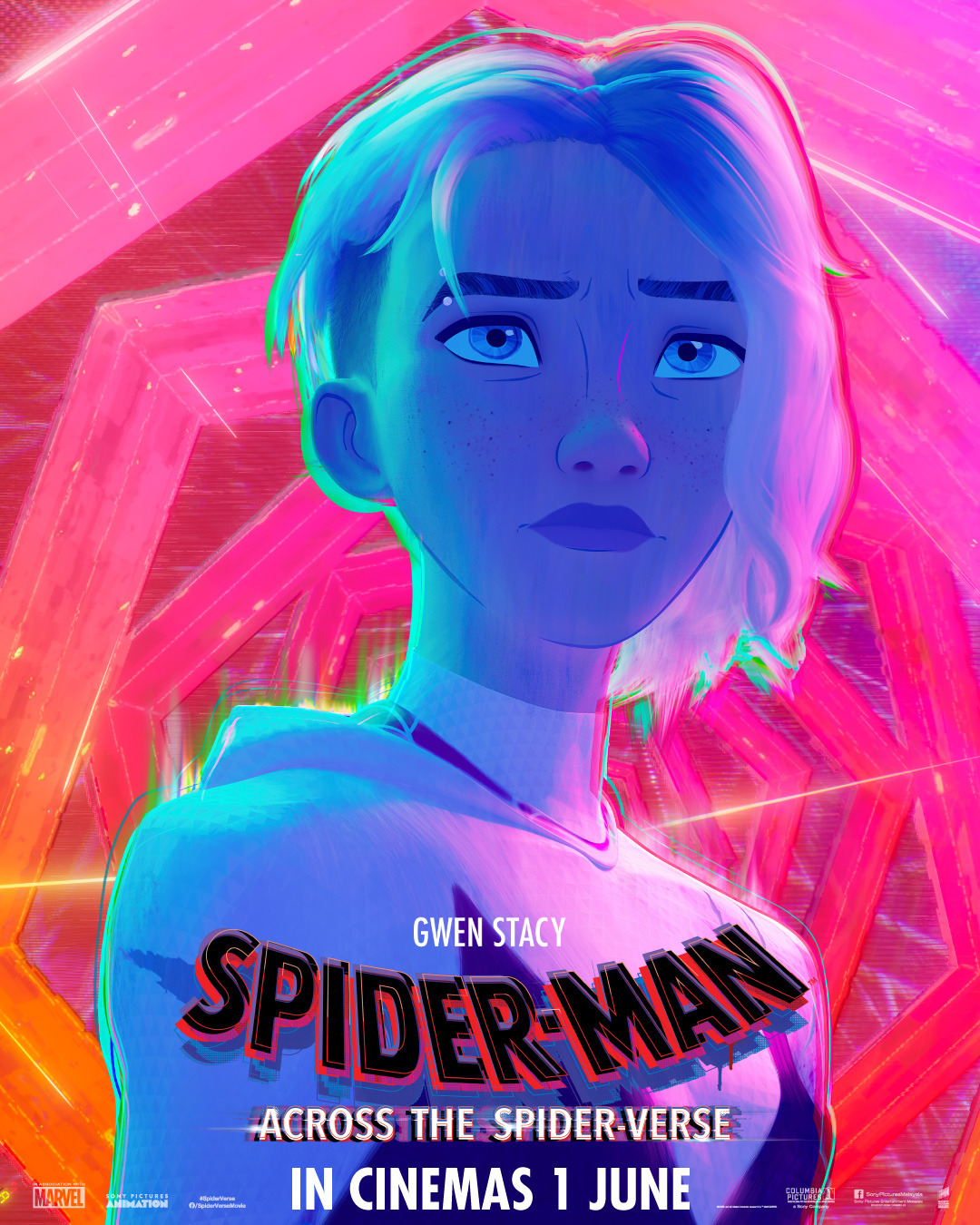
2) Spider-man: Across the Spider-verse
Every frame of this movie os fucking art and these posters prove it. The “Gwen and Miles” poster is just a random frame from the movie, but it is so stylish and well-composed that it is enough to completely sell me on the movie by itself. Just looking at it, you can tell that they’re having a good time just sitting and chatting, and that Gwen is absolutely simmering for Miles. It’s wild – this is a bombastic Spider-man movie, but what is selling me is wanting to hang out with these characters and see how their relationship blossoms. Again, that’s the power of a strong art style, it can make the marketing easy if you know what you’re doing.
Then there’s the standard character poster. You’ll notice that I haven’t even included any other “character posters” in this list, despite them making up like 70% of all movie posters released in a year. Usually these are bloody dull affairs, meant to do nothing more than introduce and familiarize an audience to the characters of the movie, but more often just turn into boring window-dressing made more out of obligation than inspiration. This poster of Gwen breaks that tradition, being colourful and eye-catching on its own, but it also utilizes the movie’s strong art style to hint that Gwen is going to be on a conflicted journey in Across the Spider-verse. It’s not just an excuse to show a name and have them look cool, the same thought that’s gone into every frame of the movie is on display here in its marketing. It would be enough to take my #1 spot, if not for…
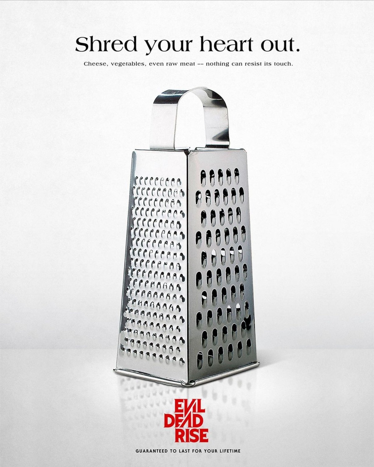

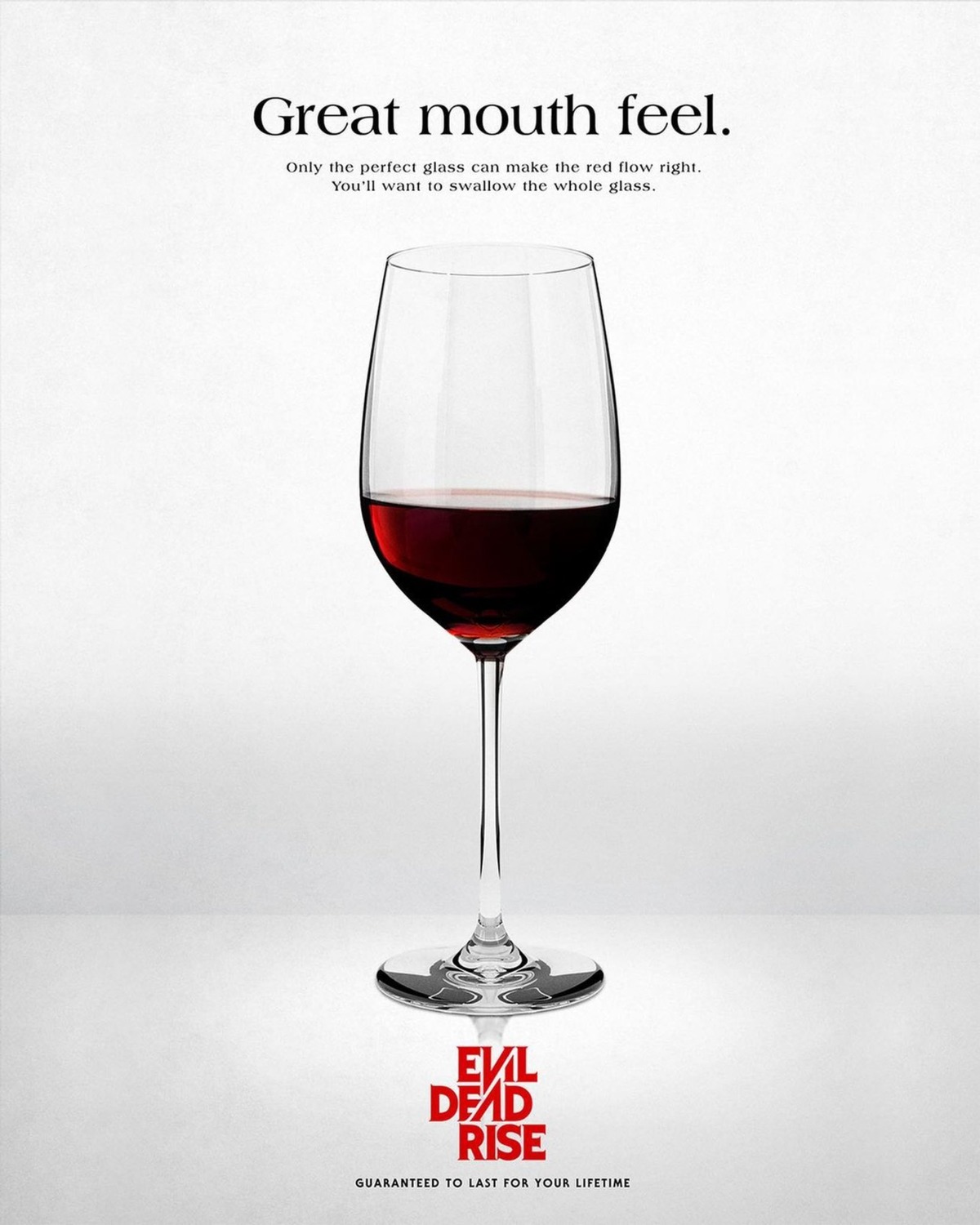
1) Evil Dead Rise
These posters got me for the sheer sadistic creativity on display. They might be confusing at first as your eye is naturally going to be drawn to the rather mundane household objects, but if you’ve ever seen an Evil Dead film (especially the 2013 remake), then when your eye is eventually drawn to the title, these objects are twisted into PAINFUL promises. “Oh God, I can just imagine the brutality of the cheese grater and scissors, but what the fuck are they going to do with the wine glass!?” It’s a less-is-more approach as you think of all the gory possibilities and this nasty bit of imagination born from such a simple bit of imagery is exactly why Evil Dead Rise‘s posters get my #1 rank this year.