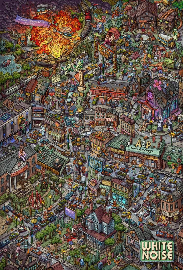
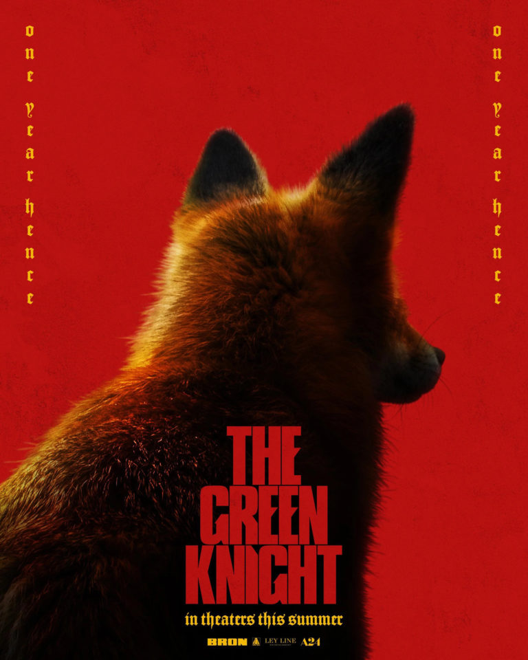
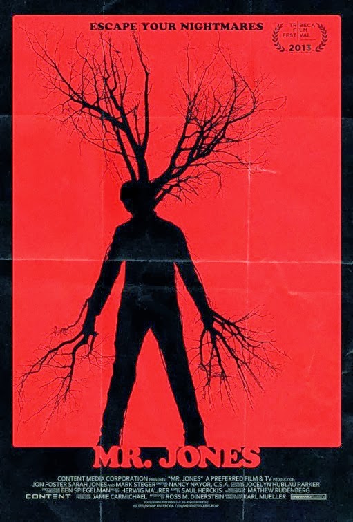
15 Best Movie Posters of 2023

I may not be writing as much as I used to, but it’ll be a cold day in hell before I miss my mostly-annual year-end countdowns! In case you’re unfamiliar with how this works, I spend the year trolling through impawards and collecting all the really cool, interesting and striking poster designs for 2023 movies and then narrow them down into a shortlist. As always, any poster released during the year is eligible to make the list, but special consideration is given to posters which are intended for mass distribution rather than posters which are intended to be limited-release, alternative, “artistic” posters. As usual, you can see the full-sized poster in all its glory if you click on the images.

Anyway, with those considerations out of the way, let’s get onto the list, starting with some honourable and dishonourable mentions:

The Drew Struzan style is over-done and tired at this point, a lazy trope to make a poster look nostalgic and exciting without having to put in any actual effort to design something original. On top of that, I couldn’t care less about a new Indiana Jones movie in 2023. However… I’d be lying if it wasn’t nice to see the iconic Struzan style brought back for one last hurrah where it absolutely is warranted, for the franchise which is perhaps most intrinsically tied to this style. It wasn’t enough to make the list proper, but I felt it worth highlighting.

Oh, and speaking of the Struzan style, here we have the poster for a new Left Behind movie. I’ll be honest, the poster itself is incredibly dull, but I mainly put it here to shit on this series and Kevin Sorbo. Also, Neal McDonough, you poor man, what the hell happened to you to make you have to slum this hard? I haven’t had the spark to do a new Retrospective series, considering all the time and effort that has to go into writing them, but dammit the idea of looking at all the Left Behind movies fills me with a sinister excitement… Maybe stay tuned in 2024 if I can muster the motivation.

Okay, this one deserves some mention for how effective these posters are for a “ridiculous slasher villain” movie. These would all be slightly-above-average posters for a regular slasher film, but add in the decent tagline and how seriously they’re taking the ridiculous premise, I can’t help but chuckle.

And with that said, let’s get into our top 15 proper:

15) Saw X

Saw X starts the list with a couple posters that I found fairly clever in their simplicity. First off is the “eye poster”, which instantly evokes a sense of primal terror before you even notice the saw shape at the edge of the iris, revealing what the victim is so scared of. The “I Heart Saw” isn’t quite as striking, but I do appreciate how it cheekily calls back to the series’ legacy of posters featuring severed body parts, hinting that this is a sequel aiming to go back to the franchise’s roots.

14) Nimona

Back when I was in university, one of the most important lessons I learned came from an American literature prof who had a blunt, but effective motto when we were writing essays: “Why should I care?” I think about that whenever I’m writing, and it’s a lesson that can be applied in most walks in life. For a poster designer, the job is (usually) to sell a movie, so “Why should I care?” presents a challenge with results that can be intriguing, if you check out this countdown annually.

I mention this because these posters for Nimona represent a twist on the usual approaches to “Why should I care” from graphic designers. Honestly, these posters have sold me on Nimona, and they aren’t doing anything particularly special in their own right. They just demonstrate that if you are working with a strong, charming art style, then that can be enough to sell a movie on its own, without any special flair being required on top of that. The designers of these posters are clearly putting in some work in order to be able to highlight the art so stylishly, so credit where it’s due, but this is one of those cases where character and tone are expressed so strongly in the character designs that you don’t really need anything else. These lists aren’t just about elaborate artistry or unique twists, sometimes it’s just working with the pieces you have and realizing that they can speak for themselves. I just thought that that was neat.

13) Super Mario Bros.: The Movie

I’m not a massive Mario fan – I enjoy the 8- and 16-bit classics, but never have played much of the games beyond that point. However, looking at this poster, I can’t help but get hyped. This is a perfect distillation of what a Mario fan would want to see in a movie, full of colourful, iconic imagery and easter eggs, similar to the Detective Pikachu poster a few years ago. It’s also worth noting that this establishes that the art style will be familiar to fans, which you wouldn’t think would be that notable, but considering that the last attempt at a Mario movie ended up being a surreal, dystopian, live-action fever dream, it’s warranted.

12) The Boogeyman

Look, if a movie’s posters are pulling off imagery which would be The Moneyshot in your average horror film, you know someone’s doing something right. The fact that these posters are actually rather scary in their own right, while still keeping its titular villain shrouded in mystery, is a bonus as well. I have no idea if this movie is any good, but if the marketing is this strong, it certainly suggests that you’d be in for a good time.

11) Expend4bles

Full disclosure: I’ve always loved this poster design which has been used across the entire Expendables franchise, to the point that it was the basis for my custom logo back when I spend hundreds of hours playing Battlefield 4. The skull + wings (or, in this case, hair) made of various weapons is a flawless bit of symbology for a deeply flawed franchise, promising all the action you could ever want from its star-studded cast. It still works here for me, and it’s good enough that I’ll even forgive that idiotic tagline.

10) The Deepest Breath

I call this the “Free Solo poster design philosophy” – a poster for a documentary which is just a simple picture of someone doing something batshit insane. While The Deepest Breath can’t quite match the same level of sheer intensity as Free Solo (to be fair, few could), it still promises an ass-clenching thriller of a documentary that will thriller your thalassophobia to record levels.

9) Cocaine Bear

THE BEAR. IS MADE. OF COCAINE.

8) How to Blow Up a Pipeline

This one gets a spot for how its title is worked into the image. It’s simple on its face, but very stark, evocative, even transgressive. I can’t help but be impressed by how the title makes it work – on many posters, the title is just there to let you know what the movie’s called. Some posters use a tagline to try to tell you what it’s about, and use characters and imagery to try to sell it. This just has a simple barrel and some inflammatory language, and it instantly gives you an idea of the sort of journey you’re in for with this movie. Kind of like Nimona, this is a lesson in using what you have, to an even more extreme degree, since they’re almost exclusively using the title to sell the film. While maybe this makes for a poster that’s less striking than some of the others on first glance, it’s a fascinating case when you think about the decisions put into it.

7) Barbie

I could not be further from the target audience for a Barbie movie, but goddamn do these posters nail the titular character’s pop cultural footprint. First of all, the “larger than life” poster is what made this rank so highly – it succinctly and artfully evokes how Barbie is an icon, a monolith which girls have looked up to for decades (literally, in this case). Meanwhile, the second poster deserves some mention because it shows that not only is Margot Robbie the perfect casting for Barbie, but assures the audience that the film understands Barbie as a character and is going to deliver on those expectations.

6) Swallowed

Do I really need to explain this one? This one just looks BLOODY PAINFUL, and assures you that you are in for an extremely uncomfortable time if you watch this movie. For a certain class of horror fan, what more could you ask for?

5) Candy Land

I really love this poster. It’s so evocative – it’s appropriately sleazy and erotic, hinting at nudity while barely obscuring it, and the faux-vintage design and blood splatters only serve to heighten all of that. Obscuring the subject’s face also serves to depersonalize her, lending the whole design a forbidden, voyeuristic quality which is nearly as uncomfortable as the more overt imagery Swallowed uses.

4) John Wick: Chapter 4

A John Wick movie came out this year, so you know they went hog wild on amazing posters. As usual, the artists really need to be commended here, because they’ve put together enough stylish designs that I could have made an entire list just of the best John Wick posters. They’re all just goddamn cool, but not quite enough to put them at the top of the list this year.

3) Oppenheimer

This is one of those posters where the title kind of brings it all together. First you see the extremely harshly-lit picture and wonder what the hell is happening. Then your eye is drawn to the title and it becomes chilling as you realize the apocalyptic awe of what is unfolding. It’s a poster that basically tells the story of Oppenheimer in one image and makes you want to see that unprecedented power unleashed for yourself. Pretty impressive I’d say for a poster which is so harshly lit that it obscures most of what you can actually see in it.

2) Spider-man: Across the Spider-verse

Every frame of this movie os fucking art and these posters prove it. The “Gwen and Miles” poster is just a random frame from the movie, but it is so stylish and well-composed that it is enough to completely sell me on the movie by itself. Just looking at it, you can tell that they’re having a good time just sitting and chatting, and that Gwen is absolutely simmering for Miles. It’s wild – this is a bombastic Spider-man movie, but what is selling me is wanting to hang out with these characters and see how their relationship blossoms. Again, that’s the power of a strong art style, it can make the marketing easy if you know what you’re doing.

Then there’s the standard character poster. You’ll notice that I haven’t even included any other “character posters” in this list, despite them making up like 70% of all movie posters released in a year. Usually these are bloody dull affairs, meant to do nothing more than introduce and familiarize an audience to the characters of the movie, but more often just turn into boring window-dressing made more out of obligation than inspiration. This poster of Gwen breaks that tradition, being colourful and eye-catching on its own, but it also utilizes the movie’s strong art style to hint that Gwen is going to be on a conflicted journey in Across the Spider-verse. It’s not just an excuse to show a name and have them look cool, the same thought that’s gone into every frame of the movie is on display here in its marketing. It would be enough to take my #1 spot, if not for…

1) Evil Dead Rise

These posters got me for the sheer sadistic creativity on display. They might be confusing at first as your eye is naturally going to be drawn to the rather mundane household objects, but if you’ve ever seen an Evil Dead film (especially the 2013 remake), then when your eye is eventually drawn to the title, these objects are twisted into PAINFUL promises. “Oh God, I can just imagine the brutality of the cheese grater and scissors, but what the fuck are they going to do with the wine glass!?” It’s a less-is-more approach as you think of all the gory possibilities and this nasty bit of imagination born from such a simple bit of imagery is exactly why Evil Dead Rise‘s posters get my #1 rank this year.

15 Best Movie Posters of 2022

Welcome back to the mostly-annual year-end countdown of the best movie posters of the year! In case you’re unfamiliar with how this works, I spend the year trolling through impawards and collecting all the really cool, interesting and striking poster designs for 2022 movies and then narrow them down into a shortlist. As always, any poster released during the year is eligible to make the list, but special consideration is given to posters which are intended for mass distribution rather than posters which are intended to be limited-release, alternative, “artistic” posters. As usual, you can see the full-sized poster in all its glory if you click on the images. Anyway, with those considerations out of the way, let’s get onto the list, starting with some dishonourable mentions!

Dishonourable Mention: Me!

Well… this was embarrassing. Last year’s big winner, Jackass Forever, ended up slipping to 2022, meaning it shouldn’t have even been on the list and should probably be winning this year’s award instead… To be fair, when I wrote the article it hadn’t been delayed into 2022 yet and I didn’t realize the issue until much later, but that was certainly embarrassing when I clued in.

Dishonourable Mentions: All This Shit

Ok, I don’t want to take up this preamble with a half dozen Dishonourable Mentions, but good God were there an unusually high number of notably-shitty posters this year. On the one hand you’ve got bootlicking shit like Bezos, which makes me retroactively hate the cult of personality that Steve Jobs cultivated even more than I already did. Then there’s cringe shit like the poster for Gamestop: Rise of the Players, which is a fascinating story but one which this poster memes to the point where I’d be embarrassed to even see their documentary. And then there’s stuff like Dakota, which despite featuring a good boy Malinois, has some of the worst graphic design I’ve seen on one of these lists before. The blue background against that garish red font literally hurts my eyes to look at.

Anyway, with that out of the way, let’s get on to this year’s best posters!

15) X

X was one of my favourite movies of the last year and these posters were actually part of the reason I checked it out in the first place. The graphic designers have outdone themselves in all of their designs for this film, capturing the 70s aesthetic and lurid subject matter through the imagery they’ve used (the crossed legs making an “X” is particularly clever). These posters don’t really spoil anything, but they prime you for the tone and feel of the movie in an abstract way and for that I think that the designers deserve some accolades.

14) Texas Chainsaw Massacre

Netflix’s Texas Chainsaw Massacre is one of the stupidest horror movies of the year, but goddamn if the posters for it weren’t some of the year’s most interesting and evocative. The sun-drenched poster is beautiful and disturbing, hiding Leatherface’s visage despite him being in full daylight. Meanwhile, I really like the abstract painting of Leatherface’s mask, which shows very little but aptly promises the “face of madness”. There’s even a little homage of the last shot from the original film beneath Leatherface’s mouth on this poster. Just great posters overall, which is especially surprising considering that the film’s Netflix release meant that they theoretically could have gotten away with marketing the film without producing any.

http://www.impawards.com/2022/good_egg_xlg.html

13) Good Egg

Here’s one of those little movies that wouldn’t get a lot of attention if not for the very striking poster design. Despite knowing nothing about this movie before seeing its poster, it’s impressive how much about the movie you can glean from this poster (it’s about a woman who has been having no luck with invitro fertilization so she turns to criminal methods to help out; hijinks ensure). In fact this poster’s so good that I legitimately want to see this movie now, so you know they did something right!

http://www.impawards.com/2022/jurassic_world_dominion_ver3_xlg.html

12) Jurassic World: Dominion

Much ink has been spilled about how Jurassic World: Dominion wastes its “dinosaurs on the mainland” setup, but for a moment there in the marketing it looked like we’d get to see cool scenes like this where a t-rex interrupts a drive-in movie showing. Depending on what you were looking to get out of Dominion, you could also argue that this makes this particular poster better than the movie we actually got. It’s also kind of wild because this is technically a poster for a teaser trailer, which feels like the pinnacle of big budget franchise marketing excess. If you want to get nitpicky, some of the photoshop compositing isn’t the best, but I really like the premise here and think that it effectively gets across the terror and wonder of dinosaurs unleashed in the real world.

http://www.impawards.com/2022/guillermo_del_toros_pinocchio_ver3.html

11) Pinocchio

It would take a lot to get me to give a shit about a Pinocchio movie (a fact evidenced by Disney’s own attempt this year coming and going without me even noticing), but apparently that limit for me is a poster with the name “Guillmero del Toro” on it. Del Toro’s creature designs are always fascinating and this poster puts that on full display, promising an unsettling take on Pinocchio which is more than a little reminiscent of Pan’s Labyrinth. Add on that this is not just childhood nostalgia pandering and this is a Pinocchio project that I actually have some interest in checking out when it releases on Netflix.

http://www.impawards.com/2022/black_panther_wakanda_forever_ver2_xlg.html

10) Black Panther: Wakanda Forever

Marvel movies tend to have pretty boring poster designs, but this one for Wakanda Forever struck me as being visually interesting the first time I saw it. It checks off all the standard “character poster” designs on the top half, but the way it places Namor and his forces upside down on the poster is interesting. It’s a clear visual metaphor, showing that the two sides are mirrored opposites, but it works really well and with more creativity than I’ve come to expect from Marvel these days.

http://www.impawards.com/2022/spin_me_round_xlg.html

9) Spin Me Round

I was thinking of giving the award for “movie poster that looks most like a dime-store novel” to The Black Phone, but Spin Me Round executes on that premise so much better in my opinion. It captures the harlequin romance cover aesthetic perfectly, with just a wink and a nod that everything may not be as straightforward as it may seem with Alison Brie’s backward glance towards the audience. Given that this is by the director of The Little Hours, which was basically the plot of a nun porn without the porn, this definitely is an intentional hint at all sorts of comedic chaos.

http://www.impawards.com/2022/northman_ver10_xlg.html

8) The Northman

The Northman makes this list mainly because… well, just look at it, it’s a gorgeous shot. Robert Eggers knows how to wring every bit of potential out of his historical films and give us some really striking visual design. Whoever decided that Bjork would make a great viking deserves all the praise. Muted colour schemes don’t always work, but here combined with the off-focus it grants The Seeress an ethereal glow which is hard to look away from.

http://www.impawards.com/2022/white_noise_ver5_xlg.html

7) White Noise

This poster makes the list for the sheer excess of it. It looks like an I Spy or Where’s Waldo illustration – everywhere you look there’s something interesting going on and the poster rewards careful study of it. There’s lots of little hidden details throughout, including the names of the director and the stars, plus various little gags and hints about the movie’s plot. You could argue that the poster is just too much, but considering how much this makes me want to study every little detail, I think it succeeds with aplomb.

6) Nope

For my money, Nope has the most iconic poster design of the year and it doesn’t even come close. This is one of those posters like for Jaws or Star Wars that people are still going to remember years from now. It doesn’t reveal anything about the movie really, just hinting at the alien abduction aspects, but it’s such a striking image and the title is so blunt that it sticks in your head immediately.

http://www.impawards.com/2022/fire_of_love_xlg.html

5) Fire of Love

Fire of Love‘s poster asks a simple question: do you want to watch a documentary about a volcanologist couple who stand in front of giant walls of lava like it ain’t no thing? It’s such a simple poster, selling you on the film itself with some of the striking, unbelievable imagery which has been captured for it and allowing that to speak for itself.

4) Deep Water

I don’t know anything about Deep Water, but the graphic designers went hard on it this year, putting out a ton of bomb-ass posters (to the point where I haven’t even posted all the posters I liked for this one film here). They’re all abstract, with vivid colours and imagery that hints at a movie full of sex, mystery, drama and murder. Again, this is for a Hulu film so it’s not like they needed to go this hard with their marketing, but the fact that they did really has helped make this movie’s posters stand out.

3) Everything Everywhere All At Once

I usually hate multiverse stories, but Everything Everywhere All At Once makes the most of the premise with some really fun and striking “alternate universe” posters. Raccacoonie in particular looks hilarious and nails the quirky Disney animation poster design perfectly, while the googly eye poster is weirdly unsettling. Even the standard poster is colourful and visually interesting, showing off the various alternate universes in a more efficient (if less fun) fashion. Everything Everywhere All At Once has had easily the funnest posters of the year, which is actually an accomplishment considering how much I enjoyed that one for White Noise.

2) The Batman

Batman movies have been trying to one-up themselves for a decade an a half now with how grim-dark they can get, and these posters for The Batman easily take the cake for how moody and dark they are. The red and black contrast is eye-catching and sets the oppressive, noir tone efficiently. The poster with the Riddler looks more akin to a serial killer film than it does a traditional Batman poster and the poster that frames Batman with the question mark hints at the Riddler’s involvement in iconic fashion. All-in-all, the posters for this incarnation of the bat are thematically united, hinting at a take on the character which will be darker, more serious and more disturbing than any we have seen before.

1) Crimes of the Future

NOPE. These posters are weird and disturbing enough without context, but if you know David Cronenberg and his penchant for twisted sci-fi and body horror, then these posters should be making your skin crawl. These posters only hint at the sorts of sick depravity you’re in store for if you watch this movie and for that they are easily the most effective posters I’ve seen all year.

15 Best Movie Posters of 2021

Welcome back to the mostly-annual year-end countdown of the best movie posters of the year! Obviously since we basically got no movies in 2020 I had to take the last year off, but we’re back for 2021 with a very solid selection of eye-catching posters that I had a seriously difficult time narrowing down into just a top 15. As before, I’m using impawards as the source for 2021 posters. Any poster released during the year is eligible, but special consideration is given to posters which are intended for mass distribution rather than posters which are intended to be limited-release, alternative, “artistic” posters. As usual, you can see the full-sized poster in all its glory if you click on the images. Anyway, with those considerations out of the way, let’s get onto the list!

Dishonourable Mention: Cosmic Sin

Okay, the idea of Bruce Willis and Frank Grillo as a couple of space marines sounds fucking awesome, but the cheap, obvious, awful headswap Photoshop job on this poster makes this whole movie seem cheap and laughable. Not that Cosmic Sin needs much help, this movie is apparently so bad and forgettable that no one has even fixed the numerous grammatical errors in its Wikipedia page as of October 21, 2021. Ouch.

15) The French Dispatch

This one mostly makes the list because you take one look at it and go “Oh hey, it’s a Wes Anderson movie in poster form”. It’s quirky, detailed and has tons of stuff to look at, each cell is practically a miniature character poster of its own and the Fibonacci sequence-like layout directs your eyes in an unusual and interesting way. The pulpy, 30s/40s serial art style also helps this standout amongst the other posters of 2021 and no-doubt reflects Anderson’s distinct visual style and aesthetics. All-in-all, a unique and fun poster which undoubtedly reflects the film’s aesthetic as well.

14) Spencer

This poster is very striking. Between the massive, elaborate outfit, the contrast between the dark and the light of the dress and Kristen Stewart’s flawless transformation into Princess Diana, there’s plenty to draw you in. What helps make this more than just a visually-appealing piece is that the design also belies the story’s darker elements, with Diana seemingly stifled, like she’s trapped in the opulence. It’s a true art piece in its own right and I’m curious if Spencer can live up to it.

13) Billie Eilish: The World’s a Little Blurry

I’m not really a fan of pop music (shocker), so unsurprisingly I don’t give a shit about Billie Eilish and could care even less for an Apple TV exclusive documentary about her. However, it’s hard to deny that she doesn’t have her own distinct style, best highlighted in these posters for The World’s a Little Blurry. I like the first one mostly, it has a moody tone to it, Eilish’s signature green hair gives it a strong hue and it (obviously) lives up to the “blurry” part of the title. It reminds me of the Joker poster from 2019 that I liked so much. Like most good posters, the use of colour is very intentional, bringing its own tone, mood, style and even symbology to these posters which I can’t help but appreciate.

12) Prisoners of the Ghostland

While I find this poster very visually-arresting, promising me the trippiest samurai movie you’ve ever seen, there’s one small element that really makes me love this poster. I love how this poster draws your eyeline downward – first you see a samurai badass with his back to you, then the spooky mask, then the title and then “This wildest movie I’ve ever made”. Wow, who’s saying that? Nicholas goddamn Cage and for him that is a freaking declaration. The poster itself is cool but that strategically-placed quote gets my imagination racing, just going to show that every aspect of poster design can be crucial to its success. For that, Prisoners of the Ghostland deserves special commendation!

11) A Classic Horror Story

This one succeeds for a couple reasons. First of all, it’s called A Classic Horror Story and the poster design makes this look like… a classic 70s horror story. Secondly, if I saw that horned devil lady in my doorway, I’d be legitimately unsettled. The fact that it seems to be happening in full daylight just makes the whole thing even more unsettling to me, while the red and black colours give the whole thing a sinister vibe. Like I said, colour is very important in good poster design (a trend which you will likely notice going forward) and the use of it here helps contribute to the horrifying atmosphere that A Classic Horror Story is giving off.

10) Honeydew

There are several horror posters this year that get by with their disturbing and unnerving imagery, including choices that just missed the list such as Malignant and We Need to Do Something. However, this poster for Honeydew is the most unsettling for me. I’m not entirely sure what is happening here, but it sure looks uncomfortable and you can see the fear in this guy’s eyes at whatever’s going on. It conjures images in my mind of some Saw-like trap and all the nastiness associated with that. The sickly, yellow hue over the entire poster just makes it feel even more disconcerting.

9) Old

This one is pretty simple but effective. While other posters for Old get across the idea that it takes place on a beach more, this one is far more interesting. In my opinion, it captures the concept of the inevitable, uncontrollable and even frightening passage of time and death very well, all wrapped up in a minimalist, black and white style that makes it striking to view.

8) The Sleeping Negro

Oh and speaking of minimalist styles, while the poster for Old mostly just looks cool, this poster for The Sleeping Negro uses it to get across some pretty clever racial imagery. This poster deftly gets across the theme of alienation and isolation in this film in a very simple manner that makes it even more effective than if they had gone for something more complicated or less stylized. Hell, they could honestly go even more minimalist if they wanted to, cutting out the title completely, and the message would still be conveyed just as strongly, as even the black character’s afro highlights that he’s singled out because of his race. When you can afford to strip down your poster even more then you know the designers hit on something right.

7) Bulletproof

This is another one of those posters where the imagery captures the ideas of the film in a really striking manner. Bulletproof is about the American response to school shootings and seeing children pointing finger guns at each other here is an eerie encapsulation of the topics this film will be exploring. Once again, the eyeline works perfectly – you see the finger guns, then you’re drawn down to the title and know what this movie is saying in chilling fashion.

6) The Suicide Squad

The Suicide Squad has a huge cast of extremely colourful and varied characters and this first poster captures that aspect of the film and its off-kilter tone in glorious fashion. It also doesn’t give any of the characters more prominence than the others, which makes the characters’ fates in the film even more ambiguous (which is pretty important for a movie where, like, 80% of these characters get annihilated in gory fashion). The second poster captures the feel of a pulpy, 60s-era action movie, which isn’t nearly as interesting but it it’s worth highlighting and contrasting it to the first poster. These are very different styles but they both work to capture the fun of this very enjoyable romp of a film.

5) The Green Knight

I love the use of bright red and gold and the subjects facing away from the camera across The Green Knight‘s posters, it gives them all a unifying, sombre tone. While the main theatrical poster would have made this list regardless due to its strong aesthetic, what really pushed this into the top five for me was the presence of that brilliantly huggable foxy boi. When I first saw that poster I squealed with glee. For the record, graphic designers, throw a fox on your poster and you’re pretty much guaranteed to make my top 15 if your poster is any good.

4) Godzilla vs. Kong

I’ve said it before and I’ll say it again, the Monsterverse consistently have some of the best posters of all Hollywood blockbusters. We get posters like Spiral which are pretty and posters like Bring Your Own Brigade and The River Runner which give you massive scale, but Godzilla vs. Kong gives you pretty colours and massive scale! The fact that they have so many cool posters and so many of these were actually used in the general marketing of the film make this even more impressive to me. Even if Godzilla vs. Kong was kinda disappointing, there’s no denying that the marketing was, once again, on point.

3) Army of the Dead

I didn’t really care for Army of the Dead – I thought it was bloated, poorly written and squandered what should have been an over-the-top action romp. While the film itself fell short, the marketing department for Army of the Dead clearly understood what this movie should have been. We get gorgeous poster after gorgeous poster of colourful, macabre excess, all of which make the film look way cooler than it actually is. This is just a handful of the great posters Army of the Dead got this year, so even if the quality wasn’t there (which it is) then due to pure variety this would have ranked highly. For my own part, I especially like the neon-hued skull in a river of paint and the pile of corpses in the shape of a skull. Man, seeing these posters is making me think about how I wish the movie lived up to them all over again…

2) The Night House

We’ve had a slew of spooky and disturbing horror movie posters in 2021, but for my money The Night House has the best of them. What makes it more impressive is that there isn’t much horror imagery to speak of – there’s a blood-red moon, a scared expression from Rebecca Hall and, in one poster, a ghostly hand cutout, representing a spectral figure or perhaps someone who’s been lost? Then there’s the strong use of red and black to give everything an eerie atmosphere. In any case, it works, I really want to see this movie and figure out what sort of thrills The Night House has in store for me, which makes it more than worthy of this spot. However, there can only be one #1 pick…

1) Jackass Forever

There’s something about this poster where I looked at it and said “this is perfect” and instantly put it as a frontrunner for the year’s posters. Like, just look at it, it’s the perfect encapsulation of what Jackass is. You’ve got the rainbow hang glider and obese man to draw your attention and then the eyeline goes down to the cactus plants and then down to the film’s title. Just by looking at it, it creates a story in your head that is equal parts funny, painful and so incredibly stupid that I can’t help but applaud it. It’s so simple, but so striking that I still can’t quite believe that it’s this good, especially because the other Jackass Forever posters don’t hit me the same way at all. Don’t let anyone tell you otherwise though, this right here: this is art.

POST-SCRIPT: Well, shit. I usually have a rule here – only posters for movies released in the year in question are considered and here I have completely flubbed as Jackass Forever is going to be released in 2022 instead. To be fair, when I started this list it actually would have been a 2021 film, but it was delayed and I missed that in the time it took to make selections, write and release the list. This isn’t the first time I’ve had this issue due to unexpected delays, but it should probably go without saying that I’ll not take Jackass Forever into account for 2022’s list (because it would probably win again).

15 Best Movie Posters of 2019

Welcome back to the annual, year-end countdown of the best movie posters of the year! And just like that, this is now officially an annual thing! I’ve been browsing impawards throughout the year, keeping an eye out for eye-catching, interesting posters and saving them for later. Suffice to say, I had a bunch of posters to sift through and narrowing this down to a top 15 was difficult (not least of all because new posters are released all the time so I couldn’t even begin to narrow the list down until the start of September). Also, starting this year I’m going to be giving extra consideration towards posters which are actually intended for mass distribution rather than posters which are intended to be artistic but very limited in their reach. I mean, this Dark Phoenix poster is really cool, but it’s also clearly a poster you’re never going to see if you go to a theatre. I’m still going to consider these kinds of posters if they’re really good, but I find it more impressive when a poster which is meant to sell general audiences on the film does something particularly artistic or interesting.

Anyway, with those considerations out of the way, let’s get onto the list! As usual, you can see the full-sized poster in all its glory if you click on the images.

Honourable Mentions

While Disney absolutely destroyed the competition at the box office this year, their posters were, by and large, very mediocre and lifeless. This poster for Frozen II was one of the few exceptions, with its interesting use of colour and reflections hinting at the plot and feel of the film. It ultimately just missed the list, but it was definitely worth mentioning.

This is another entry which could have easily made the list if the competition wasn’t quite so fierce. It’s got such a creepy design already and then as your eye gets drawn upwards you realize that the trees have been arranged in such a way that they spell “FEED”. I like this poster a lot, it looks way better than a gritty, Grimms fairy tale adaptation should.

Having seen Us, I like this poster quite a bit with its minimalist design resembling a Rorschach blot, but with the right side missing bits which hint at the film’s psycho doppelganger premise. It gets across the idea of the film very well, but I feel like it’s just a bit too subtle to really be appreciated unless you’ve actually seen the film first.

15) The Death of Dick Long

This is one of those posters where I have no idea what the film is actually supposed to be about, but it kind of makes me want to see the movie regardless. As I’ve said in previous best posters of the year countdowns, that’s ultimately the goal of a movie poster, so it’s worth some points in my book. On top of that, this poster is just eye-catching with its use of harsh, contrasting lighting and muted colours… and then you notice that the fireworks are coming from the guy’s freaking crotch. And then you notice the title is called The Death of Dick Long, and that it’s from one of the directors of Swiss Army Man. Yeah, it’s going to be weird as all hell, but intriguingly so. That said, I could have very easily skipped over this one if the poster wasn’t so eye-catching so I’d say that this is well-deserving of a spot in the Top 15.

14) Low Tide

Every best movie posters countdown needs a poster which is just a beautiful, “artistic” shot and Low Tide takes that spot for me this year. It really isn’t much more than an extremely well-composed photo and a cleverly integrated title using a reversed gradient, but that’s all it really needs to be. Low Tide‘s poster is so beautiful it makes your eyes water, suggesting that you’re in for a gorgeous treat if you watch it. In addition, its use of colour and gradients also implies a dangerous tone for the movie without really having to overtly spell it out. A great poster all-round, and that fact that it is only in at #14 just shows how impressive posters have been in 2019.

13) Hail Satan?

This poster is just so clever. It’s appropriately interesting, informative and inflammatory in equal measure. Most Americans (especially evangelicals) are uninformed about the Satanic temple and have a knee-jerk opposition to them, but that is exactly how they get awareness to their admittedly worthy causes. Usually, if you hear about Satanists in the news, it’s because they’re fighting for religious equality – after all, if an evangelical is okay to do something, a Satanist should be able to do an equivalent action, right? That idea gets across perfectly in this poster, with the image of the Statue of Liberty as Baphomet as a striking visual that is guaranteed to trigger evangelicals. Oh and it also has one of the best taglines of the year, which just manages to put this over Low Tide as far as I’m concerned. I love it.

12) Bliss

This is definitely the poster I’ve mulled over the most on this list. At first glance, the colour choices make it very ugly to look at and unappealing. However, the longer you look at it, the more intriguing it is. For one thing, the ugliness is clearly intentional and is meant to be at odds with the title, Bliss, which is usually associated with bright, cheerful colours. If you look closer you can pick out all sorts of unsettling details – screaming, disembodied mouths, blood dripping off the woman’s face, and piles of reaching, naked bodies scrambling over each other. The longer you look at it, the more unsettling things you begin to notice and the more intriguing Bliss becomes to me. Also, it’s worth mentioning that the hand-painted art help make this stand out a bit more compared to all the photoshopped posters of its contemporaries. All-in-all, when I was narrowing down this list to just a top 15, I had considered dropping Bliss on a number of occasions because of its surface-level ugliness, but I’m now confident that it really deserves a spot here due to its bold and evocative design.

11) The Ghost Who Walks

Again we have another poster which is, by itself, super intriguing. We’ve got what appears to be a very zoomed out, birds-eye shot of Santa Claus in an alleyway being escorted or robbed by a pair of men – whatever the scenario is, they don’t seem to be doing him a favour anyway. The story the poster tells is enough to make you go “WTF?”, but what really puts it over the top is the very clever composition and framing of the image and the way that the title has been integrated into the shot. It doesn’t really give you any information about the film’s story beyond a tone, but it’s fascinating enough that I can see it selling someone on the film by itself.

10) Pet Sematary

There’s no movie in 2019 that I wanted to love more than Pet Samatary, but good God the film was so mediocre that I can’t even be charitable to it. Oh well, at least we have this awesome poster that’s forever going to get my imagination going for a movie better than what we got. I love the way colour has been mostly drained from the poster. The use of black and white tones makes for great contrast and allow the bits of gold in Church’s eyes and the red in the title to stand out all the more. It’s all put together in such a creepy manner, from the great, shadowy shots of the main cast (especially the look of dread on Amy Seimetz’s face and the nearly skeletal-looking Jason Clarke), to the scary, masked children, to Church’s glower hanging over everyone. It uses the Drew Struzan style in an interesting way, is just striking and original in its own right, and ultimately does a better job of selling the film’s premise than the actual movie did. Sigh, sometimes print is better.

9) Once Upon a Time… In Hollywood

Tarantino’s latest kind of had to make this list. Sure, it’s not exactly the flashiest poster of the year, but it captures the aesthetic of 1960s film posters perfectly. The hand-drawn style, the vignettes of moments from the film, the way that the cast is shown off, even down to the way that the credits are listed – it’s perfect. Considering that that’s clearly the intent here, it would feel wrong for me not to recognize it on this list.

8) Child’s Play

Speaking of posters that, on their own, aren’t all that flashy… holy crap, Childs Play just goes bonkers. If you’re not aware, the Child’s Play remake/reboot went head-to-head with freaking Toy Story 4, and the marketing department were eager to make the most of this with this bonkers poster that takes the aesthetic from Toy Story 4‘s own marketing and uses it to make a freaking statement. There were a few posters in this Chucky murders Toy Story series, but the one with Woody’s arm and hat was the most striking, in my opinion. It reminds me of those posters for You’re Next a few years ago which had a killer hiding in the “reflection”. I just love how cheeky, bold and clever this poster design is and can only imagine how hard Bob Iger must have shit himself when he saw it for the first time.

7) Joker

Hoo boy, if there’s one movie we didn’t need in 2019, it’s probably a sympathetic, mass killer origin story for Joker for all the incels to admire… That said, this poster does a great job of conveying the idea without making him into someone we’re meant to feel sorry for. There’s such a creepy vibe here with the idea of a psychotic person who can’t smile without physically forcing himself. The awfulness of this is further reinforced by the paint-drop tear, the sickly colour palette and the disturbing extreme close-up which shows off all the strained emotion on Joker’s face. It’s a very well-composed image that gets across the idea of the film perfectly… arguably better than the actual film does, in some ways.

6) The Unborn

What. The. FUCK. IS THAT!?!?!! Okay, I’m sold on this movie already – I don’t know what the hell it’s about, but this poster is straight-up disturbing shit. It has such a disgustingly creepy vibe to it with little more than a shadowy mutant baby in a jar backlit by what looks like a hundred year old light bulb. It’s horrifying and, while I’m certain the movie can’t hope to live up to the sick shit running through my head when I look at this poster, it makes me want to find out what the hell this movie is all about. Sign me the hell up.

5) Detective Pikachu

Okay, obviously I’m a Pokemaniac, so I’m kind of biased on this one. That said, this is a dense poster packed with all sorts of subtle Easter eggs and plot hints that are enough to make a Pokemaniac like me jizz their pants. Seriously, whoever designed this poster clearly loves Pokemon and packed nearly every inch of it with obscure references to the games’ universe. Even if you don’t get the nerdy references, the Easter eggs still do the job of making the world of Ryme City appear lived-in and bustling, inviting you to pour over all the details that have been hidden in it. As a result, I’ve probably sunk more time into this one poster than I have on all the other posters on this list, combined. That by itself is an accomplishment worthy of some appreciation, which is why Detective Pikachu ranks so high on this list.

4) Aladdin

Perhaps mirroring their creative bankruptcy for most of the year, Disney’s poster output in 2019 has been unfortunately mediocre. Even Endgame didn’t have any particularly interesting posters, so imagine my surprise when I finally found a visually arresting poster for a Disney movie: the live-action AladdinAladdin was a mostly-mediocre and over-stuffed film, but it did have its charms thanks largely to the performances from the three main leads, especially Will Smith. Thankfully, they’re all on display in this gorgeous poster which uses the white background and expert use of a red and blue to draw your eye and tell a particular story. Your eye is naturally going to be drawn to Will Smith’s genie first, then down to Jafar and Jasmine, then down to Aladdin, then down to Abu jumping into the lamp before you reach the title. It’s such a cool and clearly-intentional trick, using the space of the poster itself to great effect to direct the viewer in an unnatural upper-right to lower-left line. That’s impressive on its own, but the fact that the poster itself is just gorgeous-looking easily cemented this as one of my absolute favourite posters of 2019.

3) Glass

Glass was, in a lot of ways, a colossal disappointment which threw the nascent Shyamalan resurgence back into disarray. There are a number of reasons for this, but probably the most pertinent is that Glass represents so much wasted potential. We can see some of that potential here in this poster, which captures the essence of a climactic superhero story in such a beautiful way. Each broken piece of glass shows off characters painted in a comic-book art style, interspersed with actual comic art created for the films itself. It’s enthralling to look at, packed with strong emotions for each of the characters and can’t help but feel evocative to for anyone who appreciates comic book storytelling.

Also worth mentioning is this other poster which creates a portrait of Mr. Glass out of literal shards of broken glass. It’s not nearly as striking as the above poster of course, but it is quite interesting in its own right, especially for a “character poster”, which usually just comes across as a boring, requisite marketing piece.

2) John Wick: Chapter 3 – Parabellum

There were ultimately only two films on this list which were duking it out for the top spot, and I have to say that John Wick: Chapter 3 only just barely lost out on it. I mean, just look at this poster, it is exquisite! I would hang this on my wall in a heartbeat. The neon-soaked colour palette is simultaneously arresting to look at and a perfect representation of the aesthetic of John Wick, while the harsh metals and skull imagery convey the feel of the series. There really isn’t much more to it than that – it’s just a poster so cool that it just plows its way to the runner-up position of this year’s posters.

Oh, also worth mentioning is the poster on the right, featuring John Wick versus hundreds of assassins. This gets across the tone and sort of odds that ol’ John is in for in the film in such a striking and frankly funny fashion. It isn’t quite as visually-arresting as the above poster, but it is definitely worth mentioning in its own right.

Which brings us to our #1 spot for 2019…

1) Godzilla: King of the Monsters

 If there’s one film whose marketing department absolutely killed it this year, it’s definitely Godzilla: King of the Monsters‘. To put it simply, every single poster for this film is simultaneously visually beautiful and totally kick-ass (as if this were an action movie starring Emily Blunt and Charlize Theron). Unlike a lot of blockbusters, even the regular theatrical posters have a level of creative artistic merit to them which is usually reserved for more specialized posters (presumably for fear of alienating the mass audience with a poster that’s not aimed at the lowest common demoninator). When you consider that the beautiful shots in these posters are also just being indicative of the cinematography of the film itself, it just makes the marketing for this film even more impressive. Godzilla: King of the Monsters may have been a bit bloated and underwhelming on its own merits, but holy crap if the film’s marketing department didn’t go all-out this year. Here’s hoping that next year’s Godzilla vs. Kong continues this trend, because if it does then we are in for an absolute treat.

15 Best Movie Posters of 2018

If you’ve read any of my movie reviews, you might have noticed that I always have a whole blurb at the start of the review critiquing the design of the film’s poster. I really love a good movie poster, it’s a piece of art unto itself. Films that treat their poster as more than just a piece of marketing deserve special recognition, so what better way to do that than a year-end countdown?

Also… man, it’s hard to believe that the last time I did a movie posters best-of was 5 freaking years ago! I’ve always wanted to turn it into an annual thing, but it has never actually happened for whatever reason. Hell, I even had a folder with notable movie posters saved in 2015 or 2017, but the countdown just never materialized. So, with any luck, this will be commencement of the first annual IC2S Best Movie Poster countdown!

(Images come courtesy of the film poster database Internet Movie Poster Awards.)

Honourable Mention: The Predator

This poster deserves special mention just because of how weird it is. This is one of a series of stylized posters featuring the Predator living a “cool” lifestyle of playing basketball, skateboarding and break-dancing. It’s such a bonkers design, made even weirder by the tongue-in-cheek “ALIEN” brand on their computer and basketball jersey. The neon graffiti aesthetic is also so at odds with Predator that this whole thing becomes really interesting. I mean, it’s more respectful to the franchise than The Predator was at the very least.
15) Acrimony

Acrimony has a couple really cool posters, but in my opinion this one is the best of them. Maybe I’m somewhat biased (red and black are my favourite colour combination), but the poster itself is just quite striking and says a lot about the film and the dangerous nature of its protagonist through its use of imagery. Plus, if Acrimony‘s Tomatometer is anything to go by, its posters are higher art than the film itself.

14) Isle of Dogs

This poster works on a few different levels, any one of which could be enough to get someone to want to see the film. First of all, it shows off the film’s unique artstyle with each of its colourful characters on display. It also hints at Wes Anderson’s particular “flat” style of directing, something which would excite anyone who had seen Fantastic Mr. Fox. Furthermore, it also shows the film’s Japanese setting, not only with the title and sole human character, but with the way that the dogs are arranged vertically as if they were kanji. Character posters are an overdone trope with major releases these days (one that Isle of Dogs is not immune to), but it’s nice to get a poster like this which shows off all of the characters in the film in an equal light, from the major to the minor, while also conveying that the film’s style is as important as any singular element.

13) Goodland

This poster mainly makes the list because, I mean look at it, it’s a gorgeous composition. The reflection in the water also has some thematic significance for the film, representing how the events of the film turn everything upside down. It’s just a cool, visually striking poster, one that could easily be considered art unto itself.

12) Active Measures

Visually, this isn’t a particularly complex poster. Rather, this one succeeds for just how effectively it conveys the idea of the film through simple images. The sheer scale of the maze also goes to show that this isn’t a simple affair, rather things have been progressing and going in Putin’s favour for a long time to get them to the point where they could potentially have influence in the highest levels of the White House.

11) Ant-man and the Wasp

A list of the best movie posters of the year is never complete without one good Drew Stuzan-style poster and I had a few candidates to go with this year. While Black Panther, Aquaman, Deadpool 2, Solo: A Star Wars Story and Avengers: Infinity War all had posters competing for a spot, I ultimately went with Ant-man and the Wasp. I just thought that the red, gold and white looked far more striking than any of its competitors. The equal prominence of Ant-man and Wasp as the co-leads also helped as it lent the poster just a bit more flavour to the composition, splitting the cast in half down the middle. Ultimately, it just makes the film look like a ton of fun, which is exactly what the Ant-man franchise is going for, moreso than any other Marvel franchise.

10) The American Meme

This poster for The American Meme goes to show why taglines are so important. There are a few different posters for this documentary, but this one is definitely the most eye-catching of the bunch. The tagline and image alone are enough to convey the idea that one should be cautious on social media, which is enough to make me intrigued on what sort of angle the filmmakers are going to take. In fact, of the films on this list that I haven’t seen, this is one that I am definitely going to check out entirely because of the poster. I’m not sure what higher praise you could give a film poster than that.

9) Spider-man: Into the Spider-verse

This is another one of those posters on this list which earns its place mostly by just being really cool and well-composed. It does get some points as well for managing to convey that this isn’t “just another Spider-man movie”, with its animation style, different costume for Miles Morales and the clothing he’s wearing over the costume which helps convey his character. Oh, and to top it off, the poster just makes this film look like a ton of fun.

8) Beats of Rage

…and speaking of fun, we’ve got Beats of Rage. There were a couple films in 2018 with 80s arcade-inspired posters, but Beats of Rage takes the cake in my opinion. I have absolutely no idea what this film is about, but the poster is making me interested just due to how insane it looks. Is this like a mash-up between Mad Max and Dance Dance Revolution? I almost want to watch it to find out, but I feel like there’s no way it can live up to the insanity in my head.

7) The Endless

This is one gorgeously haunting poster. It almost looks like it could be a pretty cool desktop background, but the poster is also designed in such a way as to make it simultaneously unsettling to look at. The darkness encroaching throughout the image, the gigantic cosmic portal dwarfing the human characters and the humans all getting sucked into the vortex all make for a creepy image. This is another one of those posters that gets me interested on its own and having looked into the film more as a result, it sounds enthralling.


6) The Meg

The Meg had some of the funnest and most impressive marketing campaigns of the year, promising an entertaining popcorn film with a shark bigger than any other (whether the film delivered on that promise is up for debate). The posters helped to build up that hype, that this was a shark movie for the modern blockbuster age. I liked this poster the most, as it shows off the scale along with some humour in the process, while also riffing on Jaws.

5) Avengers: Infinity War

There were quite a few cool posters for Infinity War (even the obligatory, normally-boring character posters were pretty great), but this series of five posters were by far the best and most stylish. Thanos takes the center poster, but the two posters to either side of him feature stylized versions of all of the major characters in Infinity War. It just goes to show just how epically unprecedented the scale of this film is, while also just looking super cool in its own right.

4) Deadpool 2

Unsurprisingly, Deadpool 2 had a slew of great posters to choose from, but this one was definitely my favourite. For one thing, it just looks really stylish and eye-catching. Most importantly though, the meta aspect of it is just pure Deadpool, made even better with all the random extras in the audience super excited to see the movie and Deadpool’s own enthralled expression. The marketing really shows off the character’s unique sense of humour and why this isn’t “just another superhero movie”.

3) Truth or Dare

Man, it was super hard to pick between the top 3 entries on this list, they were all super close. Perhaps the most impressive thing about this poster is that it’s for freaking Truth or Dare. Look at that thing, it makes you flinch and promises a far more brutal film than what you would be actually getting into. Furthermore, the neon green and pink style of the poster is really interesting and eye-catching. If there’s one thing I don’t like about this poster, it’s the stupid “Truth or Dare” grin on the corners of the skull’s face, but that’s more of a failing of the people who made this movie rather than the poster itself. I really wish that this was a poster for a better movie, it it does go to show that sometimes the marketing can transcend the film it’s trying to sell.

2) The Clovehitch Killer

Everything about this poster is so unsettling, from the sleeping victim to the masked killer, the washed out colours, the incongruous domestic setting, the voyeuristic framing, even the title which contextualizes everything and makes it even creepier. This is another one of those films that I am definitely going to check out this year based on nothing more than this extremely unsettling poster. I mean, if the poster is this artfully disturbing, you’d hope that the film itself can capture some of that energy right? I look forward to finding out!

And now for our winner of the 2018 IC2S Movie Poster awards… Drum roll please!

1) Free Solo

OH GOD. If ever there was a poster that conveyed exactly what the film was about, this has to be up there among the most evocative. Like… how. How do you manage to make that climb? Can you even take breaks on the way up? How does he survive? Good God, how high is that cliff!? Has a poster alone ever given someone vertigo before? I have so many questions because of this poster and the only way I can get my answers in a satisfactory manner is to watch Free Solo. Again, there is absolutely no greater praise you can give to a poster than that and I have seen few posters that have pulled that off greater than this.

Best Movie Posters of 2013

If you’ve read any of my reviews or retrospectives, you’ll probably notice that I have an interest in the design of film posters. As a result of this interest, I decided to put together a list of the best movie posters of the year. I’ve been collecting cool posters for months now and have had to do my best to whittle down this list to an acceptable number. In the future, I might turn this into a seasonal column, but for now enjoy my favourite movie posters of the year 2013!

Note: This list only encompasses films released in 2013, although some of the independent films may have been given a variety of earlier releases as well. So, as much as I want to put this amazing Godzilla poster on the list, I’ll have to wait til next year. Films with a few notable posters have been grouped together. Also, click on any of the posters for a larger resolution image (otherwise this entry will be too damn long).

Honourable Mentions:
I had a pretty long list of posters for this list, so naturally not all of them made the cut for one reason or another: maybe they were only a special issue poster or a cool design that doesn’t really do much to sell me on the movie. Maybe it was just not good enough to crack the top 10. Whatever the case, these are the posters that didn’t make the list, but that I felt deserved some recognition.

I never saw this movie because, frankly, it looked a) like the very definition of a generic buddy cop comedy and b) really bad. However, if they had based the entire marketing campaign on Struzan-esque posters like this, I might have been first in line. Unfortunately, the rest of the marketing campaign relied on gluing glasses to Sandra Bullock and trying to make Melissa McCarthy go through lipsuction.

I thought this one was just cute, although it doesn’t really tell me anything about the film. It’s definitely indie, maybe it’s quirky too, and there’s about a 25% chance of hot dogs being involved somewhere in there. Still, very clever design work went into this one.

This one makes the list for its unconventional tactics. No, not The Big Wedding, look closer. This is actually a poster for You’re Next, slipping a masked killer into the reflection (these were originally placed inside of bus stops… which is just awesome). Probably too subtle, but still a clever marketing tactic (and one which further ensures that You’re Next is gonna be in my blu-ray collection soon).

10) The Hunger Games: Catching Fire
Admittedly I mostly picked these because of Jena Malone and Jennifer Lawrence, but the posters do a good job of establishing the characters and “epic” scale of the Hunger Games franchise. The one of Katniss in particular has very interesting colour grading, making it almost appear… dated in a sense. In any case, it’s very well-composed and visually stunning. As for the one of Johanna, it does a good job of setting up this character as someone you don’t want to mess with, largely due to Jena Malone’s icy stare. The stunning subjects of these two posters really go a long way to cementing their exemplary quality.

9) The Wolverine
The Wolverine was a pretty mediocre film, but the posters marketing it were nearly all amazing. The high contrast water colour paintings of the characters are stunning and really helped to set this film apart from other super hero flicks which were going for flashy style over substance. Too bad the film couldn’t have been this artsy… hell, if they made an animated Wolverine in this style, it would be gorgeous.
 
8) Mr. Jones
WTF? Nightmares indeed. I have no idea what this movie is about, but the poster is disturbing enough by itself. For some reason, I imagine the film itself isn’t about how the ents get revenge on us, but I would bet that the movie is pretty harrowing.
 
7) World War Z
Much like The Wolverine, the black and white style really makes this poster standout. The fact that this scene is actually in the movie adds to World War Z‘s favour though. The poster promises an epic, blockbuster scale and that it will be unique – a feature which is crucial in a time in which we are exhausted with zombies. Of course, the movie ended up sucking, but at least the poster was awesome.
 
6) Machete Kills
Machete Kills was simultaneously exactly what I expected and very disappointing. It was incoherent and bloated, but it gained a lot of points in my book for how ridiculous it was – a feature highlighted very early by the marketing for the film. The poster of Sophia Vergara with the minigun brazier is hilarious and awesome and basically single-handedly won my ticket. The Lady Gaga poster is very intriguing as well. For one thing, I really don’t like Lady Gaga, but the poster does a fantastic job of portraying her as both exotic and intriguing. If only they had integrated her into the film more naturally, it may not have been for naught…


5) Evocateur: The Morton Downey Jr. Story
Like quite a few films on this list, I have no idea what this movie is about, but isn’t this poster a thing of beauty? Based on the poster, I would assume it has something to do with racial conflict in America.


4) Would You Rather
OUCH OUCH OUCH OUCH OUCH. NO. I can pretty much guarantee the movie isn’t nearly as harrowing as this poster is. Gah, just the thought of sticking a blade near my eye like that just freaks me out. If I was caught in the Death Mask trap from Saw II and the only way I could live was to cut my eye out, I’d just sit down and die. Suffice to say, this movie poster gives me the heeby-jeebies and just makes me think of all the other sick stuff the filmmakers might have put into a film with this title.

3) Iron Man 3
It takes a lot for a second sequel to cause excitement, especially after following up after a really poor first sequel (Iron Man 2, obviously) and a really good spin-off of unprecedented proportions (The Avengers, obviously). The marketing for Iron Man 3 lives up to this task, showing us a vulnerable Tony Stark who somehow has to get out of what is clearly an extremely deadly situation which one-ups the alien invasion storyline of The Avengers. The poster featuring the stylized Iron Man suits is also noteworthy for its very cool-looking design. For some reason, it makes me think of anime/manga art.


2) Gangster Squad
Gangster Squad had some truly exceptional posters perfectly capturing the spirit of pulp/noir gangster films. A lot of props have to go to the fact that Emma Stone is absolutely stunning in that red dress (hell, she carries her own poster and sells the film on that fact). Of course, the movie was an enormous disappointment, but between the trailers and the posters, the marketing for the film was undeniably brilliant.


1) Spring Breakers
This poster (the one on the right) is just brilliant. It looks pretty serene at first, like a still from an inspirational drama or a chick flick. Oh look, it’s a dude playing piano and serenading a trio of bikini-clad women in front of a gorgeous sunset. It’s covered in a girly purple font. It almost looks like a perfume/cologne ad. However, it also manages to be subtly unsettling. What’s up with the horror-esque font on the title and credits? And then you notice the girls surrounding the pianist are wearing ski masks and slinging rifles. Is this pianist just crazy or are the girls going to kill him if he doesn’t play? When you look past the very basics of this poster, it gets really intriguing. I haven’t seen Spring Breakers, but from what I understand of it, the poster captures the dichotomy of beauty and the threat of violence which really runs through the film.

Also of note are the less-artsy posters which made up the bulk of the film’s marketing – they capitalize on pastel colours and sex, which might be selling the film a little deceptively but at least the posters look good. I chose to show the Ashley Benson poster because it single-handedly put her on my radar, haha.

And there you have it – my favourite film posters of 2013. I think I’ll turn this into a regular column on this blog so be sure to come back for more in the near future! And be sure to add your favourite past and upcoming posters in the comments section below.