For the full effect of what I’m going for here, let the embedded video run while you...
popular culture
Welcome back to my annual music countdown! As is tradition here on IC2S, I go back through...

It’s mid-December, so that means another count-down of my favourite movie posters of the past year! In...
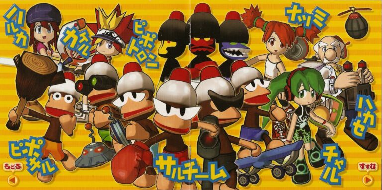
Welcome back to the Ape Escape Love/Hate series! As I alluded to at the end of the...

My PSM Video Game Girls Swimsuit Issue ranking is the gift which keeps on giving. Not only...

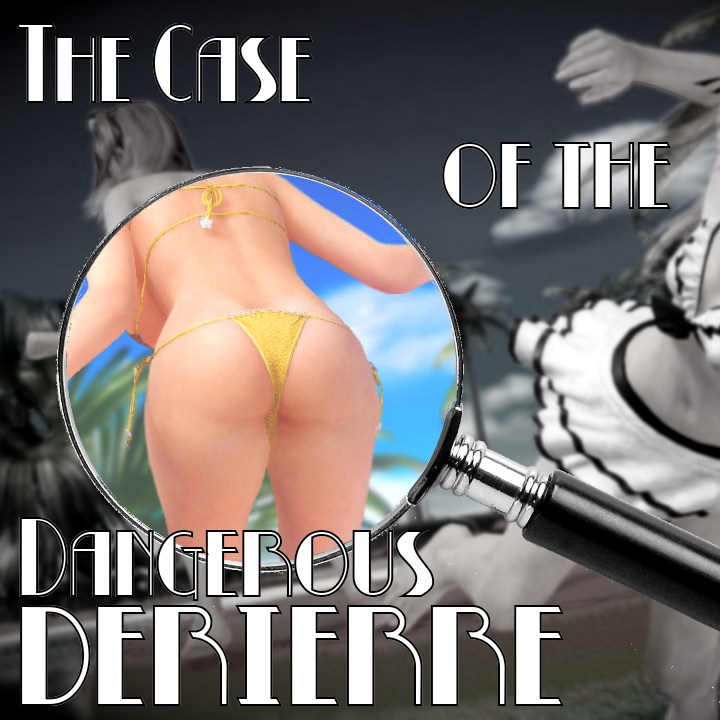
While I was researching and writing my article about the PSM video game girl swimsuit issues, I...
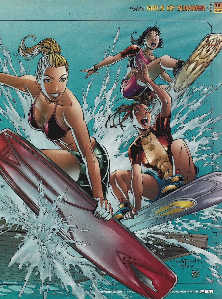
When I was a teen (back around 2005), I really got into video game magazines. EGM, Game...

The Switch 2 was recently shown off… and all the news we’ve been getting about it is...
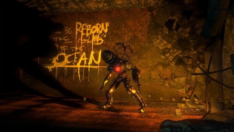
I recently replayed Bioshock and, having now familiarized myself with Ayn Rand and her ideology, it made...

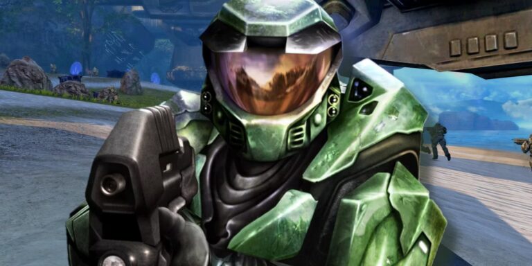
Welcome back to the Halo love/hate series! In this entry we’ll be going over the series’ second...
Surprise! It’s time for a new love/hate series! As you can probably tell, we’re going to be...

It’s mid-December, so that means another count-down of my favourite movie posters of the past year! In...

Back in the mid-2000s, I came across a somewhat-famous flowchart which purported to illustrate the hierarchy by...
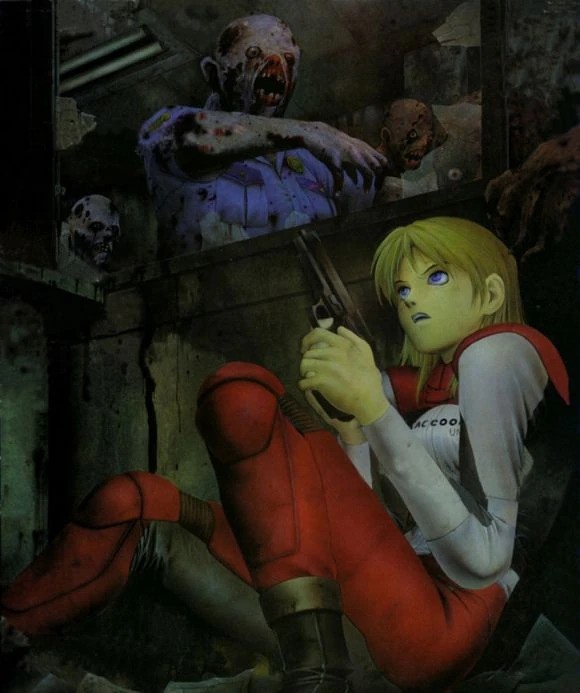
Welcome back to a very special bonus entry in the Resident Evil love/hate series! In this entry...