Welcome back to the mostly-annual year-end countdown of the best movie posters of the year! In case you’re unfamiliar with how this works, I spend the year trolling through impawards and collecting all the really cool, interesting and striking poster designs for 2022 movies and then narrow them down into a shortlist. As always, any poster released during the year is eligible to make the list, but special consideration is given to posters which are intended for mass distribution rather than posters which are intended to be limited-release, alternative, “artistic” posters. As usual, you can see the full-sized poster in all its glory if you click on the images. Anyway, with those considerations out of the way, let’s get onto the list, starting with some dishonourable mentions!
Dishonourable Mention: Me!
Well… this was embarrassing. Last year’s big winner, Jackass Forever, ended up slipping to 2022, meaning it shouldn’t have even been on the list and should probably be winning this year’s award instead… To be fair, when I wrote the article it hadn’t been delayed into 2022 yet and I didn’t realize the issue until much later, but that was certainly embarrassing when I clued in.

Dishonourable Mentions: All This Shit
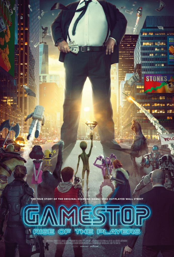
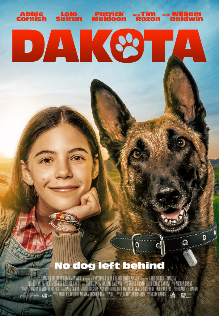
Ok, I don’t want to take up this preamble with a half dozen Dishonourable Mentions, but good God were there an unusually high number of notably-shitty posters this year. On the one hand you’ve got bootlicking shit like Bezos, which makes me retroactively hate the cult of personality that Steve Jobs cultivated even more than I already did. Then there’s cringe shit like the poster for Gamestop: Rise of the Players, which is a fascinating story but one which this poster memes to the point where I’d be embarrassed to even see their documentary. And then there’s stuff like Dakota, which despite featuring a good boy Malinois, has some of the worst graphic design I’ve seen on one of these lists before. The blue background against that garish red font literally hurts my eyes to look at.
Anyway, with that out of the way, let’s get on to this year’s best posters!
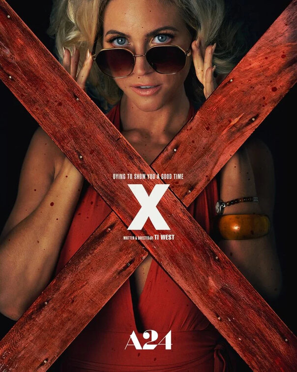
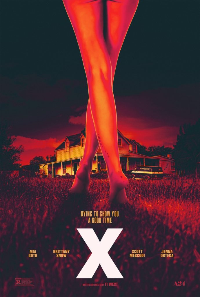
15) X
X was one of my favourite movies of the last year and these posters were actually part of the reason I checked it out in the first place. The graphic designers have outdone themselves in all of their designs for this film, capturing the 70s aesthetic and lurid subject matter through the imagery they’ve used (the crossed legs making an “X” is particularly clever). These posters don’t really spoil anything, but they prime you for the tone and feel of the movie in an abstract way and for that I think that the designers deserve some accolades.
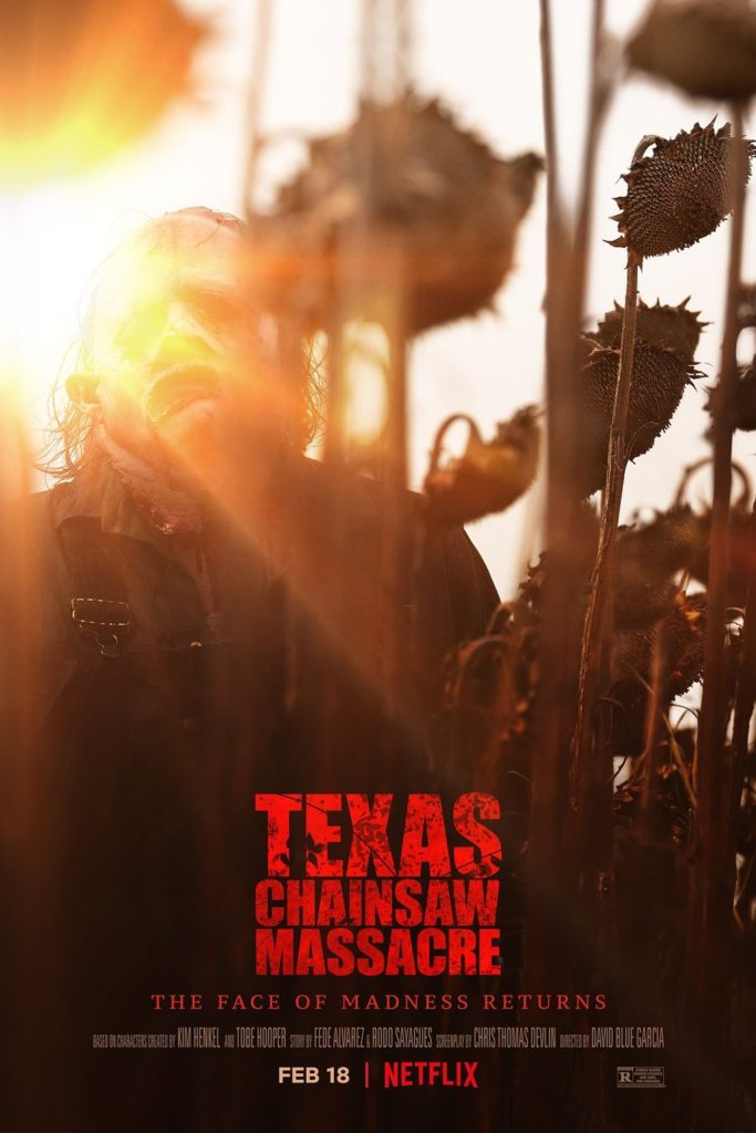
14) Texas Chainsaw Massacre
Netflix’s Texas Chainsaw Massacre is one of the stupidest horror movies of the year, but goddamn if the posters for it weren’t some of the year’s most interesting and evocative. The sun-drenched poster is beautiful and disturbing, hiding Leatherface’s visage despite him being in full daylight. Meanwhile, I really like the abstract painting of Leatherface’s mask, which shows very little but aptly promises the “face of madness”. There’s even a little homage of the last shot from the original film beneath Leatherface’s mouth on this poster. Just great posters overall, which is especially surprising considering that the film’s Netflix release meant that they theoretically could have gotten away with marketing the film without producing any.
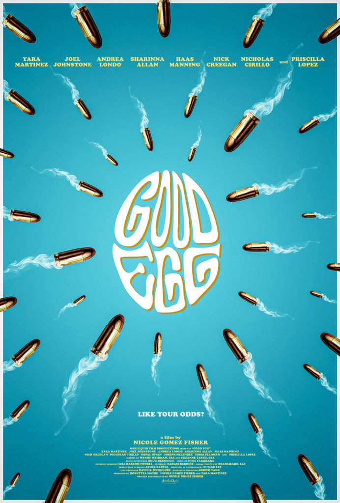
13) Good Egg
Here’s one of those little movies that wouldn’t get a lot of attention if not for the very striking poster design. Despite knowing nothing about this movie before seeing its poster, it’s impressive how much about the movie you can glean from this poster (it’s about a woman who has been having no luck with invitro fertilization so she turns to criminal methods to help out; hijinks ensure). In fact this poster’s so good that I legitimately want to see this movie now, so you know they did something right!
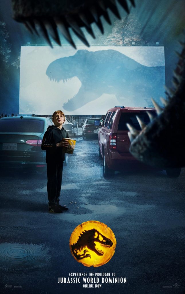
12) Jurassic World: Dominion
Much ink has been spilled about how Jurassic World: Dominion wastes its “dinosaurs on the mainland” setup, but for a moment there in the marketing it looked like we’d get to see cool scenes like this where a t-rex interrupts a drive-in movie showing. Depending on what you were looking to get out of Dominion, you could also argue that this makes this particular poster better than the movie we actually got. It’s also kind of wild because this is technically a poster for a teaser trailer, which feels like the pinnacle of big budget franchise marketing excess. If you want to get nitpicky, some of the photoshop compositing isn’t the best, but I really like the premise here and think that it effectively gets across the terror and wonder of dinosaurs unleashed in the real world.
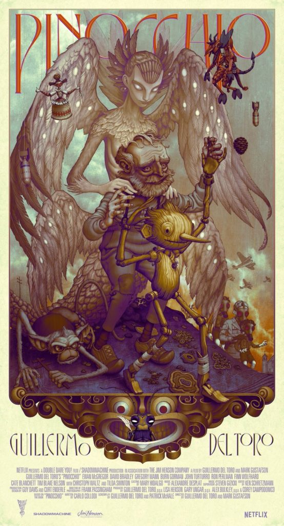
11) Pinocchio
It would take a lot to get me to give a shit about a Pinocchio movie (a fact evidenced by Disney’s own attempt this year coming and going without me even noticing), but apparently that limit for me is a poster with the name “Guillmero del Toro” on it. Del Toro’s creature designs are always fascinating and this poster puts that on full display, promising an unsettling take on Pinocchio which is more than a little reminiscent of Pan’s Labyrinth. Add on that this is not just childhood nostalgia pandering and this is a Pinocchio project that I actually have some interest in checking out when it releases on Netflix.
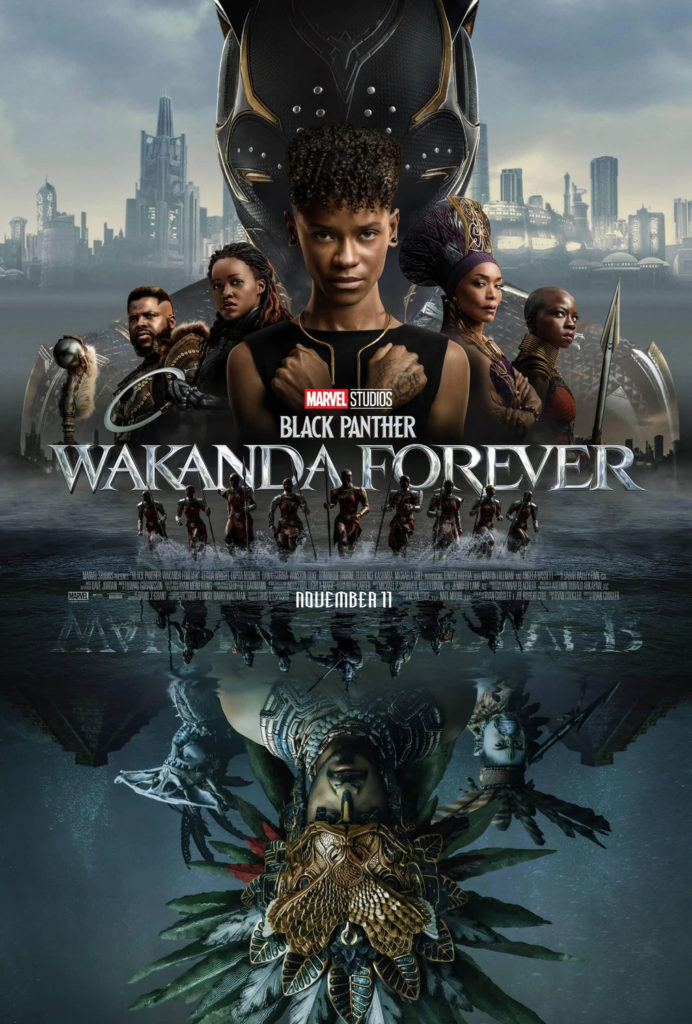
10) Black Panther: Wakanda Forever
Marvel movies tend to have pretty boring poster designs, but this one for Wakanda Forever struck me as being visually interesting the first time I saw it. It checks off all the standard “character poster” designs on the top half, but the way it places Namor and his forces upside down on the poster is interesting. It’s a clear visual metaphor, showing that the two sides are mirrored opposites, but it works really well and with more creativity than I’ve come to expect from Marvel these days.
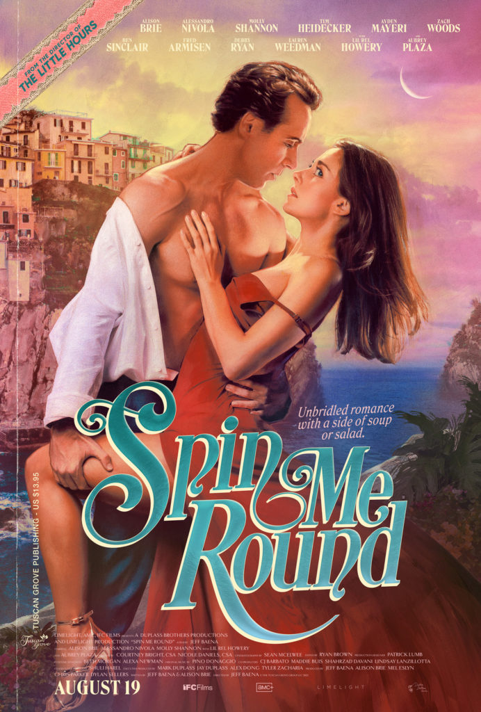
9) Spin Me Round
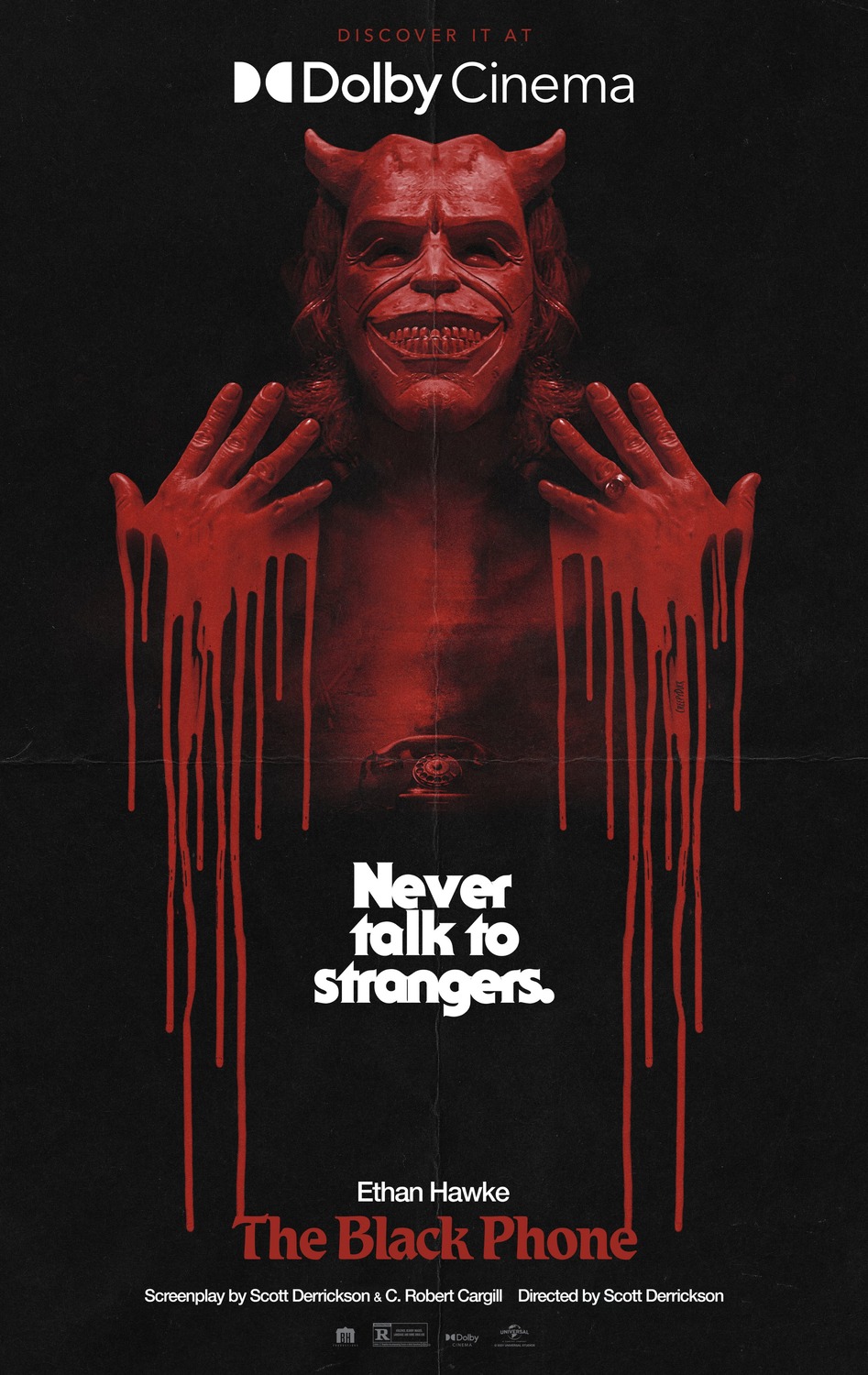
I was thinking of giving the award for “movie poster that looks most like a dime-store novel” to The Black Phone, but Spin Me Round executes on that premise so much better in my opinion. It captures the harlequin romance cover aesthetic perfectly, with just a wink and a nod that everything may not be as straightforward as it may seem with Alison Brie’s backward glance towards the audience. Given that this is by the director of The Little Hours, which was basically the plot of a nun porn without the porn, this definitely is an intentional hint at all sorts of comedic chaos.
8) The Northman
The Northman makes this list mainly because… well, just look at it, it’s a gorgeous shot. Robert Eggers knows how to wring every bit of potential out of his historical films and give us some really striking visual design. Whoever decided that Bjork would make a great viking deserves all the praise. Muted colour schemes don’t always work, but here combined with the off-focus it grants The Seeress an ethereal glow which is hard to look away from.
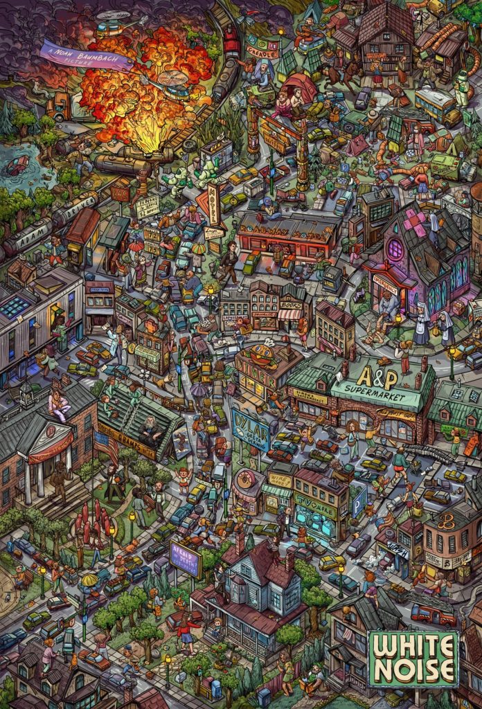
7) White Noise
This poster makes the list for the sheer excess of it. It looks like an I Spy or Where’s Waldo illustration – everywhere you look there’s something interesting going on and the poster rewards careful study of it. There’s lots of little hidden details throughout, including the names of the director and the stars, plus various little gags and hints about the movie’s plot. You could argue that the poster is just too much, but considering how much this makes me want to study every little detail, I think it succeeds with aplomb.
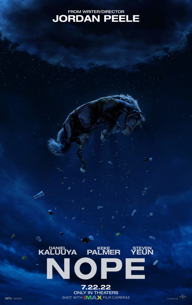
6) Nope
For my money, Nope has the most iconic poster design of the year and it doesn’t even come close. This is one of those posters like for Jaws or Star Wars that people are still going to remember years from now. It doesn’t reveal anything about the movie really, just hinting at the alien abduction aspects, but it’s such a striking image and the title is so blunt that it sticks in your head immediately.
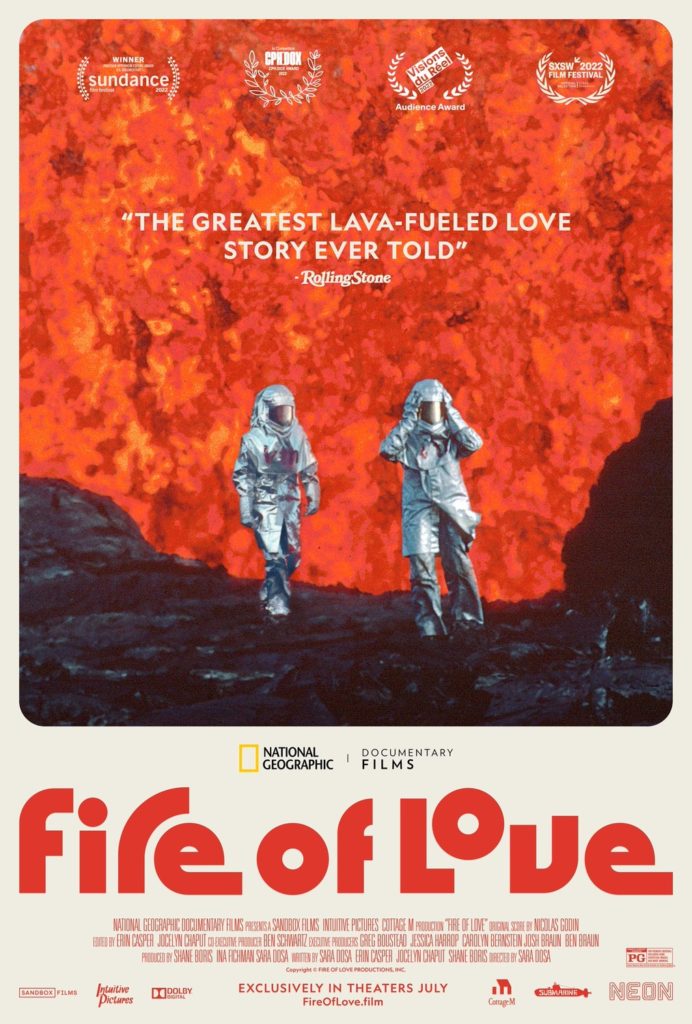
5) Fire of Love
Fire of Love‘s poster asks a simple question: do you want to watch a documentary about a volcanologist couple who stand in front of giant walls of lava like it ain’t no thing? It’s such a simple poster, selling you on the film itself with some of the striking, unbelievable imagery which has been captured for it and allowing that to speak for itself.
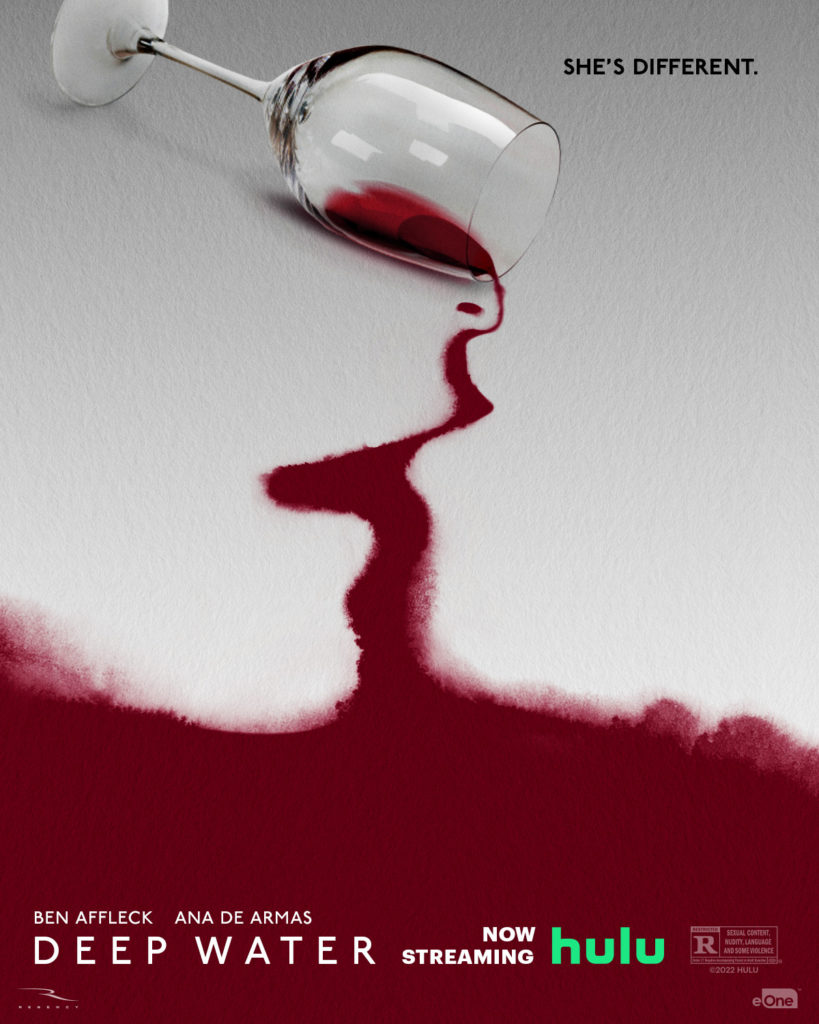
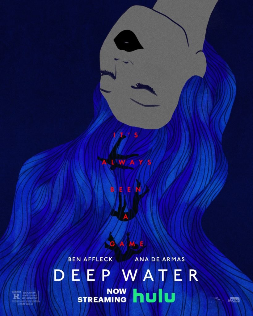
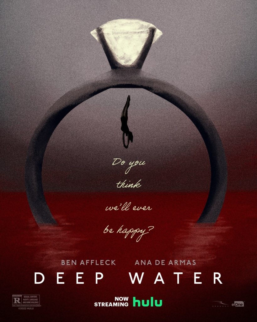
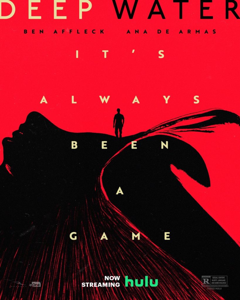
4) Deep Water
I don’t know anything about Deep Water, but the graphic designers went hard on it this year, putting out a ton of bomb-ass posters (to the point where I haven’t even posted all the posters I liked for this one film here). They’re all abstract, with vivid colours and imagery that hints at a movie full of sex, mystery, drama and murder. Again, this is for a Hulu film so it’s not like they needed to go this hard with their marketing, but the fact that they did really has helped make this movie’s posters stand out.
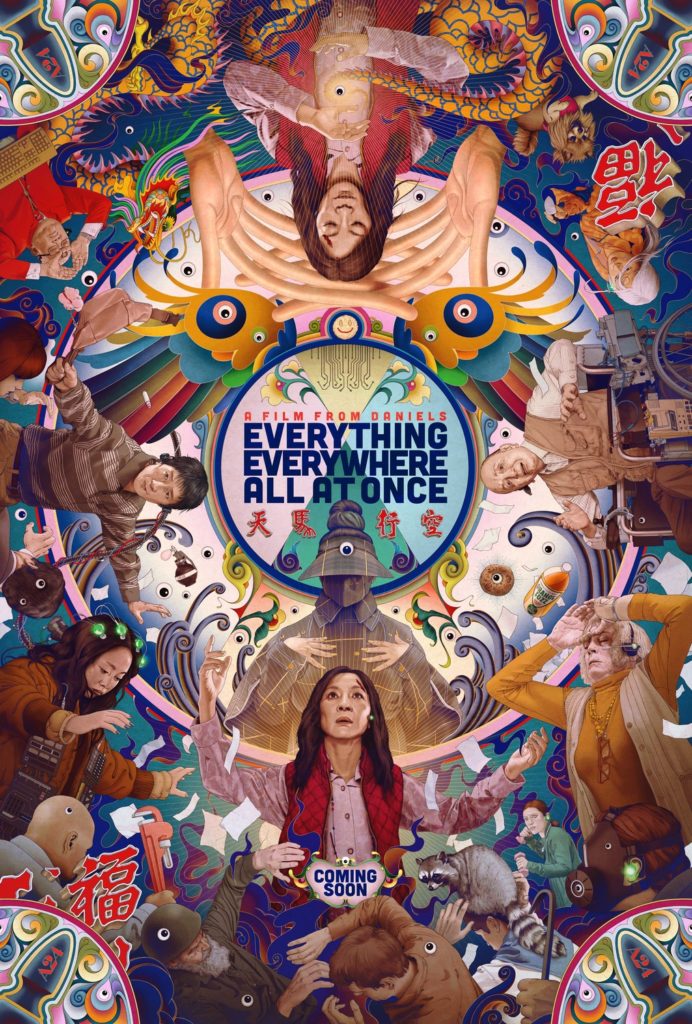
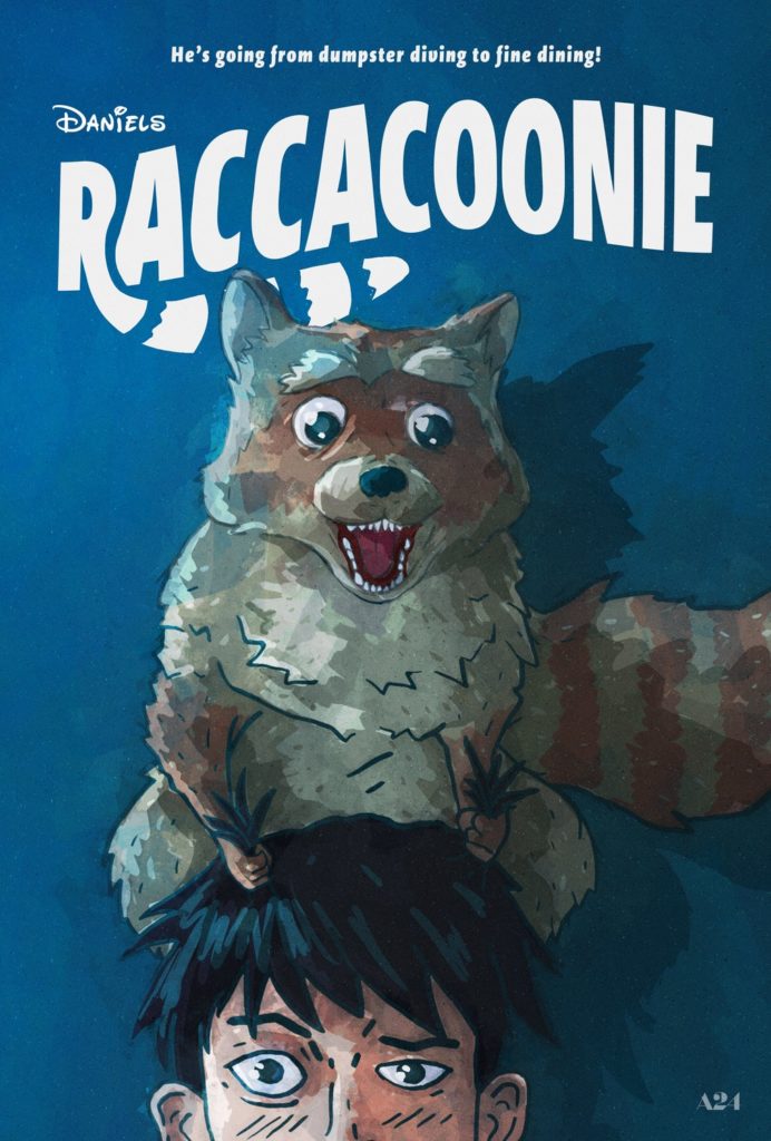
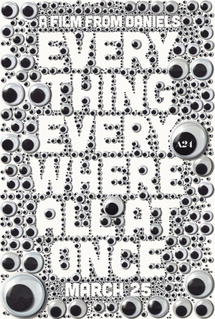
3) Everything Everywhere All At Once
I usually hate multiverse stories, but Everything Everywhere All At Once makes the most of the premise with some really fun and striking “alternate universe” posters. Raccacoonie in particular looks hilarious and nails the quirky Disney animation poster design perfectly, while the googly eye poster is weirdly unsettling. Even the standard poster is colourful and visually interesting, showing off the various alternate universes in a more efficient (if less fun) fashion. Everything Everywhere All At Once has had easily the funnest posters of the year, which is actually an accomplishment considering how much I enjoyed that one for White Noise.
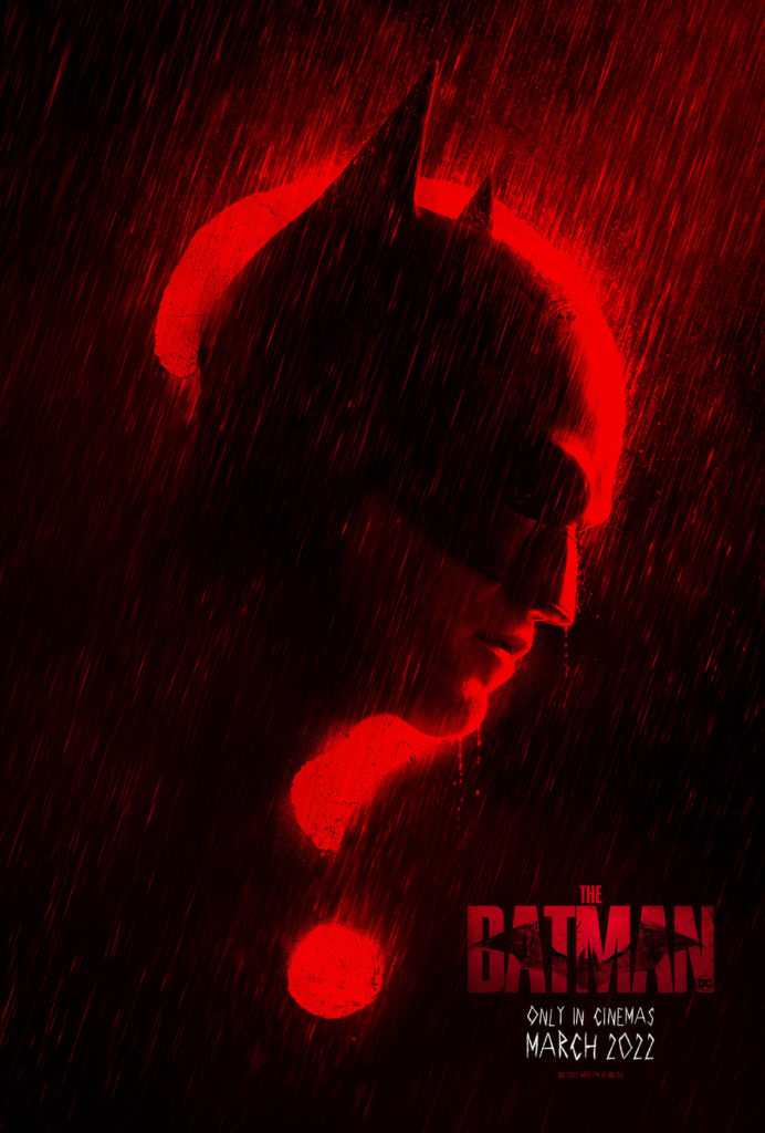
2) The Batman
Batman movies have been trying to one-up themselves for a decade an a half now with how grim-dark they can get, and these posters for The Batman easily take the cake for how moody and dark they are. The red and black contrast is eye-catching and sets the oppressive, noir tone efficiently. The poster with the Riddler looks more akin to a serial killer film than it does a traditional Batman poster and the poster that frames Batman with the question mark hints at the Riddler’s involvement in iconic fashion. All-in-all, the posters for this incarnation of the bat are thematically united, hinting at a take on the character which will be darker, more serious and more disturbing than any we have seen before.
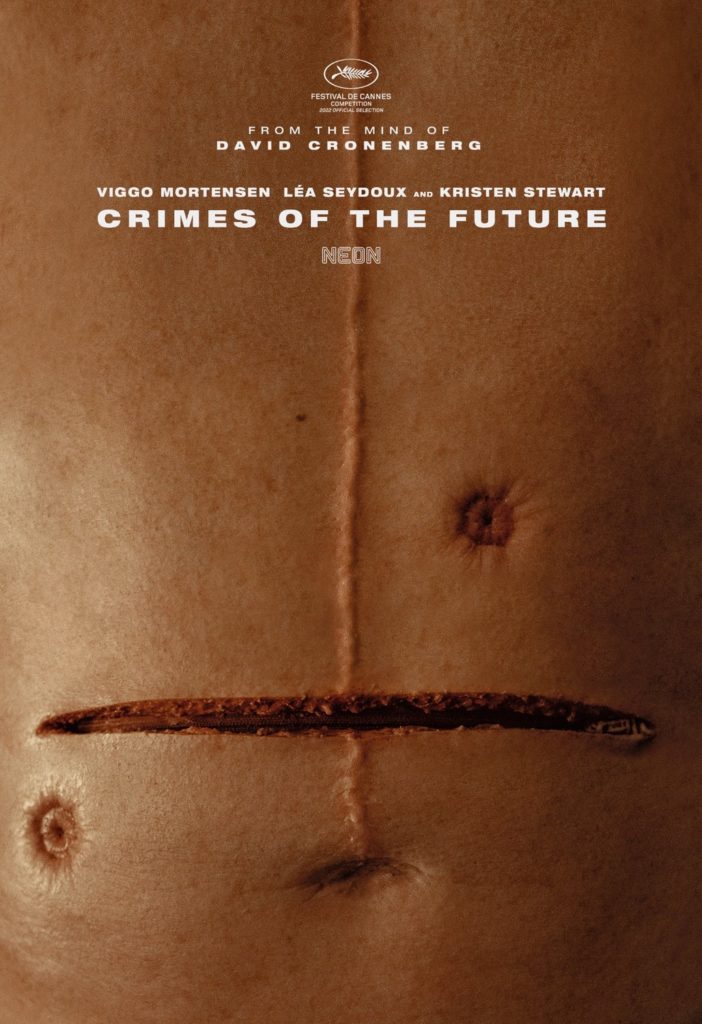
1) Crimes of the Future
NOPE. These posters are weird and disturbing enough without context, but if you know David Cronenberg and his penchant for twisted sci-fi and body horror, then these posters should be making your skin crawl. These posters only hint at the sorts of sick depravity you’re in store for if you watch this movie and for that they are easily the most effective posters I’ve seen all year.